css常用demo练习
1.横向弹性布局,溢出的部分换行
flex布局实现不同分辨率屏幕显示效果不同,”自适应布局“
(flex-flow是flex-direction和flex-wrap的复合属性)
 (1)普通情况
display:flex;
flex-flow:wrap;
white-space: nowrap;
text-overflow: ellipsis;
overflow:hidden;

(2)溢出省略无效(父元素flex布局,子元素设置flex:1自动填充剩余空间,发现设置的溢出省略无效,解决方式:子元素需要设置width:0)
.father{
	display:flex;
	overflow:hidden;

	.son{
		flex:1;
		width:0;
		white-space: nowrap;
		text-overflow: ellipsis;
	}
}
2.文字多余部分用省略号表示
CSS:解决文本溢出/自动换行/文字两端对齐
over-flow:hidden;
white-space:nowarp;
text-overflow:ellipsis;

多行文本,溢出换行
overflow:hidden;
text-overflow:ellipsis;
display:webkit-box;
-webkit-line-clamp:5;
-webkit-box-orient:vertical;
3.弹性布局,水平均匀间隔效果
display:flex;
justify-content:space-between;
4.弹性布局,div内部垂直弹性布局
display:flex;
flex-direction:column;
align-items:center;
justify-content:center;
5.hover改变特效
&:hover{
   background-color:#0000000d;
   border-radius:10px;
}
6.使用伪元素给div添加图片
::before{
  content:"";
  background:url("") center center;
  background-size:100% 100%;
}
7.添加滚动条(横纵按需)
height:50vh;
overflow:auto;
8.设置滚动条样式
.container{
   height:55vh;
   overflow:auto;
   background:white;

   /*滚动条里面小方块*/
   ::-webkit-scrollbar-thumb {
       background-color: rgba(77, 86, 133, 0.28);
       border-radius: 10px;
   }

   /*滚动条整体样式*/
   ::-webkit-scrollbar {
       width: 6px;
       height: 6px;
   }

   /*滚动条里面轨道*/
   ::-webkit-scrollbar-track {
       background: rgba(77, 86, 133, 0.1);
       border-radius: 10px;
   }
}
9.伪元素的使用
伪类:用于向某些选择器添加特殊效果(::before,::after等)
伪元素:用于将特殊效果添加到某些选择器(:hover,:foucs等)
伪类与伪元素区别
非嵌套使用:
.el-tree-node__content::hover,.el-tree-node__content::focus{
}
嵌套使用:
.el-tree-node__content{
  &:hover{
  }
  &:focus{
  }
}

关于伪类:
1.必须配合content属性使用
2.不会渲染成dom,不能用js进行操作,在css渲染层加入。
3.伪类对象的特效通常在伪类前加:hover伪类样式来激活


.aClass:hover{
}
.aClass{
  &:hover{
  }
}
.aClass::before{
}
.aClass{
  &::before{
  }
}


.test:hover::before{/*这时animation和transtion才生效*/}
10.关于深度选择器
深度选择器有三种: >>>,/deep/ 和 ::v-deep(简写为 :deep())
1.>>>  属于css原生写法
2. /deep/ 属于sass写法
3. ::v-deep 属于scss写法,vue3只支持这种写法。

<style>
  >>> .box1{
  }
  /*等效于*/
  /deep/ .box1{
  }
  /*等效于*/
  ::v-deep box1{
  }
</style>
11.给el-table的表头设置样式
   //el-table添加以下属性
  :header-cell-style="{background:'#eaf1f7',color:'#606266'}"

12.粘性定位sticky
粘性布局sticky根据滚动位置在相对(relative)和固定(fixed)之间切换,起初它会被相对定位,直到在视图窗口到达给定偏移位置为止——将其“黏贴”在设定的位置。
粘性定位sticky是相对(relative)和fixed的结合,不过fixd是相对于根节点元素进行定位,sticky粘性布局的元素,起初属于相对定位状态,直到在视口遇到给偏移位置(通过left,top,right,bottom设置)——表现为fixed。
//例如滚动区域container内,想要固定中间部分的input输入框所在外层盒子的位置,
//初始状态可以上下移动,但是如果上移到距离顶部top为0,就会粘住
<div class="container">
  <el-tree>
  </el-tree>
  <div class="input-box">
    <el-input style="width:50px;"></el-input>
  </div>
  <el-tree>
  </el-tree>
</div>

.container{
  height:200px;
  overflow:auto;
  width:100px;
}
.input-box{
  position:sticky;
  top:10px;
  z-index:999;

  width:100%;
  background:white;
}
13.同一行内的元素两边显示
flex多种方法让多个元素两边显示
         A父元素 B子元素
(1)
	A:  display:flex;
	B:  margin-right:auto;

(2)
	A:  display:flex;
	    justify-content:space-between;
(3)
	A:  display:flex;
	    justify-content:end;
	B:  flex:1;
	//flex:1实现动态填充宽度,自动占满剩余空间
(4)
	//使用4个盒子 ,中间的盒子设置成 弹性其他的两个盒子被撑到两边即可,
	.blank-arae{
	    flex-grow: 1; /**自适应,能够填充空白区域**/
	    min-width: 400px; /**伸缩盒的底线。。。**/
	}
14.使用伪元素给标题前加”竖杠“
.header-title{
  position:relative;

  &::before{
    content:"",
    display:block;
    height:15px;
    border-right:3px solid #blue;
    position:absolute;
    left:-10px;
  }
}
15.设置边框阴影
(水平阴影+垂直阴影+模糊半径+阴影颜色)
text-shadow:2px 2px 4px #000000;

box-shadow:10px 10px 5px grey;


//兼容一些浏览器老版本的box-shadow写法
-moz-box-shadow:2px 2px 10px #06c;
-webkit-box-shadow:2px 2px 10px #06c;
box-shadow:2px 2px 10px #06c;

//只需要去掉模糊半径,就可以实现类似透明边框的效果
box-shadow:10px 10px gray;
16.flex弹性布局弹性流:flex-direction、flex-warp、flex-flow
//flex-flow是flex-direction和flex-wrap的复合属性(简写方式)
//flex-flow: || 即可写作flex-flow:row wrap;

//行内显示,宽度溢出换行,实现弹性流效果。
display:flex;
flex-flow:wrap;
17.自适应、响应式、弹性布局
流式布局(百分比布局)
自适应布局:根据屏幕尺寸改变布局,换行,隐藏等(元素大小不会改变)
||
||如果屏幕太小会导致内容过于拥挤,响应式布局因此衍生出来
||
响应式布局:根据屏幕尺寸改变布局,和元素大小
弹性布局:使用弹性盒子(flex box)实现的响应式布局。
18.elmentUI的el-form每个item项水平分散对齐,两端靠边。
//space- between两端对齐写法
.el-form{
  display:flex;
  justify-content:space-between;
  flex-flow:wrap;

  .el-form-item{
    width:20%;
    display:flex;
    white-space:nowrap;

    .el-form-item__content{
      flex:1;
      .el-select{
        width:100%;
      }
    }
  }
}

//百分比写法
.el-form-item{
  display:flex;
  flex-flow:wrap;
  width:calc((100% - 6%) / 4);
  margin-right:2%;

  &:nth-child(4n){
    margin-right:0px;
  }

  .el-form-item__content{
    flex:1;
  }
}
19.&(回溯到嵌套结构上一层)详解
本质区别:是否创造了新元素,伪类:hover/:foucs 伪元素::before/::after
伪元素:不存在于dom文档中,属于虚拟元素,逻辑上存在。
伪类:偏向于添加抹些特殊效果。
::before,::after与:before,:after区别:
两者是等效的,前者是css3写法,后者是css2写法。

伪元素使用场景:
(1)不嵌套写法:(最原始写法也是经过编译后的最终形式)
.father::before{
}
(1)嵌套在父元素中:
.father{
  &::before{     // &符号在嵌套层次中回溯到上一层
  }
}


二者编译后最终都是.father::berfore{}

父子选择器使用场景:

(1)非嵌套
.father:nth-child(4n){
}
(2)嵌套在父元素中:
.father{
  &:nth-child(4n){
  }
}

除了.father:nth-child(n){}之外,父子选择器
还有.father:first-child{}
和.father:last-child{}的常见形式
20.elementUI的table表格的表头与列不能对齐的bug
// 点击添加行后,对table进行重新布局,避免滚动条拉到最右侧,表头与内容不能对齐
 this.$nextTick(()=>{
     this.$refs.table.doLayout();
  })
21.CSS3的filter(滤镜)属性
 //使用高斯模糊
 .img{
    -webkit-filter: blur(5px); /* Chrome, Safari, Opera */
    filter: blur(5px);
  }
22.动态样式绑定
class与style绑定
<span :style="{backgroundColor:colorArray[0];}"></span>
<span :class="{isNight?nightTheme:dayTheme}"></span>

<script>
	colorArray:["black","red","blue"];
	isNight:true;
</script>

<style>
  .dayTheme{
  }
  .nightTheme{
  }
</style>
23.css3颜色渐变
CSS3渐变
background-image: linear-gradient(45deg,#e66465, #9198e5);
24.背景图片加毛玻璃效果(高斯模糊)
HTML/CSS实现毛玻璃特效的两种方法
  backdrop-filter:blur(50px);
  或者
  filter:blur(50px);

 backdrop-filter CSS3 属性可以让你为一个元素后面区域添加图形效果(如模糊或颜色偏移)。
 因为它适用于元素背后的所有元素,为了看到效果,必须使元素或其背景至少部分透明。
 常规使用:
 backdrop-filter:blur(5px);
 background:white 0.3;
 //opcity:0.3;
25.关于box-sizing:border-box;
一般场景,我们习惯于给box设置一个百分比或者固定的宽度,而这个宽度我们一般是认为是包括了盒子所有内容、padding、边框的宽度。当我们需要靠给盒子设置padding给内容填充边距时,一般需要使用到这个属性box-sizing:border-box;
box-sizing默认值是content-box;一般而言是违反常规使用习惯的。
26.margin-right/margin-left:auto必须与flex连用才能实现自动占满剩余空间。
.father{
  display:flex;
  .child{
     margin-right:auto;
   }
}
27.鼠标移到标签上变为手型
cursor : pointer;
28.css父元素高度由内容撑开,而非默认100%占满
height:fit-content;
height:-webkit-fit-content;
height:-moz-fit-content;
29.padding的妙用:巧妙使用padding可以实现行元素头部对齐的效果(取代行元素分别设置margin,还必须一致)
使用padding,一般搭配box-sizing:border-box;
这个时候盒子宽度会包括内部content加上padding加上border,
一般场景,我们习惯于给box设置一个百分比或者固定的宽度,而这个宽度我们一般是认为是包括了盒子所有内容、padding、边框的宽度。所以此时应该搭配该属性使用。
这个属性默认值是content-box;一般而言是违反常规使用习惯的。
30.css空格占位符( ;&ensp; &emsp;)
正确用法
(1)普通英文半角空格
<span> <span>
(2)半个中文宽度  
<span> </span>
(3)一个中文宽度  
<span> </span>
31.中心渐变
background:radial-gradient(red,black);
32.elementUI表单项验证为数字项且非必填
使用element UI时表单验证字段必须是数字但是非必填的方法总结
33.CSS特效:鼠标移动线条吸附
网页动态效果——随鼠标移动的动态触击式线条
网页实现线条像磁铁一样向鼠标吸附
34.视觉差滚动
CSS视差滚动
vue视差滚动
插件
demo
关键属性:给背景图片设置background-attachment:fixed;
默认值为scroll,随着页面的其余部分滚动
设置为fixed,当页面的其余部分滚动时,背景图像不会移动

也可以直接设置
    background:url() no-repeat center fixed;
35.background属性常规用法
background:red url("") no-repeat center fixed;
background-size:100% 100%;
//background-size:cover || contain;
//background-position:center center;
//如果仅指定一个关键字,其他值将会是"center"
//background-position:center;
36.字体调整
//行高一般用于调节文本的高度,也可用于居中
line-height:10px;
//letter-space可以给字之间增加间距
letter-spacing:2px;

//放大,缩小
transform:scale(1.1);
37.css动画
div{
 //复合属性animation:   动画名称   完成时长   循环次数:无限
 annimation:myMove 5s infinite;
 -webkit-animation:myMove 5s infinite;
 //播放延迟:延迟2s后执行动画
 //animation-delay:2s;
 //动画方向:交替(先正向播放,然后反向播放)
 //animation-direction:alternate;
 //-webkit-animation-direction:alternate;
 //动画效果:匀速、先慢后快、先快后慢
 //animation-timing-function:linear;
 //-webkit-animation-timing-function:linear;

}
//只关注开始和结束帧变化的动画写法
@keyframes mymove
{
  from{left:0px;top:0px;transform:rotate(0deg);}
  to{left:100px;top:100px;transform:rotate(-360deg);}
}
@-webkit-keyframes mymove /*Safari and Chrome*/
{
  from{left:0px;top:0px;transform:rotate(0deg);}
  to{left:100px;top:100px;transform:rotate(-360deg);}
}

//多个关键帧的写法
@keyframes myfirst
{
	0%   {background:red; left:0px; top:0px;}
	25%  {background:yellow; left:200px; top:0px;}
	50%  {background:blue; left:200px; top:200px;}
	75%  {background:green; left:0px; top:200px;}
	100% {background:red; left:0px; top:0px;}
}

@-webkit-keyframes myfirst /* Safari 和 Chrome */
{
	0%   {background:red; left:0px; top:0px;}
	25%  {background:yellow; left:200px; top:0px;}
	50%  {background:blue; left:200px; top:200px;}
	75%  {background:green; left:0px; top:200px;}
	100% {background:red; left:0px; top:0px;}
}
38.CSS边框
//边框图片:可以给边框设置渐变色
boder-image:url() round 30;
//设置边框长度、实线、颜色
border:10px solid red;
//使用边框背景覆盖边框的颜色,宽度为10
border-image: linear-gradient(45deg,yellow, green) 10;
border-image: radial-gradient(red, green) 10;

//径向渐变
background:radius-gradient(black,red);
//线性渐变
background:linear-gradient(45deg,black,red);
38.css 3D旋转特效
.div{
  animation:mv1 9s infinite;
 }
@keyframes mv1{
		from{transform:rotateY(0deg) rotateX(0deg);}
		to{transform:rotateY(360deg) rotateX(360deg);}
	}
39.透明色transparent
40.vue实现页面全局滚动和区域局部滚动
全局滚动参考github项目:
QQ滚动视差
局部滚动参考文章:
vue监听指定区域的滚动,以及设置滚动值
41.css图片与文字不在同一水平线上
//给图片添加属性:设置图片元素中线与父元素的中线对齐
vertical-align:middle;
42.设置背景图片透明度而不影响文字
CSS实现背景图片透明和文字不透明效果
(1)使用ragb
background: rgba(255,255,255,0.8);
(2)使用opcity(会影响所有子元素)
43.display:inline-block作用
display:inline,即行内元素会在一行内排列,且不能设置宽高(设置宽高无效)
display:block,块级显示,设置以后每个块级元素独占一行(可设宽高)
display:inline-block,行内块元素(行内显示,可设宽高)
44.CSS中的&符号
& 表示嵌套的上一级,是和父级的同级样式,不同类名公用类名相同或不同样式的简洁写法
CSS样式中&、
【CSS基础】&符号该怎么用?
45.点击旋转
.xxxClass{
	&:hover{
		transform:rotate(90deg);
		opacity:0.8;
	}
	span{
		font-size:12px;
		font-weight:600px;
	}
}
46.四角边框的实现
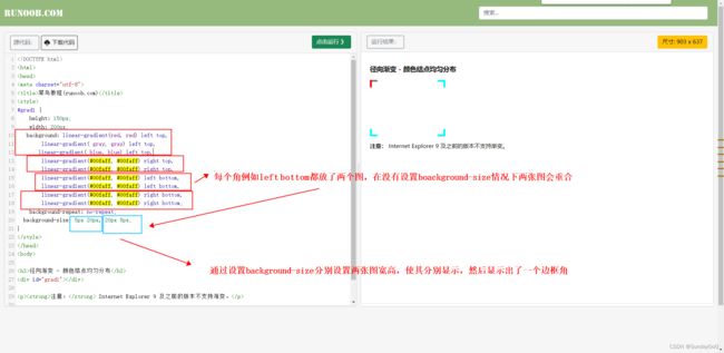
方法一:使用background属性
.div{
    width: 1000px;
    height: 500px;
    margin: 100px;
    background: linear-gradient(#00faff, #00faff) left top,
		linear-gradient(#00faff, #00faff) left top,
		linear-gradient(#00faff, #00faff) right top,
		linear-gradient(#00faff, #00faff) right top,
		linear-gradient(#00faff, #00faff) left bottom,
		linear-gradient(#00faff, #00faff) left bottom,
		linear-gradient(#00faff, #00faff) right bottom,
		linear-gradient(#00faff, #00faff) right bottom;
	background-repeat: no-repeat;
  	background-size: 5px 20px, 20px 5px;
}

方法二:伪元素+绝对定位
方法三:增加dom元素,四个div+绝对定位
47.渐变色的使用——实现进度条滚动
线性渐变linear-gradient/径向渐变radial-gradient

.div10 {
      height: 20px;
      background: repeating-linear-gradient(
        45deg,
        #30e8bf 25%,
        #ff8235 0,
        #ff8235 50%,
        #30e8bf 0,
        #30e8bf 75%,
        #ff8235 0
      );
      background-size: 30px 30px;
      animation: roll 1s linear infinite;
    }
    @keyframes roll {
      from {
        background-position-x: 0;
      }
      to {
        background-position-x: 30px;
      }
    }
48.水平均匀分布
//1flex布局,item占flex:1,margin-right,最后一个不设
<div style="display:flex">
	<div class="itemClass"/>
</div>

.itemClass{
	flex:1;
	margin-right:25px;
	&:last-child{
		margin-right:0;
	}
}

2.flex布局,justify-content:space-around;
3.el-row,el-col
- 过渡属性transition: all .38s ease-out;
transtion是复合属性,可以设置作用与该样式上所有(可指定属性)动画的过渡效果(如hover特效引起的width、height、color、bg等变化)
常规使用:
transition:all .38s ease-out;
50.CSS变量的使用
CSS变量之var()函数的应用
//1.在css中使用变量
<style lang="scss" scoped>
.top-nav{
	background:var(--bg);
	color:var(--color);
}
</style>

//2.在js中进行变量赋值
<script>
export default{
	data(){
	 return{
	 	bg:'red',
	 	color:'black',
	 }
	}
}
</script>

//3.也可以直接在html标签中使用style进行css变量赋值
<div :style="{‘--bg’:'red','--color':color}"></div>
51.清除浮动
实际开发中我们会遇到一些使用浮动的标签,使用浮动可以快速让元素向右或者向左排列,并且脱离文档流。
但是它带来的坏处是因为脱离了文档流,所以不会被包含在父元素中,父元素高度不会被这个浮动元素撑开,所以这时候需要清除浮动来实现一些样式效果。
1.推荐:使用伪元素清除浮动
<div class="father">
	<div class="son"><div>
</div>

//父元素通过after伪元素标签向自身末尾插入最后一个块级元素,并设置该元素清除浮动影响
.father{
	&::after{
		content:"";
		clear:both;
		display:block;
	}

	.son{
		float:right;
	}
}
52.图片自适应
1.背景图片自适应 background-size:contain | cover | length(第一个设置宽,第二个设置高) | percentage
background-size:contain		//保持图片纵横比,使用容器最小区域(图片不会溢出容器)
background-size:cover 		//保持图片纵横比,使用容器最大区域(图片会溢出容器)
background-size:100px auto;		//第一个设置宽,第二个设置高,未设则默认为auto(保持纵横比,atuo项根据已设置的项自适应)
background-size:100% 100%		//宽高都占满100%,填满容器

2.css属性(object-fit: fill | contain | cover | none | scale-down)容器填充
object-fit: fill 		//不保持纵横比,
object-fit: contain		//包含图片,保持纵横比,
object-fit: cover 		//覆盖,保持纵横比
object-fit: none 		//保持原图,直接放置
object-fit: scale-down	//缩放,类似包含,保持纵横比
53.sass变量的在js中使用
在一个.scss文件中定义scss变量并暴露该变量,以便其他文件的js或者css部分引用

例如这里有一个scss文件:variables.scss的内容如下
$menuDarkBg:#000000;
$menuLightBg:#ffffff;

:export{
	menuDarkBg:$menuDarkBg;
	menuLightBg:$menuLightBg;
}

在.vue文件的js部分引入并使用
<script>
import variables from "@/assets/style/variables.scss"
console.log("查看引入是否引入成功:variables ="+variables)
</script>

css部分的引入方式
<style lang="scss" scoped>
@import "~@/assets/style/variables.module.scss";
</style>

js中引入scss文件有时会失败,可能是因为项目使用的vue脚手架版本过高,对scss文件的引入方式不同,例如使用cli5时需要将xxx.scss文件变为xxx.moudle.scss文件才能成功引入。
54.子类选择器demo
可以实现一排div,首个和最后的div都靠左右边界,没有margin的效果。
.container{
	.p{
		margin-right:15px;
		&:last-children{
			margin-right:0px;
		}
	}
}

或者实现一排div,div之间有边框线,最后一个没有右边框,诸如此类效果
.lineItem{
	border-right:1px solid black;

	&:last-children{
		border-right:0px;
	}
}
55.常规CSS选择器demo解读
CSS选择器
CSS选择器深度解析
CSS选择器分为基础选择器和组合选择器,基础选择器有ID、类、标签、属性选择器,以下是常规的组合选择器demo。
(1)>(读作子元素选择器/子一代选择器)
	.container>a{
	}
选中了container类下一级的a标签(不包含嵌套在其他标签下的a标签)
(2)空格 (读作后代选择器)
.container a{
}
选中了container类下的所有的a标签(可以选中所有的a标签,包括嵌套层级的)
(3)其他选择器
 (1)分组选择器
	h1,h2,span{
	}
(2)相邻同级选择器/兄弟同级选择器
	a+p{
	}
(3)普通同级选择器
	a~p{
	}
(4)伪类选择器(:active, :hover, :focus, :first-child, :nth-child, :first-of-type)
	span{
		margin:10px;

		&:first-child{
			margin-left:0px;
		}
		&:last-child{
			margin-right:0px;
		}
	}

(4)伪元素选择器
 	a::before{
 		content:"";
 		width:10px;
 		height:10px;
 		background:red;
 	}
56.父元素高度不确定情况下,让子元素高度自适应
css中父元素没有高度,子元素高度填满
//问题描述
父元素高度不确定,由高度最高的子元素撑开,需要让其余的高度不是最高的子元素自适应父元素的高度
//解决
父元素设置:
display:flex;
align-items:stretch;(子元素自动撑满父元素的高度)
子元素设置:
height:inherit;
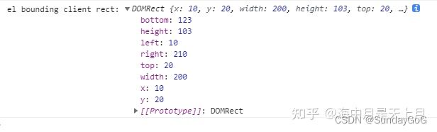
55.获取dom元素高度、宽度
let domDemo = this.document.getElementById("xxx");
console.log(domDemo.getBoundingClientRect());
56.dom元素对象属性offsetHeight /offsetWidth,clientHeight/clientWidth
offsetHeight /offsetWidth:获取元素高度,宽度,包括padding和border部分
clientHeight/clientWidth:获取元素高度/宽度,只包括padding部分
57.iconfont使用(Unicode原始方式和font-class方式)
官方文档
基于Unicode的优化:font-class方式引入图标
58.图片设定
背景图片的常用设定background: url(“xxx”) no-repeat center/contain;
<div class="top-nav"></div>

.top-nav {
    width: 100%;
    height: var(--TH);
    background: radial-gradient(ellipse at center, #000C0F 0%, #243135 60%);
    position: relative;

    h2 {
      width: 100%;
      height: 100%;
      background: url("@/assets/images/layout/top-bg.svg") no-repeat center/contain;	//
    }
}