Flutter textFeild输入框和选择框
Flutter文本框TextField
目录
参数详解
代码示例
[ 效果图](https://blog.csdn.net/ruoshui_t/article/details/90578161?ops_request_misc=%7B%22request%5Fid%22%3A%22159884301219725264645373%22%2C%22scm%22%3A%2220140713.130102334…%22%7D&request_id=159884301219725264645373&biz_id=0&utm_medium=distribute.pc_search_result.none-task-blog-2allsobaiduend~default-4-90578161.first_rank_ecpm_v3_pc_rank_v2&utm_term=flutter+textfield&spm=1018.2118.3001.4187# 效果图)
完整代码
参数详解
TextField同时也使用Text 的部分属性:
| 属性 | 作用 |
|---|---|
| controller | 控制器,如同 Android View id |
| decoration | 输入器装饰 |
| keyboardType | 输入的类型- TextInputType.text(普通完整键盘)- TextInputType.number(数字键盘)- TextInputType.emailAddress(带有“@”的普通键盘)- TextInputType.datetime(带有“/”和“:”的数字键盘)- TextInputType.multiline(带有选项以启用有符号和十进制模式的数字键盘)- TextInputType.url |
| obscureText | 是否隐藏输入(密码设置为true) |
| onChanged | 监听 文字改变触发 |
| onSubmitted | 监听 键盘提交 |
| cursorWidth | 光标显示宽度 |
| cursorRadius | 光标显示圆角 |
| cursorColor | 光标显示颜色 |
| autofocus | 是否自动聚焦,默认是 false。 |
| textCapitalization | 用户输入的类型- TextCapitalization.none 无 - TextCapitalization.sentences 首句大写 - TextCapitalization.characters 所有字符大写 - TextCapitalization.word 每个单词首字母大写 |
| enabled | 是否禁用。如果是 false 不聚焦 |
| inputFormatters | 官方提供了三种校验方法,分别是 WhitelistingTextInputFormatter(RegExp("[a-z]")) 白名单校验,也就是只允许输入符合规则的字符 BlacklistingTextInputFormatter(RegExp("[a-z]")) 黑名单校验,除了规定的字符其他的都可以输入 LengthLimitingTextInputFormatter(number) 长度限制,跟 maxLength 作用类似 |
代码示例
body: new ListView(
          children: [
            TextField(
              decoration: new InputDecoration(hintText: "This is a hint",helperText: '官方表单Demo'),
            ),
            TextField(
              keyboardType: TextInputType.number,
              decoration: new InputDecoration(
                labelText: '数字优先的文本框',
              ),
            ),
            TextField(
              decoration: new InputDecoration(
                icon: Icon(Icons.phone),//添加一个图标
                labelText: '请输入你的用户名',
                helperText: '带图标和Label的文本输入框',
              ),
            ),
            TextField(
              decoration: new InputDecoration(
                icon: Icon(Icons.lock),//添加一个图标
                labelText: '请输入密码',
                helperText: '带图标和Label的密码输入框',
              ),
              obscureText: true, //是否隐藏输入
            ),


            //--------------------------------模拟登陆---------------------------
            Text('模拟登陆',style: TextStyle(fontSize: 20,height: 3,fontWeight: FontWeight.bold),textAlign: TextAlign.center,),
            TextField(
              controller: userController, //控制器,控制TextField文字   同 Android View id
              decoration: new InputDecoration(
                icon: Icon(Icons.phone),//添加一个图标
                labelText: '请输入你的用户名',
              ),
              autofocus: false,
            ),
            TextField(
              controller: passController,
              decoration: new InputDecoration(
                icon: Icon(Icons.lock),//添加一个图标
                labelText: '请输入密码',
              ),
              obscureText: true, //
            ),
            new Container(
                width: 340.0,
                padding: new EdgeInsets.all(20),
                child: new Card(
                    color: Colors.blue,
                    elevation: 16.0,
                    child: new FlatButton(
                        child: new Padding(
                          padding: new EdgeInsets.all(10.0),
                          child: new Text(
                            '登  录',
                            style: new TextStyle(
                                color: Colors.white, fontSize: 16.0),
                          ),
                        ),
                  onPressed: _login
                    )
                )
            ),

          ],
        )


//登陆校验
  void _login() {
    print({'用户名': userController.text, '密码': passController.text});
    if(userController.text.isEmpty){
      myDialog('请输入用户名!');
    }else if(passController.text.isEmpty){
      myDialog('请输入密码!');
    }else if(userController.text == 'mzw' && passController.text == '123'){
      myDialog('登陆成功!');
      userController.clear();
      passController.clear();
    }else {
      myDialog('用户密码错误!');
    }
  }

  //对话框
  void myDialog(String msg){
    print(myContext);
    showDialog(
      context: myContext,
      barrierDismissible: false,
      child: new AlertDialog(
        title: new Text(
          '温馨提示',
          style: new TextStyle(
            color: Colors.black54,
            fontSize: 18.0,
          ),
        ),
        content: new Text(msg),
        actions: [
          new FlatButton(
              onPressed: () {
                Navigator.pop(myContext);
              },
              child: new Text('确定')),
        ],
      ),
    );
  }


TextField(
  decoration: new InputDecoration(
    labelText: '带边框的文本输入眶',
    border: OutlineInputBorder(),
  ),
),
TextField(
  maxLines: 10,
  minLines: 5,
  decoration: new InputDecoration(
    labelText: '多行文本输入框',
    border: OutlineInputBorder(),
  ),
),

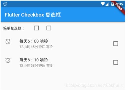
Flutter Checkbox 复选框
Flutter 复选框 有两种:一 是精简版Checkbox复选框 ,二是自带标题和副标题CheckboxListTile复选框
参数详解
| 属性 | 说明 |
|---|---|
| Checkbox 复选框 | |
| value | 是否选中此复选框 |
| onChanged | 监听 当复选框的值应该更改时调用 |
| tristate | 默认false,如果为true,复选框的值可以为true、false或null。 |
| activeColor | 选中此复选框时要使用的颜色 |
| checkColor | 选中此复选框时用于复选图标的颜色 |
| materialTapTargetSize | 配置tap目标的最小大小 |
| CheckboxListTile 复选框 | |
| value | 是否选中此复选框 |
| onChanged | 监听 当复选框的值应该更改时调用 |
| activeColor | 选中此复选框时要使用的颜色 |
| title | 列表主标题 |
| subtitle | 列表副标题 |
| isThreeLine | 默认false |
| dense | 此列表平铺是否是垂直密集列表的一部分。 |
| secondary | 显示在复选框前面的小部件 |
| selected | 选中后文字高亮,默认false |
| controlAffinity | 控件相对于文本的位置,默认 ListTileControlAffinity.platform |
代码示例
Checkbox 复选框
Checkbox(
  value: this.valueb,
  onChanged: (bool value) {
    setState(() {
      this.valueb = value;
    });
  },
),
CheckboxListTile 复选框
CheckboxListTile(
  secondary: const Icon(Icons.alarm_on),
  title: const Text('每天6:10 响铃'),
  subtitle: Text('12小时58分钟后响铃'),
  value: this.valued,
  onChanged: (bool value) {
    setState(() {
      this.valued = value;
    });
  },
),
效果图
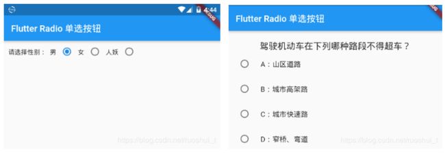
Flutter Radio 单选按钮
本章节主要讲解 Radio 和 RadioListTile 单选按钮
参数讲解
| 属性 | 说明 |
|---|---|
| Radio 单选按钮 | |
| value | 此单选按钮表示的值(可设定为id) |
| groupValue | 此组单选按钮的当前选定值 |
| onChanged | 监听 |
| activeColor | 选择此单选按钮时使用的颜色 |
| materialTapTargetSize | 配置tap目标的最小大小 |
| RadioListTile 单选按钮 | |
| value | 此单选按钮表示的值(可设定为id) |
| groupValue | 此组单选按钮的当前选定值 |
| 属性 | 说明 |
| activeColor | 选中此复选框时要使用的颜色 |
| title | 列表主标题 |
| subtitle | 列表副标题 |
| isThreeLine | 默认false |
| dense | 此列表平铺是否是垂直密集列表的一部分。 |
| secondary | 显示在复选框前面的小部件 |
| selected | 选中后文字高亮,默认false |
| controlAffinity | 控件相对于文本的位置,默认 ListTileControlAffinity.platform |
代码示例
Radio 单选按钮
Radio(
  value:1,
  groupValue:this.groupValuea,
  onChanged:(v){
    setState(() {
      this.groupValuea = v;
    });
  },
),
RadioListTile 单选按钮
RadioListTile(
  value:1,
  groupValue:this.groupValueb,
  title: Text('A:山区道路'),
  onChanged:(v){
    setState(() {
      this.groupValueb = v;
    });
  },
),
效果图
Flutter Switch
Switch一个开关控件。
| 属性 | 说明 |
|---|---|
| value | true:开 false:关 |
| onChanged | 变化时回调 |
| activeColor | 打开状态下颜色 |
| activeTrackColor | 打开状态下track颜色 |
| inactiveThumbColor | 关闭状态thumb颜色 |
| inactiveTrackColor | 关闭状态track颜色 |
| activeThumbImage | 打开状态下thumb图片 |
| inactiveThumbImage | 关闭状态thumb图片 |
| materialTapTargetSize | 点击区域 |
track和thumb位置:

例子:
import 'package:flutter/material.dart';

class SwitchDemo extends StatefulWidget {
  @override
  State createState() => _SwitchDemo();
}

class _SwitchDemo extends State {
  bool _value = true;

  @override
  Widget build(BuildContext context) {
    // TODO: implement build
    return Column(
      children: [
        Switch(
          value: _value,
          onChanged: (newValue) {
            setState(() {
              _value = newValue;
            });
          },
          activeColor: Colors.red,
          activeTrackColor:Colors.black,
          inactiveThumbColor:Colors.green,
          inactiveTrackColor: Colors.blue,
          activeThumbImage: AssetImage(
            'images/1.png',
          ),
        ),
      ],
    );
  }
}

Flutter Slider

| 属性 | 说明 |
|---|---|
| value | 控件的位置 |
| onChanged | 变化时回调 |
| onChangeStart | 滑动开始时回调一次 |
| onChangeEnd | 滑动结束时回调一次 |
| min | 最小值 |
| max | 最大值 |
| divisions | 分为几块,比如设置为5,Slider只能滑动到5个位置 |
| label | divisions设置显示在节点上的label |
| activeColor | 滑动过的区域的颜色 |
| inactiveColor | 未 滑动过的区域的颜色 |
例子:
import 'package:flutter/material.dart';

class SliderDemo extends StatefulWidget {
  @override
  State createState() => _SliderDemo();
}

class _SliderDemo extends State {
  double _value = 0;
  int _dollars = 20;

  @override
  Widget build(BuildContext context) {
    // TODO: implement build
    return Column(
      mainAxisAlignment: MainAxisAlignment.center,
      children: [
        Slider(
          value: _value,
          onChanged: (newValue) {
            print('onChanged:$newValue');
            setState(() {
              _value = newValue;
            });
          },
          onChangeStart: (startValue) {
            print('onChangeStart:$startValue');
          },
          onChangeEnd: (endValue) {
            print('onChangeEnd:$endValue');
          },
          label: '$_value dollars',
          divisions: 5,
          semanticFormatterCallback: (newValue) {
            return '${newValue.round()} dollars';
          },
        ),
        Slider(
            value: _dollars.toDouble(),
            min: 20.0,
            max: 330.0,
            label: '$_dollars dollars',
            onChanged: (double newValue) {
              setState(() {
                _dollars = newValue.round();
              });
            },
            semanticFormatterCallback: (double newValue) {
              return '${newValue.round()} dollars';
            }),

      ],
    );
  }
}

Flutter Date & Time Pickers 时间选择器
时间选择是一个函数而不是一个控件
| 参数 | 说明 |
|---|---|
| context | |
| initialDate | 初始化时间 |
| firstDate | 开始时间,时间控件选择器从这个时间开始 |
| lastDate | 结束时间 |
| initialDatePickerMode | day:初始化显示天,year:初始化先选择年 |
| textDirection | 文本方向 |
例子:
import 'package:flutter/material.dart';

class DatePickerDemo extends StatefulWidget {
  @override
  State createState() => _DatePickerDemo();
}

class _DatePickerDemo extends State {
  _showDataPicker() async {
    Locale myLocale = Localizations.localeOf(context);
    var picker = await showDatePicker(
        context: context,
        initialDate: DateTime.now(),
        firstDate: DateTime(2016),
        lastDate: DateTime(2019),
        locale: myLocale);
    setState(() {
      _time = picker.toString();
    });
  }

  _showTimePicker() async {
    var picker =
        await showTimePicker(context: context, initialTime: TimeOfDay.now());
    setState(() {
      _time = picker.toString();
    });
  }

  var _time;

  @override
  Widget build(BuildContext context) {
    // TODO: implement build
    return Column(
      children: [
        RaisedButton(
          child: Text(_time == null ? '选择日期' : _time),
          onPressed: () => _showDataPicker(),
        ),
        RaisedButton(
          child: Text(_time == null ? '选择时间' : _time),
          onPressed: () => _showTimePicker(),
        ),

      ],
    );
  }
}

