5 TextField输入框组件
文章目录
- 1 TextField构造方法
- 2 TextField主要属性
- 3 示例说明
-
- 3.1 默认展示
- 3.2 多行输入
- 3.3 密码输入
- 3.4 游标颜色、粗细,控制输入长度
- 3.5 下划线(隐藏)
- 3.6 下划线(改变属性)
- 3.7 圆角输入框
- 3.8 带有图标输入框
- 3.9 监听内容变化,获取输入框的内容
- 3.10 改变键盘右下角的功能键
- 3.11 改变键盘的输入类型
- 4 完整代码
- 5 运行效果
- 6 github源代码
- 7 结束语
TextField是一个material design风格的输入框,其本身有很多属性,不过这些属性大家不必全部记住,只要会使用就可以。使用到了,可以直接在构造方法中进行查询
1 TextField构造方法
const TextField({
    Key key,
    this.controller,
    this.focusNode,
    this.decoration = const InputDecoration(),
    TextInputType keyboardType,
    this.textInputAction,
    this.textCapitalization = TextCapitalization.none,
    this.style,
    this.strutStyle,
    this.textAlign = TextAlign.start,
    this.textAlignVertical,
    this.textDirection,
    this.readOnly = false,
    this.showCursor,
    this.autofocus = false,
    this.obscureText = false,
    this.autocorrect = true,
    this.maxLines = 1,
    this.minLines,
    this.expands = false,
    this.maxLength,
    this.maxLengthEnforced = true,
    this.onChanged,
    this.onEditingComplete,
    this.onSubmitted,
    this.inputFormatters,
    this.enabled,
    this.cursorWidth = 2.0,
    this.cursorRadius,
    this.cursorColor,
    this.keyboardAppearance,
    this.scrollPadding = const EdgeInsets.all(20.0),
    this.dragStartBehavior = DragStartBehavior.start,
    this.enableInteractiveSelection,
    this.onTap,
    this.buildCounter,
    this.scrollController,
    this.scrollPhysics,
  })
2 TextField主要属性
| 属性 | 作用 |
|---|---|
| TextEditingController controller | 设置输入框默认显示的值 |
| FocusNode focusNode | |
| InputDecoration decoration | 文本字段周围的装饰,InputDecoration的属性参考1.2.1 InputDecoration属性说明 |
| TextInputType keyboardType | 设置键盘类型: TextInputType.text:文本输入键盘 TextInputType.multiline:多行文本,配合maxLines使用 TextInputType.number:数字键盘 TextInputType.phone:数字键盘,多出’*#‘键 TextInputType.datetime:数字键盘,多出’/:‘键 TextInputType.emailAddress:文本输入键盘,显示’@‘ TextInputType.url:文本输入键盘,显示’/‘ TextInputType.numberWithOptions(signed: true, decimal: true): 数字键盘,设置signed、decimal后模拟器中没看出区别 |
| TextInputAction textInputAction | 键盘回车按钮图标 TextInputAction是个枚举类,具体指参考1.2.2 TextInputAction |
| Capitalization textCapitalization | 文本风格 TextCapitalization.none:默认一直使用小写 TextCapitalization.characters:默认一直使用大写 TextCapitalization.sentences:默认为每个句子的第一个字母使用大写键盘 TextCapitalization.word:默认为每个单词的第一个字母使用大写键盘 |
| TextStyle style | 设置输入框中文本样式 |
| StrutStyle strutStyle | |
| TextAlign textAlign | 文本对齐方式 |
| TextAlignVertical textAlignVertical | |
| TextDirection textDirection | 文本方向 |
| bool autofocus | 自动获取焦点 |
| bool obscureText | 密码模式显示 |
| bool autocorrect | 是否显示提示 |
| int maxLines | 最大行数 |
| int minLines | 最小行数 |
| bool expands | 是否放大 |
| bool readOnly | 是否只读 |
| bool showCursor | 是否显示光标 |
| int maxLength | 最大长度,右下角会显示输入限制 |
| bool maxLengthEnforced | 达到最大长度后,是否限制继续输入,为false可继续输入,为true不可继续输入 |
| ValueChanged onChanged | 内容改变回调,当达到最大长度后,继续输入也会触发。 |
| VoidCallback onEditingComplete | 点击回车回调 |
| ValueChanged onSubmitted | 提交(点击回车)回调 |
| List inputFormatters | 控制允许输入的格式,详细说明参考1.2.3 inputFormatters的使用 |
| bool enabled | |
| double cursorWidth | 光标宽度 |
| Radius cursorRadius | 光标圆角 |
| Color cursorColor | 光标颜色 |
| Brightness keyboardAppearance | 键盘外观 Brightness.light:高亮模式 Brightness.dark:暗黑模式 |
| EdgeInsets scrollPadding | |
| bool enableInteractiveSelection | |
| DragStartBehavior dragStartBehavior | |
| GestureTapCallback onTap | 点击输入框的回调 |
| InputCounterWidgetBuilder buildCounter | 自定义计数器(maxLength的显示),参考1.2.4 的使用 |
| ScrollPhysics scrollPhysics | |
| ScrollController scrollController |
3 示例说明
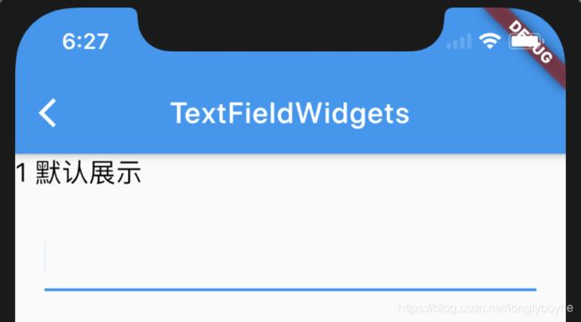
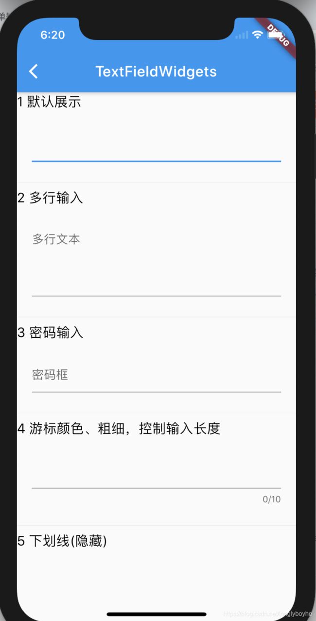
3.1 默认展示
只有一条下划线
TextField()
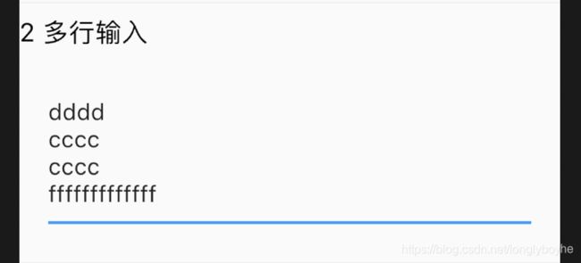
3.2 多行输入
TextField(
  maxLines: 4,
  decoration: InputDecoration(hintText: '多行文本'),
),
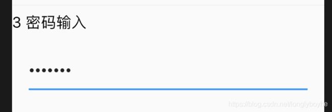
3.3 密码输入
如果要使一个表单变成密码框,只需配置 obscureText 属性是 true
TextField(
  obscureText: true,
  decoration: InputDecoration(hintText: '密码框'),
),
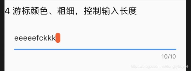
3.4 游标颜色、粗细,控制输入长度
TextField(
 autofocus: true,
 cursorColor: Colors.deepOrange,
 cursorRadius: Radius.circular(20.0),
 cursorWidth: 10.0,
 maxLength: 10,
 )),
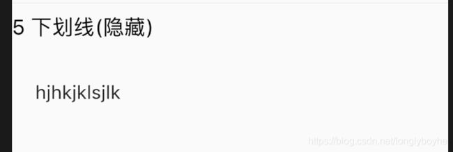
3.5 下划线(隐藏)
TextField(
  autofocus: true,
  decoration: InputDecoration(border: InputBorder.none //隐藏下划线
   )),
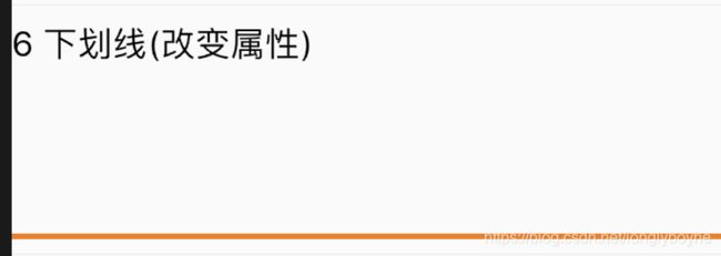
3.6 下划线(改变属性)
默认下划线是跟随主题的红色,这里将其改为橘色700。
Container(
   padding: EdgeInsets.all(20),
   child: TextField(
          autofocus: true,
          decoration: InputDecoration(border: InputBorder.none //隐藏下划线
          )),
   decoration: BoxDecoration(
   // 下滑线橘色700,宽度3像素
   border: Border(
           bottom: BorderSide(color: Colors.orange[700], width: 3.0))),
          ),
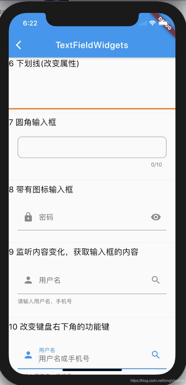
3.7 圆角输入框
TextField(
              autofocus: true,
              cursorColor: Colors.deepOrange,
              cursorRadius: Radius.circular(20.0),
              cursorWidth: 10.0,
              maxLength: 10,
              obscureText: true,
              decoration: InputDecoration(
                //  文本内容的内边距
                  contentPadding: EdgeInsets.all(10.0),
                  // 圆角矩形的输入框样式
                  border: OutlineInputBorder(
                    // 圆角半径 10
                    borderRadius: BorderRadius.circular(10.0),
                  )),
            )

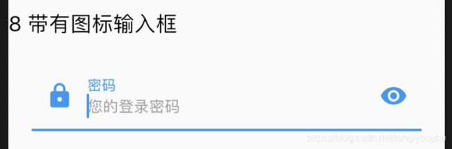
3.8 带有图标输入框
TextField(
                decoration: InputDecoration(
                    prefixIcon: Icon(Icons.lock),
                    suffixIcon: Icon(Icons.remove_red_eye),
                    labelText: "密码",
                    hintText: "您的登录密码",
                    hintStyle: TextStyle(color: Colors.grey, fontSize: 13.0)
                ),
                obscureText: true,
              )
3.9 监听内容变化,获取输入框的内容
如果我们要获取输入的内容,这时候可以通过onChange, onSubmitted
TextField(
                onChanged: (text) {
                  //内容改变的回调
                  print('change $text');
                },
                onEditingComplete:(){
                  print('editing ');
                },
                onSubmitted: (text) {
                  //内容提交(按回车)的回调
                  print('submit $text');
                },
                decoration: InputDecoration(
                    suffixIcon: Icon(Icons.search),
                    labelText: "用户名",
                    helperText: '请输入用户名、手机号',
                    hintText: "用户名或手机号",
                    prefixIcon: Icon(Icons.person)
                ),
                textInputAction:TextInputAction.go,
                // 将键盘显示类型设置为文本键盘
                keyboardType: TextInputType.text,
              )

3.10 改变键盘右下角的功能键
TextField(
                onChanged: (text) {
                  //内容改变的回调
                  print('change $text');
                },
                onEditingComplete:(){
                  print('editing ');
                },
                onSubmitted: (text) {
                  //内容提交(按回车)的回调
                  print('submit $text');
                },
                decoration: InputDecoration(
                    suffixIcon: Icon(Icons.search),
                    labelText: "用户名",
                    helperText: '请输入用户名、手机号',
                    hintText: "用户名或手机号",
                    prefixIcon: Icon(Icons.person)
                ),
                textInputAction:TextInputAction.go,
                // 将键盘显示类型设置为文本键盘
                keyboardType: TextInputType.text,
              )

3.11 改变键盘的输入类型
TextField(
                onChanged: (text) {
                  //内容改变的回调
                  print('change $text');
                },
                onEditingComplete:(){
                  print('editing ');
                },
                onSubmitted: (text) {
                  //内容提交(按回车)的回调
                  print('submit $text');
                },
                decoration: InputDecoration(
                    prefixIcon: Icon(Icons.lock),
                    suffixIcon: Icon(Icons.remove_red_eye),
                    labelText: "密码",
                    hintText: "您的登录密码",
                    hintStyle: TextStyle(color: Colors.grey, fontSize: 13.0)
                ),
                obscureText: true,
                textInputAction:TextInputAction.go,
                // 将键盘显示类型设置为数字键盘
                keyboardType: TextInputType.number,
              )

4 完整代码
import 'package:flutter/material.dart';

/// create at
/// by laohe(老贺)
/// describe:

class TextFieldWidgets extends StatefulWidget {
  TextFieldWidgets({Key key}) : super(key: key);

  @override
  _TextFieldWidgetsState createState() => _TextFieldWidgetsState();
}

class _TextFieldWidgetsState extends State<TextFieldWidgets> {
  @override
  Widget build(BuildContext context) {
    return Scaffold(
      appBar: AppBar(
        title: Text('TextFieldWidgets'),
      ),
      body: Container(
          child: ListView(
        children: <Widget>[
          Text(
            "1 默认展示",
            style: TextStyle(color: Colors.black, fontSize: 18.0),
            textAlign: TextAlign.left,
          ),
          Container(
            padding: EdgeInsets.all(20),
            child: TextField(),
          ),

          ///默认展示
          Divider(),
          Text(
            "2 多行输入",
            style: TextStyle(color: Colors.black, fontSize: 18.0),
            textAlign: TextAlign.left,
          ),
          Container(
            padding: EdgeInsets.all(20),
            child: TextField(
              maxLines: 4,
              decoration: InputDecoration(hintText: '多行文本'),
            ),
          ),
          Divider(),
          Text(
            "3 密码输入",
            style: TextStyle(color: Colors.black, fontSize: 18.0),
            textAlign: TextAlign.left,
          ),
          Container(
            padding: EdgeInsets.all(20),
            child: TextField(
              obscureText: true,
              decoration: InputDecoration(hintText: '密码框'),
            ),
          ),
          Divider(),
          Text(
            "4 游标颜色、粗细,控制输入长度",
            style: TextStyle(color: Colors.black, fontSize: 18.0),
            textAlign: TextAlign.left,
          ),
          Container(
              padding: EdgeInsets.all(20),
              child: TextField(
                autofocus: true,
                cursorColor: Colors.deepOrange,
                cursorRadius: Radius.circular(20.0),
                cursorWidth: 10.0,
                maxLength: 10,
              )),
          Divider(),
          Text(
            "5 下划线(隐藏)",
            style: TextStyle(color: Colors.black, fontSize: 18.0),
            textAlign: TextAlign.left,
          ),
          Container(
            padding: EdgeInsets.all(20),
            child: TextField(
                autofocus: true,
                decoration: InputDecoration(border: InputBorder.none //隐藏下划线
                    )),
          ),
          Divider(),
          Text(
            "6 下划线(改变属性)",
            style: TextStyle(color: Colors.black, fontSize: 18.0),
            textAlign: TextAlign.left,
          ),
          Container(
            padding: EdgeInsets.all(20),
            child: TextField(
                autofocus: true,
                decoration: InputDecoration(border: InputBorder.none //隐藏下划线
                    )),
            decoration: BoxDecoration(
                // 下滑线橘色700,宽度3像素
                border: Border(
                    bottom: BorderSide(color: Colors.orange[700], width: 3.0))),
          ),
          Divider(),
          Text(
            "7 圆角输入框",
            style: TextStyle(color: Colors.black, fontSize: 18.0),
            textAlign: TextAlign.left,
          ),
          Container(
              padding: EdgeInsets.all(20),
            child: TextField(
              autofocus: true,
              cursorColor: Colors.deepOrange,
              cursorRadius: Radius.circular(20.0),
              cursorWidth: 10.0,
              maxLength: 10,
              obscureText: true,
              decoration: InputDecoration(
                //  文本内容的内边距
                  contentPadding: EdgeInsets.all(10.0),
                  // 圆角矩形的输入框样式
                  border: OutlineInputBorder(
                    // 圆角半径 10
                    borderRadius: BorderRadius.circular(10.0),
                  )),
            )
          ),
          Divider(),
          Text(
            "8 带有图标输入框",
            style: TextStyle(color: Colors.black, fontSize: 18.0),
            textAlign: TextAlign.left,
          ),
          Container(
              padding: EdgeInsets.all(20),
              child: TextField(
                decoration: InputDecoration(
                    prefixIcon: Icon(Icons.lock),
                    suffixIcon: Icon(Icons.remove_red_eye),
                    labelText: "密码",
                    hintText: "您的登录密码",
                    hintStyle: TextStyle(color: Colors.grey, fontSize: 13.0)
                ),
                obscureText: true,
              )
          ),
          Divider(),
          Text(
            "9 监听内容变化,获取输入框的内容",
            style: TextStyle(color: Colors.black, fontSize: 18.0),
            textAlign: TextAlign.left,
          ),
          Container(
              padding: EdgeInsets.all(20),
              child: TextField(
                onChanged: (text) {
                  //内容改变的回调
                  print('change $text');
                },
                onEditingComplete:(){
                  print('editing ');
                },
                onSubmitted: (text) {
                  //内容提交(按回车)的回调
                  print('submit $text');
                },
                decoration: InputDecoration(
                    suffixIcon: Icon(Icons.search),
                    labelText: "用户名",
                    helperText: '请输入用户名、手机号',
                    hintText: "用户名或手机号",
                    prefixIcon: Icon(Icons.person)
                ),
                textInputAction:TextInputAction.go,
                // 将键盘显示类型设置为文本键盘
                keyboardType: TextInputType.text,
              )
          ),
          Divider(),
          Text(
            "10 改变键盘右下角的功能键",
            style: TextStyle(color: Colors.black, fontSize: 18.0),
            textAlign: TextAlign.left,
          ),
          Container(
              padding: EdgeInsets.all(20),
              child: TextField(
                onChanged: (text) {
                  //内容改变的回调
                  print('change $text');
                },
                onEditingComplete:(){
                  print('editing ');
                },
                onSubmitted: (text) {
                  //内容提交(按回车)的回调
                  print('submit $text');
                },
                decoration: InputDecoration(
                    suffixIcon: Icon(Icons.search),
                    labelText: "用户名",
                    helperText: '请输入用户名、手机号',
                    hintText: "用户名或手机号",
                    prefixIcon: Icon(Icons.person)
                ),
                textInputAction:TextInputAction.go,
                // 将键盘显示类型设置为文本键盘
                keyboardType: TextInputType.text,
              )
          ),
          Divider(),
          Text(
            "11 改变键盘的输入类型",
            style: TextStyle(color: Colors.black, fontSize: 18.0),
            textAlign: TextAlign.left,
          ),
          Container(
              padding: EdgeInsets.all(20),
              child: TextField(
                onChanged: (text) {
                  //内容改变的回调
                  print('change $text');
                },
                onEditingComplete:(){
                  print('editing ');
                },
                onSubmitted: (text) {
                  //内容提交(按回车)的回调
                  print('submit $text');
                },
                decoration: InputDecoration(
                    suffixIcon: Icon(Icons.search),
                    labelText: "用户名",
                    helperText: '请输入用户名、手机号',
                    hintText: "用户名或手机号",
                    prefixIcon: Icon(Icons.person)
                ),
                textInputAction:TextInputAction.go,
                // 将键盘显示类型设置为文本键盘
                keyboardType: TextInputType.text,
              )
          ),
          Container(
              padding: EdgeInsets.all(20),
              child: TextField(
                onChanged: (text) {
                  //内容改变的回调
                  print('change $text');
                },
                onEditingComplete:(){
                  print('editing ');
                },
                onSubmitted: (text) {
                  //内容提交(按回车)的回调
                  print('submit $text');
                },
                decoration: InputDecoration(
                    prefixIcon: Icon(Icons.lock),
                    suffixIcon: Icon(Icons.remove_red_eye),
                    labelText: "密码",
                    hintText: "您的登录密码",
                    hintStyle: TextStyle(color: Colors.grey, fontSize: 13.0)
                ),
                obscureText: true,
                textInputAction:TextInputAction.go,
                // 将键盘显示类型设置为数字键盘
                keyboardType: TextInputType.number,
              )
          ),
        ],
      )),
    );
  }
}
5 运行效果

6 github源代码
TextFieldWidgets下载地址
如果总结的对您帮助,麻烦star!!!
7 结束语
对基本组件,只有经常在项目中使用才可孰能生巧,作出漂亮的合理的Widget出来。希望上面的讲解对大家有所帮助,对基本属性的学习,不用死记,只要练习写几个demo,然后自己尝试的改变一下属性看一下运行效果,很快就可以学会了。