Flutter组件--按钮(Button)组件
1.按钮组件的属性
| 属性 |
说明 |
| onPressed |
必填参数,按下按钮时触发的回调,接收一个方法,传null表示按钮禁用,会显示禁用相关样式 |
| child |
子组件 |
| style |
通过ButtonStyle装饰 |
ButtonStylee里面的常用的参数
| 属性名称 |
值类型 |
属性值 |
| foregroundColor |
Color |
文本颜色 |
| backgroundColor |
Color |
按钮的颜色 |
| shadowColor |
Color |
阴影颜色 |
| splashColor | Color | 渐没效果(单击的时候才会显示) |
| elevation |
double |
阴影的范围,值越大阴影范围越大 |
| padding |
内边距 |
|
| shape |
设置按钮的形状 shape: MaterialStateProperty.all( RoundedRectangleBorder( borderRadius: BorderRadius.circular(10)) ), 设置成椭圆形 shape:StaddiumBorder(), |
|
| side |
设置边框 | side: MaterialStateProperty.all( BorderSide(width: 1, color: Colors.red), ) |
2.按钮的样式
2.1.ElevatedButton :"凸起"按钮,它默认带有阴影和灰色背景.按下后,阴影会变大;
2.2.TextButton :文本按钮,默认背景透明并不带阴影.按下后,会有背景色;
2.3.OutlineButton :默认有一个边框,不带阴影且背景透明.按下后,边框颜色会变亮、同时出现背景和阴影;
2.4.IconButton :是一个可点击的Icon,不包括文字,默认没有背景,点击后会出现背景;
2.5.RaiseButton:漂浮按钮,默认会有一个灰色的背景色,单击后会有水波纹效果.
2.6.FlatButton:扁平按钮.默认只有文字,没有背景色和边框(里面可以使用icon增加图标和label增加文字展示).
注意事项:
默认情况下,按钮距离上边沿和下边沿是有一定间距的.materialTapTargetSize是一个枚举类型,可以进行有效的控制.
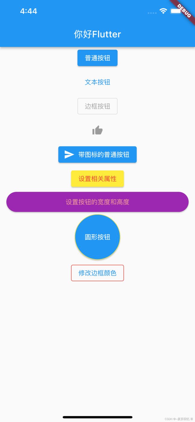
3.示例代码:
class MyApp extends StatelessWidget {
  const MyApp({super.key});

  @override
  Widget build(BuildContext context) {
    return ListView(
      children: [
        Column(
          children: [
            /**
             * 普通按钮
             */
            ElevatedButton(
                onPressed: () {
                  print("按钮的单击事件");
                },
                child: Text("普通按钮")),
            SizedBox(height: 5),

            /**
             * 文本按钮
             */
            TextButton(onPressed: () {}, child: Text("文本按钮")),
            SizedBox(height: 5),

            /**
             * 边框按钮
             */
            OutlinedButton(onPressed: null, child: Text("边框按钮")),
            SizedBox(height: 5),

            /**
             * icon按钮
             */
            IconButton(onPressed: null, icon: Icon(Icons.thumb_up)),

            /**
             * 带图标的普通按钮
             */
            SizedBox(height: 5),
            ElevatedButton.icon(
                onPressed: (){},
                icon: Icon(Icons.send),
                label: Text("带图标的普通按钮")),

             /**
             * 设置普通按钮的属性
             */
            SizedBox(height: 5),
            ElevatedButton(
              style: ButtonStyle(
                backgroundColor: MaterialStateProperty.all(Colors.yellow),//背景颜色
                foregroundColor: MaterialStateProperty.all(Colors.red),//文字颜色
              ),
              onPressed: (){},
            child: Text("设置相关属性")),

             /**
             * 修改按钮的高度和宽度有两种方法:
             * 方法一:
             * 在按钮的外面增加一个Container组件,然后通过设置Container组件的宽度和高度,进而到达控制按钮尺寸的效果
             *方法二:
             *在按钮的最外层包裹一层ButtonTheme控件,该控件里面含有minWidth和height属性
             */
            SizedBox(height: 5),
            Container(
              width: 400,
              height: 44,
              child:    ElevatedButton(
              style: ButtonStyle(
                backgroundColor: MaterialStateProperty.all(Colors.purple),//背景颜色
                foregroundColor: MaterialStateProperty.all(Colors.red.shade200),//文字颜色
                shape: MaterialStateProperty.all(
                  RoundedRectangleBorder(
                    borderRadius: BorderRadius.circular(22),//设置圆角

                  )
                )
              ),
              onPressed: (){},
            child: Text("设置按钮的宽度和高度")),
            ),
             SizedBox(height: 5),
             Container(
              width: 100,
              height: 100,
              child:   ElevatedButton(
               style:ButtonStyle(
                shape: MaterialStateProperty.all(
                  CircleBorder(side: BorderSide(color:Colors.yellow))//按钮边框的颜色

                )
               ) ,
               onPressed: (){},

             child: Text("圆形按钮")) ,
             ),
             SizedBox(height: 5),
             /**
              * 修改边框颜色
              */

              OutlinedButton(onPressed: (){},
               child: Text("修改边框颜色"),
               style: ButtonStyle(
                side: MaterialStateProperty.all(
                  BorderSide(width: 1,
                  color: Colors.red),
                )
               ),)


          ],
        )
      ],
    );
  }
}
4. 下拉按钮进行选择
class BoxStyleDemo extends StatefulWidget {
  const BoxStyleDemo({super.key});

  @override
  State createState() => _BoxStyleDemoState();
}

class _BoxStyleDemoState extends State {
  var selectValue;

  @override
  Widget build(BuildContext context) {
    return Container(
      child: DropdownButton(
          items: [
            DropdownMenuItem(
              child: Text('男'),
              value: 0,
            ),
            DropdownMenuItem(
              child: Text('女'),
              value: 1,
            ),
          ],
          onChanged: (value) {
            setState(() {
              selectValue = value;
            });

          },
          value: selectValue,
          hint: Text("请选择性别"),

          ),
    );
  }
}