25个常用Matplotlib图的Python代码(一):散点图、气泡图、带线性回归最佳拟合线的散点图、抖动图、计数图
# !pip install brewer2mpl
import numpy as np
import pandas as pd
import matplotlib as mpl
import matplotlib.pyplot as plt
import seaborn as sns
import warnings; warnings.filterwarnings(action='once')

large = 22; med = 16; small = 12
params = {'axes.titlesize': large,
          'legend.fontsize': med,
          'figure.figsize': (16, 10),
          'axes.labelsize': med,
          'axes.titlesize': med,
          'xtick.labelsize': med,
          'ytick.labelsize': med,
          'figure.titlesize': large}
plt.rcParams.update(params)
plt.style.use('seaborn-whitegrid')
sns.set_style("white")
%matplotlib inline

# Version
print(mpl.__version__)  #> 3.0.0
print(sns.__version__)  #> 0.9.0
1.散点图
Scatteplot是用于研究两个变量之间关系的经典和基本图。如果数据中有多个组,则可能需要以不同颜色可视化每个组。
# Import dataset
midwest = pd.read_csv("https://raw.githubusercontent.com/selva86/datasets/master/midwest_filter.csv")

# Prepare Data
# Create as many colors as there are unique midwest['category']
categories = np.unique(midwest['category'])
colors = [plt.cm.tab10(i/float(len(categories)-1)) for i in range(len(categories))]

# Draw Plot for Each Category
plt.figure(figsize=(16, 10), dpi= 80, facecolor='w', edgecolor='k')

for i, category in enumerate(categories):
    plt.scatter('area', 'poptotal',
                data=midwest.loc[midwest.category==category, :],
                s=20, c=colors[i], label=str(category))

# Decorations
plt.gca().set(xlim=(0.0, 0.1), ylim=(0, 90000),
              xlabel='Area', ylabel='Population')

plt.xticks(fontsize=12); plt.yticks(fontsize=12)
plt.title("Scatterplot of Midwest Area vs Population", fontsize=22)
plt.legend(fontsize=12)
plt.show() 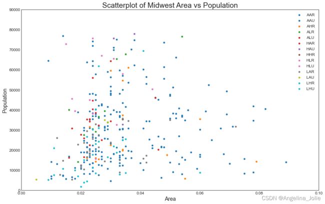
2.带边界的气泡图
边界内显示一组点以强调其重要性。在此示例中,您将从应该被环绕的数据帧中获取记录,并将其传递给下面的代码中描述的记录。
from matplotlib import patches
from scipy.spatial import ConvexHull
import warnings; warnings.simplefilter('ignore')
sns.set_style("white")

# Step 1: Prepare Data
midwest = pd.read_csv("https://raw.githubusercontent.com/selva86/datasets/master/midwest_filter.csv")

# As many colors as there are unique midwest['category']
categories = np.unique(midwest['category'])
colors = [plt.cm.tab10(i/float(len(categories)-1)) for i in range(len(categories))]

# Step 2: Draw Scatterplot with unique color for each category
fig = plt.figure(figsize=(16, 10), dpi= 80, facecolor='w', edgecolor='k')

for i, category in enumerate(categories):
    plt.scatter('area', 'poptotal', data=midwest.loc[midwest.category==category, :], s='dot_size', c=colors[i], label=str(category), edgecolors='black', linewidths=.5)

# Step 3: Encircling
# https://stackoverflow.com/questions/44575681/how-do-i-encircle-different-data-sets-in-scatter-plot
def encircle(x,y, ax=None, **kw):
    if not ax: ax=plt.gca()
    p = np.c_[x,y]
    hull = ConvexHull(p)
    poly = plt.Polygon(p[hull.vertices,:], **kw)
    ax.add_patch(poly)

# Select data to be encircled
midwest_encircle_data = midwest.loc[midwest.state=='IN', :]

# Draw polygon surrounding vertices
encircle(midwest_encircle_data.area, midwest_encircle_data.poptotal, ec="k", fc="gold", alpha=0.1)
encircle(midwest_encircle_data.area, midwest_encircle_data.poptotal, ec="firebrick", fc="none", linewidth=1.5)

# Step 4: Decorations
plt.gca().set(xlim=(0.0, 0.1), ylim=(0, 90000),
              xlabel='Area', ylabel='Population')

plt.xticks(fontsize=12); plt.yticks(fontsize=12)
plt.title("Bubble Plot with Encircling", fontsize=22)
plt.legend(fontsize=12)
plt.show() 
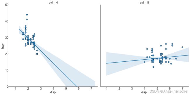
3.带线性回归最佳拟合线的散点图
两个变量如何相互改变。下面显示了数据中各组之间最佳拟合线的差异。
# Import Data
!conda install statsmodels
df = pd.read_csv("https://raw.githubusercontent.com/selva86/datasets/master/mpg_ggplot2.csv")
df_select = df.loc[df.cyl.isin([4,8]), :]

# Plot
sns.set_style("white")
gridobj = sns.lmplot(x="displ", y="hwy", hue="cyl", data=df_select,
                     height=7, aspect=1.6, robust=True, palette='tab10',
                     scatter_kws=dict(s=60, linewidths=.7, edgecolors='black'))

# Decorations
gridobj.set(xlim=(0.5, 7.5), ylim=(0, 50))
plt.title("Scatterplot with line of best fit grouped by number of cylinders", fontsize=20)
每个回归线都在自己的列中,设置参数:
# Import Data
df = pd.read_csv("https://raw.githubusercontent.com/selva86/datasets/master/mpg_ggplot2.csv")
df_select = df.loc[df.cyl.isin([4,8]), :]

# Each line in its own column
sns.set_style("white")
gridobj = sns.lmplot(x="displ", y="hwy",
                     data=df_select,
                     height=7,
                     robust=True,
                     palette='Set1',
                     col="cyl",
                     scatter_kws=dict(s=60, linewidths=.7, edgecolors='black'))

# Decorations
gridobj.set(xlim=(0.5, 7.5), ylim=(0, 50))
plt.show()
4.抖动图
通常,多个数据点具有完全相同的X和Y值。结果,多个点相互绘制并隐藏。为避免这种情况,请稍微抖动点,以便您可以直观地看到它们。
# Import Data
df = pd.read_csv("https://raw.githubusercontent.com/selva86/datasets/master/mpg_ggplot2.csv")

# Draw Stripplot
fig, ax = plt.subplots(figsize=(16,10), dpi= 80)
sns.stripplot(df.cty, df.hwy, jitter=0.25, size=8, ax=ax, linewidth=.5)

# Decorations
plt.title('Use jittered plots to avoid overlapping of points', fontsize=22)
plt.show()
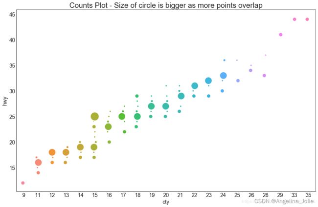
5.计数图
# Import Data
df = pd.read_csv("https://raw.githubusercontent.com/selva86/datasets/master/mpg_ggplot2.csv")
df_counts = df.groupby(['hwy', 'cty']).size().reset_index(name='counts')

# Draw Stripplot
fig, ax = plt.subplots(figsize=(16,10), dpi= 80)
sns.stripplot(df_counts.cty, df_counts.hwy, size=df_counts.counts*2, ax=ax)

# Decorations
plt.title('Counts Plot - Size of circle is bigger as more points overlap', fontsize=22)
plt.show()