使用postcss-pxtorem插件实现px转换rem
1.下载postcss-pxtorem(其他插件按需下载自行配置)并在package.json同级目录下新建postcss.config.js文件:
export const defaultHtmlFontSize = 37.5
export default {
  plugins: {
    autoprefixer: {
      overrideBrowserslist: ['Android >= 4.0', 'iOS >= 7'],
    },
    'postcss-pxtorem': {
      // 根节点的 fontSize 值
      rootValue: defaultHtmlFontSize,
      propList: ['*'],
      selectorBlackList: [':root'],
    },
  },
}
2.在utils目录下新建rem.ts文件
import {defaultHtmlFontSize} from '../../postcss.config'

// 设置 rem 函数
export const setRem = () => {
    // 375 默认字体大小37.5px; 375px = 120rem ;每个元素px基础上/37.5
    const designScreenWidth = 375;

    const scale = designScreenWidth / defaultHtmlFontSize
    const htmlWidth = document.documentElement.clientWidth || document.body.clientWidth
    // 得到html的Dom元素
    const htmlDom = document.getElementsByTagName('html')[0]
    // 设置根元素字体大小
    htmlDom.style.fontSize = htmlWidth / scale + 'px'
  }

export const initRem = () => {
    // 初始化
    setRem()
    // 改变窗口大小时重新设置 rem
    window.onresize = function() {
        setRem()
    }
}
3.在main.ts文件调用initRem方法:
import { createApp } from 'vue'
import {createPinia} from 'pinia'
import App from './App.vue'
import router from './router'
import { initRem } from './utils/rem'

const app = createApp(App)
app.use(createPinia());
app.use(router)


// const rootValue = 37.5
// const rootWidth = 375
// const deviceWidth = document.documentElement.clientWidth; // 用户的设备屏幕宽度
// document.documentElement.style.fontSize = (deviceWidth * rootValue / rootWidth) + 'px';
initRem();

app.mount('#app')
设计图要使用375px宽度的,然后直接写px就行了,如果是750的设计图,就/2之后的值,比如border在750的设计图是2px的,在代码中就要写成1px
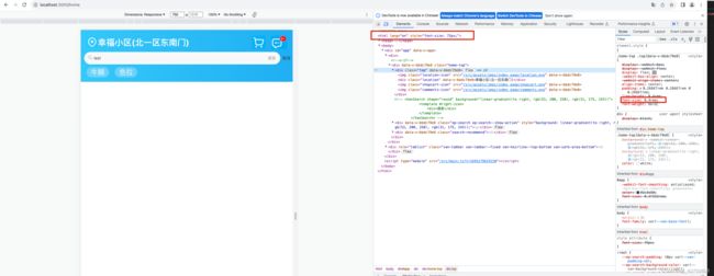
使用示例:
按照上面的公式, 375宽度的html的字体大小是37.5px; top类为15px的font-size转换为rem的就是15 / 37.5 = 0.4rem

750宽度的html的字体大小是75px,top类为15px的font-size转换为rem的还是15 / 37.5 = 0.4rem
为什么750px宽度的屏幕的rem值没有变化呢?
(1) rem是相对单位;
rem单位是相对于HTML标签的字号计算结果;[网页的根标签是:html标签;html字号也叫根字号,根标签字号。]
1rem = 1HTML字号大小。
(2) px转rem计算:
rem(css属性) = px(css属性) / px(html或者body[优先找html]的fontSize);
反过来rem转化为px就是:
px(css属性) = rem的数值 * html的fontSize数值;
如果html标签的font-size是16px,那么1rem就是16px, 而0.4rem就是0.4*16 = 6.4px。
如果html标签的font-size是20px,那么1rem就是16px, 而0.4rem就是0.4*20 = 8px。
如果html标签的font-size是37.5px,那么1rem就是37.5px, 而0.4rem就是0.4*37.5 = 15px。
如果html标签的font-size是75px,那么1rem就是75px, 而0.4rem就是0.4*75 = 30px。
从计算可知: 750px是375px的2倍,所以计算结果是无误的.
虽然是vue3项目的示例,但原理都差不多, react项目根据它的代码要求改改应该就能用了.