python数据可视化Matplotlib
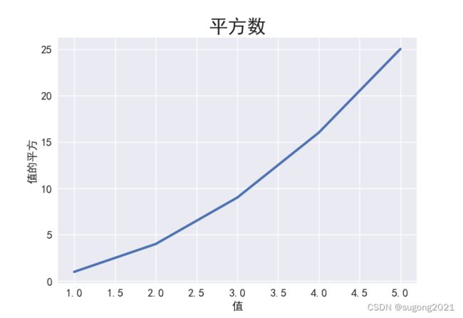
1.绘制简单的折线图
# -*- coding: utf-8 -*-
import matplotlib.pyplot as plt


input_values = [1, 2, 3, 4, 5]
squares = [1, 4, 9, 16, 25]
plt.style.use('seaborn')
fig, ax = plt.subplots()
ax.plot(input_values, squares, linewidth=3)   # 线条粗细

# 设置图表标题并给坐标轴加标签
ax.set_title("平方数", fontsize=24)
ax.set_xlabel("值", fontsize=14)
ax.set_ylabel("值的平方", fontsize=14)

# 设置刻度标记大小
ax.tick_params(axis='both', labelsize=14)
# 在代码中添加如下语句 —— 设置字体为:SimHei(黑体)
plt.rcParams['font.sans-serif']=['SimHei'] # 用来正常显示中文标签(中文乱码问题)

plt.show()
效果图:
2.使用内置样式绘制散点图,自定义颜色,颜色映射,自动保存图片
import matplotlib.pyplot as plt


x_values = range(1, 1001)
y_values = [x**2 for x in x_values]
plt.style.use('seaborn')
fig, ax = plt.subplots()
# 颜色映射cmap=plt.cm.Blues
ax.scatter(x_values, y_values, c=y_values, cmap=plt.cm.Blues, s=10)

#设置图标标题并给坐标轴加标签
ax.set_title("平方数", fontsize=24)
ax.set_xlabel("值", fontsize=14)
ax.set_ylabel("值的平方", fontsize=14)

# 设置每个坐标轴的取值范围
ax.axis([0, 1100, 0, 1100000])
# 设置刻度标记的大小
ax.tick_params(axis='both', which='major', labelsize=14)
# 正常显示中文
plt.rcParams['font.sans-serif'] = ['SimHei']

# 显示
# plt.show()
# 保存
plt.savefig('squares_plot.png', bbox_inches='tight')
结果:

3.随机漫步
random_walk.py
from random import choice
class RandomWalk:
def __init__(self, num_points=5000):
self.num_point = num_points
self.x_values = [0]
self.y_values = [0]
def fill_walk(self):
while len(self.x_values) < self.num_point:
# 决定前进方向以及沿这个方向前进的距离
x_direction = choice([1, -1])
x_distance = choice([0, 1, 2, 3, 4])
x_step = x_direction * x_distance
y_direction = choice([1, -1])
y_distance = choice([0, 1, 2, 3, 4])
y_step = y_direction * y_distance
# 拒绝原地踏步
if x_step == 0 and y_step == 0:
continue
# 计算下一个点的x和y
x = self.x_values[-1] + x_step
y = self.y_values[-1] + y_step
self.x_values.append(x)
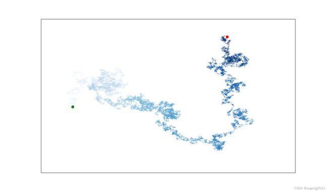
self.y_values.append(y)rw.visual.py
import matplotlib.pyplot as plt
from random_walk import RandomWalk


while True:
    rw = RandomWalk(50_000)
    rw.fill_walk()

    plt.style.use('classic')
    fig, ax = plt.subplots(figsize=(16, 9))
    point_number = range(rw.num_point)
    ax.scatter(rw.x_values, rw.y_values, c=point_number, cmap=plt.cm.Blues, edgecolors='none', s=1)

    #突出起点和终点
    ax.scatter(0, 0, c='green', edgecolors='none', s=100)
    ax.scatter(rw.x_values[-1], rw.y_values[-1], c='red', edgecolors='none', s=100)

    # 隐藏坐标轴
    ax.get_xaxis().set_visible(False)
    ax.get_yaxis().set_visible(False)

    plt.show()

    # 模拟多次随机漫步
    keep_running = input("Make another walk? (y/n):")
    if keep_running == 'n':
        break
结果:美的像一朵云