Flutter学习笔记:常用的表单组件
6. 表单组件
代码地址
1. Switch开关
- Switch是一个受控组件,需要传递value(布尔类型)决定显示的状态,通过回调onChange对状态改变时进行操作(类似React受控组件)
- Switch默认撑满整个外部容器,长度需要通过外部的容器控制
class SwitchComponent extends StatefulWidget {
  SwitchComponent({Key key}) : super(key: key);

  @override
  _SwitchComponentState createState() => _SwitchComponentState();
}

class _SwitchComponentState extends State {
  bool _switchSelected = false;

  @override
  Widget build(BuildContext context) {
    return Container(
      child: Switch(
        value: _switchSelected,
        onChanged: (value) {
          print(value);
          setState(() {
            _switchSelected = value;
          });
        },
        activeColor: Colors.red,
        hoverColor: Colors.greenAccent,
      ),
      width: 120,
    );
  }
}
2. 单选框
单选框分为Radio和RadioListTile,RadioListTile主要和ListView中的ListTile一样,是一个详细的列表块。
使用方法:
- Radio的使用
// Radio的定义
const Radio({
    Key key,
    @required this.value,
    @required this.groupValue,
    @required this.onChanged,
    this.activeColor,
    this.focusColor,
    this.hoverColor,
    this.materialTapTargetSize,
    this.focusNode,
    this.autofocus = false,
})
- value:单选框定义的值
- groupValue: 一个如果value等于groupValue变量中的值表现为选中状态
- onChange: 点击发生状态改变时的回调
- 其他参数大多是控制样式大小的
// 外部定义了
String _radioData = "";
// 组件中使用
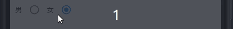
Row(
children: [
Text('男'),
Radio(
value: '男',
groupValue: this._radioData,
onChanged: (value) {
setState(() {
this._radioData = value;
});
}),
Text('女'),
Radio(
value: '女',
groupValue: this._radioData,
onChanged: (value) {
setState(() {
this._radioData = value;
});
})
],
),
效果
- RadioListTile的使用
class RadioListTile extends StatelessWidget {
  const RadioListTile({
    Key key,
    @required this.value,
    @required this.groupValue,
    @required this.onChanged,
    this.activeColor,
    this.title,
    this.subtitle,
    this.isThreeLine = false,
    this.dense,
    this.secondary,
    this.selected = false,
    this.controlAffinity = ListTileControlAffinity.platform,
  })
- value: 和Radio类似
- groupValue: 和Radio中的一样
- title: 类似ListTile中的主标题
- subtitle: 类似Listile中的副标题
// 定义的_radioData为String
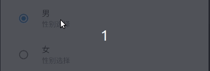
RadioListTile(
value: '男',
groupValue: this._radioData,
subtitle: Text('性别选择'),
title: Text('选择您的性别(单选)'),
onChanged: (value) {
setState(() {
this._radioData = value;
});
}),
RadioListTile(
value: '女',
groupValue: this._radioData,
subtitle: Text('性别选择'),
title: Text('选择您的性别(单选)'),
onChanged: (value) {
setState(() {
this._radioData = value;
});
}),
效果
3. 多选框
多选框和单选框一样,有Checkbox和CheckboxListTile两种
使用方法:
class Checkbox extends StatefulWidget {
  const Checkbox({
    Key key,
    @required this.value,
    this.tristate = false,
    @required this.onChanged,
    this.activeColor,
    this.checkColor,
    this.focusColor,
    this.hoverColor,
    this.materialTapTargetSize,
    this.focusNode,
    this.autofocus = false,
  });
- value: bool,代表是否被选中
- onChange: 该选项框改变时的回调函数
- tristate: 为true的时候显示为第三态
List> hobbies = [
    {"name": '抽烟', "selected": false},
    {"name": "喝酒", "selected": false},
    {"name": "烫头", "selected": false}
];
List checkSelection = [];

// 使用Checkbox的方法,没有第三台只需设置
hobbies.forEach((item) {
    checkSelection.add(
        Container(
            child: Row(children: [
                Checkbox(
                    value: item['selected'],
                    onChanged: (bool isSelected) {
                        setState(() {
                            item['selected'] = isSelected;
                        });
                    }),
                Text('${item['name']}')
            ])),
    );
});
效果
- 使用CheckboxListTile的例子
api和之前的RadioListTile的基本相似
hobbies.forEach((item) {
    checkBoxListileSelection.add(CheckboxListTile(
        value: item['selected'],
        onChanged: (value) {
            setState(() {
                item['selected'] = value;
            });
        },
        title: Text('${item['name']}'),
    ));
});
效果

4. 输入框
处理输入文本
  const TextField({
    Key key,
    this.controller,
    this.focusNode,
    this.decoration = const InputDecoration(),
    TextInputType keyboardType,
    this.textInputAction,
    this.textCapitalization = TextCapitalization.none,
    this.style,
    this.strutStyle,
    this.textAlign = TextAlign.start,
    this.textAlignVertical,
    this.textDirection,
    this.readOnly = false,
    ToolbarOptions toolbarOptions,
    this.showCursor,
    this.autofocus = false,
    this.obscureText = false,
    this.autocorrect = true,
    this.enableSuggestions = true,
    this.maxLines = 1,
    this.minLines,
    this.expands = false,
    this.maxLength,
    this.maxLengthEnforced = true,
    this.onChanged,
    this.onEditingComplete,
    this.onSubmitted,
    this.inputFormatters,
    this.enabonEditingCompleteled,
    this.cursorWidth = 2.0,
    this.cursorRadius,
    this.cursorColor,
    this.keyboardAppearance,
    this.scrollPadding = const EdgeInsets.all(20.0),
    this.dragStartBehavior = DragStartBehavior.start,
    this.enableInteractiveSelection = true,
    this.onTap,
    this.buildCounter,
    this.scrollController,
    this.scrollPhysics,
  })
介绍几个常用的
- controller: 定义的controller控制文本的初始信息,监听数值变化等等
- focusNode: 用于聚焦到该文本框
- decoration: 设置文本框的样式,包括前后的图表,类似于placeholder的水印显示文本
- keyboardType: 规定弹出键盘的类型,电话号码还是文本
- style: 输入文本的样式
- obscureText: 对于密码来说,需要隐藏文本, 展示为*
- autofocus: 进入页面后自动聚焦
- onChange: 文本框改变的回调函数
- inputFormatters可以通过正则来控制输入文本的类型,比如只能输入文字
其他属性还没研究过,研究到了在说
- 使用Focus聚焦的方法
- 定义一个focusNode节点
- 重写dispose方法
- 将focusNode
- 需要聚集焦点的时候使用FocusScope.of(context).requestFocus(_focusNode);
// 定义
TextEditingController _userName = TextEditingController(text: "");
TextEditingController _phoneNumber = TextEditingController();

// TextField
class _MyHomePageState extends State {
  TextEditingController _userName = TextEditingController(text: "");
  TextEditingController _phoneNumber = TextEditingController();
  FocusNode _focusNode;

  @override
  void initState() {
    super.initState();
    // _focusNode
    _focusNode = FocusNode();
  }

  @override
  void dispose() {
    _focusNode.dispose();
    super.dispose();
  }

  @override
  Widget build(BuildContext context) {
    return Scaffold(
      appBar: AppBar(title: Text(widget.title)),
      body: Container(
        child: Column(
          children: [
            TextField(
              controller: _userName,
              decoration: InputDecoration(
                  hintText: '请输入您的姓名',
                  labelText: '用户名',
                  prefixIcon: Icon(Icons.person)),
              autofocus: true,
              style: TextStyle(
                color: Colors.red[200],
              ),
              focusNode: _focusNode,
            ),
            TextField(
              controller: _phoneNumber,
              decoration: InputDecoration(
                  hintText: '请输入电话',
                  labelText: '联系电话',
                  icon: Icon(Icons.phone)),
              inputFormatters: [
                WhitelistingTextInputFormatter(RegExp("[0-9]")),
              ],
            )
          ],
        ),
        padding: EdgeInsets.all(10),
      ),
    );
  }
}
效果
