实例1
import numpy as np
import matplotlib
import matplotlib.pyplot as plt
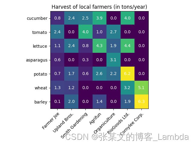
vegetables = ["cucumber", "tomato", "lettuce", "asparagus",
"potato", "wheat", "barley"]
farmers = ["Farmer Joe", "Upland Bros.", "Smith Gardening",
"Agrifun", "Organiculture", "BioGoods Ltd.", "Cornylee Corp."]
harvest = np.array([[0.8, 2.4, 2.5, 3.9, 0.0, 4.0, 0.0],
[2.4, 0.0, 4.0, 1.0, 2.7, 0.0, 0.0],
[1.1, 2.4, 0.8, 4.3, 1.9, 4.4, 0.0],
[0.6, 0.0, 0.3, 0.0, 3.1, 0.0, 0.0],
[0.7, 1.7, 0.6, 2.6, 2.2, 6.2, 0.0],
[1.3, 1.2, 0.0, 0.0, 0.0, 3.2, 5.1],
[0.1, 2.0, 0.0, 1.4, 0.0, 1.9, 6.3]])
fig, ax = plt.subplots()
im = ax.imshow(harvest)
ax.set_xticks(np.arange(len(farmers)), labels=farmers)
ax.set_yticks(np.arange(len(vegetables)), labels=vegetables)
plt.setp(ax.get_xticklabels(), rotation=45, ha="right",
rotation_mode="anchor")
for i in range(len(vegetables)):
for j in range(len(farmers)):
text = ax.text(j, i, harvest[i, j],
ha="center", va="center", color="w")
ax.set_title("Harvest of local farmers (in tons/year)")
fig.tight_layout()
plt.show()
实例2
import numpy as np
import matplotlib
import matplotlib.pyplot as plt
import matplotlib.ticker as ticker
def heatmap(data, row_labels, col_labels, ax=None,
cbar_kw={}, cbarlabel="", **kwargs):
if not ax:
ax = plt.gca()
im = ax.imshow(data, **kwargs,vmin=0, vmax=1)
cbar = ax.figure.colorbar(im, ax=ax, **cbar_kw)
tick_locator = ticker.MaxNLocator(nbins=11)
cbar.locator = tick_locator
cbar.update_ticks()
cbar.ax.set_ylabel(cbarlabel, rotation=-90, va="bottom")
ax.set_xticks(np.arange(data.shape[1]))
ax.set_yticks(np.arange(data.shape[0]))
font1 = {'family': 'Times New Roman',
'weight': 'normal',
'size': 16}
font2 = {'family': 'Times New Roman',
'weight': 'normal',
'size': 16}
ax.set_xticklabels(col_labels)
ax.set_yticklabels(row_labels)
ax.tick_params(top=False, bottom=True,
labeltop=False, labelbottom=True)
plt.setp(ax.get_xticklabels(), rotation=0, ha="center",
rotation_mode="anchor")
for edge, spine in ax.spines.items():
spine.set_visible(False)
ax.set_xticklabels(np.arange(data.shape[1]+1)-.5, minor=True)
ax.set_yticklabels(np.arange(data.shape[0]+1)-.5, minor=True)
ax.grid(which="minor", color="w", linestyle='-', linewidth=0.5)
ax.tick_params(which="minor", bottom=False, left=False)
return im, cbar
def annotate_heatmap(im, data=None, valfmt="{x:.2f}",
textcolors=["black", "white"],
threshold=None, **textkw):
"""
A function to annotate a heatmap.
Parameters
----------
im
The AxesImage to be labeled.
data
Data used to annotate. If None, the image's data is used. Optional.
valfmt
The format of the annotations inside the heatmap. This should either
use the string format method, e.g. "$ {x:.2f}", or be a
`matplotlib.ticker.Formatter`. Optional.
textcolors
A list or array of two color specifications. The first is used for
values below a threshold, the second for those above. Optional.
threshold
Value in data units according to which the colors from textcolors are
applied. If None (the default) uses the middle of the colormap as
separation. Optional.
**kwargs
All other arguments are forwarded to each call to `text` used to create
the text labels.
"""
if not isinstance(data, (list, np.ndarray)):
data = im.get_array()
if threshold is not None:
threshold = im.norm(threshold)
else:
threshold = im.norm(data.max())/2.
kw = dict(horizontalalignment="center",
verticalalignment="center")
kw.update(textkw)
if isinstance(valfmt, str):
valfmt = matplotlib.ticker.StrMethodFormatter(valfmt)
texts = []
for i in range(data.shape[0]):
for j in range(data.shape[1]):
kw.update(color=textcolors[int(im.norm(data[i, j]) > threshold)])
text = im.axes.text(j, i, valfmt(data[i, j], None), **kw)
texts.append(text)
return texts
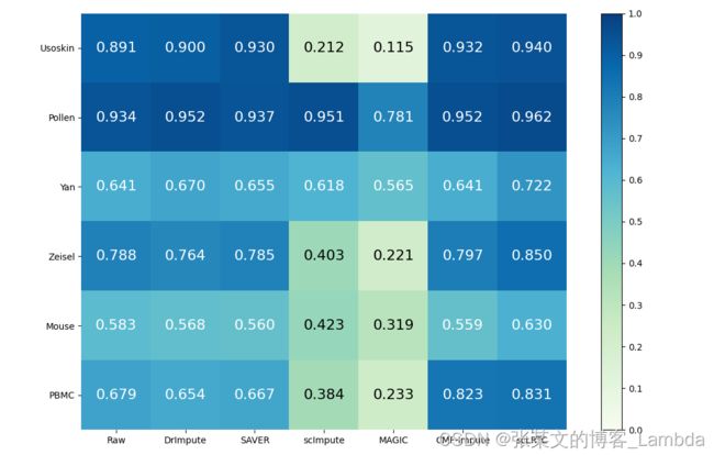
datasets = ["Usoskin", "Pollen","Yan", "Zeisel","Mouse","PBMC"]
methods = ["Raw","DrImpute", "SAVER", "scImpute","MAGIC","CMF-Impute","scLRTC"]
results = np.array([[0.891,0.900,0.930,0.212,0.115,0.932,0.940],
[0.934,0.952,0.937,0.951,0.781,0.952,0.962],
[0.641,0.670,0.655,0.618,0.565,0.641,0.722],
[0.788,0.764,0.785,0.403,0.221,0.797,0.850],
[0.583,0.568,0.560,0.423,0.319,0.559,0.630],
[0.679,0.654,0.667,0.384,0.233,0.823,0.831]])
fig, ax = plt.subplots(figsize=(11,7))
im, cbar = heatmap(results, datasets, methods, ax=ax,
cmap=plt.get_cmap("GnBu"))
texts = annotate_heatmap(im, valfmt="{x:.3f}",size = 16)
fig.tight_layout()
plt.savefig('./heatmaps.png', dpi=600)
plt.show()