uniapp自定义封装确认框
最近的app项目有个从有下角弹出的确认框,但是uniapp没有合适的组件所以自己写了一个,功能确实都完成了,但是跟项目的耦合度还是略高,主要是原因有两个:
1、uniapp在除H5模式下都挂载不到根元素,需要在使用页引入组件;
2、由于确认框需要都网上一个个叠加,所以需要不同name,这个我是用vuex存值的,后期再改改,争取这部分去掉,解决耦合度太高的缺点。
好了,说完以上,如果大家有需求,那就直接粘代码。
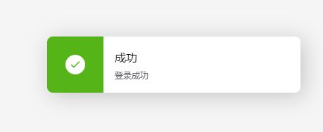
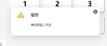
先看效果:
使用方法:
template:
<confirm-box></confirm-box>
javascript:
this.$confirm({ type: 'info', message: '当前警告内容' });
具体组件参数:
* confirm 确认框
	 * @description 包括确认、警告、错误、成功
	 * @event {Function(param)} $confirm(param)
			@param {Object{type,message}} {
								name,				值类型为 String,取唯一名称,避免多次弹出
								type,         		值为'info/warning/error/success'
								mask,		  		值类型为 Boolean(为true时为透明遮罩,进行其他操作无效,只能操作确认框)
								message,      		值类型为 String
								closed: true, 		值类型为 Boolean(type值为warning/error时使用,closed为true时可使用@close方法)
								confirmText,  		值类型为 String(type值为info时使用,更改确定按钮文字)
								cancelText,   		值类型为 String(type值为info时使用,更改取消按钮文字)
								confirm: () => {},  type='info',确认方法
								cancel: () => {},   type='info',取消方法
								close: () => {}		type='warning/error',关闭方法
							}
具体代码
组件代码分三个文件:
confirm-box.vue
<template>
<view class="confirmBox" :class="{padding0: this.componentNames.length == 0}">
<template v-for="(name,index) in componentNames">
<component
:is="name.type==='success'?name.type:'confirm'"
:id="index"
:type="name.type"
:message="name.message"
:confirmText="name.confirmText"
:cancelText="name.cancelText"
:closed="name.closed"
:key="`${$moment().format('X')}-${index}`"
@confirm="name.confirm"
@cancel="name.cancel"
@closeFunc="name.close"
class="component"
></component>
<view class="mask" v-if="name.mask" :key="index"></view>
</template>
</view>
</template>
<script>
/**
* confirm 确认框
* @description 包括确认、警告、错误、成功
* @event {Function(param)} $confirm(param)
@param {Object{type,message}} {
name, 值类型为 String,取唯一名称,避免多次弹出
type, 值为'info/warning/error/success'
mask, 值类型为 Boolean(为true时为透明遮罩,进行其他操作无效,只能操作确认框)
message, 值类型为 String
closed: true, 值类型为 Boolean(type值为warning/error时使用,closed为true时可使用@close方法)
confirmText, 值类型为 String(type值为info时使用,更改确定按钮文字)
cancelText, 值类型为 String(type值为info时使用,更改取消按钮文字)
confirm: () => {}, type='info',确认方法
cancel: () => {}, type='info',取消方法
close: () => {} type='warning/error',关闭方法
}
* @example
* template:
* confirm.vue
<template>
	<uni-transition :duration="50" :mode-class="[modeClass]" :show="show" class="confirm clearfix">
		<view class="left">
			<uni-icons v-if="type !== 'warning'" :type="iconType" :color="iconColor" size="32"></uni-icons>
			<image v-if="type === 'warning'" style="width: 32px;height: 32px;margin-top: 12px;" src="../../static/confirm/waring.svg" mode=""></image>
		</view>
		<view class="right">
			<view class="title">
				{{title}}
			</view>
			<view class="tip">
				{{message}}
			</view>
			<view class="footer" v-if="type === 'info'">
				<button type="default" class="button" :class="[vtheme]" @click="confirm">{{confirmText}}</button>
				<button type="default" class="button giveup" @click="cancel">{{cancelText}}</button>
			</view>
			<view class="close" v-else>
				<uni-icons type="clear" size="20" color="#606367" @click="closeFunc"></uni-icons>
			</view>
		</view>
	</uni-transition>
</template>

<script>
	export default{
		props:{
			message: String,
			type: String,
			id: [Number,String],
			closed:{
				type: Boolean,
				default: false
			},
			confirmText:{
				type: String,
				default: '确定'
			},
			cancelText:{
				type: String,
				default: '取消'
			}
		},
		data(){
			return{
				modeClass: 'slide-bottom',
				show: true,
				title: ''
			}
		},
		computed:{
			iconType(){
				if(this.type === 'info'){
					this.iconColor = this.themeColor;
					this.title = "信息";
					return 'info-filled';
				}else if(this.type === 'warning'){
					this.iconColor = '#EDBE54';
					this.title = "警告";
					return 'warning';
				}else if(this.type === 'error'){
					this.iconColor = '#F05151';
					this.title = "错误";
					return 'minus-filled'
				}
			}
		},
		watch:{
			type:{
				handler: function(val){
					if(val === 'info'){
						this.title = "信息";
					}else if(val === 'warning'){
						this.title = "警告";
					}else if(val === 'error'){
						this.title = "错误";
					}
				},
				deep: true,
				immediate: true
			}
		},
		mounted() {
			let self = this;
			if(this.type == "warning" && !this.closed){
				this.timeOut = setTimeout(function(){
					self.modeClass = 'slide-right';
					self.show = false;
					self.$confirmDel(self.id);
				},3000)
			}
		},
		methods:{
			cancel(){
				this.common();
				this.$emit('cancel');
			},
			confirm(){
				this.common();
				this.$emit('confirm');
			},
			closeFunc(){
				this.common();
				if(this.closed) this.$emit('closeFunc');
			},
			common(){
				this.modeClass = 'slide-right';
				this.show = false;
				this.$confirmDel(this.id);
			}
		}
	}
</script>

<style lang="scss" scoped>
	.confirm{
		display: flex;
		width: 720rpx;
		// height: 360rpx;
		background-color: color(bg2);
		clear: both;
		margin-bottom: 32rpx;
		box-shadow: 5px 5px 30px rgba(0, 0, 0, 0.2);
		@include radius(mini);
		.left{
			width: 160rpx;
			text-align: center;
			float: left;
			padding-top: 8rpx;
		}
		.right{
			float: left;
			padding: 32rpx;
			padding-left: 0;
			display: flex;
			height: 100%;
			box-sizing: border-box;
			flex-direction: column;
			.title{
				color: color(tx);
				font-size: 32rpx;
			}
			.tip{
				color: color(secondery);
				font-size: 24rpx;
				flex: 1;
				padding: 16rpx 0;
				margin: 16rpx 0;
			}
			.footer{
				display: flex;
				.button{
					height: 56rpx;
					line-height: 56rpx;
					font-size: 28rpx;
					color: #fff;
					width: 200rpx;
					margin-right: 32rpx;
					@include base-background();
					@include radius(large);
					&::after{
						border: 0;
					}
				}
				.giveup{
					background-color: #D7D9DC;
				}
			}
			.close{
				position: absolute;
				right: 8px;
				top: 0;
			}
		}
	}
	.clearfix::after{
		content: "\20";
		display: block;
		height: 0;
		clear: both;
	}
	.clearfix{
		zoom: 1;
	}
</style>
success.vue
<template>
	<uni-transition :duration="500" :mode-class="[modeClass]" :show="show" class="success">
		<view class="left">
			<uni-icons type="checkbox-filled" color="#fff" size="32"></uni-icons>
		</view>
		<view class="right">
			<view class="top">
				成功
			</view>
			<view class="bottom">
				{{message}}
			</view>
		</view>
	</uni-transition>
</template>

<script>
	export default{
		props: ['message','id'],
		data(){
			return{
				timeOut: null,
				modeClass: 'slide-bottom',
				show: true
			}
		},
		mounted() {
			let self = this;
			this.timeOut = setTimeout(function(){
				self.modeClass = 'slide-right';
				self.show = false;
				self.$confirmDel(self.id);
			},3000)
		},
		methods:{
			open(){
				this.show = true;
			}
		}
	}
</script>

<style lang="scss" scoped>
	.success{
		width: 720rpx;
		height: 160rpx;
		margin-bottom: 32rpx;
		box-shadow: 5px 5px 30px rgba(0, 0, 0, 0.2);
		background-color: color(bg2);
		@include radius(mini);
		display: flex;
		overflow: hidden;
		.left{
			width: 160rpx;
			background-color: color(success);
			line-height: 160rpx;
			text-align: center;
		}
		.right{
			box-sizing: border-box;
			padding: 32rpx;
			.top{
				color: color(tx);
				font-size: 32rpx;
			}
			.bottom{
				color: color(secondery);
				font-size: 24rpx;
			}
		}
	}
</style>
vuex部分:
confirmBox.js
const state = {
    componentNames: [],

}

const mutations = {
    SET_COMPONENT_NAMES(state,names) {
		if(names.hasOwnProperty('name')){
			let has = state.componentNames.filter(item => item.name == names.name);
			if(has.length) return;
		}
        state.componentNames.push(names);
    },
	DELETE_COMPONENT_NAMES(state,id){
		state.componentNames.splice(id,1);
	}
}

const actions = {

}

const getters = {
    componentNames: state => state.componentNames
}

export default {
    namespaced: true,
    state,
    mutations,
    actions,
    getters
}
全局混入
import { mapMutations } from 'vuex'
import Vue from 'vue'
export default {
    install(Vue) {
        Vue.mixin({
            methods:{
                ...mapMutations({
					confirm$: 'confirm/SET_COMPONENT_NAMES',
					$confirmDel: 'confirm/DELETE_COMPONENT_NAMES'
                }),
				$confirm: _.debounce(function(obj){
					this.confirm$(obj)
				},500)
            }
        })
    }
}
完事儿,就这么多,如果使用的时候有啥问题,可以直接留言,请大家指正!