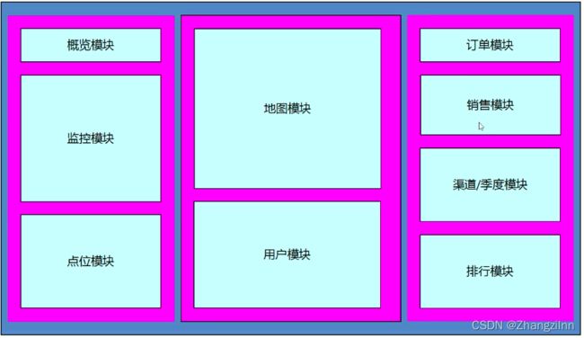
数据可视化项目——Echarts
//学习笔记
1.窗口适配方案:
flexible.js (检测浏览器宽度,修改html文字大小)
+
rem单位(页面元素根据rem适配大小,配合cssrem插件)
+
flex布局
移动端的效果图是750px,所以cssrem插件的基准值是 75px(flexible.js把屏幕分10等份)
PC端效果图是1920px,所以cssrem插件的基准值是 80px(flexible.js把屏幕分24等份)
此处修改flexible.js代码:
  // set 1rem = viewWidth / 24  此时我们把屏幕平均划分为24等份
  function setRemUnit() {
    var rem = docEl.clientWidth / 24
    docEl.style.fontSize = rem + 'px'
  }
cssrem插件——设置——扩展设置——Root Font Size 改为80
目标:要把屏幕宽度约束在1024~1920之间有适配
@media screen and (max-width: 1024px) {
            html {
                font-size: 42.66px !important;
            }
        }

        @media screen and (min-width: 1920px) {
            html {
                font-size: 80px !important;
            }
        }
2.项目基础布局
大盒子viewport
2.1公共面板样式开发(设置边框图片border-image)
面板类:panel

bug:因为切割过后导致子盒子变小
debug:定位(子绝父相)再拉伸
.inner {
    position: absolute;
    top: -0.6375rem;
    left: -1.65rem;
    right: -0.475rem;
    bottom: -0.25rem;
    padding: .3rem .45rem;
}
3.概览区域 (overview)
略
4.监控区域(monitor)
4.1无缝滚动
外面的大盒子marquee-view,里面的滚动子盒子marquee

1.先克隆marquee里面所有的行(row)
2.通过css3动画滚动marquee
3.鼠标经过marquee就停止动画:animation-play-state:paused
js:
// 1.先克隆marquee里面所有的行(row)
    $('.marquee-view .marquee').each(function() {
        var rows = $(this)
            .children()
            .clone();
        $(this).append(rows)
    })
css:
/* 2.通过css3动画滚动marquee */

.marquee-view .marquee {
    animation: move 15s linear infinite;
}

@keyframes move {
    0% {}
    100% {
        transform: translateY(-50%)
    }
}


/* 3.鼠标经过marquee就停止动画:animation-play-state:paused */

.marquee-view .marquee:hover {
    animation-play-state: paused;
}
5.点位分布统计模块
5.1当浏览器缩放时,图表等比例缩放
window.addEventListener('resize', function() {
        myChart.resize()
    })
6.地图区域统计模块
略
7.用户统计模块
7.1修改柱状图的柱子颜色
——修改线性渐变色方式(在option中修改):
color: new echarts.graphic.LinearGradient(
            //(x1,y1)到(x2,y2)之间进行渐变
            0, 0, 0, 1, [
                { offset: 0, color: '#00fffb' }, //0开始
                { offset: 1, color: '#0061ce' }, //1结束
            ]
        ),
7.2 grid相关配置:
grid: {
            left: '0%',
            right: '3%',
            bottom: '3%',
            top: '3%',
            containLabel: true,
            //是否显示直角坐标系网格
            show: true,
            //设置边框的颜色
            borderColor: 'rgba(0,240,255,0.3)'
        },
7.3 x轴调整:
        xAxis: [{
            type: 'category',
            data: ['Mon', 'Tue', 'Wed', 'Thu', 'Fri', 'Sat', 'Sun'],
            //柱子在刻度之间false,刻度在柱子之间true
            axisTick: {
                alignWithLabel: false,
                //刻度不显示
                show: false
            },
            //刻度标签更改颜色
            axisLabel: {
                color: '#4c9bfd'
            },
            //修改x轴颜色
            axisLine: {
                lineStyle: {
                    color: 'rgba(0,240,255,0.3)'
                }
            }
        }],
7.4 y轴调整:
yAxis: [{
            type: 'value'
        }],
        series: [{
            name: 'Direct',
            type: 'bar',
            barWidth: '60%',
            data: [10, 52, 200, 334, 390, 330, 220]
        }],
        axisTick: {
            alignWithLabel: false,
            //刻度不显示
            show: false
        },
        //刻度标签更改颜色
        axisLabel: {
            color: '#4c9bfd'
        },
        //修改y轴颜色
        axisLine: {
            lineStyle: {
                color: 'rgba(0,240,255,0.3)'
            }
        },
        //分割线颜色更改
        splitLine: {
            lineStyle: {
                color: 'rgba(0,240,255,0.3)'
            }
        }
7.5 单独修改柱子样式:
//修改单独柱体模块抽取封装item
    var item = {
        name: '',
        value: 1200,
        itemStyle: {
            color: '#254065'
        },
        //鼠标放在柱子上不想高亮显示
        emphasis: {
            itemStyle: {
                color: '#254065'
            }
        },
        //鼠标经过柱子不显示提示框
        tooltip: {
            extraCssText: 'opacity:0'
        }
    }
放入data中:
series: [{
            name: 'Direct',
            type: 'bar',
            barWidth: '60%',
            data: [2100, 1900, 1700, 1560, 1400, item, item, item,
                900, 750, 600, 480, 240
            ]
        }],
8.订单模块
略
9.销售统计模块
9.1修改配置
var option = {
        tooltip: {
            trigger: 'axis'
        },
        legend: {
            //距离容器右侧10%
            right: '10%',
            textStyle: {
                color: '#4c9bfd'
            },
            //如果serise里面有name 则data可省略
            // data: ['', 'Union Ads', 'Video Ads', 'Direct', 'Search Engine']
        },
        grid: {
            left: '3%',
            right: '4%',
            bottom: '3%',
            top: '20%',
            show: true,
            borderColor: '012f4a',
            containLabel: true
        },

        xAxis: {
            type: 'category',
            boundaryGap: false, //去除轴内间距
            data: ['1月', '2月', '3月', '4月', '5月', '6月', '7月', '8月', '9月', '10月', '11月', '12月'],
            axisTick: {
                show: false
            },
            axisLabel: {
                color: '#4c9bfd'
            },
            axisLine: {
                show: false
            },
        },
        yAxis: {
            type: 'value',
            axisTick: {
                show: false
            },
            axisLabel: {
                color: '#4c9bfd'
            },
            axisLine: {
                lineStyle: {
                    color: '#012f4a'
                }
            }
        },
        color: ['#00f2f1', '#ed3f35'],
        series: [{
                name: '预期销售额',
                type: 'line',
                // stack: 'Total',
                data: [24, 40, 101, 134, 90, 230, 210, 230, 120, 230, 210, 120],
                //折线修饰为圆滑
                smooth: true
            },
            {
                name: '实际销售额',
                type: 'line',
                // stack: 'Total',
                data: [40, 64, 191, 324, 290, 330, 310, 213, 180, 200, 180, 79],
                smooth: true
            },

        ]
    };
9.2切换效果
因为series里面的data数据决定折线的显示,所以当点击不同tab标签,让series里面的data调用不同数据即可

实现步骤:
1.准备需要切换的的4组数据
2.绑定点击事件
切换激活tab样式
切换图标依赖的数据(重新渲染图表)
3.开启定时器,进行切换,鼠标经过sales停止定时器 ,离开开启定时器
9.2.1准备数据:
// (1)准备数据
    var data = {
        year: [
            [24, 40, 101, 134, 90, 230, 210, 230, 120, 230, 210, 120],
            [40, 64, 191, 324, 290, 330, 310, 213, 180, 200, 180, 79]
        ],
        quarter: [
            [23, 75, 12, 97, 21, 67, 98, 21, 43, 64, 76, 38],
            [43, 31, 65, 23, 78, 21, 82, 64, 43, 60, 19, 34]
        ],
        month: [
            [34, 87, 32, 76, 98, 12, 32, 87, 39, 36, 29, 36],
            [56, 43, 98, 21, 56, 87, 43, 12, 43, 54, 12, 98]
        ],
        week: [
            [43, 73, 62, 54, 91, 54, 84, 43, 86, 43, 54, 53],
            [32, 54, 34, 87, 32, 45, 62, 68, 93, 54, 54, 24]
        ]
    };
9.2.2绑定点击事件:
data-* 属性是HTML5中的新属性
因此为点击事件 年、季、月、周自定义data-type属性
年
                        季
                        月
周对于自定义属性,可以用dataset得到属性值
this.dataset.type // 拿到当前a 的自定义属性值
其中data.year和data['year']都能获取data中的数据,但因为year的数据是字符串,因此选用data['year'],即:
var arr = data[this.dataset.type];
// 根据拿到的数据重新渲染 series里面的data值
option.series[0].data = arr[0];
option.series[1].data = arr[1];
// 重新把配置好的新数据给实例对象
myChart.setOption(option);
    // (2) 点击切换效果
    $(".sales .caption").on("click", "a", function() {
        // 此时要注意这个索引号的问题
        index = $(this).index() - 1;
        // 点击当前a 高亮显示 调用active
        $(this)
            .addClass("active")
            .siblings("a")
            .removeClass("active");
        // 拿到当前a 的自定义属性值
        // 根据拿到的值 去找数据
        var arr = data[this.dataset.type];
        // console.log(arr);
        // 根据拿到的数据重新渲染 series里面的data值
        option.series[0].data = arr[0];
        option.series[1].data = arr[1];
        // 重新把配置好的新数据给实例对象
        myChart.setOption(option);
    });
9.2.3 tab栏自动切换效果(定时器)
$("选择器").hover(function(){},function(){}) //对鼠标的移入移出进行监听
// 5. tab栏自动切换效果
    //  开启定时器每隔3s,自动让a触发点击事件即可
    var as = $(".sales .caption a");
    var index = 0;
    var timer = setInterval(function() {
        index++;
        if (index >= 4) index = 0;
        as.eq(index).click();
    }, 1000);
    // 鼠标经过sales,关闭定时器,离开开启定时器
    $(".sales").hover(
        function() {
            clearInterval(timer);
        },
        function() {
            clearInterval(timer);
            timer = setInterval(function() {
                index++;
                if (index >= 4) index = 0;
                as.eq(index).click();
            }, 1000);
        }
    );
})();
9.2.4 index赋值:
// 此时要注意这个索引号的问题
//点击哪个就把索引号赋值给index(要-1 因为标题是0!!!a从1开始排序)
index = $(this).index() - 1;
10.渠道分布模块
略
11.季度进度模块
半圆形做法:把一个饼状图分成三段最下面设置为透明

12.全国热榜模块(重要)
步骤:
1.准备后台返回的真实数据
2.利用数据渲染各省热销模块sup模块(拼接html格式字符串,进行渲染)
3.当数据进入tab的时候
激活当前tab样式,删除其他tab样式
渲染各省热销sub模块(拼接html格式字符串,进行渲染)
4.默认激活第一个tab的效果
5.开启定时器,依次切换
12.1遍历hotData数组
其中针对上升下降的属性item.flag ,其返回值为布尔值 因此可写为:
${item.flag ? "icon-up" : "icon-down"} //true则返回up,false则返回down
var supHTML = "";
    $.each(hotData, function(index, item) {
        // console.log(item);
        supHTML += `${item.city} ${item.sales} `;
    });
    // 把生成的5个小li字符串给 sub dom盒子
    $(".sup").html(supHTML);
    // 3. 当鼠标进入 tab 的时候
    // 鼠标经过当前的小li要高亮显示
    $(".province .sup").on("mouseenter", "li", function() {
        index = $(this).index();
        render($(this));
    });
默认把第一个小li处于鼠标经过状态
var lis = $(".province .sup li");

lis.eq(0).mouseenter();