QML语法
文章目录
- 注释
- 基本元素对象(Item Element)
-
- 矩形框元素(Rectangle Element)
- 文本元素(Text Element)
- 图像元素(Image Element)
- MouseArea(鼠标区域)
- 输入元素
-
- 文本输入(TextInput)
- 焦点区域(FocusScope)
- 文本编辑器(TextEdit)
- 按键元素(Key)
- Repeater(重复元素)
- 组件(Compontents)
- 转换
- 定位元素(Positioning Element)
-
- Column(列)
- Row(行)
- Grid(栅格)
- Flow
- 布局元素
- 属性
-
- id属性
- alias别名
- 列表属性
- 默认属性
- 分组属性
- 附加属性
- 信号处理器
注释
单选注释以 // 开始。
多行注释以 /* 开始,以 */ 结束。
基本元素对象(Item Element)
Item是所有可视化元素的基础对象,所有其它的可视化元素都继承⾃Item。它⾃⾝不会有任何绘制操作,但是定义了所有可视化元素共有的属性:
| Group(分组) | Properties(属性) |
|---|---|
| Geometry(⼏何属性) | x,y(坐标)定义了元素左上⾓的位置,width,height(⻓和宽)定义元素的显示范围,z(堆叠次序)定义元素之间得重叠顺序 |
| Layout handling(布局操作) | anchors(锚定),包括左(left),右(right),上(top),下(bottom),水平与垂直居中(vertical center,horizontal center),与margins(间距)⼀起定义了元素与其它元素之间的位置关系 |
| Key handlikng(按键操作) | 附加属性key(按键)和keyNavigation(按键定位)属性来控制按键操作,处理输⼊焦点(focus)可⽤操作 |
| Transformation(转换) | 缩放(scale)和rotate(旋转)转换,通⽤的x,y,z属性列表转(transform),旋转基点设置(transformOrigin) |
| Visual(可视化) | 不透明度(opacity)控制透明度,visible(是否可⻅)控制元素是否显⽰,clip(裁剪)⽤来限制元素边界的绘制,smooth(平滑)⽤来提⾼渲染质量 |
| State definition(状态定义) | states(状态列表属性)提供了元素当前所⽀持的状态列表,当前属性的改变也可以使⽤transitions(转变)属性列表来定义状态转变动画 |
- 基本元素对象(item)
- 矩形元素对象(Rectangle)
- 文本元素(Text)
- 图像元素(Image)
- 鼠标区域元素(MouseArea)
矩形框元素(Rectangle Element)
Rectangle(矩形框)是一个矩形框,包含背景颜色、边框颜色,边框宽度等属性。还可以通过radius(半径)实现一个圆角矩形。
Item{
    Rectangle {
        id: rect1
        x: 15; y: 12
        width: 80; height: 80
        color: "red"
    }
    Rectangle {
        id: rect2
        x: 105; y: 12
        width: 80; height: 80
        gradient: Gradient {//渐变色
            GradientStop { position: 0.0; color: "green" }
            GradientStop { position: 1.0; color: "red" }
        }
        border.color: "red"
    }


    Rectangle {
        id: rect3
        x: 200; y: 12
        width: 80; height: 80
        border.color: "red"
        border.width: 4
        radius: 40
    }
}

注意:⼀个矩形框如果没有width/height(宽度与⾼度)将不可⻅。
文本元素(Text Element)
Text(文本元素)用于显示文本。可以根据文本(text)和字体(font)计算初始化的宽和高。使用字体属性(font property group)改变当前字体、horizontalAlignment与verticalAlignment属性来设置它的对⻬效果。还包含设置省略号、换行等。
Item{
    Text {
        text: 'hello world!'
        width: 150; height: 120
        color: "#303030"
        font.pixelSize: 28
        elide: Text.ElideMiddle//省略号位置
        style: Text.Sunken
        styleColor: '#FF4444'
        verticalAlignment: Text.AlignTop //设置对齐方式
        //wrapMode: Text.WordWrap  //换行
    }
}
一个没有设置宽度或者文本的文本元素(Text Element) 将不可见,默认的初始宽度是0。
图像元素(Image Element)
Image (图像元素)用于显示不同格式的图像(例如png、jpg、gif、bmp)。source属性(source property)提供图像文件的链接信息,fillMode(文件模式)能够控制元素对象的大小调整, 给source 属性一个 URL 来自动从网络加载图片。
Item{
    Image {
    id:image1
    x: 12; y: 12
    // width: 48
    // height: 118
    source: "./pinwheel.png"
    }
    Image {
    x: image1.x + image1.width + 20; y: image1.y
    width: image1.width/2
    height: image1.height/2
    source: "./pinwheel.png"
    //使PreserveAspectCrop可以避免裁剪图像数据被渲染到图像边界外
    fillMode: Image.PreserveAspectCrop
    clip: true
    }
}
MouseArea(鼠标区域)
是一个非可视化元素对象用于处理鼠标事件。
Item{
    Image {
        id:image1
        x: 12; y: 12
        source: "./pinwheel.png"
        MouseArea {
        id: area
        width: parent.width
        height: parent.height
        onClicked: image2.visible = !image2.visible
        }
    }
    Image {
        id:image2
        x: 200; y: 12
        source: "./pinwheel.png"
    }
}
输入元素
文本输入(TextInput)
⽂本输⼊允许⽤户输⼊⼀⾏⽂本。这个元素⽀持使⽤正则表达式验证器来限 制输⼊和输⼊掩码的模式设置。
// textinput.qml
import QtQuick 2.0
Rectangle {
	width: 200
	height: 80
	color: "linen"
	TextInput {
		id: input1
		x: 8; y: 8
		width: 96; height: 20
		focus: true
		text: "Text Input 1"
	}
	TextInput {
		id: input2
		x: 8; y: 36
		width: 96; height: 20
		text: "Text Input 2"
	}
}
⽤户可以通过点击TextInput来改变焦点。为了⽀持键盘改变焦点,我们可以 使⽤KeyNavigation(按键向导)这个附加属性。
import QtQuick 2.0
Rectangle {
	width: 200
	height: 80
	color: "linen"
	TextInput {
		id: input1
		x: 8; y: 8
		width: 96; height: 20
		focus: true
		text: "Text Input 1"
		KeyNavigation.tab: input2
	}
	TextInput {
		id: input2
		x: 8; y: 36
		width: 96; height: 20
		text: "Text Input 2"
		KeyNavigation.tab: input1
	}
}
KeyNavigation(按键向导)附加属性可以预先设置⼀个元素id绑定切换焦点 的按键。
焦点区域(FocusScope)
⼀个焦点区域(focus scope)定义了如果焦点区域接收到焦点,它的最后⼀ 个使⽤focus:true的⼦元素接收焦点,它将会把焦点传递给最后申请焦点的⼦ 元素。我们创建了第⼆个版本的TLineEdit组件,称作TLineEditV2,使⽤焦 点区域(focus scope)作为根元素。
import QtQuick 2.0
FocusScope {
	width: 96; height: input.height + 8
	Rectangle {
		anchors.fill: parent
		color: "lightsteelblue"
		border.color: "gray"
	}
	property alias text: input.text
	property alias input: input

	TextInput {
		id: input
		anchors.fill: parent
		anchors.margins: 4
		focus: true
	}
}
文本编辑器(TextEdit)
⽀持多⾏ ⽂本编辑。它不再⽀持⽂本输⼊的限制,但是提供了已绘制⽂本的⼤⼩查询(paintedHeight,paintedWidth)。我们也创建了⼀个我们⾃⼰的组件 TTextEdit,可以编辑它的背景,使⽤focus scope(焦点区域)来更好的切换焦点。
import QtQuick 2.0
FocusScope {
	width: 96; height: 96
	Rectangle {
		anchors.fill: parent
		color: "lightsteelblue"
		border.color: "gray"
	}
	property alias text: input.text
	property alias input: input

	TextEdit {
		id: input
		anchors.fill: parent
		anchors.margins: 4
		focus: true
	}
}
使⽤这个组件:
import QtQuick 2.0
Rectangle {
	width: 136
	height: 120
	color: "linen"
	TTextEdit {
		id: input
		x: 8; y: 8
		width: 120; height: 104
		focus: true
		text: "Text Edit"
	}
}
按键元素(Key)
附加属性key允许你基于某个按键的点击来执⾏代码。例如使⽤up,down按 键来移动⼀个⽅块,left,right按键来旋转⼀个元素,plus,minus按键来缩 放⼀个元素。
import QtQuick 2.0
DarkSquare {
	width: 400; height: 200
	GreenSquare {
		id: square
		x: 8; y: 8
	}
	focus: true
	Keys.onLeftPressed: square.x -= 8
	Keys.onRightPressed: square.x += 8
	Keys.onUpPressed: square.y -= 8
	Keys.onDownPressed: square.y += 8
	Keys.onPressed: {
		switch(event.key) {
			case Qt.Key_Plus:
				square.scale += 0.2
				break;
			case Qt.Key_Minus:
				square.scale -= 0.2
				break;
		}
	}
}
Repeater(重复元素)
通常Repeater(重复元素)与定位器一起使用。它的工作方式就像for循环与迭代器的模式一样。
import QtQuick 2.2
import QtQuick.Window 2.2
Window{
height: 600;width: 800
DarkSquare {
id: root
width: 252
height: 252
property variant colorArray: ["#00bde3", "#67c111", "#ea7025"]
Grid{
anchors.fill: parent
anchors.margins: 8
spacing: 4
Repeater {
model: 16
Rectangle {
width: 56; height: 56
property int colorIndex: Math.floor(Math.random()*3)
color: root.colorArray[colorIndex]
border.color: Qt.lighter(color)
Text {
anchors.centerIn: parent
color: "#f0f0f0"
text: "Cell " + index
}
}
}
}
}
}
组件(Compontents)
一个组件是一个可以重复使用的元素,QML提供几种不同的方法来创建组件。一个以文件为基础的组件在文件中创建了一个QML元素,并且将文件以元素类型来命名(例如Button.qml)。你可以像任何其它的QtQuick模块中使用元素一样来使用这个组件。在我们下面的例子中,你将会使用你的代码作为一个Button(按钮)来使用。
创建了一个包含文本和鼠标区域的矩形框。它类似于一个简单的按钮。
Rectangle { // our inlined button ui
        id: button
        x: 12; y: 12
        width: 116; height: 26
        color: "lightsteelblue"
        border.color: "slategrey"
        Text {
            anchors.centerIn: parent
            text: "Start"
        }
        MouseArea {
            anchors.fill: parent
            onClicked: {
                status.text = "Button clicked!"
            }
        }
    }

    Text { // text changes when button was clicked
        id: status
        x: 12; y: 76
        width: 116; height: 26
        text: "waiting ..."
        horizontalAlignment: Text.AlignHCenter
    }
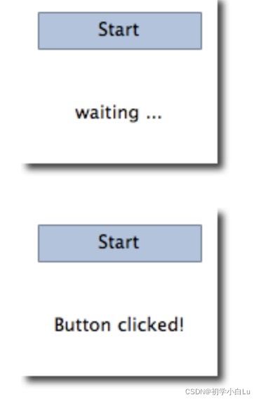
用户界面将会看起来像下面这样。初始化的状态,按钮点击后的效果。
创建了一个Button.qml文件,并且将我们的代码拷贝了进去。我们在根级添加一个属性导出方便使用者修改它。在根级导出了文本和点击信号。通常我们命名根元素为root让引用更加方便。我们使用了QML的alias(别名)的功能,它可以将内部嵌套的QML元素的属性导出到外面使用。有一点很重要,只有根级目录的属性才能够被其它文件的组件访问。
// Button.qml

import QtQuick 2.0

Rectangle {
    id: root
    // export button properties
    property alias text: label.text
    signal clicked

    width: 116; height: 26
    color: "lightsteelblue"
    border.color: "slategrey"

    Text {
        id: label
        anchors.centerIn: parent
        text: "Start"
    }
    MouseArea {
        anchors.fill: parent
        onClicked: {
            root.clicked()
        }
    }
}
使用我们新的Button元素只需要在我们的文件中简单的声明一下就可以了,之前的例子将会被简化。
Button { // our Button component
        id: button
        x: 12; y: 12
        text: "Start"
        onClicked: {
            status.text = "Button clicked!"
        }
    }

    Text { // text changes when button was clicked
        id: status
        x: 12; y: 76
        width: 116; height: 26
        text: "waiting ..."
        horizontalAlignment: Text.AlignHCenter
    }
转换
QML元素对象通常能够被平移,旋转,缩放。
简单的位移是通过改变x,y坐标来完成的。旋转是改变rotation(旋转)属性来完成的,这个值使用角度作为单位(0~360)。缩放是通过改变scale(比例)的属性来完成的,小于1意味着缩小,大于1意味着放大。旋转与缩放不会改变对象的几何形状,对象的x,y(坐标)与width/height(宽/高)也类似。只有绘制指令是被转换的对象。
ClickableImage元素(ClickableImage element),ClickableImage仅仅是一个包含鼠标区域的图像元素。
// ClickableImage.qml

// Simple image which can be clicked

import QtQuick 2.0

Image {
    id: root
    signal clicked

    MouseArea {
        anchors.fill: parent
        onClicked: root.clicked()
    }
}
可点击图片元素来显示了三个火箭。当点击时,每个火箭执行一种简单的转换。点击背景将会重置场景。
// transformation.qml


import QtQuick 2.0

Item {
    // set width based on given background
    width: bg.width
    height: bg.height

    Image { // nice background image
        id: bg
        source: "assets/background.png"
    }

    MouseArea {
        id: backgroundClicker
        // needs to be before the images as order matters
        // otherwise this mousearea would be before the other elements
        // and consume the mouse events
        anchors.fill: parent
        onClicked: {
            // reset our little scene
            rocket1.x = 20
            rocket2.rotation = 0
            rocket3.rotation = 0
            rocket3.scale = 1.0
        }
    }

    ClickableImage {
        id: rocket1
        x: 20; y: 100
        source: "assets/rocket.png"
        onClicked: {
            // increase the x-position on click
            x += 5
        }
    }

    ClickableImage {
        id: rocket2
        x: 140; y: 100
        source: "assets/rocket.png"
        smooth: true // need antialising
        onClicked: {
            // increase the rotation on click
            rotation += 5
        }
    }

    ClickableImage {
        id: rocket3
        x: 240; y: 100
        source: "assets/rocket.png"
        smooth: true // need antialising
        onClicked: {
            // several transformations
            rotation += 5
            scale -= 0.05
        }
    }
}
火箭1在每次点击后X轴坐标增加5像素,火箭2每次点击后会旋转。火箭3每次点击后会缩小。对于缩放和旋转操作我们都设置了smooth:true来增加反锯齿,由于性能的原因通常是被关闭的(与剪裁属性clip类似)。当你看到你的图形中出现锯齿时,你可能就需要打开平滑(smooth)。
使用MouseArea来覆盖整个背景,点击背景可以初始化火箭的值。
在代码中先出现的元素有更低的堆叠顺序(叫做z顺序值z-order),如果你点击火箭1足够多次,你会看见火箭1移动到了火箭2下面。z轴顺序也可以使用元素对象的z-property来控制。
由于火箭2后出现在代码中,火箭2将会放在火箭1上面。这同样适用于MouseArea(鼠标区域),一个后出现在代码中的鼠标区域将会与之前的鼠标区域重叠,后出现的鼠标区域才能捕捉到鼠标事件。
注意: 文档中元素的顺序很重要。
定位元素(Positioning Element)
QtQuick模块提供了Row,Column,Grid,Flow用来作为定位器。
// RedSquare.qml

import QtQuick 2.0

Rectangle {
    width: 48
    height: 48
    color: "#ea7025"
    border.color: Qt.lighter(color)
}
Qt.lighter(color)来指定了基于填充色的边界高亮色
Column(列)
column元素将它的子对象通过顶部对齐的列方式进行排列。spacing属性用来设置每个元素之间的间隔大小。
// column.qml

import QtQuick 2.0

DarkSquare {
    id: root
    width: 120
    height: 240

    Column {
        id: column
        anchors.centerIn: parent
        spacing: 8
        RedSquare { }
        GreenSquare { width: 96 }
        BlueSquare { }
    }
}
Row(行)
Row(行)元素将它的子对象从左到右,或者从右到左依次排列,排列方式取决于 layoutDirection 属性。spacing 属性用来设置每个元素之间的间隔大小。
import QtQuick 2.2
import QtQuick.Window 2.2
Window{
height: 600;width: 800
BrightSquare {
id: root
width: 400; height: 120
Row {
id: row
anchors.centerIn: parent
spacing: 20
BlueSquare { }
GreenSquare { }
RedSquare { }
}
}
}
Grid(栅格)
Grid(栅格)元素通过设置 rows(行数)和 columns(列数)将子对象排列在一个栅格中。可以只限制行数或者列数。
import QtQuick 2.2
import QtQuick.Window 2.2
Window{
height: 600;width: 800
BrightSquare {
id: root
width: 160
height: 160
Grid {
id: grid
rows: 2
columns: 2
anchors.centerIn: parent
spacing: 8
RedSquare { }
RedSquare { }
RedSquare { }
RedSquare { }
}
}
}
Flow
属性 flow(流)与 layoutDirection(布局方向)用来控制子元素的加入顺序。spacing 属性用来控制所有元素之间的间隔。
为了让一个流可以工作,必须指定一个宽度或者高度,可以通过属性直接设定,或者通过 anchor(锚定)布局设置。
import QtQuick 2.2
import QtQuick.Window 2.2
Window{
height: 600;width: 800
BrightSquare {
id: root
width: 160
height: 160
Flow {
anchors.fill: parent
anchors.margins: 20
spacing: 20
RedSquare { }
BlueSquare { }
GreenSquare { }
RedSquare { }
BlueSquare { }
GreenSquare { }
}
}
}
布局元素
使⽤anchors(锚)对元素进⾏布局。anchoring(锚定)是基础元素对 象的基本属性,可以被所有的可视化QML元素使⽤。
- anchors.top : AnchorLine
- anchors.bottom : AnchorLine
- anchors.left : AnchorLine,元素左对齐它的父元素:
anchors.left: parent.left,元素的左边与它父元素的右边对齐:anchors.left: parent.right - anchors.right : AnchorLine
- anchors.horizontalCenter : AnchorLine,元素中间对齐:
anchors.horizontalCenter: parent.horizontalCenter - anchors.verticalCenter : AnchorLine,垂直方向居中对齐:
anchors.verticalCenter: parent.verticalCenter - anchors.baseline : AnchorLine
- anchors.fill : Item ,元素填充它的父元素:
anchors.fill: parent - anchors.centerIn : Item,元素在它的父元素中居中:
anchors.centerIn: parent - anchors.margins : real
- anchors.topMargin : real
- anchors.bottomMargin : real
- anchors.leftMargin : real
- anchors.rightMargin : real
- anchors.horizontalCenterOffset : real,元素水平方向居中对齐父元素并向后偏移12像素:
anchors.horizontalCenterOffset: -12 - anchors.verticalCenterOffset : real
- anchors.baselineOffset : real
- anchors.alignWhenCentered : bool
示例:元素填充它的⽗元素。
GreenSquare {
	BlueSquare {
		width: 12
		anchors.fill: parent
		anchors.margins: 8
		text: '(1)'
	}
}
示例:元素左对⻬它的⽗元素。
GreenSquare {
	BlueSquare {
		width: 48
		y: 8
		anchors.left: parent.left
		anchors.leftMargin: 8
		text: '(2)'
	}
}
示例:元素的左边与它⽗元素的右边对⻬
GreenSquare {
	BlueSquare {
		width: 48
		anchors.left: parent.right
		text: '(3)'
	}
}
示例:元素中间对⻬。Blue1与它的⽗元素⽔平中间对⻬。Blue2与Blue1中间对 ⻬,并且它的顶部对⻬Blue1的底部。
GreenSquare {
	BlueSquare {
		id: blue1
		width: 48; height: 24
		y: 8
		anchors.horizontalCenter: parent.horizontalCenter
	}
	BlueSquare {
		id: blue2
		width: 72; height: 24
		anchors.top: blue1.bottom
		anchors.topMargin: 4
		anchors.horizontalCenter: blue1.horizontalCenter
		text: '(4)'
	}
}
示例:元素在它的⽗元素中居中。
GreenSquare {
	BlueSquare {
		width: 48
		anchors.centerIn: parent
		text: '(5)'
	}
}
示例:元素⽔平⽅向居中对⻬⽗元素并向后偏移12像素,垂直⽅向居中对⻬。
GreenSquare {
	BlueSquare {
		width: 48
		anchors.horizontalCenter: parent.horizontalCenter 		、
		anchors.horizontalCenterOffset: -12
		anchors.verticalCenter: parent.verticalCenter
		text: '(6)'
	}
}
属性
QML支持许多类型的属性(参阅QML基本类型)。基本类型包括整型、实数型、布尔、字符串、颜色以及列表。
id属性
每个对象可给予一个特定唯一的属性称之为id。在同一个QML文件中id值是唯一的。指定一个id可以允许该对象可以被其它的对象与脚本引用。
下面的示例中,第一个矩形元素的id名为”myRect”。第二个矩形元素的宽度是引用的myRect.widtch,这意味着它将与第一矩形具有相同的width值。
Item {
     Rectangle {
         id: myRect
         width: 100
         height: 100
     }
     Rectangle {
         width: myRect.width
         height: 200
     }
 }
注意: 一个id首字符必须是小写字母或下划线并且不能包含字母,数字和下划线以外的字符。
alias别名
给已经存在的属性定义一个别名,以后再次使用这个属性的时候便可以通过这个属性别名来访问它了。
一般用在实例化其它控件,而需要修改实例化后的子控件属性时候使用。比如A.qml中实例化了B(来源B.qml),又想改其子控件的具体属性,这个时候就可以用“alias”。
语法:property alias :
注意,别名属性只能引用到其声明处类型作用域中的一个对象或一个对象的属性,它不能包含任何JavaScript表达式,也不能引用类型作用域之外的对象。
(1).属性别名在整个组件初始化完毕之后才是可用的:代码是从上向下执行的,因此一个比较常见的错误是,在引用所指向的属性还没初始化的时候就使用了别名。
(2).别名不能使用在同一个组件中声明的另一个别名。
(3).属性别名可以与现有的属性同名,但会覆盖现有属性。
B 中 AliasBase.qml文件中:
import QtQuick 2.0
import QtQuick.Window 2.2
import QtQuick.Controls 2.2

Column {
    id:         _root;
    spacing:    4

    //[重点1]
    property alias  title: titleLabel.text

    Label {
        id: titleLabel;
        text:  "..."            //[重点2]
        anchors.horizontalCenter:  parent.horizontalCenter;
        horizontalAlignment :      Text.AlignHCenter;
        color: "black";
        font.bold:  true;
        font.pixelSize: 36;
    }
}
A 中 AliasMain.qml,中代码:
import QtQuick 2.0
import QtQuick.Window 2.2

Window {
    visible: true;
    width:  300;
    height: 250;

    AliasBase {  //主要一定要大写呀
        id: aliBase;
        title:  qsTr("Rename");   //[重点3]
    }
}
列表属性
Item {
     children: [
         Image {},
         Text {}
     ]
 }
在单一项目列表的情况下,是可以省略方括号:
Image {
     children: Rectangle {}
 }
默认属性
每个对象类型可以指定列表或对象属性之一作为其默认属性。如果一属性已被声明为默认属性,该属性标记可以被省略。纯粹是语法上的简化,其行为与通过名称指定属性相同,但是在许多情况下可以增加自然感。默认属性必须是对象或列表属性。l
State {
     changes: [
         PropertyChanges {},
         PropertyChanges {}
     ]
 }
因为changes是State类型的默认属性。可以简化成这样:
State {
         PropertyChanges {},
         PropertyChanges {}
 }
分组属性
在某些情况下使用一个‘.’符号或分组符号形成一个逻辑组。
Text {
     font.pixelSize: 12  //在元素文件分组属性使用‘.‘符号显示。
     font.bold: true
 }
或
Text {
     font { pixelSize: 12; bold: true }
 }
附加属性
有些对象的属性附加到另一个对象。附加属性的形式为Type.property其中Type是附加property元素的类型。
Component {
     id: myDelegate
     Text {
         text: "Hello"
         color: ListView.isCurrentItem ? "red" : "blue"
     }
 }
 ListView {
     delegate: myDelegate
 }
ListView元素附加ListView.isCurrentItem属性到每个它创建的代理上。
ListView元素附加ListView.isCurrentItem属性到每个它创建的代理上。
Item {
     focus: true
     Keys.onSelectPressed: console.log("Selected")
 }
信号处理器
信号处理器允许响应事件时处理动作。例如,MouseArea元素有信号处理器来处理鼠标按下,释放以及单击:
MouseArea {
     onPressed: console.log("mouse button pressed")
 }
所有信号处理器开始都是启用的。
有一些信号处理器包含一个可选的参数,例如MouseArea onPressed信号处理程序有鼠标参数:
 MouseArea {
     acceptedButtons: Qt.LeftButton | Qt.RightButton
     onPressed: if (mouse.button == Qt.RightButton) console.log("Right mouse button pressed")
 }