Vue2.0+AntvX6—基类Cell
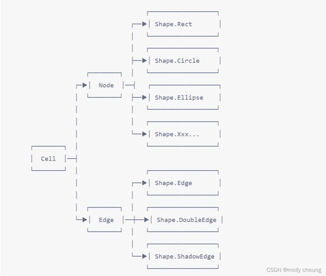
什么是基类Cell?
在 X6 的 Shape 命名空间中内置了一些基础图形,如 Rect、Edge、Circle 等,这些图形最终都有共同的基类 Cell,定义了节点和边共同属性和方法,
一、Shape的基本用法
方法一:
step1 :引入shape
import { Graph, Shape } from '@antv/x6'
step2:用构造函数来创建节点/边
使用这些图形的构造函数来创建节点/边,然后调用 graph.addNode 或 graph.addEdge 方法将其添加到画布。
    // 用构造函数来创建节点/边
    graphAddNodeEdge() {
      const rect = new Shape.Rect({
        id: 'node1',
        x: 40,
        y: 40,
        width: 100,
        height: 40,
        label: 'rect',
        zIndex: 2
      })

      const circle = new Shape.Circle({
        id: 'node2',
        x: 280,
        y: 200,
        width: 60,
        height: 60,
        label: 'circle',
        zIndex: 2
      })

      const edge = new Shape.Edge({
        id: 'edge1',
        source: rect,
        target: circle,
        zIndex: 1
      })
      this.graph.addNode(rect)
      this.graph.addNode(circle)
      this.graph.addEdge(edge)
    }
方法二:
step1 :引入shape
import { Graph, Shape } from '@antv/x6'
const { Rect, Circle, Edge } = Shape
step2:用构造函数来创建节点/边
 // 用构造函数来创建节点/边
    graphAddNodeEdge() {
      const rect = new Rect({
        id: 'node1',
        x: 40,
        y: 40,
        width: 100,
        height: 40,
        label: 'rect',
        zIndex: 2
      })

      const circle = new Circle({
        id: 'node2',
        x: 280,
        y: 200,
        width: 60,
        height: 60,
        label: 'circle',
        zIndex: 2
      })

      const edge = new Edge({
        id: 'edge1',
        source: rect,
        target: circle,
        zIndex: 1
      })
      this.graph.addNode(rect)
      this.graph.addNode(circle)
      this.graph.addEdge(edge)
    }

二、Shape的基础选项
| 选项名 | 类型 | 默认值 | 描述 |
|---|---|---|---|
| id | String | undefined | 节点/边的唯一标识,默认使用自动生成的 UUID。 |
| markup | Markup | undefined | 节点/边的 SVG/HTML 片段 |
| attrs | Object | { } | 节点/边属性样式。 |
| shape | String | undefined | 渲染节点/边的图形。 |
| view | String | undefined | 渲染节点/边的视图。 |
| zIndex | Number | undefined | 节点/边在画布中的层级,默认根据节点/边添加顺序自动确定。 |
| visible | Boolean | true | 节点/边是否可见。 |
| parent | String | undefined | 父节点。 |
| children | String | undefined | 子节点/边。 |
| data | any | undefined | 节点/边关联的业务数据。 |
三、Shape的基础选项详解——markup
markup 指定了渲染节点/边时使用的 SVG/HTML 片段,使用 JSON 格式描述。例如 Shape.Rect 节点的 markup 定义如下。
{
  markup: [
    {
      tagName: 'rect',
      selector: 'body',
    },
    {
      tagName: 'text',
      selector: 'label',
    },
  ],
}
表示该节点内部包含 和 两个 SVG 元素,渲染到页面之后,节点对应的 SVG 元素看起来像下面这样。
<g data-cell-id="c2e1dd06-15c6-43a4-987a-712a664b8f85" class="x6-cell x6-node" transform="translate(40,40)">
  <rect fill="#fff" stroke="#000" stroke-width="2" fill-opacity="0.5" width="100" height="40"></rect>
  <text font-size="14" xml:space="preserve" fill="#333" text-anchor="middle" font-family="Arial, helvetica, sans-serif" transform="matrix(1,0,0,1,50,20)">
    <tspan dy="0.3em" class="v-line">rect</tspan>
  </text>
</g>
markup 定义
interface Markup {
tagName: string
ns?: string
selector?: string
groupSelector?: string | string[]
attrs?: { [key: string]: string | number }
style?: { [key: string]: string | number }
className?: string | string[]
textContent?: string
children?: Markup[]
}
tagName: SVG/HTML 元素标签名。
ns:与 tagName 对应的元素命名空间,默认使用 SVG 元素命名空间 “http://www.w3.org/2000/svg”,当 tagName 指定的标签是 HTML 元素时,需要使用 HTML 元素的命名空间 “http://www.w3.org/1999/xhtml”。(官网的解释,本人没有看懂,哪位大神懂了,欢迎评论交流。)
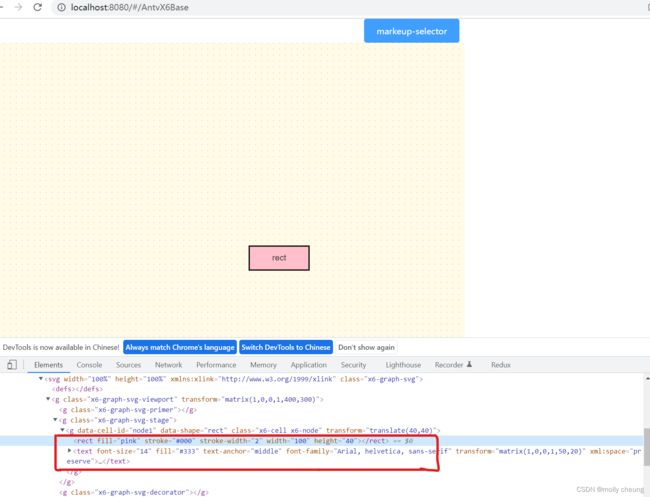
selector:SVG/HTML 元素的唯一标识,通过该唯一标识为该元素指定属性样式。
 // markeup-selector
    testMarkeup() {
      const rect = new Rect({
        id: 'node1',
        x: 40,
        y: 40,
        width: 100,
        height: 40,
        markup: [
          {
            tagName: 'rect', //SVG/HTML 元素标签名
            selector: **'body'**, //用来指定属性样式
          },
          {
            tagName: 'text',
            selector: **'label'**
          }
        ],
        attrs: {
          // 指定 rect 元素的样式
          **body**: {
            stroke: '#000', // 边框颜色
            fill: 'pink' // 填充颜色
          },
          // 指定 text 元素的样式
          **label**: {
            text: 'rect', // 文字
            fill: '#333' // 文字颜色
          },
        }
      })
      this.graph.addNode(rect)
    }
groupSelector:群组选择器,通过群组选择器可以为该群组对应的多个元素指定样式。
{
  markup: [
    {
      tagName: 'rect',
      selector: 'body',
      groupSelector: 'group1',
    },
    {
      tagName: 'rect',
      selector: 'wrap',
      groupSelector: 'group1',
    },
    {
      tagName: 'text',
      selector: 'label',
    },
  ],
}
new SomeNode({
  attrs: {
    group1: {
      fill: '#2ECC71',
    },
  },
})
attrs:该 SVG/HTML 元素的默认属性键值对,用于定义通用属性。
style:该 SVG/HTML 元素的行内样式键值对。
className:该 SVG/HTML 元素的 CSS 样式名。
textContent:该 SVG/HTML 元素的文本内容。
children:嵌套的子元素。
四、Shape的基础选项详解——shape
节点/边的图形,类似 MVC 模式中的 Model,决定了节点/边的数据逻辑,
内置节点
| 构造函数 | shape 名称 | 描述 |
|---|---|---|
| Shape.Rect | rect | 矩形 |
| Shape.Circle | circle | 圆形 |
| Shape.Ellipse | ellipse | 椭圆 |
| Shape.Polygon | polygon | 多边形 |
| Shape.Polyline | polyline | 折线 |
| Shape.Path | path | 路径 |
| Shape.Image | image | 图片 |
| Shape.HTML | html | HTML 节点,使用 foreignObject 渲染 HTML 片段 |
| Shape.TextBlock | text-block | 文本节点,使用 foreignObject 渲染文本 |
| Shape.BorderedImage | image-bordered | 带边框的图片 |
| Shape.EmbeddedImage | image-embedded | 内嵌入矩形的图片 |
| Shape.InscribedImage | image-inscribed | 内嵌入椭圆的图片 |
| Shape.Cylinder | cylinder | 圆柱 |
内置边
| 构造函数 | shape名称 | 描 |
|---|---|---|
| Shape.Edge | edge | 边 |
| Shape.DoubleEdge | double-edge | 双线边 |
| Shape.ShadowEdge | shadow-edge | 阴影边 |
五、Shape的基础选项详解——其他
id
id 是节点/边的唯一标识,推荐使用具备业务意义的 ID,默认使用自动生成的 UUID。
attrs
attrs 选项定制节点样式,这是一个复杂对象。
该对象的 Key 是节点中 SVG 元素的选择器(Selector),对应的值是应用到该 SVG 元素的 SVG 属性值(如 fill 和 stroke)。
选择器(Selector)通过节点的 markup 确定,如上面Selector图解中Rect 节点定义了 ‘body’(代表 元素) 和 ‘label’(代表 元素) 两个选择器。
① 使用 CSS 选择器来指定节点样式:
(使用 CSS 选择器时需要注意,指定的 CSS 选择器可能选中多个元素,这时对应的属性样式将同时应用到多个元素上)
const rect = new Shape.Rect({
  x: 40,
  y: 40,
  width: 100,
  height: 40,
  attrs: {
    rect: { // 使用 rect css 选择器替代预定义的 body 选择器
      fill: '#2ECC71',
      stroke: '#000',
    },
    text: { // 使用 text css 选择器替代预定义的 label 选择器
      text: 'rect',
      fill: '#333',
      fontSize: 13,
    },
  },
})
支持使用小驼峰(camelCase)格式的属性名,如 ‘fontSize’,这就避免了 ‘font-size’ 这种属性名作为对象 Key 时需要加引号的书写麻烦。
② 除了标准的 SVG 属性,在 X6 中还定义了一系列特殊属性,还可以使用 CSS 来定制样式,节点和边渲染到画布后分别有 ‘x6-node’ 和 ‘x6-edge’ 两个样式名
// markeup
    testMarkeup() {
      const rect = new Rect({
        id: 'node1',
        x: 40,
        y: 40,
        width: 100,
        height: 40,
        markup: [
          {
            tagName: 'rect', //SVG/HTML 元素标签名
            selector: 'body', //用来指定属性样式,
          },
          {
            tagName: 'text',
            selector: 'label'
          }
        ],
        attrs: {
          label: {
            text: 'rect', // 文字
            fill: '#333' // 文字颜色
          }
        }
      })
      this.graph.addNode(rect)
    }
。。。
<style scoped>
/deep/ .x6-node rect {
  fill: #2ecc71;
  stroke: #000;
}
</style>
③ 调用实例上的 attr() 方法来修改节点属性样式。
rect.attr('label/text', 'hello')

// 等同于
rect.attr('label', {
  text: 'hello'
})

// 等同于
rect.attr({
  label: {
    text: 'hello'
  }
})
当传入的属性值为 null 时可以移除该属性
rect.attr('label/text', null)
view
指定渲染节点/边所使用的视图,视图的概念与 MVC 模式中的 View 一致
zIndex
节点/边在画布中的层级,默认根据节点/边添加顺序自动确定。节点/边渲染到画布后可以通过 cell.getZIndex() 和 cell.setZIndex(z: number) 来获取或设置 zIndex 的值,也可以调用 cell.toFront() 和 cell.toBack() 来将其移到最顶层或对底层
visible
节点/边是否可见。
parent
父节点 ID。
children
子节点/边的 ID 数组。
data
与节点/边关联的业务数据。
const rect = new Shape.Rect({
  x: 40,
  y: 40,
  width: 100,
  height: 40,
  data: {
    bizID: 125,
    date: '20200630',
    price: 89.00,
  }
})
六、选项默认值
Shape.Rect.config({
  width: 80,
  height: 40,
  markup: [
    {
      tagName: 'rect',
      selector: 'body',
    },
    {
      tagName: 'text',
      selector: 'label',
    },
  ],
  attrs: {
    body: {
      fill: '#fff',
      stroke: '#000',
      strokeWidth: 2,
    },
    label: {
      fontSize: 14,
      fill: '#333',
      fontFamily: 'Arial, helvetica, sans-serif',
      textAnchor: 'middle',
      textVerticalAnchor: 'middle',
    }
  },
})
默认选项可以简化我们添加节点的代码,例如,只需要指定矩形节点的位置和文本就可以添加一个矩形到画布。
const rect = graph.addNode({
  x: 100,
  y: 100,
  attrs: {
    label: {
      text: 'rect',
    },
  },
})
每次调用 config(options) 都是与当前预设值进行深度 merge,例如下面代码分别将矩形的边框默认颜色修改为红色和将默认文本颜色修改为蓝色,最终效果是两者的叠加。
// 只修改边框的默认颜色
Shape.Rect.config({
  attrs: {
    body: {
      stroke: 'red',
    },
  },
})

// 只修改默认文本颜色
Shape.Rect.config({
  attrs: {
    label: {
      fill: 'blue',
      // 覆盖上面定义的 red
      stroke: '#000',
    },
  },
})
七、自定义选项
使用了 label 选项来设置矩形的标签文本
const rect = graph.addNode({
  x: 100,
  y: 100,
  label: 'rect',
})
只是在定义矩形时通过定义 propHooks 钩子来消费自定义选项,看下面 label 选项钩子的实现细节。
Shape.Rect.config({
  // 通过钩子将 label 应用到 'attrs/text/text' 属性上
  propHooks(metadata) {
    const { label, ...others } = metadata
    if (label) {
      ObjectExt.setByPath(others, 'attrs/text/text', label)
    }
    return others
  },
})
通过 propHooks 钩子,我们很容易就扩展出一些自定义的选项。例如,我们可以将某些样式定义为节点的选项,这样不仅可以减少嵌套,而且使创建节点的代码语义性更强。
看下面的代码,为矩形定义 rx 和 ry 自定义选项。
Shape.Rect.config({
  propHooks: {
    rx(metadata) {
      const { rx, ...others } = metadata
      if (rx != null) {
        ObjectExt.setByPath(others, 'attrs/body/rx', rx)
      }
      return others
    },
    ry(metadata) {
      const { ry, ...others } = metadata
      if (ry != null) {
        ObjectExt.setByPath(others, 'attrs/body/ry', ry)
      }
      return others
    },
  },
})
这样,我们就可以很方便添加圆角矩形。
const rect = graph.addNode({
  x: 100,
  y: 100,
  rx: 5,
  ry: 10,
  label: 'rect',
})