IFrame自适应内容高度
关键点:
1. 加载页面时计算iFrame的高度。
2. 当网页尺寸发生变化时,重新计算IFrame高度。
代码如下:
其中使用到了Bootstrap样式,可自行到Bootstrap官网下载。
<html>
<head>
    <meta charset="utf-8">
    <title>Bootstrap 实例 - 徽章(Badges)title>
    <link rel="stylesheet" href="../dist/css/bootstrap.min.css">
    <script src="../jquery/jquery-1.12.0.min.js">script>
    <script src="../dist/js/bootstrap.min.js">script>
head>
<body>

<div id="main_breadcrumb">
<ol class="breadcrumb">
    <li><a href="#">Homea>li>
    <li><a href="#">2013a>li>
    <li class="active">十一月li>
ol>
div>

<body>
    <div style="width: 100%">

        <div id="main-Container">
            <div id="sidebar" class="col-md-2 column">

                <div class="col-md-12">
                    <a href="#">Mailbox <span class="badge" style="background-color:red">Newspan>a>
                    <ul id="main-nav" class="nav nav-tabs nav-stacked" style="">
                    <li>
                        <a href="#systemSetting" class="nav-header collapsed" data-toggle="collapse">
                            <i class="glyphicon glyphicon-cog">i>index
                            <span class="pull-right glyphicon glyphicon-chevron-down">span>
                        a>

                        <ul id="systemSetting" class="nav nav-list collapse secondmenu" style="height: 0px;">
                            <li><a href="#" onclick="menuClick('${base}toViewInfo?id=${s.id}')"><i class="glyphicon glyphicon-user">i>aaaa>li>
                            <li><a href="#" onclick="menuClick('${base}toTestList')"><i class="glyphicon glyphicon-th-list">i>bbba>li>
                        ul>
                    li>
                    <li>
                        <a href="#systemSetting1" class="nav-header collapsed" data-toggle="collapse">
                            <i class="glyphicon glyphicon-cog">i>index1
                            <span class="pull-right glyphicon glyphicon-chevron-down">span>
                        a>
                        <ul id="systemSetting1" class="nav nav-list collapse secondmenu" style="height: 0px;">
                            <li><a href="#"><i class="glyphicon glyphicon-asterisk">i>ccca>li>
                            <li><a href="#"><i class="glyphicon glyphicon-edit">i>ddda>li>
                            <li><a href="#"><i class="glyphicon glyphicon-eye-open">i>eeea>li>
                        ul>
                    li>
                    ul>
                div>
            div>


            <div class="col-md-10 column" id="main_content">

                <div id="sub_breadcrumb">
                <ol class="breadcrumb">
                    <li><a href="#">Homea>li>
                    <li><a href="#">2013a>li>
                    <li class="active">十一月li>
                ol>
                div>


                <iframe id="iframepage" src="test_content.html" frameborder="0" scrolling="yes" style="border:0px; width:100%;" onload="changeFrameHeight()">iframe>

            div>
        div>
    div>

<script type="text/javascript">
function changeFrameHeight(){
    var ifm=document.getElementById("iframepage");
    ifm.height=document.documentElement.clientHeight-ifm.offsetTop-document.getElementById("main_breadcrumb").offsetHeight
-document.getElementById("sub_breadcrumb").offsetHeight;
//-document.getElementById("main_content").offsetHeight;
}
window.onresize=function(){
    changeFrameHeight();
}
script>
body>
html>
页面高度计算参考资料
感谢杯中水提供的素材
说明如下:
IE中:
document.body.clientWidth ==> BODY对象宽度
document.body.clientHeight ==> BODY对象高度
document.documentElement.clientWidth ==> 可见区域宽度
document.documentElement.clientHeight ==> 可见区域高度
FireFox中:
document.body.clientWidth ==> BODY对象宽度
document.body.clientHeight ==> BODY对象高度
document.documentElement.clientWidth ==> 可见区域宽度
document.documentElement.clientHeight ==> 可见区域高度
Opera中:
document.body.clientWidth ==> 可见区域宽度
document.body.clientHeight ==> 可见区域高度
document.documentElement.clientWidth ==> 页面对象宽度(即BODY对象宽度加上Margin宽)
document.documentElement.clientHeight ==> 页面对象高度(即BODY对象高度加上Margin高)
没有定义W3C的标准,则
IE为:
document.documentElement.clientWidth ==> 0
document.documentElement.clientHeight ==> 0
FireFox为:
document.documentElement.clientWidth ==> 页面对象宽度(即BODY对象宽度加上Margin宽)
document.documentElement.clientHeight ==> 页面对象高度(即BODY对象高度加上Margin高)
Opera为:
document.documentElement.clientWidth ==> 页面对象宽度(即BODY对象宽度加上Margin宽)
document.documentElement.clientHeight ==> 页面对象高度(即BODY对象高度加上Margin高)
网页可见区域宽: document.body.clientWidth
网页可见区域高: document.body.clientHeight
网页可见区域宽: document.body.offsetWidth (包括边线的宽)
网页可见区域高: document.body.offsetHeight (包括边线的高)
网页正文全文宽: document.body.scrollWidth
网页正文全文高: document.body.scrollHeight
网页被卷去的高: document.body.scrollTop
网页被卷去的左: document.body.scrollLeft
网页正文部分上: window.screenTop
网页正文部分左: window.screenLeft
屏幕分辨率的高: window.screen.height
屏幕分辨率的宽: window.screen.width
屏幕可用工作区高度: window.screen.availHeight
屏幕可用工作区宽度: window.screen.availWidth
(注意:CSS中的margin属性,与clientWidth、offsetWidth、clientHeight、offsetHeight均无关)
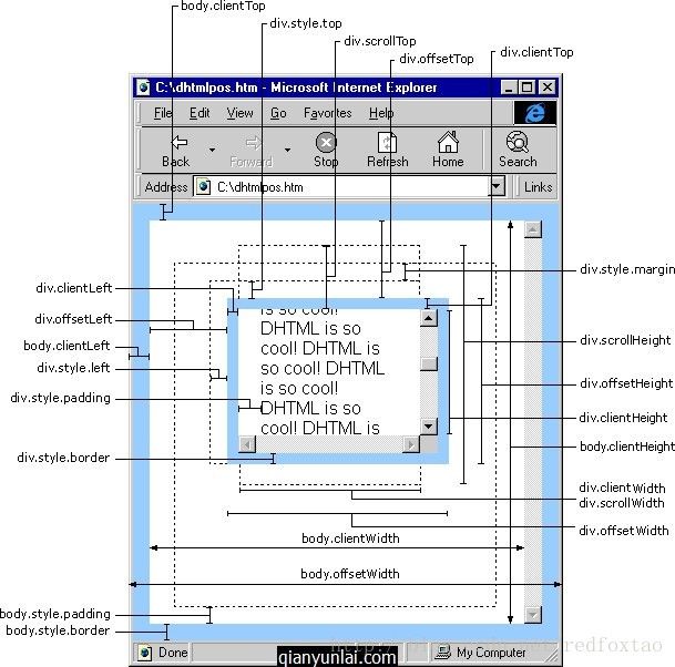
HTML精确定位:scrollLeft、scrollWidth、clientWidth、offsetWidth
scrollWidth ==> 获取对象的滚动宽度
scrollHeight ==> 获取对象的滚动高度
scrollLeft ==> 设置或获取位于对象左边界和窗口中目前可见内容的最左端之间的距离(被卷去的左)
scrollTop ==> 设置或获取位于对象最顶端和窗口中可见内容的最顶端之间的距离(被卷去的高)
offsetLeft ==> 获取对象相对于版面或由 offsetParent 属性指定的父坐标的计算左侧位置
offsetTop ==> 获取对象相对于版面或由 offsetTop 属性指定的父坐标的计算顶端位置
offsetHeight ==> 获取对象相对于版面或由父坐标 offsetParent 属性指定的父坐标的高度
event.clientX ==> 相对文档的水平座标
event.clientY ==> 相对文档的垂直座标
event.offsetX ==> 相对容器的水平坐标
event.offsetY ==> 相对容器的垂直坐标
document.documentElement.scrollTop ==> 垂直方向滚动的值
event.clientX+document.documentElement.scrollTop ==> 相对文档的水平座标+垂直方向滚动的量