前段CSS3---狂神说Java学习笔记
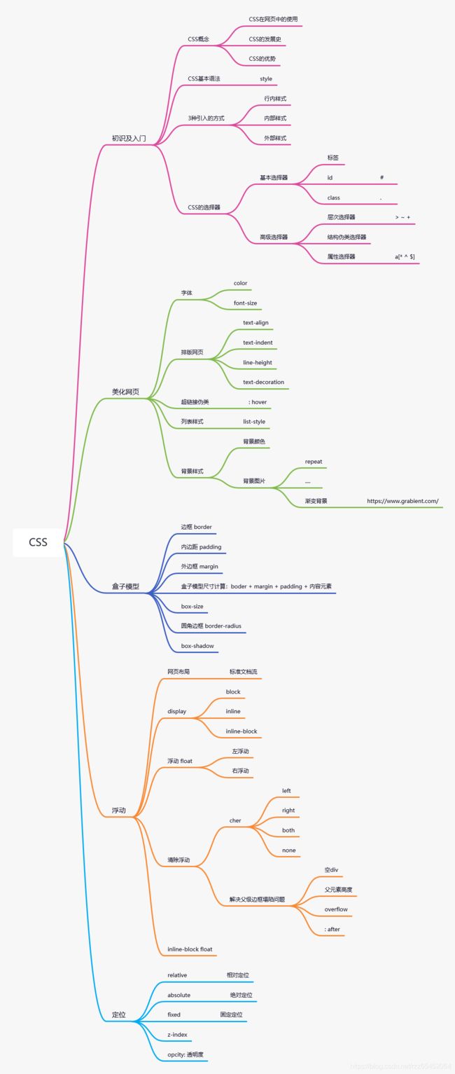
Css3详解
狂神说Java(CSS3)学习网址
| 编译 | 归类 | |
|---|---|---|
| style | 风格 | css |
| index | 索引 | css |
| link | 连接 | css |
| import | 进口 | css |
| image | 形象 | css |
| .class | 调用class选择器 | 选择器 |
| #id | 调用id选择器 | 选择器 |
| body p{} | 后代选择器 | 选择器 |
| body>p{} | 子选择器 | 选择器 |
| .active + p{} | 相邻兄弟选择器 | 选择器 |
| .active ~ p{} | 通用兄弟选择器 | 选择器 |
| ul li:first-child{} | 第一个子元素 | 结构-伪类选择器 |
| ul li:last-child{} | 最后一个子元素 | 结构-伪类选择器 |
| p:nth-child(1){} | 第一个是p的元素 | 结构-伪类选择器 |
| p:nth-of-type(2){} | 第二个所有元素 | 结构-伪类选择器 |
| a[id=first]{} | = 绝对等于 | 属性选择器 |
| a[class*=“links”]{} | *= 包含这个元素 | 属性选择器 |
| a[href^=http]{} | ^= 以这个开头 | 属性选择器 |
| a[href$=pdf]{} | $= 以这个结尾 | 属性选择器 |
| span | 持续时间(重点要突出的字) | 美化 |
| font | 字体 | 美化 |
| family | 家庭(字体种类) | font- |
| weight | 重量,加重 | font- |
| bold | 加重,粗体 | weight: |
| text- | 文本 | 美化 |
| align | 排列 | text- |
| center | 居中 | |
| indent | 缩进 | text- |
| decoration | 装饰 | text- |
| underline | 下 | |
| over | 上 | |
| shadow | 阴影 | text- |
| line | 线,行 | 美化 |
| height | 高度 | line- |
| vertical | 垂直 | |
| align | 排列 | vertical- |
| middle | 中间 | |
| hover | 悬停 | a: 鼠标 |
| active | 积极,未释放 | a: 鼠标 |
| list | 列表 | 美化 |
| style | 风格 | list- |
| width | 宽度 | 美化 |
| height | 高度 | 美化 |
| background | 背景 | 美化 |
| repeat | 重复 | background- |
| linear | 线性的 | 渐变 |
| gradient | 梯度,斜坡 | linear- |
| margin | 外边框 | 盒子 |
| paddiong | 内边框 | 盒子 |
| border | 边境,边框 | 盒子 |
| solid | 固体,实线 | border |
| dashed | 虚线 | border |
| 0 auto | 上下为0,左右相等 | border |
| display | 显示 | 显示 |
| block | 块元素 | display |
| inline | 行内元素 | display |
| inline-block | 有原有元素,又有另外一种 | display |
| float | 浮动 | 浮动 |
| clear | 清楚,不允许有浮动 | 浮动 |
| overflow | 溢流 | 浮动 |
| hidden | 隐藏,多余的隐藏 | overflow |
| auto | 滚动条 | overflow |
| after | 防止浮动移动伪类 | 浮动 |
| position | 定位 | 定位 |
| relative | 相对定位 | position |
| absolute | 绝对定位 | position |
| fixed | 固定定位 | position |
| z-index | 图层 | position |
| opacity | 透明度 | position |
- Styles
- CSS是什么
- CSS怎么用(快速入门)
- CSS选择器(重点+难点)
- 美化网页(文字,阴影,超链接,列表,渐变…)
- 盒子模型
- 浮动
- 定位
- 网页动画(特效效果)
学习网站:runoob.com
1、什么是CSS
Cascading Style Sheel 层叠级联样式表
CSS:表明(美化网页)
字体,颜色,边距,高度,背景图片,网页定位,网页浮动…
发展史:
CSS1.0
CSS2.0 DIV(块) + CSS,HTML 与 CSS 结构分离的思想,网页变得简单,SEO
CSS2.1 浮动,定位
CSS3.0 圆角,阴影,动画… 浏览器兼容性~
1.1、CSS快速入门
style
创建文件规范格式
- lesson01
- 1.我的第一个css程序
- CSS文件
- style.css
- index.html
- CSS文件
- 1.我的第一个css程序
<html lang="en">
<head>
    <meta charset="UTF-8">
    <title>Titletitle>

    <style>
        h1{
        color: red;
        }
    style>

head>
<body>
<h1>我是标题h1>
body>
html>
<html lang="en">
<head>
    <meta charset="UTF-8">
    <title>Titletitle>

    <link rel="stylesheet" href="css/style01.css">

head>
<body>
<h1>我是标题h1>
body>
html>
 /*建议单独建立css文件
	这样即美观,也有助于查找,修改,复用
        */
h1{
        color: red;
        }
css的优势:
- 内容和表现分离
- 网页结构表现统一,可以实现复用
- 样式十分的丰富
- 建议使用独立于html的css文件
- 利用SEO,容易被搜索引擎收录!(Vue不容易被收录)
1.2、CSS的三种导入方式
- 行内样式
- 内部样式
- 外部样式
<html lang="en">
<head>
    <meta charset="UTF-8">
    <title>Titletitle>

    <style>
        h1{
        color:green;
        }
    style>

    <link rel="stylesheet" href="css/style.css">

head>
<body>


<h1 style="color:red">我是标题h1>
body>
html>
扩展:外部样式两种写法
-
链接式:
<link rel="stylesheet" href="css/style.css"> -
导入式:
@import 是CSS2.1 特有的!
<style>
    @import url("css/style.css");
style>
优先级
就近原则
2、选择器
作用:选择页面上的某一个或者某一类元素
2.1、基本选择器
2.1.1、标签选择器
选择一类标签 标签{}
<html lang="en">
<head>
    <meta charset="UTF-8">
    <title>Titletitle>
    <style>
    /* 标签选择器,会选择到页面上所有的这个标签的元素*/
        h1{
        color: red;
        background: #3cbda6;
        border-radius: 24px;
        }
        p{
        font-size: 60px;
        }
    style>
head>
<body>
<h1>学Javah1>

<p>听狂神说p>

body>
html>
2.1.2、类选择器 class
选择所有class 属性一致的标签,可以跨标签 .类名{}
<html lang="en">
<head>
    <meta charset="UTF-8">
    <title>类选择器title>
    <style>
    /*类选择器的格式 .class的名字{}
        好处,可以多个标题归类,是同一个class,可以复用
    */
        .T1{
        color:red;
        }
        .T2{
        color:yellow;
        }
    style>
head>
<body>
<h1 class="T1">标题1h1>
<h1 class="T2">标题2h1>
<h1 class="T1">标题3h1>

<p class="T2">P标签p>
body>
html>
2.1.3、id 选择器
全局唯一! #id名字{}
<html lang="en">
<head>
    <meta charset="UTF-8">
    <title>ID选择器title>
    <style>
    /*id选择器 :id必须保证全局唯一!
    #id名字{}
    优先级:
    不遵循就近原则,固定的
    id选择器 > class选择器 > 标签选择器
    */
        h1{
        color:red;
        }
        .c2{
        color:blue;
        }
        #i3{
        color:green
        }
    style>
head>
<body>
<h1 class="c2" id="i3">标题1h1>
<h1 class="c2">标题2h1>
<h1>标题3h1>
<h1>标题4h1>
<h1>标题5h1>
body>
html>
优先级
id选择器 > class选择器 > 标签选择器
不遵循就近原则,固定的
2.2、层次选择器
2.2.1、后代选择器
在某个元素的后面,祖爷爷 爷爷 爸爸 儿子
/*后代选择器*/
body p{
color:blue;
}
2.2.2、子选择器
一代,只指儿子
/*子选择器*/
body>p{
color:yellow;
}
2.2.3、相邻兄弟选择器
同辈,只有一个,相邻(向下)
/*相邻兄弟选择器*/
.active + p{
color:green;
}
2.2.4、通用兄弟选择器
同辈,向下所有,选中元素的向下所有兄弟元素
/*通用兄弟选择器*/
.active~p{
color:orange;
}
2.3、结构-伪类选择器
伪类-条
/*ul的第一个子元素*/
ul li:first-child{
color:blue;
}
/*ul的最后一个子元素*/
ul li:last-child{
color:green;
}
/*选择 p1:定位到父元素,选择当前的第一个元素
选择当前p元素的父级元素,选中父级元素的第一个,并且是当前元素才生效!顺序
*/
p:nth-child(1){
color:red
}
/*定位到父元素,下的p元素的第二个,类型        */
p:nth-of-type(2){
color:yellow;
}
a:hover{background:black}
2.4、属性选择器(常用)
id+class 结合
/* 存在id属性的元素 a[]{} */
a[id]{
background:yellow;
}
= 绝对等于
/*id=first的元素*/
 a[id=first]{
 background:yellow;
 }
*= 包含这个元素
/*class 中有 links的元素*/
a[class*="links"]{
background:green;
}
^= 以这个开头
/*选中href中以http开头的元素*/
a[href^=http]{
background:green;
}
$= 以这个结尾
/*选中href中以pdf结尾的元素*/
a[href$=pdf]{
background:green;
}
3、美化网页元素
3.1、为什么要美化网页
- 有效的传递页面信息
- 美化网页,页面漂亮,才能吸引用户
- 凸显页面的主题
- 提高用户的体验
span标签:重点要突出的字,使用span套起来(只是普通标签,但常用span)
span
欢迎学习"title1">java
3.2、字体样式
font-family:字体可以同时设定英文和汉字两个字体
font-size: 字体的大小,px像素(Pixel),em相对长度尺寸
font-weight:字体粗细
color:字体颜色
可是直接使用font值,字体粗细,大小,行高,字体
font:bold 20px/50px Arial;
3.3、文本样式
- 颜色 :color rgb rgba
- 文本对齐的方式 :text-align:center
- 首行缩进 :text-indent
- 行高 :line-height 单行文字上下居中!line-height = height
- 装饰 :text-decoration
- 文本图片水平对齐 :vertical-align:middle
coloer:颜色
/*
颜色:
单词
RGB: #0~F(6位)
RGBA: A(0~1)代表透明度
*/
3.5、列表
/*list-style
none 去掉原点
circle 空心圆
decimal 数字
square 正方形
*/
	ul li{
    	height:30px
        list-style:none;
        text-indent:1em;
	}
3.6、背景
背景颜色
背景图片
练习
[外链图片转存失败,源站可能有防盗链机制,建议将图片保存下来直接上传(img-zX7f1VK4-1619445897092)(D:\狂神\422.png)]
html
<html lang="en">
<head>
    <meta charset="UTF-8">
    <title>列表title>
    <link rel="stylesheet" href="css/style.css">
head>
<body>

<div id="nav">
    <h2 class="title">全部商品分类h2>
    <ul>
        <li><a href="#">图书a>  <a href="#">音像a>  <a href="#">数字商品a>li>
        <li><a href="#">家用电器a>  <a href="#">手机a>  <a href="#">数码a>li>
        <li><a href="#">电脑a>  <a href="#">办公a>li>
        <li><a href="#">家居a>  <a href="#">家装a>  <a href="#">厨具a>li>
        <li><a href="#">服饰鞋帽a>  <a href="#">个护化妆a>li>
        <li><a href="#">礼品箱包a>  <a href="#">钟表a>  <a href="#">珠宝a>li>
        <li><a href="#">食品饮料a>  <a href="#">保健食品a>li>
        <li><a href="#">彩票a>  <a href="#">旅游a>  <a href="#">充值a>  <a href="#">票务a>li>
    ul>
div>
body>
html>
style
#nav{
    width:230px;
    background:yellow;
}
.title{
    font-size:20px;
    text-indent:1em;
    line-height:30px;
    background:red;
    /*颜色,图片,图片位置,平铺方式*/
    background:red url("../images/d.gif") 250px 10px no-repeat;
}
ul{
background:yellow;
}
ul li{
    list-style:none;
    text-indent:1em;
    line-height:30px;
    background-image:url("../images/r.gif");
    background-repeat:no-repeat;
    background-position:210px 2px;
}
a{
color:black;
font-size:14px;
text-decoration:none;
}
a:hover{
    color:orange;
    text-decoration:underline;
}
3.7、渐变
Grabient.com
逐渐改变颜色,主要分两种
- 径向渐变
- 圆形渐变
background-color:#FFFFFF;
background-image:linear-gradient(115deg,#FFFFFF 0%,#6284FF 50%,#FF0000 100%)
4、盒子模型
4.1、什么是盒子模型
margin: 外边距
paddiong: 内边距
border: 边距
4.2、边框
border:4px solid red;
- 边框的粗细
- 边框的样式
- 边框的颜色
<html lang="en">
<head>
    <meta charset="UTF-8">
    <title>盒子模型title>
    <style>
        /*body 总有一个默认的外边距,gin:0*/
        h2,ul,li,a,body{
        margin:0;   /*外边距,四个方向全部为0*/
        padding:0;  /*内边距,四个方向全部为0*/
        text-decoration:none;   /*下划线*/
        }
        #box{   /*宽,高*/
        width:300px;

        /*边框:粗细,实虚线,颜色*/
        border:4px solid red;
        }
        h2{
        font-size:22px;
        background:orange;
        color:white;
        line-height:70px;

        }
        form{
            background:orange;
        }
        /*大div下的小div,第一个input类型*/
       div div:nth-of-type(1) input{
            border:3px solid black;
        }
        div div:nth-of-type(2) input{
            border:3px dashed green;
        }
        div div:nth-of-type(3) input{
            border:3px solid black;
        }
    style>
head>
<body>
<div id="box">
    <h2>会员登录h2>
    <form action="#">
        <div class="y1">
            <span>用户名:span>
            <input type="text">
        div>
        <div>
            <span>密码:span>
            <input type="text">
        div>
        <div>
            <span>邮件:span>
            <input type="text">
        div>
    form>
div>
body>
html>
4.3、内外边距
外边距的妙用:居中元素
margin:0 auto; :上下为0,左右相等
margin:0; :所有边距为零
margin:0 1; :上下和左右
margin:0 1 2 3; :上 右 下 左
margin 属性的方向是由顺时针旋转,margin、border、paddiong一样
*盒子尺寸技术方式
你这个元素到底多大?
应该是:margin + border + padding + 内容宽度
不要应为制作 margin 最后导致原尺寸元素放不下
4.4、边框圆角
div{
    width:100px;
    height:100px;
    border:10px solid red;
    /* 左上 右上 右下 左下 ,顺时针方向*/
    border-radius:55px 55px 55px 55px
    /*两个元素时为:左上右下,右下左上*/
}
4.5、盒子阴影
div{
width:100px;
height:100px;
border:10px solid red;
    /*右 下 模糊度 颜色*/
box-shadow:10px 10px 80px yellow;
}
5、浮动
5.1、标准文件流
标准的文件流是自上而下,没有左右,类似于手机界面
块级元素:独占一行
h1~h6 p div 列表…
行内元素:不独占一行
span a img strong…
行内元素可以被包含在 块级元素中,反之,则不可以~
5.2、display
修改块行状态
/*  display 显示
    block 块元素
    inline 行内元素
    inline-block 即保持原有元素,还添加另外一种元素
	none	不是块元素,也不是行内元素,会消失不见,但代码存在。
*/
    div{
    width:100px;
    height:100px;
    border:1px solid red;
    display:inline-block;
    }
    span{
    width:100px;
    height:100px;
    border:1px solid red;
    display:inline-block;
    }
这个也是一种实现行内元素排列的方式,但是我们很多情况都是用 float
5.3、float
- 左右浮动 float
将图片浮起,移动。但是浮起的图片会挤开其他元素块,同时会跟随网页移动!!
float:left;
float:right;
5.4、父级边框塌陷的问题
5.4.1、防止浮动移动
clear:right; 右侧不允许有浮动元素
clear:left; 左侧不允许有浮动元素
clear:both; 两侧不允许有浮动元素
clear:none;
5.4.2、解决方案
1、增加父级元素的高度
#father{
border:1px #000 solid;
height:800px;
}
2、增加一个空的div标签,清除浮动
/*新建一个div*/

.clear{
	clear:both;
	margin:0;
	padding:0;
}
3、overflow
在父级元素中增加一个 overflow:hidden;
overflow:auto; 滚动条
4、在父类添加一个伪类:after
#father:after{
    content:' ';
    display:block;
    clear:both;
}
5.4.3、小结
-
设置父元素的高度
简单,元素假设有了固定的高度,就会被限制 -
浮动元素后面添加空div
简单,代码中尽量避免空div -
overflow
简单,下拉滚动条的一些场景避免使用 -
在父类添加一个伪类:after
写法稍微复杂,但是没有副作用
5.5、display对比float
-
display
方向不可以控制
-
float
浮动起来的话会脱离标准文档流,所有要解决父级边框塌陷的问题
6、定位
position
6.1、相对定位
<html lang="en">
<head>
    <meta charset="UTF-8">
    <title>相对定位title>
    <style>
        body{
        margin-top: 50px;
        }
        div{
        margin:10px;
        padding:5px;
        font-size:12px;
        line-height:25px;
        }
        #father{
        border:1px solid #666;

        }
        #first{
        background-color:yellow;
        border:1px dashed red;
        position:relative;  /*相对定位*/
        top:-20px;   /*相对于top顶部,距离减少20px*/
        left:50px;  /*相对于left左边,距离增加30px*/
        }
        #second{
        background-color:yellow;
        border:1px dashed green;
        }
        #third{
        background-color:yellow;
        border:1px dashed blue;
        position:relative;
        bottom:10px;    /*相对于下边,距离增加10px*/
        right:20px;
        }
    style>

head>
<body>

<div id="father">
    <div id="first">第一个盒子div>
    <div id="second">第二个盒子div>
    <div id="third">第三个盒子div>

div>

body>
html>
相对定位:position:relative;
相对于原来的位置,进行指定的偏移(+距离增加,-距离缩短)
相对定位的话,它任然在标准文档流中,原来的位置会被保留
top:-20px;
left:50px;
bottom:10px;
right:20px;
练习:方块定位
自己编写:style
/*删除默认尺寸,外边距,内边距,文字下划线*/
a,div,body{
    margin:0;
    padding:0;
    text-decoration:none;
}
div{

}

/*确定大div框架尺寸,宽,高
(计算每个div内块+边线=100,框架尺寸应该为300,但是实际299为正好尺寸)
(可能是相对位置和实际编程尺寸的误差)
(以后研究!!!)
边框:大小,实线,颜色
内边距
*/
#box{
      width:299px;
      height:299px;
      border:3px solid red;
      padding:10px;
}

/*使用id定位大div(box)下的小div块,
小div内尺寸,框内颜色,及文字居中
*/
#box>div{
    width:100px;
    height:100px;
    background-color:pink;
    text-align:center;
}

/*使用id定位大div(box)下的小div块,
鼠标放置变蓝
*/
#box>div:hover{
    background-color:blue;
}

/*确定移动尺寸*/
#l2{
    position:relative;
    top:-100px;
    left:200px;
}
#l4{
    position:relative;
        top:-100px;
        left:200px;
}
#l5{
    position:relative;
        top:-300px;
        left:100px;
}

/*a字体颜色和字体尺寸*/
a{
    color:white;
    font:bold 20px/100px Arial;
}
a:hover{

}
老师编写
<html lang="en">
<head>
    <meta charset="UTF-8">
    <title>Titletitle>
    <style>
        #box{
            width:300px;
            height:300px;
            padding:10px;
            border:2px solid red;
        }
        a{
            width:100px;
            height:100px;
            text-decoration:none;
            background:pink;
            line-height:100px;
            text-align:center;
            color:white;
            display:block;
        }
        a:hover{
            background:blue;
        }
        .l2,.l4{
            position:relative;
            left:200px;
            top:-100px;
        }
        .l5{
            position:relative;
            left:100px;
            top:-300px;
        }
    style>
head>
<body>
<div id="box">

    <div class="l1"><a href="">链接1a>div>
    <div class="l2"><a href="">链接2a>div>
    <div class="l3"><a href="">链接3a>div>
    <div class="l4"><a href="">链接4a>div>
    <div class="l5"><a href="">链接5a>div>
div>
body>
html>
主要区别:
-
老师使用了display修改了a标签元素
宽width,高height,内边距padding,边框border,取消下划线text-decoration,背景颜色background,字体位置高度line-height,字体位置宽度text-align,字体颜色color,相对移动位置position:relative,左边left,顶部top,改变标签元素状态display
-
我使用了div块+a标签
宽width,高height,内边距padding,边框border,取消下划线text-decoration,背景颜色background,字体位置高度line-height,字体位置宽度text-align,字体颜色color,相对移动位置position:relative,左边left,顶部top
我的编写多使用了一个div块,产生了更多行代码,并且更分散,更杂乱。不如使用display更加简洁
6.2、绝对定位
position:absolute
定位:基于xxx定位,上 下 左 右
相对定位后,它原有的位置还存在,边框不会缩小
绝对定位后,它原有的位置不在存在,边框会缩小
- 没有父级元素定位的前提下,它相对于浏览器当前窗口定位
- 假设父级元素存在定位,我们通常会相对于父级元素进行偏移(position:relative;)
- 在父级元素范围内移动
相对于父级或浏览器的位置,进行指定的偏移
绝对定位的话,它不在在标准文档流中,原来的位置不会被保留
#father{
        border:1px solid #666;
		position:relative;	 /*确定父级相对定位*/
        }
        #first{
        background-color:yellow;
        border:1px dashed red;
        position:absolute; 	/*绝对定位偏移*/
        top:-20px;
        left:50px;
        }
6.3、固定定位 fixed
<html lang="en">
<head>
    <meta charset="UTF-8">
    <title>固定定位title>
    <style>
        body{
        height:1000px;
        }
        div:nth-of-type(1){ /*绝对定位:相对于浏览器*/
        width:100px;
        height:100px;
        background:red;
        position:absolute;
        right:0;
        bottom:0;
        }
        div:nth-of-type(2){ /*fixed,固定定位*/
        width:50px;
        height:50px;
        background:yellow;
        position:fixed;
        right:0;
        bottom:0;
        }
    style>
head>
<body>
<div>d1div>
<div>d2div>
body>
html>
6.4、z-index
图层 z-index:默认是0,最高无限~999
只有存在于相对定位和绝对定位的时,只有浮起来才会有层级概念
/*父级元素相对定位*/
#content ul{
    position:relative;
}
/*子级元素绝对定位*/
.tipText,.tipBg{
    position:absolute;
    width:380px;
    height:25px;
    top:216px
}
/*抬高定位层*/
.tipText{
    z-index:999;
}
.tipBg{
    bcakground:black;
    opacity:0.5/*背景透明度*/
    filter:alpha(opacity=50)	/*ie8之前版本的背景透明度*/
}
背景透明度 opacity:0.5;
7、动画
菜鸟教程
源码之家
除非你是专业动画,不如尽量搜索以及成型的代码,不要重复种树
8、总结