tailwind css_使用Tailwind CSS重新创建Google.com
tailwind css
Tailwind CSS is an awesome tool that changes the way we write our HTML and CSS. Tailwind is a "utility-first CSS framework" that I initially wasn't sure about. Our HTML gets pretty busy when using Tailwind, but I've found it's not that bad of a tradeoff.
Tailwind CSS是一个很棒的工具,它可以改变我们编写HTML和CSS的方式。 Tailwind是我最初不确定的“实用程序优先CSS框架”。 使用Tailwind时,我们HTML变得非常繁忙,但是我发现这并不是一个不好的折衷。

The more I have used Tailwind, the more I have liked it. It lets me design my UI quicker than ever before. People say that CSS frameworks will make you not know the underlying CSS. With Tailwind, I believe you need to know your CSS even better to be able to use the utility classes.
我使用Tailwind的次数越多,我越喜欢它。 它使我可以比以往更快地设计UI。 人们说CSS框架会让您不了解底层CSS。 使用Tailwind,我相信您需要更好地了解CSS才能使用实用程序类。
Let's recreate something with Tailwind so that we can practice.
让我们用Tailwind重新创建一些东西,以便我们进行练习。
我们将建立什么 ( What We'll Build )
I've found some things around the web to rebuild with Tailwind. For this article, we'll build Google's home page at google.com. Let's get started!
我在网上发现了一些要用Tailwind重建的东西。 对于本文,我们将在google.com上构建Google的主页。 让我们开始吧!
We tried building this on a Twitch stream. Check out the stream to see us trying this live!
我们尝试在Twitch流上构建它。 查看信息流,看看我们如何现场直播!

We'll do all of our work inside of CodePen. It's a great place to experiment with HTML/CSS/JavaScript projects.
我们将在CodePen内部进行所有工作。 这是尝试HTML / CSS / JavaScript项目的好地方。
Fork this CodePen to start: https://codepen.io/chrisoncode/pen/mdyoGar
分叉此CodePen以启动: https ://codepen.io/chrisoncode/pen/mdyoGar
Here's the final CodePen:
这是最终的CodePen :
创建标题 ( Creating the Header )
The header contains a left and right section with a couple links in each. We'll use CSS flexbox and the justify-content property to make the left and right sections.
页眉包含一个左右部分,每个部分中都有几个链接。 我们将使用CSS flexbox和justify-content属性创建左右部分。
Here's the HTML for our header. Place this in the html section of our CodePen.
这是我们标头HTML。 将此放置在我们的CodePen的html部分中。
< div class = " flex justify-between text-sm text-gray-700 " >
    < div >
        left side of nav

    < div >
        right side of nav
Here are the Tailwind classes we're using:
这是我们正在使用的Tailwind类:
flex: Set display to be flex so that children divs will sit next to each otherflex:将显示设置为flex,以便子div相邻放置justify-between: Use justify-content to set children divs to the left and rightjustify-between:使用justify-content将子div设置为左右text-sm: Smaller font sizetext-sm:较小的字体text-gray-700: Text color is a little lighter than blacktext-gray-700:文本颜色比黑色略浅
Now we can add the links and style those:
现在,我们可以添加链接并设置其样式:
< div class = " flex justify-between text-sm text-gray-700 " >
  < div class = " flex items-center " >
    < a class = " block p-3 " > About
    < a class = " block p-3 " > Store


  < div class = " flex items-center " >
    < a class = " block p-3 " > Gmail
    < a class = " block p-3 " > Images
    < img class = " rounded-full block py-3 px-4 " src = " https://lh3.googleusercontent.com/-qKDxtPVf3MA/AAAAAAAAAAI/AAAAAAAAAAA/ACHi3rdxXjFhEvxN4q1JUHeo4xlUIanULA.CMID/s64-c/photo.jpg " >
We've styled our left and right navigation items and the links. We've also added an image for the avatar.
我们已经设置了左右导航项和链接的样式。 我们还为头像添加了图像。
https://i.imgur.com/ES1qCCS.png\]\(https://i.imgur.com/ES1qCCS.png\)
https://i.imgur.com/ES1qCCS.png \] \(https://i.imgur.com/ES1qCCS.png \)
创建主要部分 ( Creating the Main Section )
The main section consists of a logo, an input box, and two buttons. Here's the HTML for this including the Google logo image.
主要部分包括徽标,输入框和两个按钮。 这是包含Google徽标图片HTML。
< div >
< div >
< img src = " https://www.google.com/images/branding/googlelogo/2x/googlelogo_color_272x92dp.png " >
< div >
< div > ️
< input type = " text " >
< div >
< div >
< button > Google Search
< button > I'm Feeling Lucky
Now that we have the HTML ready. We can add the styling with our Tailwind classes.
现在我们已经准备好了HTML。 我们可以在Tailwind类中添加样式。
容器 (The Container)
< div class = " flex justify-center pt-20 " >
< div >
< img src = " https://www.google.com/images/branding/googlelogo/2x/googlelogo_color_272x92dp.png " >
< div >
< div > ️
< input type = " text " >
< div >
< div >
< button > Google Search
< button > I'm Feeling Lucky
We've added flex and justify-center to center everything horizontally and given some padding to the top with p-20.
我们添加了flex和justify-center来将所有内容水平justify-center ,并使用p-20在顶部添加了一些填充。
图片 (The Image)
We need to restrict the width of the image and also center it.
我们需要限制图像的宽度并将其居中。
< img class = " w-2/3 ml-auto mr-auto mb-6 " src = " https://www.google.com/images/branding/googlelogo/2x/googlelogo_color_272x92dp.png " >We've used the following classes:
我们使用了以下类:
w-2/3: Set the width to be 66%w-2/3:将宽度设置为66%ml-autoandmr-auto: Setting the margin left and right to auto so we can center the imageml-auto和mr-auto:将左右边距设置为auto以使图像居中mb-6: Adding some margin to the bottom of the image so there is spacing between the image and the search box.mb-6:在图像底部添加一些边距,以便图像和搜索框之间有间距。
搜索框 (The Search Box)
The search box is the interesting part of the entire design. We could style the 搜索框是整个设计中有趣的部分。 我们可以设置 We'll style the div using Tailwind classes for padding, border, rounded corners, and shadows. 我们将使用Tailwind类为div,padding,border,圆角和阴影设置div的样式。 We've also styled the input box to remove the outline. It would be a proper next step to give this input some focus styling for accessibility. 我们还为输入框设置了样式,以删除轮廓。 适当的下一步是为此输入提供一些可访问性的焦点样式。 The last step is to style the buttons. We need to make sure they are aligned to the center of our page. We will also style the buttons to be gray. 最后一步是设置按钮样式。 我们需要确保它们与页面中心对齐。 我们还将按钮样式设置为灰色。 We've also added some hover psuedo classes so that our buttons will get a little darker when they are hovered. 我们还添加了一些悬停伪类,以使我们的按钮悬停时会变暗。 Here's what our entire middle section looks like: 这是我们整个中间部分的样子: The footer will be similar to the header except it will be fixed to the bottom and also have a gray background. 页脚将与页眉相似,除了页脚将固定在底部并且背景为灰色。 To fix it to the bottom we'll use 要将其固定到底部,我们将使用 We are using the same techniques as the header to make our nav items spread to the left and right. 我们使用与标题相同的技术来使我们的导航项左右分散。 We didn't have to write a single line of custom CSS to recreate google.com with Tailwind CSS! 我们无需编写任何行的自定义CSS即可使用Tailwind CSS重新创建google.com ! Hope you enjoyed this tutorial and gained some more knowledge and familiarity with Tailwind. We have a similar tutorial where we rebuilt the Twitter Creation Modal. Check out the tutorial. 希望您喜欢本教程并且对Tailwind有所了解和熟悉。 我们有一个类似的教程,其中我们重建了Twitter Creation Modal。 查看教程。 翻译自: https://scotch.io/tutorials/recreate-googlecom-with-tailwind-css tailwind css or we could style the focus and active. Divs don't bring any styling that we need to override.
样式,也可以设置包含输入的focus和active 。 Divs没有带来我们需要覆盖的任何样式。
< div class = " flex border border-gray-200 rounded-full p-4 shadow text-xl " >
< div > ️
< input type = " text " class = " w-full outline-none px-3 " >
< div >

按钮 (The Buttons)
< div class = " mt-8 text-center " >
< button class = " mr-3 bg-gray-200 border border-gray-300 py-3 px-4 rounded hover:bg-gray-400 hover:border-gray-500 " > Google Search
< button class = " bg-gray-200 border border-gray-300 py-3 px-4 rounded hover:bg-gray-400 hover:border-gray-500 " > I'm Feeling Lucky
bg-gray-200: Gray background bg-gray-200 :灰色背景 border: 1px border all the way around border :1px边框 border-gray-300: Color the border a light gray (a little darker than the background) border-gray-300 :为边框上浅灰色(比背景暗一点) rounded: Give a small border radius for rounded corners rounded :为圆角提供较小的边框半径 py-3 px-4: Give some padding to the button py-3 px-4 :给按钮添加一些填充 hover:bg-gray-400: Darker gray on hover hover:bg-gray-400 :悬停时呈深灰色 hover:border-gray-500: Darker border color on hover. hover:border-gray-500 :悬停时边框颜色变深。 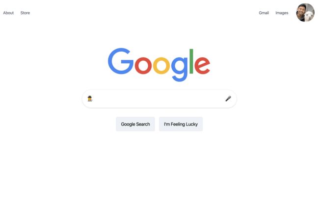
页脚 ( The Footer )
fixed and bottom-0.fixed和bottom-0 。
< div class = " fixed bottom-0 bg-gray-200 border-t w-full flex justify-between text-gray-600 text-xs " >
< div class = " flex " >
< a class = " block p-3 " > Advertising
< a class = " block p-3 " > Business
< a class = " block p-3 " > How Search Works
< div class = " flex " >
< a class = " block p-3 " > Privacy
< a class = " block p-3 " > Terms
< a class = " block p-3 " > Settings
结论 ( Conclusion )