android第一行代码《第三章》UI开发的点点滴滴
知识归纳
- 3.1如何编写程序界面
- 3.2常用控件的使用方法
-
- 3.2.1 TextView
- 3.2.2 Button
- 3.2.3 EditText
- 3.2.4 ImageView
- 3.2.5 PregressBar
- 3.2.6 AlertDialog
- 3.2.7 ProgressDialog
- 3.3 详解四种基本布局
-
- 3.3.1 线性布局
- 3.3.2 相对布局
- 3.3.3 帧布局
- 3.3.4 百分比布局
- 3.4 创建自定义控件
-
- 3.4.1 引入布局
- 3.4.2 创建自定义控件
3.1如何编写程序界面
Android开发中编写界面的方法主要有如下两种:
可视化编辑器
优点:允许拖放控件来编写布局,同时可以在视图上修改控件的属性
缺点:不利于了解界面背后的原理,屏幕适配性不好
XML代码这是用的最多的方式。不仅能够实现高度复杂的控件,还能分析和修改当前现有界面。
3.2常用控件的使用方法
- Android中提供了大量的UI控件,下面我们学习几种比较常用的控件。
3.2.1 TextView
主要作用:
- 在界面上显示一段文本信息。
使用方法:
  <TextView
        android:text="TextView"
        android:layout_width="wrap_content"
        android:layout_height="wrap_content"
        android:id="@+id/textView"
        />
属性说明:
android:id 给当前控件定义一个唯一标识符。
android:layout_width和android:layout_height指定控件的宽度和高度, Android中所有的控件都有这两个属性,值有match_parent、fill_parent和wrap_content。其中:match_parent和fill_parent意义相同(更推荐使用match_parent),表示让当前控件的大小和父布局的大小一样;wrap_content表示让当前控件的大小能够刚好包含住里面的内容。
android:gravity 指定文字的对齐方式,可选值有top、bottom、left、right、center等。可以用 “|” 来同时指定多个值。
android:textSize 指定文字的大小。Android中字体大小使用sp作为单位。
android:textColor 指定文字颜色。
android:text 指定TextView中显示的文本内容。
这里简单的解释了TextView中的几个属性,其它属性等用到的时候自行查阅。
3.2.2 Button
主要作用:
显示一个按钮,与用户进行交互。
Button可配置的属性和TextView差不多。
使用方法:
    <Button
        android:text="Button"
        android:layout_width="wrap_content"
        android:layout_height="wrap_content"
        android:id="@+id/button2"
        android:layout_weight="1"
        android:textAllCaps="false"/>
属性说明:
- 其它属性跟上面说的TextView一样,这里说一个特殊的。
- android:textAllCaps 如果不加这个属性,那么上面设置的文字Button最终显示的却是“BUTTON”,这是因为系统会对Button中的所有英文字母自动进行大写转换,如果不想要这个效果,可以将android:textAllCaps设置为false。
Button注册监听器:
- ----------方法1(定义事件)------------
    public void btn_click(View view)
    {
        // 在此处添加逻辑
    }

- ----------方法2(匿名类)-----------
		Button button = (Button) findViewById(R.id.button2);
        button.setOnClickListener(new View.OnClickListener() {
            @Override
            public void onClick(View v) {
                // 在此处添加逻辑
            }
        });
- ----------方法3(实现接口)-----------
public class FirstActivity extends AppCompatActivity implements View.OnClickListener
{
    @Override
    protected void onCreate(Bundle savedInstanceState) {
        super.onCreate(savedInstanceState);
        setContentView(R.layout.layout);

    }
    @Override
    public void onClick(View v) {
        switch (v.getId())
        {
            case R.id.button2:
                // 在此处添加逻辑
                break;
            default:
                break;
        }
    }
}
3.2.3 EditText
主要作用:
- 用于和用户进行交互,用户可以在控件里面输入和编辑内容,并可以在程序中对这些内容进行处理。
使用方法:
    <EditText
        android:layout_width="wrap_content"
        android:layout_height="wrap_content"
        android:hint="Type something here"
        android:text="Name"
        android:ems="10"
        android:id="@+id/editText"
        android:maxLines="2"
        />
属性说明:
- android:hint 指定一段提示性文本,用户输入后,文本自动消失。
- android:ems指定将对应的控件宽度。当设置该属性后,一行中最大只能显示设置的宽度。(注:当 android:layout_width=“match_parent” 时该属性不会生效)
- android:maxLines 指定EditText的最大行数,当输入的内容超过行数后,文本就会向上滚动。
获取输入框文本:
String inputText = editText.getText().toString();
3.2.4 ImageView
主要作用:
- 用于在界面上展示图片。图片根据分辨率的不同放在不同的drawable或mipmap目录下。
使用方法:
    <ImageView
   	    android:id="@+id/imageView"
        android:layout_width="wrap_content"
        android:layout_height="wrap_content"
        android:src="@mipmap/ic_launcher"  />
属性说明:
- android:src 给ImageView指定一张图片。
代码中指定图片:
ImageView imageView = (ImageView)findViewById(R.id.imageView);
imageView.setImageResource(R.drawable.ww);
3.2.5 PregressBar
主要作用:
- 在界面上显示一个进度条。
使用方法:
     <ProgressBar
        android:id="@+id/progressBar2"
        android:layout_width="wrap_content"
        android:layout_height="wrap_content"
        style="?android:attr/progressBarStyleHorizontal"
        android:visibility="visible"
        android:max="100"
        />
属性说明:
- android:visibility 控制控件是否可见。 visible表示控件可见,默认值。invisible表示控件不可见,但仍占据原来的位置,相当于控件透明。gone表示控件不可见,且不占据原来的位置。
- style 指定控件的形状。
- android:max 给进度条设置一个最大值。
代码中控制控件是否可见:
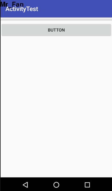
implements View.OnClickListener {
    ProgressBar progressBar;
    @Override
    protected void onCreate(Bundle savedInstanceState) {
        super.onCreate(savedInstanceState);
        setContentView(R.layout.layout);
        Button button = (Button) findViewById(R.id.button3);
         progressBar = (ProgressBar) findViewById(R.id.progressBar2);
        button.setOnClickListener(this);
    }
    @Override
    public void onClick(View v) {
        if(progressBar.getVisibility()==View.GONE)
        {
            progressBar.setVisibility(View.VISIBLE);
        }
        else
        {
            progressBar.setVisibility(View.GONE);
        }
    } }
运行结果:
3.2.6 AlertDialog
主要作用:
- 用于提示一些非常重要的内容或者警告信息。比如为了防止用户误删重要内容,在删除前弹出一个确认对话框。
使用方法:
 AlertDialog.Builder dialog = newAlertDialog.Builder(MainActivity.this);
    dialog.setTitle("This is Dialog");
    dialog.setMessage("Something improtant");
    dialog.setCancelable(false);
    dialog.setPositiveButton("OK", new DialogInterface.OnClickListener() {
        @Override
        public void onClick(DialogInterface dialog, int which) {

        }
    });
    dialog.setNegativeButton("Cancel", new DialogInterface.OnClickListener() {
        @Override
        public void onClick(DialogInterface dialog, int which) {

        }
    });
    dialog.show();
使用说明:
AlertDialog.Builder创建一个AlertDialog实例
setTitle 设置标题
setMessage 设置内容
setCancelable 是否用Back键关闭对话框
setPositiveButton() 设置确认按钮的点击事件
setNegativeButton() 设置取消按钮的点击事件
show() 将dialog显示出来
3.2.7 ProgressDialog
主要作用:
- 跟AlertDialog类似,都能够屏蔽掉其他控件的交互能力。只是ProgressDialog会在对话框中显示一个进度条,一般用于表示当前操作比较耗时,让用户耐心地等待。
使用方法:
   ProgressDialog progressDialog = new ProgressDialog(MainActivity.this);
   progressDialog.setTitle("This is ProgressDialog");
   progressDialog.setMessage("Loding...");
   progressDialog.setCancelable(true);
   progressDialog.show();
使用说明:
- new ProgressDialog 创建一个ProgressDialog对象
- setTitle 设置标题
- setMessage 设置内容
- setCancelable 是否用Back键关闭对话框
- show() 将dialog显示出来
备注:
- 如果在setCancelable()中传入了false,表示ProgressDialog不能通过Back键取消掉,这时需要在代码中做好控制,当数据加载完成后必须调用ProgressDialog的 dismiss() 方法来关闭对话框,否则ProgressDialog将会一直存在。
3.3 详解四种基本布局
布局是一种可以放置多个控件或者布局的容器,可以按照一定的规律调整内部控件或布局的位置,从而来写出精美的界面。
3.3.1 线性布局
LinearLayout称作线性布局,该布局会将它所包含的控件在线性方向(水平或垂直方向)上依次排列。
基本使用:
xmlns:android="http://schemas.android.com/apk/res/android"
    xmlns:app="http://schemas.android.com/apk/res-auto"
    android:orientation="horizontal"
    android:layout_width="match_parent"
    android:layout_height="match_parent">
    <Button
        android:id="@+id/button1"
        android:layout_width="wrap_content"
        android:layout_height="wrap_content"
        android:layout_gravity="top"
        android:text="Button 1"/>

    <Button
        android:id="@+id/button2"
        android:layout_width="wrap_content"
        android:layout_height="wrap_content"
        android:layout_gravity="center_vertical"
        android:text="Button 2"/>

    <Button
        android:id="@+id/button3"
        android:layout_width="wrap_content"
        android:layout_height="wrap_content"
        android:layout_gravity="bottom"
        android:text="Button 3"/>

    <EditText
        android:id="@+id/input_message"
        android:layout_width="0dp"
        android:layout_height="wrap_content"
        android:layout_weight="1"
        android:hint="Type something"/>

    <Button
        android:id="@+id/send"
        android:layout_width="wrap_content"
        android:layout_height="wrap_content"
        android:text="send"/>
属性说明:
android:orientation 指定排列方向,可以是vertical或horizontal。默认的排列方向是horizontal
android:layout_weight 使用比例的方式来指定控件的大小
备注:
如果LinearLayout的排列方向是horizontal,内部的控件宽度就不能指定为match_parent,因为这样的话,单独的一个控件就会将整个水平方向占满,其他的控件就没有可放的位置。同理,如果LinearLayout的排列方向是vertical,内部控件的高度就不能指定为match_parent。
android:layout_gravity用于指定控件在布局中的对齐方式,而android:gravity用于指定文字在控件中的对齐方式。
LinearLayout的排列方式是horizontal时,只有在垂直方向上的对齐方式才会生效,因为此时水平方向上的长度是不固定的,每添加一个控件,水平方向上的长度都会改变,因此无法确定该方向上的对齐方式。同理,当LinearLayout的排列方向是vertical时,只有水平方向上的对齐方式才会生效。
3.3.2 相对布局
RelativeLayout称作相对布局。通过相对定位的方式让控件出现在布局的任何位置。
基本使用:
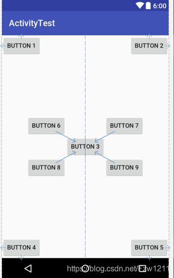
 <RelativeLayout xmlns:android="http://schemas.android.com/apk/res/android"
    xmlns:app="http://schemas.android.com/apk/res-auto"
    android:layout_width="match_parent"
    android:layout_height="match_parent">
    <Button
        android:id="@+id/button1"
        android:layout_width="wrap_content"
        android:layout_height="wrap_content"
        android:layout_alignParentLeft="true"
        android:layout_alignParentTop="true"
        android:text="Button 1"/>

    <Button
        android:id="@+id/button2"
        android:layout_width="wrap_content"
        android:layout_height="wrap_content"
        android:layout_alignParentRight="true"
        android:layout_alignParentTop="true"
        android:text="Button 2"/>

    <Button
        android:id="@+id/button3"
        android:layout_width="wrap_content"
        android:layout_height="wrap_content"
        android:layout_centerInParent="true"
        android:text="Button 3"/>

    <Button
        android:id="@+id/button4"
        android:layout_width="wrap_content"
        android:layout_height="wrap_content"
        android:layout_alignParentLeft="true"
        android:layout_alignParentBottom="true"
        android:text="Button 4"/>

    <Button
        android:id="@+id/button5"
        android:layout_width="wrap_content"
        android:layout_height="wrap_content"
        android:layout_alignParentRight="true"
        android:layout_alignParentBottom="true"
        android:text="Button 5"/>

    <Button
        android:id="@+id/button6"
        android:layout_width="wrap_content"
        android:layout_height="wrap_content"
        android:layout_above="@id/button3"
        android:layout_toLeftOf="@id/button3"
        android:text="Button 6"/>

    <Button
        android:id="@+id/button7"
        android:layout_width="wrap_content"
        android:layout_height="wrap_content"
        android:layout_above="@id/button3"
        android:layout_toRightOf="@id/button3"
        android:text="Button 7"/>

    <Button
        android:id="@+id/button8"
        android:layout_width="wrap_content"
        android:layout_height="wrap_content"
        android:layout_below="@id/button3"
        android:layout_toLeftOf="@id/button3"
        android:text="Button 8"/>

    <Button
        android:id="@+id/button9"
        android:layout_width="wrap_content"
        android:layout_height="wrap_content"
        android:layout_below="@id/button3"
        android:layout_toRightOf="@id/button3"
        android:text="Button 9"/>
RelativeLayout>
效果图:
属性说明:
android:layout_alignParentLeft 与父布局的左边对齐
android:layout_alignParentRight 与父布局的右边对齐
android:layout_alignParentTop 与父布局的上边对齐
android:layout_alignParentBottom 与父布局的下边对齐
android:layout_centerInParent 位于父布局中心
上面的属性主要用在控件相对于父布局进行定位的属性。但控件也可以相对于其他控件进行定位!
android:layout_above 位于相对控件的上方
android:layout_below 位于相对控件的下方
android:layout_toLeftOf 位于相对控件的左侧
android:layout_toRightOf 位于相对控件的右侧
备注: 当一个控件去引用另一个控件id的时候,该控件一定要定义在引用控件的后面,不然会出现找不到id的情况。
3.3.3 帧布局
FrameLayout称作帧布局。它里面所有的控件都会默认摆放在布局的左上角。
基本使用:
xmlns:android="http://schemas.android.com/apk/res/android"
    xmlns:app="http://schemas.android.com/apk/res-auto"
    android:layout_width="match_parent"
    android:layout_height="match_parent">
    <TextView
        android:id="@+id/text_view"
        android:layout_width="wrap_content"
        android:layout_height="wrap_content"
        android:layout_gravity="left"
        android:text="This is TextView"/>

    <ImageView
        android:id="@+id/image_view"
        android:layout_width="wrap_content"
        android:layout_height="wrap_content"
        android:layout_gravity="right"
        android:src="@mipmap/ic_launcher"/>

FrameLayout>
属性说明:
- android:layout_gravity 指定控件在布局中的对齐方式。
3.3.4 百分比布局
在前面介绍的LinearLayout、RelativeLayout和FrameLayout三种布局,只有LinearLayout支持使用layout_weight属性来实现按比例指定控件大小的功能。为此,Android引入了百分比布局。我们不再需要使用wrap_content、match_parent等方式来指定控件的大小,而是直接指定控件在布局中所占的百分比,这样就可以实现任意比例分割布局的效果。
由于LinearLayout本身支持按比例指定控件的大小,因此百分比布局只为RelativeLayout和FrameLayout进行了功能扩展,提供了PercentFrameLayout和PercentRelativeLayout这两个布局。
Android开发人员将百分比布局定义在了support库中,因此我们需要在项目的build.gradle中添加百分比布局库的依赖,就能保证百分比布局在Android所以系统版本上的兼容性。
打开app/build.gradle文件,在dependencies闭包中添加如下内容:dependencies { compile 'com.android.support:percent:24.2.1' }
基本使用:
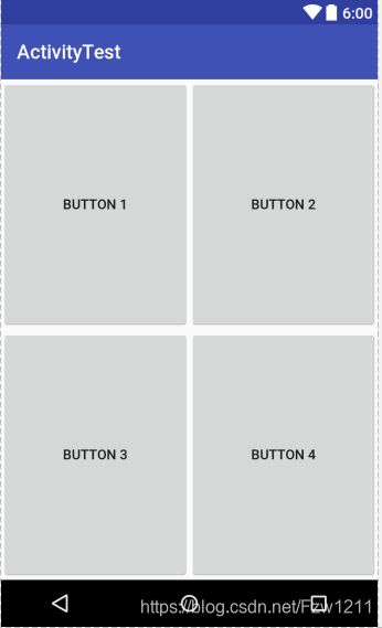
<android.support.percent.PercentFrameLayout xmlns:android="http://schemas.android.com/apk/res/android"
    android:layout_width="match_parent"
    android:layout_height="match_parent"
    xmlns:app="http://schemas.android.com/apk/res-auto">

    <Button
        android:id="@+id/button1"
        android:text="Button 1"
        android:layout_gravity="left|top"
        app:layout_widthPercent="50%"
        app:layout_heightPercent="50%"/>

    <Button
        android:id="@+id/button2"
        android:text="Button 2"
        android:layout_gravity="right|top"
        app:layout_widthPercent="50%"
        app:layout_heightPercent="50%"/>

    <Button
        android:id="@+id/button3"
        android:text="Button 3"
        android:layout_gravity="left|bottom"
        app:layout_widthPercent="50%"
        app:layout_heightPercent="50%"/>

    <Button
        android:id="@+id/button4"
        android:text="Button 4"
        android:layout_gravity="right|bottom"
        app:layout_widthPercent="50%"
        app:layout_heightPercent="50%"/> android.support.percent.PercentFrameLayout>
效果图:
属性说明:
- android.support.percent.PercentFrameLayout 由于百分比布局并不是内置在系统SDK当中,所以需要把完整的包路径写出来
- xmlns:app 定义一个app的命名空间,这样才能使用百分比布局的自定义属性
- app:layout_widthPercent 指定控件的宽度在布局中所占的百分比
- app:layout_heightPercent 指定控件的高度在布局中所占的百分比
- PercentFrameLayout继承了FrameLayout的特性,所以我们需要通过android:layout_gravity属性来指定放置布局的位置。
- PercentRelativeLayout的用法同PercentFrameLayout很类似。它继承了RelativeLayout的所有特性。可按照PercentFrameLayout自行尝试。
3.4 创建自定义控件
前面学习了Android中的常用控件和布局,顺便梳理下控件和布局之间的继承关系:
从上面的图中可得出如下结论:所有控件都是直接或间接继承自View
所有的布局都是直接或间接继承自ViewGroup
View是Android中最基本的一种UI控件,它可以在屏幕上绘制一块矩形区域,并能响应这块区域的各种事件
ViewGroup是一种特殊的View,它可以包含很多子View和子ViewGroup,是一个用于放置控件和布局的容器

3.4.1 引入布局
在平时的项目开发中,很多活动可能都需要相同样式的标题栏,如果在每个活动中都编写一遍同样的标题栏代码,就会导致代码的大量重复,这时候我们就可以用引入布局的方式来解决这个问题。
新建布局:
- 新建一个title.xml,代码如下所示:
 <LinearLayout xmlns:android="http://schemas.android.com/apk/res/android"
    android:layout_width="match_parent"
    android:layout_height="wrap_content"
    android:background="@drawable/title_bg">
    <Button
        android:id="@+id/title_back"
        android:layout_width="wrap_content"
        android:layout_height="wrap_content"
        android:layout_gravity="center"
        android:layout_margin="5dp"
        android:background="@drawable/back_bg"
        android:text="Back"
        android:textAllCaps="false"
        android:textColor="#fff"/>
    <TextView
        android:id="@+id/title_text"
        android:layout_width="0dp"
        android:layout_height="wrap_content"
        android:layout_gravity="center"
        android:layout_weight="1"
        android:gravity="center"
        android:text="Title Text"
        android:textColor="#fff"
        android:textSize="24sp"/>
    <Button
        android:id="@+id/title_edit"
        android:layout_width="wrap_content"
        android:layout_height="wrap_content"
        android:layout_gravity="center"
        android:layout_margin="5dp"
        android:background="@drawable/edit_bg"
        android:text="Edit"
        android:textColor="#fff"/> LinearLayout>
属性说明:
- android:background 用于给控件或布局指定一个背景
- android:layout_margin 指定控件在上下左右方向上偏移的距离,单位为dp
使用标题栏:
----- 通过使用include语句将标题栏布局引入进来。-----<LinearLayout xmlns:android="http://schemas.android.com/apk/res/android" xmlns:app="http://schemas.android.com/apk/res-auto" android:layout_width="match_parent" android:layout_height="match_parent">LinearLayout>
隐藏系统自带的标题栏:
- 在显示我们通过引入布局写的标题栏前,我们需要隐藏掉系统自带的标题栏:
     ActionBar actionBar = getSupportActionBar();
        if(actionBar!=null)
        {
            actionBar.hide();
        }
- 通过调用getSupportActionBar()获得ActionBar的实例,然后调用ActionBar的 hide() 方法将标题栏隐藏。
效果图:

3.4.2 创建自定义控件
引入布局很好的解决了重复编写布局代码的问题,但是如果布局中有一些控件要求能够响应事件,那么我们就需要在每个活动中单独编写一次事件注册的代码。比如标题栏中的返回按钮,其实不管在哪个活动中,这个按钮的功能都是销毁当前活动。如果每一个活动中都需要重新注册一遍返回按钮的点击事件,这样就会增加很多重复代码,此时我们就应使用自定义控件的方式来解决。
自定义控件
    public TitleLayout(Context context, AttributeSet attrs) {
        super(context, attrs);
        LayoutInflater.from(context).inflate(R.layout.title,this);
        Button titleBack = (Button) findViewById(R.id.title_back);
        Button titleEdit = (Button) findViewById(R.id.title_edit);

        titleBack.setOnClickListener(new OnClickListener() {
            @Override
            public void onClick(View v) {
                ((Activity)getContext()).finish();
            }
        });

        titleEdit.setOnClickListener(new OnClickListener() {
            @Override
            public void onClick(View v) {
                Toast.makeText(getContext(),"You clicked Edit Button",Toast.LENGTH_SHORT).show();
            }
        });
    } } ```
说明:
- 重写了LinearLayout带有两个参数的构造函数,在布局中引入TitleLayout控件就会调用这个构造函数
- 使用LayoutInflater对标题栏布局进行动态加载,LayoutInflater的from() 方法构建出一个 LayoutInflater对象,然后调用 inflate() 方法动态加载一个布局。
- inflate() 方法第一个参数是要加载布局文件的id,第二个参数是给加载好的布局添加一个父布局。
- 通过 findViewById() 找到布局文件中的控件,分别为各个按钮注册点击事件。
在布局中使用自定义控件:
<LinearLayout xmlns:android="http://schemas.android.com/apk/res/android"
    xmlns:app="http://schemas.android.com/apk/res-auto"
    android:layout_width="match_parent"
    android:layout_height="match_parent">
    <fanzhiwei.activitytest.TitleLayout
        android:layout_width="match_parent"
        android:layout_height="wrap_content">
    fanzhiwei.activitytest.TitleLayout>

LinearLayout>
备注:
在使用自定义控件的时候,我们需要指定控件的完整类名。
效果图:
