JetpackCompose快速实现底部导航栏,BottomNavigation使用
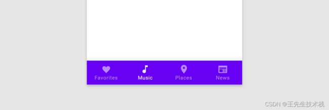
首先放上一个效果,这里需要特别鸣谢@扔物线大佬,因为我这边使用的颜色,图片都是从大佬的项目中直接拿过来的。原谅我是个白嫖怪~
在@扔物线大佬的WeCompose项目中,对于底部导航栏的实现是使用Row + Column组合的方式实现的。但是我今天在阅读android developer文件的jetpack compose 指南的时候,发现官方个实现了Material Design的BottomNavigation效果,大致看了下文档,发现使用也是很简单。对于熟悉Flutter#BottomNavigation或者android原生BottomNavigation的小伙伴上手相当容易,这里我简单记录下。
MD文档地址:https://developer.android.com/reference/kotlin/androidx/compose/material/package-summary#TopAppBar(kotlin.Function0,androidx.compose.ui.Modifier,kotlin.Function0,kotlin.Function1,androidx.compose.ui.graphics.Color,androidx.compose.ui.graphics.Color,androidx.compose.ui.unit.Dp)
本身比较简单,我这里就直接列出来两个的实现。
BottomNavigation
@Composable
fun BottomNavigation(
    modifier: Modifier? = Modifier,
    backgroundColor: Color? = MaterialTheme.colors.primarySurface,
    contentColor: Color? = contentColorFor(backgroundColor),
    elevation: Dp? = BottomNavigationDefaults.Elevation,
    content: (@Composable @ExtensionFunctionType RowScope.() -> Unit)?
): Unit
BottomNavigationItem
@Composable
fun RowScope?.BottomNavigationItem(
    selected: Boolean?,
    onClick: (() -> Unit)?,
    icon: (@Composable () -> Unit)?,
    modifier: Modifier? = Modifier,
    enabled: Boolean? = true,
    label: (@Composable () -> Unit)? = null,
    alwaysShowLabel: Boolean? = true,
    interactionSource: MutableInteractionSource? = remember { MutableInteractionSource() },
    selectedContentColor: Color? = LocalContentColor.current,
    unselectedContentColor: Color? = selectedContentColor.copy(alpha = ContentAlpha.medium)
): Unit
使用方式非常简单,Jetpack Compose本身的核心思想就是组装,从名字就能直接BottomNavigationItem是BottomNavigation的子compose,所以直接塞进去用 就完事了~
import androidx.compose.material.BottomNavigation
import androidx.compose.material.BottomNavigationItem
import androidx.compose.material.Icon
import androidx.compose.material.Text
import androidx.compose.runtime.mutableStateOf
import androidx.compose.runtime.remember

var selectedItem by remember { mutableStateOf(0) }
val items = listOf("Songs", "Artists", "Playlists")

BottomNavigation {
    items.forEachIndexed { index, item ->
        BottomNavigationItem(
            icon = { Icon(Icons.Filled.Favorite, contentDescription = null) },
            label = { Text(item) },
            selected = selectedItem == index,
            onClick = { selectedItem = index }
        )
    }
}
是不是非常简单,有没有感觉已经给学会了。最后放出使用本次使用BottomNavigation完整代码。
- demo调用使用的承载类
ComposeBasicActivity.kt
class ComposeBasicActivity : ComponentActivity() {

    companion object {
        val mBottomTabItems =
            listOf(
                BottomItem("微信", R.drawable.ic_chat_filled, R.drawable.ic_chat_outlined),
                BottomItem("通讯录", R.drawable.ic_contacts_filled, R.drawable.ic_contacts_outlined),
                BottomItem("发现", R.drawable.ic_discovery_filled, R.drawable.ic_discovery_outlined),
                BottomItem("我", R.drawable.ic_me_filled, R.drawable.ic_me_outlined)
            )
    }

    override fun onCreate(savedInstanceState: Bundle?) {
        super.onCreate(savedInstanceState)
        WindowCompat.setDecorFitsSystemWindows(window, true)
        setContent {
            WeComposeTheme {
                ProvideWindowInsets {
                    val systemUiController = rememberSystemUiController()
                    SideEffect {
                        systemUiController.setStatusBarColor(Purple500, darkIcons = false)
                    }
                    Surface(color = WeComposeTheme.colors.background) {
                        var bottomSelectedState by remember { mutableStateOf(0) }
                        Scaffold(
                            topBar = { TopBarWidget() },
                            bottomBar = {
                                BottomBarWidget(bottomSelectedState, mBottomTabItems) {
                                    bottomSelectedState = it
                                }
                            }
                        ) {

                        }
                    }
                }
            }
        }
    }
}
- 具体的
BottomBarWidget封装
这里废话一下,说明下为什么我要把状态处理放在外面?
这里就牵扯到封装思想了,控件不应该自身关注由谁引起变化,而应该只是使用事件触发变化。下面的图是官网的图,其实就很好地说明了这点。

package org.fireking.compose.widget
import androidx.compose.foundation.layout.padding
import androidx.compose.foundation.layout.size
import androidx.compose.material.BottomNavigation
import androidx.compose.material.BottomNavigationItem
import androidx.compose.material.Icon
import androidx.compose.material.Text
import androidx.compose.runtime.Composable
import androidx.compose.ui.Modifier
import androidx.compose.ui.res.painterResource
import androidx.compose.ui.text.TextStyle
import androidx.compose.ui.text.font.FontWeight
import androidx.compose.ui.tooling.preview.Preview
import androidx.compose.ui.unit.dp
import androidx.compose.ui.unit.sp
import org.fireking.compose.ComposeBasicActivity
import org.fireking.compose.ui.theme.WeComposeTheme
data class BottomItem(val label: String, val selectItemRes: Int, val unSelectItemRes: Int)
@Composable
fun BottomBarWidget(
selectedPosition: Int,
bottomItems: List<BottomItem>,
onItemSelected: (position: Int) -> Unit
) {
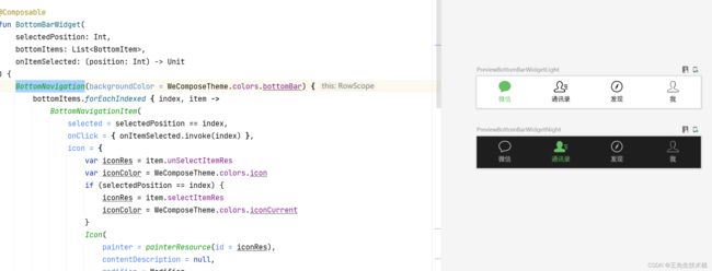
BottomNavigation(backgroundColor = WeComposeTheme.colors.bottomBar) {
bottomItems.forEachIndexed { index, item ->
BottomNavigationItem(
selected = selectedPosition == index,
onClick = { onItemSelected.invoke(index) },
icon = {
var iconRes = item.unSelectItemRes
var iconColor = WeComposeTheme.colors.icon
if (selectedPosition == index) {
iconRes = item.selectItemRes
iconColor = WeComposeTheme.colors.iconCurrent
}
Icon(
painter = painterResource(id = iconRes),
contentDescription = null,
modifier = Modifier
.size(24.dp)
.padding(bottom = 4.dp),
tint = iconColor,
)
},
label = {
val labelStyle = if (selectedPosition == index) {
TextStyle(
fontWeight = FontWeight.Medium,
color = WeComposeTheme.colors.iconCurrent,
fontSize = 11.sp
)
} else {
TextStyle(
fontWeight = FontWeight.Normal,
color = WeComposeTheme.colors.icon,
fontSize = 11.sp
)
}
Text(
text = bottomItems[index].label,
style = labelStyle,
)
},
)
}
}
}
@Preview(showBackground = true)
@Composable
fun PreviewBottomBarWidgetLight() {
WeComposeTheme(WeComposeTheme.Theme.Light) {
BottomBarWidget(0, ComposeBasicActivity.mBottomTabItems, {})
}
}
@Preview(showBackground = true)
@Composable
fun PreviewBottomBarWidgetNight() {
WeComposeTheme(WeComposeTheme.Theme.Dark) {
BottomBarWidget(1, ComposeBasicActivity.mBottomTabItems, {})
}
}
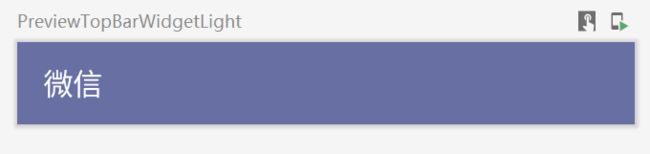
附赠一个TopAppBar实例给你白嫖
package org.fireking.compose.widget

import androidx.compose.material.MaterialTheme
import androidx.compose.material.Text
import androidx.compose.material.TopAppBar
import androidx.compose.runtime.Composable
import androidx.compose.ui.text.TextStyle
import androidx.compose.ui.text.font.FontWeight
import androidx.compose.ui.tooling.preview.Preview
import androidx.compose.ui.unit.sp
import org.fireking.compose.ui.theme.WeComposeTheme

@Composable
fun TopBarWidget() {
    TopAppBar(title = {
        Text(
            text = "微信",
            style = TextStyle(
                fontSize = 18.sp,
                fontWeight = FontWeight.Medium,
                color = MaterialTheme.colors.background
            )
        )
    }, backgroundColor = WeComposeTheme.colors.appBar)
}

@Preview(
    showBackground = true,
    widthDp = 375,
    heightDp = 50,
    backgroundColor = 0xFFFF5959
)
@Composable
fun PreviewTopBarWidgetLight() {
    TopBarWidget()
}
本次BottomNavigation就说到这里了。