Intermediate-Data-Visualization-with-Seaborn
文章目录
- 1. Seaborn Introduction
-
- 1.1 Introduction to Seaborn
- 1.2 Seaborn foundation
- 1.3 Reading a csv file
- 1.4 Comparing a histogram and distplot
- 1.5 Using the distribution plot
- 1.6 Plot a histogram
- 1.7 Rug plot and kde shading
- 1.8 Interpreting the results
- 1.9 Regression Plots in Seaborn
- 1.10 Create a regression plot
- 1.11 Plotting multiple variables
- 1.12 Facetting multiple regressions
- 2. Customizing Seaborn Plots
-
- 2.1 Using Seaborn Styles
- 2.2 Setting the default style
- 2.3 Comparing styles
- 2.4 Removing spines
- 2.5 Colors in Seaborn
- 2.6 Matplotlib color codes
- 2.7 Using default palettes
- 2.8 Color Palettes
- 2.9 Creating Custom Palettes
- 2.10 Customizing with matplotlib
- 2.11 Using matplotlib axes
- 2.12 Additional plot customizations
- 2.13 Adding annotations
- 2.14 Multiple plots
- 3. Additional Plot Types
-
- 3.1 Categorical Plot Types
- 3.2 Stripplot() and swarmplot()
- 3.3 boxplots, violinplots and lvplots
- 3.4 barplots, pointplots and countplots
- 3.5 Regression Plots
- 3.6 Regression and residual plots
- 3.7 Regression plot parameters
- 3.8 Binning data
- 3.9 Matrix plots
- 3.10 Creating heatmaps
- 3.11 Customizing heatmaps
- 4. Creating Plots on Data Aware Grids
-
- 4.1 Using FacetGrid, factorplot and Implot
- 4.2 Building a FacetGrid
- 4.3 Using a factorplot
- 4.4 Using a Implot
- 4.5 Using PairGrid and pairplot
- 4.6 Building a Pair Grid
- 4.7 Using a pairplot
- 4.8 Additional pairplots
- 4.9 Using JointGrid and jointplot
- 4.10 Building a JointGrid and Jointplot
- 4.11 Jointplots and regression
- 4.11 Complex jointplots
- 4.12 Selecting Seaborn Plots
1. Seaborn Introduction
1.1 Introduction to Seaborn
1.2 Seaborn foundation
What library provides the foundation for pandas and Seaborn plotting?
□ \square □ javascript
■ \blacksquare ■ matplotlib
□ \square □ vega
□ \square □ ggplot2
matplotlib is the basis for many python plotting libraries. A basic understanding of matplotlib is helpful for better understanding Seaborn.
1.3 Reading a csv file
Before you analyze data, you will need to read the data into a pandas DataFrame. In this exercise, you will be looking at data from US School Improvement Grants in 2010. This program gave nearly $4B to schools to help them renovate or improve their programs.
This first step in most data analysis is to import pandas and seaborn and read a data file in order to analyze it further.
Introduction
- Import
pandasandseabornusing the standard naming conventions. - The path to the csv file is stored in the
grant_filevariable. - Use
pandasto read the file. - Store the resulting DataFrame in the variable
df.
# import all modules
import pandas as pd
import seaborn as sb
import matplotlib.pyplot as plt

# Read in the DataFrame
df = pd.read_csv(grant_file)
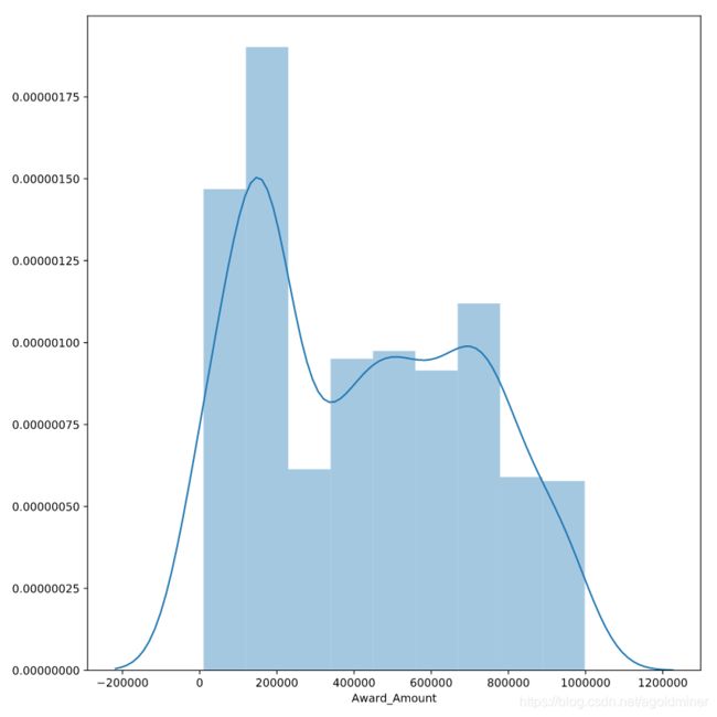
1.4 Comparing a histogram and distplot
The pandas library supports simple plotting of data, which is very convenient when data is already likely to be in a pandas DataFrame.
Seaborn generally does more statistical analysis on data and can provide more sophisticated insight into the data. In this exercise, we will compare a pandas histogram vs the seaborn distplot.
Instruction 1
Use the pandas’ plot.hist() function to plot a histogram of the Award_Amount column.
# Display pandas histogram
df['Award_Amount'].plot.hist()
plt.show()

# Clear out the pandas histogram
plt.clf()

Instruction 2
Use Seaborn’s distplot() function to plot a distribution plot of the same column.
# Display a Seaborn distplot
sns.distplot(df['Award_Amount'])
plt.show()

# Clear the distplot
plt.clf()
1.5 Using the distribution plot
1.6 Plot a histogram
The distplot() function will return a Kernel Density Estimate (KDE) by default. The KDE helps to smooth the distribution and is a useful way to look at the data. However, Seaborn can also support the more standard histogram approach if that is more meaningful for your analysis.
Instruction
- Create a
distplotfor the data and disable the KDE. - Explicitly pass in the number 20 for the number of bins in the histogram.
- Display the plot using
plt.show().
# Create a distplot
sns.distplot(df['Award_Amount'],
             kde = False,
             bins = 20)

# Display the plot
plt.show()

1.7 Rug plot and kde shading
Now that you understand some function arguments for distplot(), we can continue further refining the output. This process of creating a visualization and updating it in an incremental fashion is a useful and common approach to look at data from multiple perspectives.
Seaborn excels at making this process simple.
Instruction
- Create a
distplotof theAward_Amountcolumn in thedf. - Configure it to show a shaded kde (using the
kde_kwsdictionary). - Add a rug plot above the x axis.
- Display the plot.
# Create a distplot of the Award Amount
sns.distplot(df['Award_Amount'],
             hist = False,
             rug = True,
             kde_kws = {'shade' : True})

# Plot the results
plt.show()

1.8 Interpreting the results
Looking at this distplot, which of these choices can you infer based on the visualization?

Possible Answers
□ \square □ The most frequent award amount range was between $650K and $700K.
□ \square □ The award amounts are normally distributed.
■ \blacksquare ■ There are a large group of award amounts < $400K.
□ \square □ The average award is > $900K.
1.9 Regression Plots in Seaborn
1.10 Create a regression plot
For this set of exercises, we will be looking at FiveThirtyEight’s data on which US State has the worst drivers. The data set includes summary level information about fatal accidents as well as insurance premiums for each state as of 2010.
In this exercise, we will look at the difference between the regression plotting functions.
Instruction 1
- The data is available in the dataframe called
df. - Create a regression plot using
regplot()with"insurance_losses"on the x axis and"premiums"on the y axis.
# Create a regression plot of premiums vs. insurance_losses
sns.regplot(x = "insurance_losses",
            y = "premiums",
            data = df)

# Display the plot
plt.show()

Instruction 2
- Create a regression plot of
"premiums"versus"insurance_losses"usinglmplot(). - Display the plot.
# Create an lmplot of premiums vs. insurance_losses
sns.lmplot(x = "insurance_losses",
           y = "premiums",
           data = df)

# Display the second plot
plt.show()

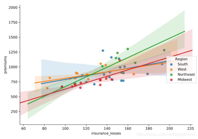
1.11 Plotting multiple variables
Since we are using lmplot() now, we can look at the more complex interactions of data. This data set includes geographic information by state and area. It might be interesting to see if there is a difference in relationships based on the Region of the country.
Instruction
- Use
lmplot()to look at the relationship betweeninsurance_lossesandpremiums. - Plot a regression line for each
Regionof the country.
# Create a regression plot using hue
sns.lmplot(data = df,
           x = "insurance_losses",
           y = "premiums",
           hue = "Region")

# Show the results
plt.show()
1.12 Facetting multiple regressions
lmplot() allows us to facet the data across multiple rows and columns. In the previous plot, the multiple lines were difficult to read in one plot. We can try creating multiple plots by Region to see if that is a more useful visualization.
Instruction
- Use
lmplot()to look at the relationship betweeninsurance_lossesandpremiums. - Create a plot for each
Regionof the country. - Display the plots across multiple rows.
# Create a regression plot with multiple rows
sns.lmplot(data = df,
           x = "insurance_losses",
           y = "premiums",
           row = "Region")

# Show the plot
plt.show()

2. Customizing Seaborn Plots
2.1 Using Seaborn Styles
2.2 Setting the default style
For these exercises, we will be looking at fair market rent values calculated by the US Housing and Urban Development Department. This data is used to calculate guidelines for several federal programs. The actual values for rents vary greatly across the US. We can use this data to get some experience with configuring Seaborn plots.
Instruction
- Plot a
pandashistogram without adjusting the style. - Set Seaborn’s default style.
- Create another
pandashistogram of thefmr_2column which represents fair market rent for a 2-bedroom apartment.
# Plot the pandas histogram
df['fmr_2'].plot.hist()
plt.show()
plt.clf()

# Set the default seaborn style
sns.set()

# Plot the pandas histogram again
df['fmr_2'].plot.hist()
plt.show()
plt.clf()

2.3 Comparing styles
Seaborn supports setting different styles that can control the aesthetics of the final plot. In this exercise, you will plot the same data in two different styles in order to see how the styles change the output.
Instruction 1
Create a distplot() of the fmr_2 column in df using a dark style. Use plt.clf() to clear the figure.
sns.set_style('dark')
sns.distplot(df['fmr_2'])
plt.show()
plt.clf()

Instruction 2
Create the same distplot() of fmr_2 using a whitegrid style. Clear the plot after showing it.
sns.set_style('whitegrid')
sns.distplot(df['fmr_2'])
plt.show()
plt.clf()

2.4 Removing spines
In general, visualizations should minimize extraneous markings so that the data speaks for itself . Seaborn allows you to remove the lines on the top, bottom, left and right axis, which are often called spines.
Instruction
- Use a
whitestyle for the plot. - Create a
lmplot()comparing thepop2010and thefmr_2columns. - Remove the top and right spines using
despine().
# Set the style to white
sns.set_style('white')

# Create a regression plot
sns.lmplot(data = df,
           x = 'pop2010',
           y = 'fmr_2')

# Remove the spines
sns.despine()

# Show the plot and clear the figure
plt.show()
plt.clf()

2.5 Colors in Seaborn
2.6 Matplotlib color codes
Seaborn offers several options for modifying the colors of your visualizations. The simplest approach is to explicitly state the color of the plot. A quick way to change colors is to use the standard matplotlib color codes.
Instruction
- Set the default Seaborn style and enable the
matplotlibcolor codes. - Create a
distplotfor thefmr_3column usingmatplotlib's magenta (m) color code.
# Set style, enable color code, and create a magenta distplot
sns.set(color_codes = True)
sns.distplot(df['fmr_3'],
             color = 'm')

# Show the plot
plt.show()

2.7 Using default palettes
Seaborn includes several default palettes that can be easily applied to your plots. In this example, we will look at the impact of two different palettes on the same distplot.
Instruction
- Create a
forloop to show the difference between thebrightandcolorblindpalette. - Set the palette using the
set_palette()function. - Use a
distplotof thefmr_3column.
# Loop through differences between bright and colorblind palettes
for p in ['bright', 'colorblind']:
    sns.set_palette(p)
    sns.distplot(df['fmr_3'])
    plt.show()

    # Clear the plots
    plt.clf()

2.8 Color Palettes
When visualizing multiple elements of data that do not have inherent ordering. Which type of Seaborn palette should you use?
□ \square □ sequential
■ \blacksquare ■ circular
□ \square □ diverging
□ \square □ None of the above.
2.9 Creating Custom Palettes
Choosing a cohesive palette that works for your data can be time consuming. Fortunately, Seaborn provides the color_palette() function to create your own custom sequential, categorical, or diverging palettes. Seaborn also makes it easy to view your palettes by using the palplot() function.
In this exercise, you can experiment with creating different palettes.
Instruction 1
Create and display a Purples sequential palette containing 8 colors.
sns.palplot(sns.color_palette("Purples", 8))
plt.show()

Instruction 2
Create and display a palette with 10 colors using the husl system.
sns.palplot(sns.color_palette('husl', 10))
plt.show()

Instruction 3
Create and display a diverging palette with 6 colors coolwarm.
sns.palplot(sns.color_palette('coolwarm', 6))
plt.show()

2.10 Customizing with matplotlib
2.11 Using matplotlib axes
Seaborn uses matplotlib as the underlying library for creating plots. Most of the time, you can use the Seaborn API to modify your visualizations but sometimes it is helpful to use matplotlib's functions to customize your plots. The most important object in this case is matplotlib's axes.
Once you have an axes object, you can perform a lot of customization of your plot.
Instruction
- Use
plt.subplots()to create a axes and figure objects. - Plot a
distplotof columnfmr_3on the axes. - Set a more useful label on the x axis of “3 Bedroom Fair Market Rent”.
# Create a figure and axes
fig, ax = plt.subplots()

# Plot the distribution of data
sns.distplot(df['fmr_3'],
             ax = ax)

# Create a more descriptive x axis label
ax.set(xlabel = "3 Bedroom Fair Market Rent")

# Show the plot
plt.show()

2.12 Additional plot customizations
The matplotlib API supports many common customizations such as labeling axes, adding titles, and setting limits. Let’s complete another customization exercise.
Instruction
- Create a
distplotof thefmr_1column. - Modify the x axis label to say “1 Bedroom Fair Market Rent”.
- Change the x axis limits to be between 100 and 1500.
- Add a descriptive title of “US Rent” to the plot.
# Create a figure and axes
fig, ax = plt.subplots()

# Plot the distribution of 1 bedroom rents
sns.distplot(df['fmr_1'],
             ax = ax)

# Modify the properties of the plot
ax.set(xlabel = "1 Bedroom Fair Market Rent",
       xlim = (100, 1500),
       title = "US Rent")

# Display the plot
plt.show()

2.13 Adding annotations
Each of the enhancements we have covered can be combined together. In the next exercise, we can annotate our distribution plot to include lines that show the mean and median rent prices.
For this example, the palette has been changed to bright using sns.set_palette().
Instruction
- Create a figure and axes.
- Plot the
fmr_1column distribution. - Add a vertical line using
axvlinefor themedianandmeanof the values which are already defined.
# Create a figure and axes. Then plot the data
fig, ax = plt.subplots()
sns.distplot(df['fmr_1'],
             ax = ax)

# Customize the labels and limits
ax.set(xlabel = "1 Bedroom Fair Market Rent",
       xlim = (100,1500),
       title = "US Rent")

# Add vertical lines for the median and mean
ax.axvline(x = df['fmr_1'].median(),
           color = 'm',
           label = 'Median',
           linestyle = '--',
           linewidth = 2)

ax.axvline(x = df['fmr_1'].mean(),
           color='b',
           label='Mean',
           linestyle='-',
           linewidth=2)

# Show the legend and plot the data
ax.legend()
plt.show()

2.14 Multiple plots
For the final exercise we will plot a comparison of the fair market rents for 1-bedroom and 2-bedroom apartments.
Instruction
- Create two axes objects,
ax0andax1. - Plot
fmr_1onax0andfmr_2onax1. - Display the plots side by side.
# Create a plot with 1 row and 2 columns that share the y axis label
fig, (ax0, ax1) = plt.subplots(nrows = 1,
                               ncols = 2,
                               sharey = True)

# Plot the distribution of 1 bedroom apartments on ax0
sns.distplot(df['fmr_1'], ax = ax0)
ax0.set(xlabel = "1 Bedroom Fair Market Rent",
        xlim = (100, 1500))

# Plot the distribution of 2 bedroom apartments on ax1
sns.distplot(df['fmr_2'], ax = ax1)
ax1.set(xlabel = "2 Bedroom Fair Market Rent",
        xlim = (100, 1500))

# Display the plot
plt.show()

3. Additional Plot Types
3.1 Categorical Plot Types
3.2 Stripplot() and swarmplot()
Many datasets have categorical data and Seaborn supports several useful plot types for this data. In this example, we will continue to look at the 2010 School Improvement data and segment the data by the types of school improvement models used.
As a refresher, here is the KDE distribution of the Award Amounts:

While this plot is useful, there is a lot more we can learn by looking at the individual Award_Amounts and how they are distributed among the 4 categories.
Instruction 1
Create a stripplot of the Award_Amount with the Model Selected on the y axis with jitter enabled.
# Create the stripplot
sns.stripplot(data = df,
              x = 'Award_Amount',
              y = 'Model Selected',
              jitter = True)

plt.show()

Instruction 2
Create a swarmplot() of the same data, but also include the hue by Region.
# Create and display a swarmplot with hue set to the Region
sns.swarmplot(data = df,
              x = 'Award_Amount',
              y = 'Model Selected',
              hue = 'Region')

plt.show()

3.3 boxplots, violinplots and lvplots
Seaborn’s categorical plots also support several abstract representations of data. The API for each of these is the same so it is very convenient to try each plot and see if the data lends itself to one over the other.
In this exercise, we will use the color palette options presented in Chapter 2 to show how colors can easily be included in the plots.
Instruction 1
Create and display a boxplot of the data with Award_Amount on the x axis and Model Selected on the y axis.
# Create a boxplot
sns.boxplot(data = df,
            x = 'Award_Amount',
            y = 'Model Selected')

plt.show()
plt.clf()

Instruction 2
Create and display a similar violinplot of the data, but use the husl palette for colors.
# Create a violinplot with the husl palette
sns.violinplot(data = df,
               x = 'Award_Amount',
               y = 'Model Selected',
               palette = 'husl')

plt.show()
plt.clf()

Instruction 3
Create and display an lvplot using the Paired palette and the Region column as the hue.
# Create a lvplot with the Paired palette and the Region column as the hue
sns.lvplot(data = df,
           x = 'Award_Amount',
           y = 'Model Selected',
           palette = 'Paired',
           hue = 'Region')

plt.show()
plt.clf()

3.4 barplots, pointplots and countplots
The final group of categorical plots are barplots, pointplots and countplot which create statistical summaries of the data. The plots follow a similar API as the other plots and allow further customization for the specific problem at hand.
Instruction 1
Create a countplot with the df dataframe and Model Selected on the y axis and the color varying by Region.
# Show a countplot with the number of models used with each region a different color
sns.countplot(data = df,
              y = "Model Selected",
              hue = "Region")

plt.show()
plt.clf()

Instruction 2
-
Create a
pointplotwith thedfdataframe andModel Selectedon the x-axis andAward_Amounton the y-axis. -
Use a
capsizein thepointplotin order to add caps to the error bars.
# Create a pointplot and include the capsize in order to show bars on the confidence interval
sns.pointplot(data = df,
              y = 'Award_Amount',
              x = 'Model Selected',
              capsize = .1)

plt.show()
plt.clf()

Instruction 3
Create a barplot with the same data on the x and y axis and change the color of each bar based on the Region column.
# Create a barplot with each Region shown as a different color
sns.barplot(data = df,
            y = 'Award_Amount',
            x = 'Model Selected',
            hue = 'Region')

plt.show()
plt.clf()

3.5 Regression Plots
3.6 Regression and residual plots
Linear regression is a useful tool for understanding the relationship between numerical variables. Seaborn has simple but powerful tools for examining these relationships.
For these exercises, we will look at some details from the US Department of Education on 4 year college tuition information and see if there are any interesting insights into which variables might help predict tuition costs.
For these exercises, all data is loaded in the df variable.
Instruction 1
- Plot a regression plot comparing
Tuitionand average SAT scores(SAT_AVG_ALL). - Make sure the values are shown as green triangles.
# Display a regression plot for Tuition
sns.regplot(data = df,
            y = 'Tuition',
            x = "SAT_AVG_ALL",
            marker = '^',
            color = 'g')

plt.show()
plt.clf()

Instruction 2
Use a residual plot to determine if the relationship looks linear.
# Display the residual plot
sns.residplot(data = df,
              y = 'Tuition',
              x = "SAT_AVG_ALL",
              color = 'g')

plt.show()
plt.clf()

There does appear to be a linear relationship between tuition and SAT scores.
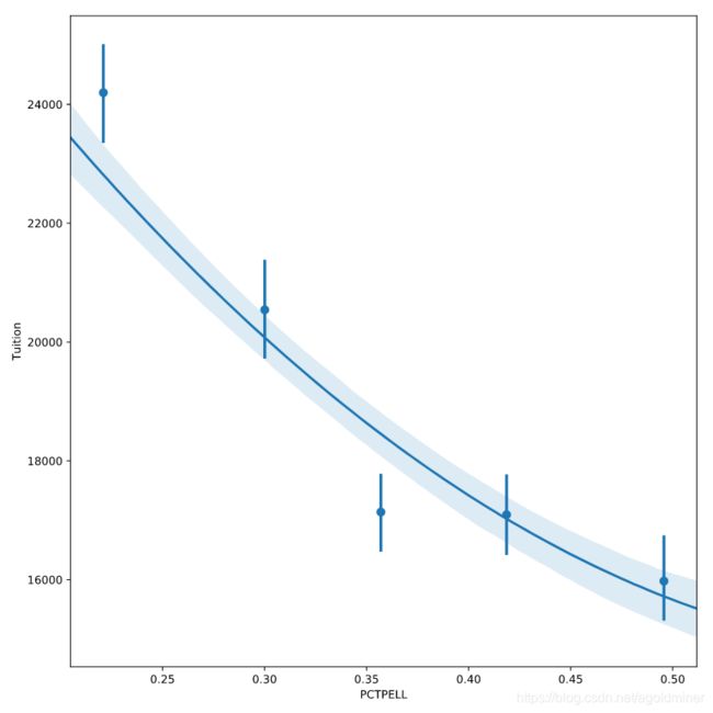
3.7 Regression plot parameters
Seaborn’s regression plot supports several parameters that can be used to configure the plots and drive more insight into the data.
For the next exercise, we can look at the relationship between tuition and the percent of students that receive Pell grants. A Pell grant is based on student financial need and subsidized by the US Government. In this data set, each University has some percentage of students that receive these grants. Since this data is continuous, using x_bins can be useful to break the percentages into categories in order to summarize and understand the data.
Instruction 1
Plot a regression plot of Tuition and PCTPELL.
# Plot a regression plot of Tuition and the Percentage of Pell Grants
sns.regplot(data = df,
            y = 'Tuition',
            x = "PCTPELL")

plt.show()
plt.clf()

Instruction 2
Create another plot that breaks the PCTPELL column into 5 different bins.
# Create another plot that estimates the tuition by PCTPELL
sns.regplot(data = df,
            y = 'Tuition',
            x = "PCTPELL",
            x_bins = 5)

plt.show()
plt.clf()

Instruction 3
Create a final regression plot that includes a 2nd order polynomial regression line.
# The final plot should include a line using a 2nd order polynomial
sns.regplot(data = df,
            y = 'Tuition',
            x = "PCTPELL",
            x_bins = 5,
            order = 2)

plt.show()
plt.clf()
3.8 Binning data
When the data on the x axis is a continuous value, it can be useful to break it into different bins in order to get a better visualization of the changes in the data.
For this exercise, we will look at the relationship between tuition and the Undergraduate population abbreviated as UG in this data. We will start by looking at a scatter plot of the data and examining the impact of different bin sizes on the visualization.
Instruction 1
Create a regplot of Tuition and UG and set the fit_reg parameter to False to disable the regression line.
# Create a scatter plot by disabling the regression line
sns.regplot(data = df,
            y = 'Tuition',
            x = "UG",
            fit_reg = False)

plt.show()
plt.clf()

Instruction 2
Create another plot with the UG data divided into 5 bins.
# Create a scatter plot and bin the data into 5 bins
sns.regplot(data = df,
            y = 'Tuition',
            x = "UG",
            x_bins = 5)

plt.show()
plt.clf()

Instruction 3
Create a regplot() with the data divided into 8 bins.
# Create a regplot and bin the data into 8 bins
sns.regplot(data = df,
            y = 'Tuition',
            x = "UG",
            x_bins = 8)

plt.show()
plt.clf()

3.9 Matrix plots
3.10 Creating heatmaps
A heatmap is a common matrix plot that can be used to graphically summarize the relationship between two variables. For this exercise, we will start by looking at guests of the Daily Show from 1999 - 2015 and see how the occupations of the guests have changed over time.
The data includes the date of each guest appearance as well as their occupation. For the first exercise, we need to get the data into the right format for Seaborn’s heatmap function to correctly plot the data. All of the data has already been read into the df variable.
Instruction
- Use pandas’
crosstab()function to build a table of visits byGroupandYear. - Print the
pd_crosstabDataFrame. - Plot the data using Seaborn’s
heatmap().
# Create a crosstab table of the data
pd_crosstab = pd.crosstab(df["Group"], df["YEAR"])
print(pd_crosstab)

# Plot a heatmap of the table
sns.heatmap(pd_crosstab)

# Rotate tick marks for visibility
plt.yticks(rotation = 0)
plt.xticks(rotation = 90)

plt.show()

3.11 Customizing heatmaps
Seaborn supports several types of additional customizations to improve the output of a heatmap. For this exercise, we will continue to use the Daily Show data that is stored in the df variable but we will customize the output.
Instruction
- Create a crosstab table of
GroupandYEAR. - Create a heatmap of the data using the
BuGnpalette. - Disable the
cbarand increase thelinewidthto 0.3.
# Create the crosstab DataFrame
pd_crosstab = pd.crosstab(df["Group"], df["YEAR"])

# Plot a heatmap of the table with no color bar and using the BuGn palette
sns.heatmap(pd_crosstab,
            cbar = False,
            cmap = "BuGn",
            linewidths = 0.3)

# Rotate tick marks for visibility
plt.yticks(rotation = 0)
plt.xticks(rotation = 90)

#Show the plot
plt.show()
plt.clf()

4. Creating Plots on Data Aware Grids
4.1 Using FacetGrid, factorplot and Implot
4.2 Building a FacetGrid
Seaborn’s FacetGrid is the foundation for building data-aware grids. A data-aware grid allows you to create a series of small plots that can be useful for understanding complex data relationships.
For these exercises, we will continue to look at the College Scorecard Data from the US Department of Education. This rich dataset has many interesting data elements that we can plot with Seaborn.
When building a FacetGrid, there are two steps:
- Create a
FacetGridobject with columns, rows, or hue. - Map individual plots to the grid.
Instruction
- Create a
FacetGridthat shows a point plot of the Average SAT scoresSAT_AVG_ALL. - Use
row_orderto control the display order of the degree types.
# Create FacetGrid with Degree_Type and specify the order of the rows using row_order
g2 = sns.FacetGrid(df,
                   row="Degree_Type",
                   row_order=['Graduate',
                              'Bachelors',
                              'Associates',
                              'Certificate',
                              'Non-degree'])

# Map a pointplot of SAT_AVG_ALL onto the grid
g2.map(sns.pointplot, 'SAT_AVG_ALL')

# Show the plot
plt.show()
plt.clf()

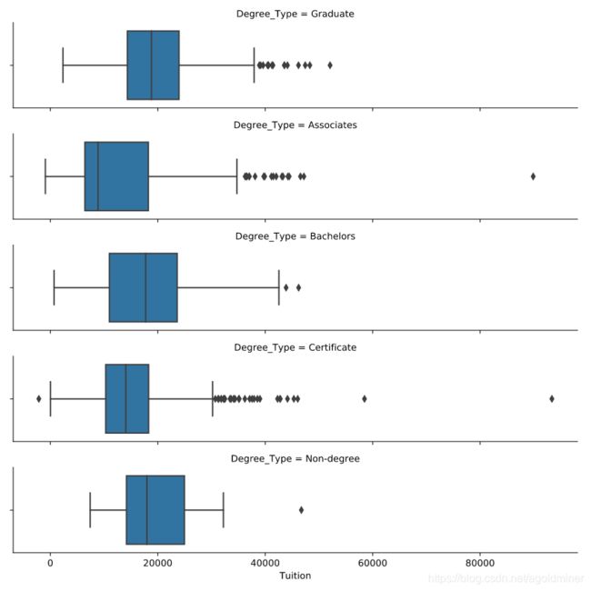
4.3 Using a factorplot
In many cases, Seaborn’s factorplot() can be a simpler way to create a FacetGrid. Instead of creating a grid and mapping the plot, we can use the factorplot() to create a plot with one line of code.
For this exercise, we will recreate one of the plots from the previous exercise using factorplot() and show how to create a boxplot on a data-aware grid.
Instruction 1
Create a factorplot() that contains a boxplot (box) of Tuition values varying by Degree_Type across rows.
# Create a factor plot that contains boxplots of Tuition values
sns.factorplot(data = df,
               x = 'Tuition',
               kind = 'box',
               row = 'Degree_Type')

plt.show()
plt.clf()
Instruction 2
- Create a
factorplot()of SAT Averages (SAT_AVG_ALL) facetted acrossDegree_Typethat shows a pointplot (point). - Use
row_orderto order the degrees from highest to lowest level.
# Create a facetted pointplot of Average SAT_AVG_ALL scores facetted by Degree Type
sns.factorplot(data = df,
               x = 'SAT_AVG_ALL',
               kind = 'point',
               row = 'Degree_Type',
               row_order = ['Graduate',
                            'Bachelors',
                            'Associates',
                            'Certificate',
                            'Non-degree'])

plt.show()
plt.clf()

4.4 Using a Implot
The lmplot is used to plot scatter plots with regression lines on FacetGrid objects. The API is similar to factorplot with the difference that the default behavior of lmplot is to plot regression lines.
For the first set of exercises, we will look at the Undergraduate population (UG) and compare it to the percentage of students receiving Pell Grants (PCTPELL).
For the second lmplot exercise, we can look at the relationships between Average SAT scores and Tuition across the different degree types and public vs. non-profit schools.
Instruction 1
Create a FacetGrid() with Degree_Type columns and scatter plot of UG and PCTPELL.
# Create a FacetGrid varying by column and columns ordered with the degree_order variable
g = sns.FacetGrid(df,
                  col = "Degree_Type",
                  col_order = degree_ord)

# Map a scatter plot of Undergrad Population compared to PCTPELL
g.map(plt.scatter, 'UG', 'PCTPELL')

plt.show()
plt.clf()

Instruction 2
Create a lmplot() using the same values from the FacetGrid().
# Re-create the plot above as an lmplot
sns.lmplot(data = df,
           x = 'UG',
           y = 'PCTPELL',
           col = "Degree_Type",
           col_order = degree_ord)

plt.show()
plt.clf()

Instruction 3
- Create a facetted
lmplot()comparingSAT_AVG_ALLtoTuitionwith columns varying byOwnershipand rows byDegree_Type. - In the
lmplot()add ahuefor Women Only Universities.
# Create an lmplot that has a column for Ownership, a row for Degree_Type and hue based on the WOMENONLY column
sns.lmplot(data = df,
           x = 'SAT_AVG_ALL',
           y = 'Tuition',
           col = "Ownership",
           row = 'Degree_Type',
           row_order = ['Graduate', 'Bachelors'],
           hue = 'WOMENONLY',
           col_order = inst_ord)

plt.show()
plt.clf()

4.5 Using PairGrid and pairplot
4.6 Building a Pair Grid
When exploring a dataset, one of the earliest tasks is exploring the relationship between pairs of variables. This step is normally a precursor to additional investigation.
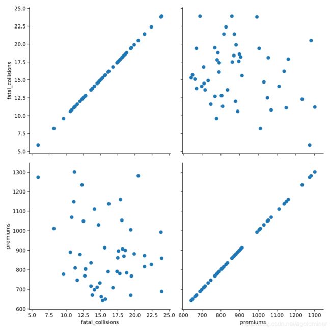
Seaborn supports this pair-wise analysis using the PairGrid. In this exercise, we will look at the Car Insurance Premium data we analyzed in Chapter 1. All data is available in the df variable.
Instruction 1
Compare “fatal_collisions” to “premiums” by using a scatter plot mapped to a PairGrid().
# Create a PairGrid with a scatter plot for fatal_collisions and premiums
g = sns.PairGrid(df,
                 vars=["fatal_collisions", "premiums"])

g2 = g.map(plt.scatter)

plt.show()
plt.clf()
Instruction 2
Create another PairGrid but plot a histogram on the diagonal and scatter plot on the off diagonal.
# Create the same PairGrid but map a histogram on the diag
g = sns.PairGrid(df,
                 vars=["fatal_collisions", "premiums"])

g2 = g.map_diag(plt.hist)
g3 = g2.map_offdiag(plt.scatter)

plt.show()
plt.clf()

4.7 Using a pairplot
The pairplot() function is generally a more convenient way to look at pairwise relationships. In this exercise, we will create the same results as the PairGrid using less code. Then, we will explore some additional functionality of the pairplot(). We will also use a different palette and adjust the transparency of the diagonal plots using the alpha parameter.
Instruction 1
Recreate the pairwise plot from the previous exercise using pairplot().
# Create a pairwise plot of the variables using a scatter plot
sns.pairplot(data=df,
             vars=["fatal_collisions", "premiums"],
             kind='scatter')

plt.show()
plt.clf()

Instruction 2
- Create another pairplot using the “Region” to color code the results.
- Use the
RdBupalette to change the colors of the plot.
# Plot the same data but use a different color palette and color code by Region
sns.pairplot(data=df,
             vars=["fatal_collisions", "premiums"],
             kind='scatter',
             hue='Region',
             palette='RdBu',
             diag_kws={'alpha':.5})

plt.show()
plt.clf()

4.8 Additional pairplots
This exercise will go through a couple of more examples of how the pairplot() can be customized for quickly analyzing data and determining areas of interest that might be worthy of additional analysis.
One area of customization that is useful is to explicitly define the x_vars and y_vars that you wish to examine. Instead of examining all pairwise relationships, this capability allows you to look only at the specific interactions that may be of interest.
We have already looked at using kind to control the types of plots. We can also use diag_kind to control the types of plots shown on the diagonals. In the final example, we will include a regression and kde plot in the pairplot.
Instruction 1
- Create a pair plot that examines
fatal_collisions_speedingandfatal_collisions_alcon the x axis andpremiumsandinsurance_losseson the y axis. - Use the husl palette and color code the scatter plot by Region.
# Build a pairplot with different x and y variables
sns.pairplot(data=df,
             x_vars=["fatal_collisions_speeding", "fatal_collisions_alc"],
             y_vars=['premiums', 'insurance_losses'],
             kind='scatter',
             hue='Region',
             palette='husl')

plt.show()
plt.clf()

Instruction 2
- Build a
pairplot()withkdeplots along the diagonals. Include theinsurance_lossesandpremiumsas the variables. - Use a
regplot for the the non-diagonal plots. - Use the
BrBGpalette for the final plot.
# plot relationships between insurance_losses and premiums
sns.pairplot(data=df,
             vars=["insurance_losses", "premiums"],
             kind='reg',
             palette='BrBG',
             diag_kind = 'kde',
             hue='Region')

plt.show()
plt.clf()

4.9 Using JointGrid and jointplot
4.10 Building a JointGrid and Jointplot
Seaborn’s JointGrid combines univariate plots such as histograms, rug plots and kde plots with bivariate plots such as scatter and regression plots. The process for creating these plots should be familiar to you now. These plots also demonstrate how Seaborn provides convenient functions to combine multiple plots together.
For these exercises, we will use the bike share data that we reviewed earlier. In this exercise, we will look at the relationship between humidity levels and total rentals to see if there is an interesting relationship we might want to explore later.
Instruction 1
- Use Seaborn’s “whitegrid” style for these plots.
- Create a
JointGrid()with “hum” on the x-axis and “total_rentals” on the y. - Plot a
regplot()anddistplot()on the margins.
# Build a JointGrid comparing humidity and total_rentals
sns.set_style("whitegrid")
g = sns.JointGrid(x = "hum",
                  y = "total_rentals",
                  data = df,
                  xlim = (0.1, 1.0))

g.plot(sns.regplot, sns.distplot)

plt.show()
plt.clf()

Instruction 2
Re-create the plot using a jointplot().
# Create a jointplot similar to the JointGrid
sns.jointplot(x = "hum",
              y = "total_rentals",
              kind = 'reg',
              data = df)

plt.show()
plt.clf()

4.11 Jointplots and regression
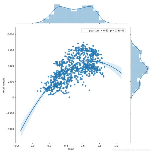
Since the previous plot does not show a relationship between humidity and rental amounts, we can look at another variable that we reviewed earlier. Specifically, the relationship between temp and total_rentals.
Instruction 1
Create a jointplot with a 2nd order polynomial regression plot comparing temp and total_rentals.
# Plot temp vs. total_rentals as a regression plot
sns.jointplot(x = "temp",
              y = "total_rentals",
              kind = 'reg',
              data = df,
              order = 2,
              xlim = (0, 1))

plt.show()
plt.clf()
Instruction 2
Use a residual plot to check the appropriateness of the model.
# Plot a jointplot showing the residuals
sns.jointplot(x = "temp",
              y = "total_rentals",
              kind = 'resid',
              data = df,
              order = 2)

plt.show()
plt.clf()

Based on the residual plot and the pearson r value, there is a positive relationship between temperature and total_rentals.
4.11 Complex jointplots
The jointplot is a convenience wrapper around many of the JointGrid functions. However, it is possible to overlay some of the JointGrid plots on top of the standard jointplot. In this example, we can look at the different distributions for riders that are considered casual versus those that are registered.
Instruction 1
- Create a
jointplotwith a scatter plot comparingtempandcasualriders. - Overlay a
kdeploton top of the scatter plot.
# Create a jointplot of temp vs. casual riders
# Include a kdeplot over the scatter plot
g = (sns.jointplot(x = "temp",
                   y = "casual",
                   kind = 'scatter',
                   data = df,
                   marginal_kws = dict(bins = 10, rug = True)).plot_joint(sns.kdeplot))

plt.show()
plt.clf()

Instruction 2
Build a similar plot for registered users.
# Replicate the above plot but only for registered riders
g = (sns.jointplot(x = "temp",
                   y = "registered",
                   kind = 'scatter',
                   data = df,
                   marginal_kws = dict(bins = 10, rug = True)).plot_joint(sns.kdeplot))

plt.show()
plt.clf()
