vite动态配置svg图标及其他方式集合
文章目录
- 前言
- 使用`vite-plugin-svg-icons`动态配置
-
- 安装
- 插件引入
- 图标下载
- 新建组件`svg-icon.vue`
- 使用
- 使用vue组件动态配置
- 总结
-
- `如有启发,可点赞收藏哟~`
前言
在配置化的情况下,图标配置也显得极为重要的
使用vite-plugin-svg-icons动态配置
参考vite-plugin-svg-icons
安装
npm i vite-plugin-svg-icons -D
插件引入
- vite.config.ts
import { resolve } from 'path'
import { createSvgIconsPlugin } from "vite-plugin-svg-icons";
export default defineConfig(({ command, mode }) => {
...
return {
plugins: [
...
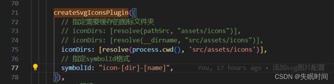
createSvgIconsPlugin({
// 指定需要缓存的图标文件夹
// iconDirs: [resolve(pathSrc, "assets/icons")],
// iconDirs: [resolve(__dirname, "src/assets/icons")],
iconDirs: [resolve(process.cwd(), 'src/assets/icons')], // 指定项目内图标路径
// 指定symbolId格式
symbolId: "icon-[dir]-[name]",
}),
]
}
- main.ts 项目入口引入配置
import 'virtual:svg-icons-register'

图标下载
下载方式例举几个
- 阿里图标
- Element-Plus图标
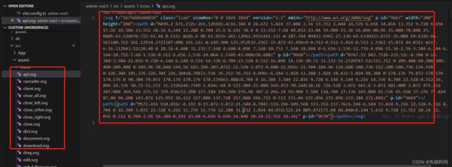
把需要使用的svg图标放置这个src/assets/icons目录
新建组件svg-icon.vue
<template>
  <svg
    aria-hidden="false"
    class="svg-icon"
    :style="'width:' + size + ';height:' + size"
  >
    <use :xlink:href="symbolId" :fill="color" />
  svg>
template>

<script setup lang="ts">
import { computed } from "vue";

const props = defineProps({
  prefix: {
    type: String,
    default: "icon",
  },
  iconClass: {
    type: String,
    required: false,
    default: "",
  },
  color: {
    type: String,
    default: "",
  },
  size: {
    type: String,
    default: "20px",
  },
});
setTimeout(() => {
  console.log(symbolId)
}, 5000);
const symbolId = computed(() => `#${props.prefix}-${props.iconClass}`);
script>

<style scoped>
.svg-icon {
  display: inline-block;
  width: 1em;
  height: 1em;
  overflow: hidden;
  vertical-align: -0.15em; /* 因icon大小被设置为和字体大小一致,而span等标签的下边缘会和字体的基线对齐,故需设置一个往下的偏移比例,来纠正视觉上的未对齐效果 */
  outline: none;
  fill: currentcolor; /* 定义元素的颜色,currentColor是一个变量,这个变量的值就表示当前元素的color值,如果当前元素未设置color值,则从父元素继承 */
}
style>
使用
<SvgIcon v-if="menu.icon" :icon-class="icon" />
import { defineComponent, ref } from "vue";
import SvgIcon from "@/components/svg-icon/index.vue";
export default defineComponent({
    components: {
        SvgIcon,
    },
    setup() {
    	const icon = ref('document')
        return {
            icon,
        };
    },
});

使用vue组件动态配置
可以引入Element-Plus提供的icon组件,也可自定义icon组件
- IconCommunity.vue 自定义svg组件
<template>
  <svg
    xmlns="http://www.w3.org/2000/svg"
    width="20"
    height="20"
    fill="currentColor"
  >
    <path
      d="M15 4a1 1 0 1 0 0 2V4zm0 11v-1a1 1 0 0 0-1 1h1zm0 4l-.707.707A1 1 0 0 0 16 19h-1zm-4-4l.707-.707A1 1 0 0 0 11 14v1zm-4.707-1.293a1 1 0 0 0-1.414 1.414l1.414-1.414zm-.707.707l-.707-.707.707.707zM9 11v-1a1 1 0 0 0-.707.293L9 11zm-4 0h1a1 1 0 0 0-1-1v1zm0 4H4a1 1 0 0 0 1.707.707L5 15zm10-9h2V4h-2v2zm2 0a1 1 0 0 1 1 1h2a3 3 0 0 0-3-3v2zm1 1v6h2V7h-2zm0 6a1 1 0 0 1-1 1v2a3 3 0 0 0 3-3h-2zm-1 1h-2v2h2v-2zm-3 1v4h2v-4h-2zm1.707 3.293l-4-4-1.414 1.414 4 4 1.414-1.414zM11 14H7v2h4v-2zm-4 0c-.276 0-.525-.111-.707-.293l-1.414 1.414C5.42 15.663 6.172 16 7 16v-2zm-.707 1.121l3.414-3.414-1.414-1.414-3.414 3.414 1.414 1.414zM9 12h4v-2H9v2zm4 0a3 3 0 0 0 3-3h-2a1 1 0 0 1-1 1v2zm3-3V3h-2v6h2zm0-6a3 3 0 0 0-3-3v2a1 1 0 0 1 1 1h2zm-3-3H3v2h10V0zM3 0a3 3 0 0 0-3 3h2a1 1 0 0 1 1-1V0zM0 3v6h2V3H0zm0 6a3 3 0 0 0 3 3v-2a1 1 0 0 1-1-1H0zm3 3h2v-2H3v2zm1-1v4h2v-4H4zm1.707 4.707l.586-.586-1.414-1.414-.586.586 1.414 1.414z"
    />
  svg>
template>
- index.vue
<script lang="ts" src="./index.ts" />

<template>
  <div v-for="(icon, index) in ElIcons" :key="icon + index">
    <el-icon><component :is="icon">component>el-icon>
  div>
template>
- index.ts
import { defineComponent, reactive } from "vue";
import IconCommunity from "@/components/icons/IconCommunity.vue";
import Menu from "@/components/menu/index.vue";
import {
  Document,
  Menu as IconMenu,
  Location,
  Setting,
} from '@element-plus/icons-vue'
export default defineComponent({
  components: {
    Document,
    IconMenu,
    Location,
    Setting,
    IconCommunity
  },
  setup() {
    const ElIcons = reactive(['Document', 'IconMenu', 'Location', 'Setting', 'IconCommunity'])
    return {
      ElIcons,
    };
  },
});
效果如图
