python的数据分析可视化
以下为本次数据分析可视化的全部包
import os
import math
from PIL import Image
from pyecharts.charts import Pie
from pyecharts.charts import Bar
from pyecharts.charts import WordCloud
#用于设值全局配置和系列配置
from pyecharts import options as opts
import csv
import xlrd
import re
import jieba
from snownlp import SnowNLP
import matplotlib.pyplot as plt
import numpy as np
from pyecharts.charts import Graph
from collections import Counter
from pyecharts.charts import Map
from pyecharts.charts import Geo
from pyecharts.charts import Gauge
from pyecharts.charts import Liquid
以下为本次数据分析可视化的所有文件
以下为分布代码,以及实现的功能:
'''
例子1:饼状图统计好友男女比例
'''
# 1.1 读取csv文件,把性别信息读取出来
def getSex(filename):
lstsex = []
with open(filename,'r') as fr:
reader = csv.reader(fr)
for i in reader:
lstsex.append(i[4])
return lstsex
# 1.2 性别pyecharts可视化
def VisualSexpyechart(lstsex):
sex = dict()
# 2.1 提取好友性别信息,从1开始,因为第0个是自己
for f in lstsex[1:]:
if f == '1': # 男
sex['man'] = sex.get('man',0) + 1
elif f== '2': # 女
sex['women'] = sex.get('women',0) + 1
else: # 未知
sex['unknown'] = sex.get('unknown',0) + 1
# 在屏幕上打印出来
total = len(lstsex[1:])
# 2.2打印出自己的好友性别比例
print("男性好友:%.2f%%" %(float(sex['man']) / total*100) + '\n' + "女性好友:%.2f%%" %(float(sex['women']) / total*100) +
"不明性别好友:%.2f%%" %(float(sex['unknown']) / total*100))
# 2.3使用pyecharts饼状图
attr = ['男性好友','女性好友','不明性别好友']
value = [sex['man'],sex['women'],sex['unknown']]
# 饼图用的数据格式是[(key1,value1),(key2,value2)],所以先使用 zip函数将二者进行组合
data_pair = [list(z) for z in zip(attr, value)]
# 初始化配置项,内部可设置颜色
(
Pie(init_opts=opts.InitOpts(bg_color="white"))
.add(
# 系列名称,即该饼图的名称
series_name="性别分析",
# 系列数据项,格式为[(key1,value1),(key2,value2)]
data_pair=data_pair,
# 通过半径区分数据大小 “radius” 和 “area” 两种
rosetype='',
# 饼图的半径,设置成默认百分比,相对于容器高宽中较小的一项的一半
radius="55%",
# 饼图的圆心,第一项是相对于容器的宽度,第二项是相对于容器的高度
center=["50%", "50%"],
# 标签配置项
label_opts=opts.LabelOpts(is_show=True, position="center"),
)
# 全局设置
.set_global_opts(
# 设置标题
title_opts=opts.TitleOpts(
# 名字
title="微信好友性别比例",
# 组件距离容器左侧的位置
pos_left="center",
# 组件距离容器上方的像素值
pos_top="20",
# 设置标题颜色
title_textstyle_opts=opts.TextStyleOpts(color="black"),
),
# 图例配置项,参数 是否显示图里组件
legend_opts=opts.LegendOpts(is_show=True),
)
# 系列设置
.set_series_opts(
tooltip_opts=opts.TooltipOpts(
trigger="item", formatter="{a}
{b}: {c} ({d}%)"
),
# 设置标签颜色
label_opts=opts.LabelOpts(color="black"),
)
.render('好友性别比例.html')
)
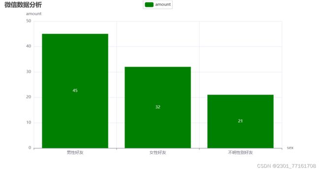
# 1.3 性别pyecharts 柱状图可视化
def VisualSexpyechart2(lstsex):
sex = dict()
# 2.1 提取好友性别信息,从1开始,因为第0个是自己
for f in lstsex[1:]:
if f == '1': # 男
sex['man'] = sex.get('man', 0) + 1
elif f == '2': # 女
sex['women'] = sex.get('women', 0) + 1
else: # 未知
sex['unknown'] = sex.get('unknown', 0) + 1
# 在屏幕上打印出来
total = len(lstsex[1:])
# 2.2打印出自己的好友性别比例
print(
"男性好友:%.2f%%" % (float(sex['man']) / total * 100) + '\n' + "女性好友:%.2f%%" % (
float(sex['women']) / total * 100) + '\n' +
"不明性别好友:%.2f%%" % (float(sex['unknown']) / total * 100))
# 2.3使用pyecharts饼状图
attr = ['男性好友', '女性好友', '不明性别好友']
value = [sex['man'], sex['women'], sex['unknown']]
# # 饼图用的数据格式是[(key1,value1),(key2,value2)],所以先使用 zip函数将二者进行组合
# data_pair = [list(z) for z in zip(attr, value)]
# 初始化配置项,内部可设置颜色
bar = (
Bar()
.add_xaxis(attr)
.add_yaxis("amount", value, color='green')
.set_global_opts(
title_opts=opts.TitleOpts(title='微信数据分析'),
yaxis_opts=opts.AxisOpts(name="amount"),
xaxis_opts=opts.AxisOpts(name="sex")
)
).render('好友性别比例2.html') 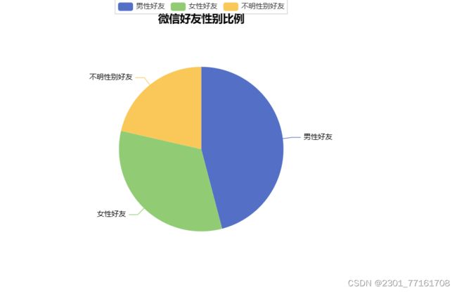
'''
例子2:柱状图学生省份和城市分析
'''
# 2.1读取省份信息
def getProvince(filename):
Province1 = {}
Province2 = {}
Province3 = {}
a = []
flag = 0
for filename_kid in filename:
flag += 1
rd = xlrd.open_workbook(filename_kid)
all_sheet = rd.sheet_names()
for sheet_kid in all_sheet:
table = rd.sheet_by_name(sheet_kid)
nrows = table.nrows
for i in range(nrows - 1):
province = table.cell(i + 1, 6).value
if flag == 1:
Province1[province] = Province1.get(province, 0) + 1
elif flag == 2:
Province2[province] = Province2.get(province, 0) + 1
else:
Province3[province] = Province3.get(province, 0) + 1
if flag == 1:
a.append(Province1)
elif flag == 2:
a.append(Province2)
else:
a.append(Province3)
return a
# 2.2省份可视化
def Provincepyechart(province_list):
province_dict = ['黑龙江', '四川', '天津', '内蒙古', '江苏', '海南', '辽宁', '陕西', '浙江', '河南', '山西', '湖北', '广西', '重庆', '吉林', '贵州',
'云南', '河北', '山东']
province1_dict = province_list[0]
province2_dict = province_list[1]
province3_dict = province_list[2]
province1 = []
province2 = []
province3 = []
value1 = []
value2 = []
value3 = []
for key, value in province1_dict.items():
province1.append(key)
value1.append(value)
for key, value in province2_dict.items():
province2.append(key)
value2.append(value)
for key, value in province3_dict.items():
province3.append(key)
value3.append(value)
print(province1)
print(province2)
print(province3)
bar = (
Bar()
.add_xaxis(province_dict)
.add_yaxis('软件18学生', value1)
.add_yaxis('软件19学生', value2)
.add_yaxis('软件20学生', value3)
.set_global_opts(title_opts=opts.TitleOpts(title="18,19,20级学生省份分析"),
xaxis_opts=opts.AxisOpts(
axislabel_opts=opts.LabelOpts(
rotate=45, # Optional[Numeric]
)
)
))
bar.render('18,19,20级学生省份分析.html')
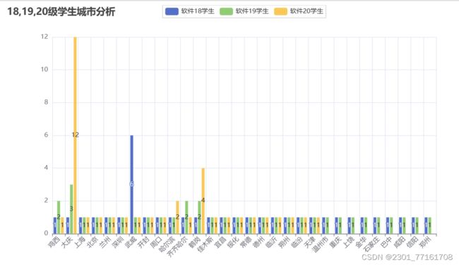
# 2.3读取城市信息
def getCity(filename):
City1 = {}
City2 = {}
City3 = {}
a = []
flag = 0
for filename_kid in filename:
flag += 1
rd = xlrd.open_workbook(filename_kid)
all_sheet = rd.sheet_names()
for sheet_kid in all_sheet:
table = rd.sheet_by_name(sheet_kid)
nrows = table.nrows
for i in range(nrows - 1):
City = table.cell(i + 1, 7).value
if flag == 1:
City1[City] = City1.get(City, 0) + 1
elif flag == 2:
City2[City] = City2.get(City, 0) + 1
else:
City3[City] = City3.get(City, 0) + 1
if flag == 1:
a.append(City1)
elif flag == 2:
a.append(City2)
else:
a.append(City3)
return a
# 2.4城市可视化
def cityPyechart(city_list):
city_dict = ['鸡西', '大庆', '上海', '北京', '兰州', '深圳', '武威', '开封', '周口', '哈尔滨', '齐齐哈尔', '鹤岗', '佳木斯', '宜昌', '绥化',
'常德', '德州', '临沂', '朔州', '临汾', '天津', '温州市', '重庆', '上饶', '金华', '石家庄', '巴中', '咸阳', '信阳','郑州']
city1_dict = city_list[0]
city2_dict = city_list[1]
city3_dict = city_list[2]
city1 = []
city2 = []
city3 = []
value1 = []
value2 = []
value3 = []
for key, value in city1_dict.items():
city1.append(key)
value1.append(value)
for key, value in city2_dict.items():
city2.append(key)
value2.append(value)
for key, value in city3_dict.items():
city3.append(key)
value3.append(value)
print(city1)
print(city2)
print(city3)
bar = (
Bar()
.add_xaxis(city_dict)
.add_yaxis('软件18学生', value1)
.add_yaxis('软件19学生', value2)
.add_yaxis('软件20学生', value3)
.set_global_opts(title_opts=opts.TitleOpts(title="18,19,20级学生省份分析"),
xaxis_opts=opts.AxisOpts(
axislabel_opts=opts.LabelOpts(
rotate=45, # Optional[Numeric]
)
)
))
bar.render('18,19,20级学生城市分析.html')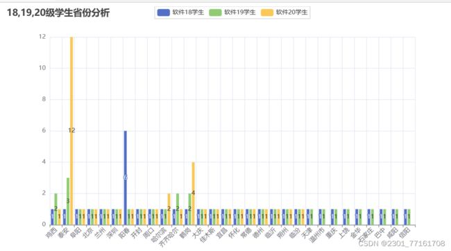
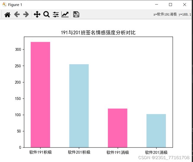
'''
    例子3:分析191,201学生情感
'''
plt.rcParams['font.sans-serif'] = ['SimHei']
plt.rcParams['axes.unicode_minus'] = False
# 3.1 读取Excel表格,保存txt文件词性,分析情感强度
def getStrong(filename,save):
    data = xlrd.open_workbook(filename,'r',encoding_override='utf-8')
    temp = []
    name = []
    tables = data.sheets()
    for i in range(len(tables)):
        list = data.sheet_by_index(i)
        rows = list.nrows
        for j in range(rows):
            if j== 0:
                continue
            name.append(list.row_values(j)[3])
            temp.append(list.row_values(j)[16])
        file = open(f"{save}",'a',encoding='utf-8')
        i = 0
        for ld in temp:
            signature = ld.strip().replace("emoji","").replace("span","").replace("class","")
            rec = re.compile("lf\d+\w*|[<>/=]]")
            signature = rec.sub("",signature)
            if signature != "":
                file.write(name[i]+" : " +signature)
                s = SnowNLP(signature)
                if s.sentiments > 0.5:
                    file.write(" : 积极!\n")
                elif s.sentiments <= 0.5:
                    file.write(" : 消极!\n")
                i+=1
# 3.2 统计两个班级积极与消极数量
def counter(save):
    # https://blog.csdn.net/weixin_38762584/article/details/115023975
    # f’{}’ 用法等同于 format用法的简单使用,更加方便
    txt = open(f"{save}", encoding="utf-8").read()
    need_words = open("../课程作业/qingxu.txt", encoding="utf-8").read()
    find = need_words.split()
    jieba.load_userdict('./qingxu.txt')
    words = jieba.lcut(txt)
    counts = {}
    for word in words:
        counts[word] = counts.get(word,0) + 1
    lst=[]
    for i in range(len(find)):
        try :
            print(find[i],counts[find[i]])
        except:
            lst.append(find[i])
    a = counts[find[0]]
    b = counts[find[1]]
    return a,b
'''
    例子4:柱状图18,19,20级学生男女比例
'''
# 4.1 读取xls文件,把性别信息读取出来
def getProvince1(filename):
    Province1 = {}
    Province2 = {}
    Province3 = {}
    a = []
    flag = 0
    for filename_kid in filename:
        flag += 1
        rd = xlrd.open_workbook_xls(filename_kid)   #xlrd.open_workbook()不支持xls文件
        all_sheet = rd.sheet_names()
        for sheet_kid in all_sheet:
            table = rd.sheet_by_name(sheet_kid)
            nrows = table.nrows
            for i in range(nrows-1):
                province = table.cell(i+1, 5).value
                if flag == 1:
                    Province1[province] = Province1.get(province, 0) + 1
                elif flag == 2:
                    Province2[province] = Province2.get(province, 0) + 1
                else:
                    Province3[province] = Province3.get(province, 0) + 1
        if flag == 1:
            a.append(Province1)
        elif flag == 2:
            a.append(Province2)
        else:
            a.append(Province3)
    return a

# 4.2 性别可视化
def VisualSexpyechart1(province_list):
    province1_dict = province_list[0]
    province2_dict = province_list[1]
    province3_dict = province_list[2]
    province1 = []
    province2 = []
    province3 = []
    value1 = []
    value2 = []
    value3 = []
    for key,value in province1_dict.items():
        province1.append(key)
        value1.append(value)
    for key,value in province2_dict.items():
        province2.append(key)
        value2.append(value)
    for key,value in province3_dict.items():
        province3.append(key)
        value3.append(value)
    print(province1)
    print(province2)
    print(province3)
    bar = (
        Bar()
            .add_xaxis(province1)
            .add_yaxis('软件18学生', value1,color='lightblue')

            .add_yaxis('软件19学生', value2,color='lightgreen')

            .add_yaxis('软件20学生', value3,color='purple')
            .set_global_opts(title_opts=opts.TitleOpts(title="18,19,20级学生性别分析"))
    )
    bar.render('18,19,20级学生性别分析.html')
'''
    例子5:关系图example
'''
def getRoom(filename):
    Room={}
    data= xlrd.open_workbook(filename,'r',encoding_override='utf-8')
    table= data.sheets()[0]
    rows=table.nrows
    for i in range(rows):
        if i==0:
            continue
        Room[table.row_values(i)[3]]=table.row_values(i)[9]
    print(Room)
    return Room
def RoomSee(Room):
    nodes = []
    for i in Room:
       nodes.append({"name": i, "symbolSize": 5})
    links = []
    for i in Room:
           for j in Room:
              if Room[i]==Room[j]:
                links.append({"source": i, "target": j})

    graph= (
        Graph()
        .add("", nodes, links, repulsion=8000)
        .set_global_opts(title_opts=opts.TitleOpts(title="Graph-基本示例"))
    )
    graph.render('关系图.html')
'''
    例子6:词云
'''
from pyecharts import options
from pyecharts.charts import WordCloud
import csv
import re
import jieba
def getInfo(filename,index):
    lstdata = []
    with open(filename,'r') as fr:
        reader = csv.reader(fr)
        for i in reader:
            if i!='':
                lstdata.append(i[index])
        file = open('./sign.txt','a',encoding='utf-8')
        for ld in lstdata:
            signature = ld.strip().replace("emoji",'').replace("span",'').replace("class",'')
            rec = re.compile("lf\d+\w*|[<>/=]")
            signature = rec.sub("",signature)
            file.write(signature+"\n")
# 2 生成云图
def create_word_cloud(filename):
    # 读取文件内容

    text = open("./{}.txt".format(filename),encoding='utf-8').read()
    # 结巴分词,精确模式
    wordlist = jieba.lcut(text,cut_all=True)
    counts = {} # 通过键值对的形式存储词语及其出现的次数
    words = []
    for word in wordlist:
        if len(word) == 1: # 单个词语不计算在内
            continue
        else:
            counts[word] = counts.get(word,0) + 1 # 遍历所有词语,每出现一次其对应的值加1

    for key,value in counts.items():
        words.append((key,value))

    w = (
        WordCloud()
            .add("",words)
            .set_global_opts(title_opts=options.TitleOpts(title="词云"))
            .render('./变形词云.html')
    )

'''
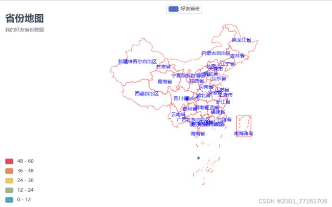
例子7:好友省份地图可视化
'''
# 7.1 获取数据
def getInfo1(filename,index):
lstdata = []
with open(filename,'r') as fr:
reader = csv.reader(fr)
for i in reader:
lstdata.append(i[index])
return lstdata
# 7.2 根据数据生成省份地图
def province_Map(lstprovince):
lstprovincenew = []
# 2.1 去掉空白的项
for i in lstprovince:
if i == " ":pass
else: lstprovincenew.append(i)
# 2.2 统计每个城市出现的次数
data = Counter(lstprovincenew).most_common(15) # 使用Counter类统计出现的次数,并转换为元组列表
print(data)
# 2.3 根据省份数据生成地图
c = (
Map()
.add(
series_name="好友省份",
data_pair=data,
maptype='china', # china-cities
is_selected=True,
# 是否启用鼠标滚轮缩放和拖动平移,默认为True
is_roam=True,
# 是否显示图形标记,默认为True
is_map_symbol_show=True,
itemstyle_opts={
# 常规显示
"normal": {"areaColor": "white", "borderColor": "red"},
# 强调颜色
"emphasis": {"areaColor": "rgba(0,0,0,1)"}
}
)
.set_global_opts(
# 设置标题
title_opts=opts.TitleOpts(
# 主标题
title="省份地图",
# 副标题
subtitle="我的好友省份数据",
# 组件距离容器左侧的位置
pos_left="left",
# 组件距离容器上方的像素值
pos_top="20",
# 设置标题颜色
title_textstyle_opts=opts.TextStyleOpts(color="#404a59",font_size=24)
),
# 图例配置项,参数 是否显示图里组件
legend_opts=opts.LegendOpts(is_show=True),
# 设置分段显示
visualmap_opts=opts.VisualMapOpts(max_=60, is_piecewise=True)
)
# 关闭标签(地图上的省份名称)名称显示,系列配置项里的标签加上color="bule" 参数可设置标签颜色为蓝色。
.set_series_opts(
label_opts=opts.LabelOpts(
is_show=True,
color='blue')
)
.render("./我的好友省份分布.html")
)
'''
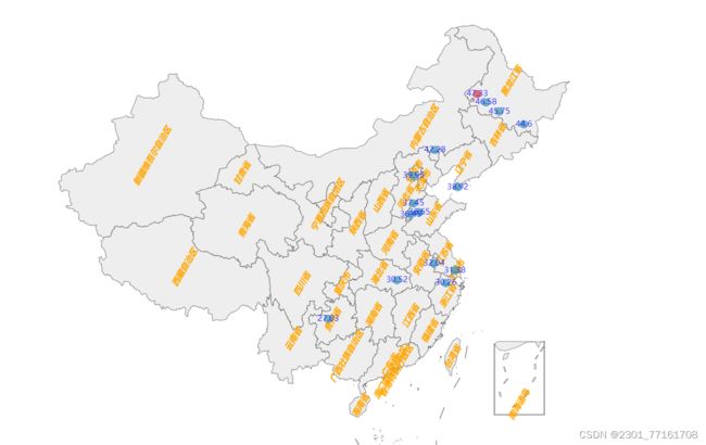
例子8:好友城市地图分析
'''
# 8.1 获取数据
def getInfo2(filename,index):
lstdata = []
with open(filename,'r') as fr:
reader = csv.reader(fr)
for i in reader:
if i[index]=="City": pass
else: lstdata.append(i[index])
return lstdata
# 8.2 城市地图可视化
def city_Map(lstcity):
lstcitynew = []
# 2.1 去掉空白的项
for i in lstcity:
if i == "":pass
else: lstcitynew.append(i)
# 2.2 统计每个城市出现的次数
data = Counter(lstcitynew).most_common(15) # 使用Counter类统计出现的次数,并转换为元组列表
print(list(data))
# 2.3 根据省份数据生成地图
c = (
# Geo() 里通过添加 init_opts 参数可以配置初始化画布大小。
# Geo(init_opts=opts.InitOpts(height="1000px", width="1500px"))
Geo(init_opts=opts.InitOpts(
width="1600px",
height="1000px",
page_title="我的", # 网页标题
)
)
.add_schema(maptype="china", # china-cities
label_opts=opts.LabelOpts(is_show=True,
position='inside', # 标签的位置。
font_size=12, # 文字的字体大小
color="orange", # 文字的颜色。如果设置为 'auto',则为视觉映射得到的颜色,如系列色。
font_style='italic',
font_weight='bold',
font_family='Arial',
rotate=60, # 标签旋转。从 -90 度到 90 度。正值是逆时针。
margin=8, # 刻度标签与轴线之间的距离。
)
)
.add(
series_name="好友城市",
data_pair=data,
# type_=ChartType.HEATMAP, # Geo 图类型,
symbol="circle", # 标记图形形状,提供的标记类型包括 'circle', 'rect', 'roundRect', 'triangle','diamond', 'pin', 'arrow', 'none'
symbol_size=12, # 标记的大小
blur_size=15, # 每个点的大小
point_size=10, # 每个点模糊的大小,
color="blue", # 系列 label 颜色
is_selected=True
)
.set_global_opts(
# 设置标题
title_opts=opts.TitleOpts(
# 主标题
title="城市地图",
# 副标题
subtitle="吴迪的好友城市数据",
# 组件距离容器左侧的位置
pos_left="left",
# 组件距离容器上方的像素值
pos_top="20",
# 设置标题颜色
title_textstyle_opts=opts.TextStyleOpts(color="#404a59",font_size=24)
),
# 图例配置项,参数 是否显示图里组件
legend_opts=opts.LegendOpts(is_show=True),
# 设置分段显示
visualmap_opts=opts.VisualMapOpts(max_=40, is_piecewise=True)
)
# 关闭标签(地图上的省份名称)名称显示,系列配置项里的标签加上color="bule" 参数可设置标签颜色为蓝色。
.set_series_opts(
label_opts=opts.LabelOpts(
is_show=True,
color='blue')
)
.render("./我的好友城市分布.html")
)
# 打开xlsx
workbook = xlrd.open_workbook('./coor.xls')
sheet1 = workbook.sheet_by_name('Sheet1') # 这是好友信息表
num_rows1 = sheet1.nrows
sheet2 = workbook.sheet_by_name('Sheet2') # 这是职业广告对应表
num_rows2 = sheet2.nrows
# 根据输入的词语检索职业特点
# word 为待检索的词语,num_rows是excel表的行数目
def lexicon_deall(word,num_rows):
for curr_row in range(num_rows):
cell = sheet2.cell_value(curr_row,0)
if word in cell:
return True
return False
# 获取好友昵称
def get_Name():
NickName = []
for i in range(num_rows1-1):
NickName.append(sheet1.cell_value(i+1,2))
return NickName
# 定义一个函数,用来根据朋名称信息,并分析其职业特点
def create_nickname(NickName):
num_list = [] # 昵称中有手机号的朋友
advertise_list = [] # 宣传用昵称
temp = False
cop = re.compile("[^\u4e00-\u9fa5^.^a-z^A-Z^0-9]") # 去掉不必要的符号,只保留汉字,字母和数字
# 对好友的名称挨个分析
for sid,val in enumerate(NickName):
v1 = val.strip().replace("emoji","").replace("span","").replace("class","")
v2 = cop.sub("",v1)
# 判断是否包含手机号
if re.findall(r"1\d{10}",v2):
num_list.append(NickName[sid])
# 判断是否包含职业特点
cut = jieba.cut(v2)
# print("".join(cut))
for c in cut:
if lexicon_deall(c,num_rows2) == True:
print(c)
temp = True
if temp == True:
advertise_list.append(NickName[sid])
temp = False
# 把好友职业信息保存到文件中
with open("昵称分析.txt",'w',encoding="utf-8") as f:
f.write("以下是昵称中带手机号的好友:\n")
f.write(str(num_list))
f.write("这部分好友有自己的生意,需要大家关注手机号,联系方便\n")
f.write("以下是昵称中带职业的好友:\n")
f.write(str(advertise_list))
f.write("这部分好友有自己的事业\n")
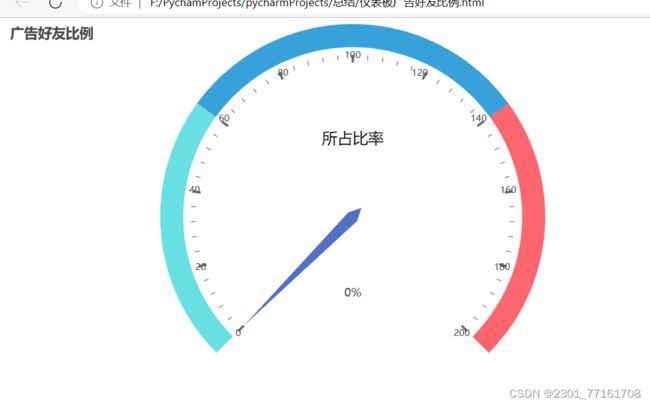
# 好友职业信息可视化,仪表盘和水球图展示
c = (
Gauge()
.add(
series_name = "广告好友指标",
data_pair = [("所占比率", len(advertise_list)/len(NickName)*100)],
radius="100%", # 设置比例大小
min_=0, max_=200, # 设置起始、终止刻度
title_label_opts=opts.GaugeTitleOpts(
font_size=20, color="black", font_family="Microsoft YaHei" # 设置字体、颜色、大小
),
axisline_opts=opts.AxisLineOpts(
linestyle_opts=opts.LineStyleOpts(
color=[(0.3, "#67e0e3"), (0.7, "#37a2da"), (1, "#fd666d")], width=30 # 设置区间颜色、仪表宽度
)
),
)
.set_global_opts(
title_opts=opts.TitleOpts(
title="广告好友比例"
),
legend_opts=opts.LegendOpts(
is_show=False
),
)
.render("./仪表板广告好友比例.html")
)
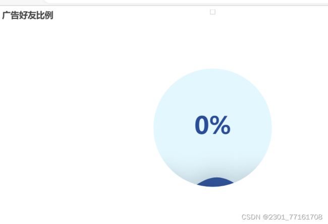
c = (
Liquid()
.add("广告好友", [(len(advertise_list)/len(NickName)),(len(advertise_list)/len(NickName)*100)], is_outline_show=False)
.set_global_opts(title_opts=opts.TitleOpts(title="广告好友比例"))
.render("./水球图广告好友比例.html")
)