figma设计
Should UI/UX design be considered as part of the fullstack development skills? It is debatable as there is no common definition of fullstack skills. However, UI/UX design is undeniably one of the critical activities as part of the whole app development lifecycle. Luckily, the advent of UI/UX design tools vastly improve the productivity as it speeds up the development of screen design and shortens the timeframe of the design review.
UI / UX设计是否应被视为全栈开发技能的一部分? 这是有争议的,因为全栈技能没有通用的定义。 但是,不可否认,UI / UX设计是整个应用程序开发生命周期中的关键活动之一。 幸运的是,UI / UX设计工具的出现极大地提高了生产率,因为它加快了屏幕设计的开发速度,缩短了设计审查的时间。
As a tech developer, I crave for exploring the fabulous domain of UI/UX design and experimenting various combination of screen designs. In this article, I will share the UI/UX design of my new app using Figma.
作为技术开发人员,我渴望探索UI / UX设计的绝佳领域并尝试各种屏幕设计组合。 在本文中,我将使用Figma分享我的新应用程序的UI / UX设计。
UX / UI设计工具包 (UX/UI Design Toolkits)
Screen design software nowadays come with sophisticated features, at the same time, it is super easy to use. All those software are in vector graphics, meaning that we can design and form graphics using lines and curves supported resolutions without aliasing.
当今的屏幕设计软件具有复杂的功能,同时,它非常易于使用。 所有这些软件均为矢量图形,这意味着我们可以使用支持的直线和曲线的分辨率来设计和形成图形,而不会出现锯齿。
There are several tools available in the market — Sketch, Adobe XD, InVision and Figma. Their functionalities are generally similar. Sketch is definitely a famous tool and the leader in this domain but it is too expensive for personal project as it costs USD 99 for perpetual license. On the other hand, Figma drew my attention because it is free for individual account with up to 3 projects. Figma is an awesome design tool, it supports screen design on browser as well as client program with access to repository online. It is definitely a good choice for beginner to work on screen design.
市场上有几种工具可供使用-Sketch,Adobe XD,InVision和Figma。 它们的功能通常相似。 Sketch绝对是该领域的著名工具和领导者,但对于个人项目来说太贵了,因为永久许可证的价格为99美元。 另一方面,Figma引起了我的注意,因为它最多可用于3个项目的个人帐户。 Figma是一个很棒的设计工具,它支持浏览器上的屏幕设计以及可在线访问存储库的客户端程序。 对于初学者进行屏幕设计绝对是一个不错的选择。
关于应用程序 (About the App)
I will develop screen design based on an app — Household Inventory Helper. The idea is to help us maintain our groceries and other household items effectively.
我将基于一个应用程序-家庭库存帮助程序来开发屏幕设计。 这样做的目的是帮助我们有效地维护杂货和其他生活用品。
Based on this idea, I figure out the list of main functions:
基于这个想法,我弄清楚了主要功能列表:
Item Finder — Make it easy to find and locate items by keyword or by category
物品查找器 -轻松按关键字或类别查找和定位物品
Reminder — Show the list of items soon to expire and the suggested shopping list
提醒 -显示即将过期的商品清单和建议的购物清单
Inventory Maintenance — Manage the inventory records
库存维护 -管理库存记录
Settings — Define our own places at home and inventory item category
设置 -定义我们自己的住所和库存物品类别
线框 (Wireframe)
Wireframe design is the first step in the UX/UI design process. The outcome are usually the screen design presentation in grey, black & white without images and textual content. The focus is mainly on the important elements — screen layouts, screen navigation and functionalities whereas cosmetic design and color theme will be determined in later stage. Since the screen design would be changed rapidly during the initial stage, it takes less effort to alter the design and so speed up the turn around time for any changes on design. Moreover, this is an effective approach to help us pay attention to those core features instead of being side tracked by look & feel and other less important items.
线框设计是UX / UI设计过程的第一步。 结果通常是屏幕设计呈现为灰色,黑色和白色,没有图像和文本内容。 重点主要放在重要元素上-屏幕布局,屏幕导航和功能,而外观设计和色彩主题将在稍后阶段确定。 由于屏幕设计会在初始阶段快速更改,因此更改设计所需的精力更少,因此可以加快设计更改的周转时间。 此外,这是一种有效的方法,可以帮助我们关注这些核心功能,而不是被外观和其他不太重要的项目所跟踪。
Here is the wireframe of the home inventory app at a glance. This version covers detail UI components, it is the result after review and fine-tune.
这是房屋清单应用的线框图,一目了然。 此版本涵盖了详细的UI组件,它是经过审查和微调后的结果。
Wireframe Screen Design 线框屏幕设计分步屏幕设计 (Step-by-Step Screen Design)
Let me walkthrough the following available tools on Figma:
让我在Figma上演练以下可用工具:
- Frame 帧
- Vector Graphic Tools 矢量图形工具
- Icons 图示
- Reusable UI Component 可重用的UI组件
帧 (Frame)
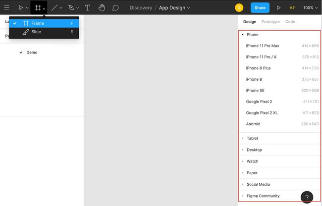
Frame serves as a container of UI components, we consider it as screen or popup dialog and put UI elements on it, so creation of frame is the first step of screen design. Figma provides a set of pre-defined frame sizes for a wide range of devices, making it convenient for us to setup frame for your target devices like iPhone, android, desktop, watch, etc. You can define your own frame size if you cannot find your device in the list.
框架用作UI组件的容器,我们将其视为屏幕或弹出对话框并在其中放置UI元素,因此创建框架是屏幕设计的第一步。 Figma为各种设备提供了一组预定义的帧大小,这使我们可以方便地为目标设备(如iPhone,Android,台式机,手表等)设置帧。如果无法定义帧大小,则可以定义自己的帧大小在列表中找到您的设备。
Figma — Frame Figma —框架强大的矢量图形工具 (Powerful Vector Graphic Tools)
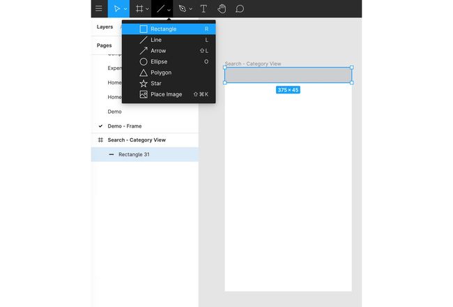
Once frame is ready, let’s create a page title bar. You can draw a rectangle with grey background. As you can see, Figma provides a list of tools for vector graphic drawing like rectangle, line, arrow,ellipse, etc. You can quickly get familiar with the tools if you worked on shapes using Microsoft Office before. The drawing tools look simple but they are powerful, we can freely create various shapes by just using the tools.
框架准备好后,让我们创建一个页面标题栏。 您可以绘制一个灰色背景的矩形。 如您所见,Figma提供了用于矢量图形绘制的工具列表,例如矩形,直线,箭头,椭圆形等。如果您以前使用Microsoft Office处理形状,则可以快速熟悉这些工具。 绘图工具看起来很简单,但是功能强大,我们只需使用这些工具就可以自由创建各种形状。
Figma — Vector Drawing Tools Figma —矢量绘图工具Besides, I find the assistance feature so much useful as Figma shows the object size, spacing information of all related objects and alignment guidance to help me put quickly object in a right position.
此外,我发现辅助功能非常有用,因为Figma可以显示物体尺寸,所有相关物体的间距信息以及对齐指导,以帮助我快速将物体放置在正确的位置。
Figma — Alignment & Space Figma —对齐方式和空间图示 (Icons)
Icons are the wonderful and essential elements, enriching the screen design and enhancing user experience. You can find a list of icon available here at your disposal. If you have already signed in to Figma on browser, the icon sets will automatically copied to your account under Drafts area. Therefore, you can search for an icon by typing keyword under Assets. For instance, I can get navigation menu icon by keyword “menu”.
图标是美妙而必不可少的元素,丰富了屏幕设计并增强了用户体验。 您可以在此处找到可用的图标列表。 如果您已经在浏览器上登录了Figma,则图标集将自动复制到“草稿”区域下的帐户中。 因此,您可以通过在“资产”下键入关键字来搜索图标。 例如,我可以通过关键字“ menu”获得导航菜单图标。
Figma — Icon Resources Figma —图标资源Great! We have got a navigation menu icon on the page title bar. You can find 2 objects there — rectangle and icon in the left pane.
大! 页面标题栏上有一个导航菜单图标。 您可以在其中找到2个对象-左侧窗格中的矩形和图标。
Figma —Menu Icon Figma-菜单图标文字标签 (Text Label)
Adding the text label is another basic feature of Figma. There are number of properties such as font, size, alignment and color available on right panel.
添加文本标签是Figma的另一个基本功能。 右侧面板上有许多属性,例如字体,大小,对齐方式和颜色。
Figma — Text Label Figma —文本标签可重用的UI组件 (Reusable UI Component)
Productivity and efficiency are the competitive advantages of UX/UI design tool over traditional graphic drawing software such as photoshop. Designers can define their own UI components and put them into library for reuse across multiple frames and projects.
与传统的图形绘制软件(例如photoshop)相比,生产率和效率是UX / UI设计工具的竞争优势。 设计人员可以定义自己的UI组件,并将其放入库中,以在多个框架和项目中重复使用。
Steps to create reusable UI component
创建可重复使用的UI组件的步骤
Taking category card as an example, we can group both text label and box followed by UI component creation.
以类别卡为例,我们可以对文本标签和框进行分组,然后创建UI组件。
Figma — UI Component Creation Figma — UI组件创建Then, we are free to grasp the component from Assets for reuse in any frame.
然后,我们可以自由地从Assets中抓取组件以在任何框架中重复使用。
Figma — UI Component in Assets Figma —资产中的UI组件Screen Design Change with UI Component
使用UI组件进行屏幕设计更改
When we create an instance of UI component from Asset, the instance keeps its linkage to master component. Let’s say we have 3 frames below, the page title bar highlighted in red is the master component while those in other pages are the instance.
当我们从Asset创建UI组件的实例时,该实例保持其与主组件的链接。 假设下面有3个框,用红色突出显示的页面标题栏是主要组件,而其他页面中的标题栏是实例。
Figma — Page Title Bar UI Component Figma —页面标题栏UI组件The use of UI component saves us a lot time in case of any amendment required on screen design. If users want to add a new button on the page title bar, should we bother altering the page title bar on every frame? Figma provides a super useful feature, we can just add the new button (highlighted in red) to the master UI component and the newly added button will appear in all instances (highlighted in green).
UI组件的使用为我们节省了很多时间,以防屏幕设计需要任何修改。 如果用户想在页面标题栏上添加新按钮,我们是否应该麻烦每一帧都更改页面标题栏? Figma提供了一个超级有用的功能,我们只需将新按钮(以红色突出显示)添加到主UI组件,新添加的按钮将出现在所有实例中(以绿色突出显示)。
Figma — Add New Element to UI Component Figma —将新元素添加到UI组件原型 (Prototype)
The feature to support prototype provided by UX/UI design tool is a game changer because it is possible for end-users to play with the screen flow and evaluate the user experience in an early stage of development. Instead of monotonous 2D graphics, prototype can vividly present the design and interaction. The earlier end-users can provide comments on the design, the more certain the user requirement. As a result, minimizing the risk of re-work or schedule delay due to change request of design in a later stage. The setup of prototype does not require code, it is just a straightforward configuration on Figma screen.
UX / UI设计工具提供的支持原型的功能可以改变游戏规则,因为最终用户可以在开发的早期阶段就玩屏游戏并评估用户体验。 原型可以单调生动地呈现设计和交互,而不是单调的2D图形。 最终用户越早提供对设计的评论,用户需求就越确定。 结果,将由于后期变更设计要求而导致的返工或进度延迟的风险降至最低。 原型的设置不需要代码,这只是在Figma屏幕上的简单配置。
屏幕流 (Screen Flow)
I pick one of the screen flows as an example to illustrate how to create prototype. This is a typical function to invoke function to new item to the inventory:
我以其中一个屏幕流为例来说明如何创建原型。 这是调用库存新项目功能的典型功能:
- Click on menu icon to display side menu 单击菜单图标以显示侧面菜单
- Select menu item to go to the screen of new item creation 选择菜单项以转到创建新项的屏幕
- Click on Add Unit button to display popup dialog 单击添加单位按钮以显示弹出对话框
互动设置 (Interaction Settings)
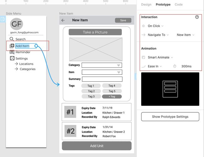
The interaction setup is to tell Figma to do something when a specific event happens. For example, we can tell Figma to display side menu when menu icon is clicked. The screenshot below illustrates the configuration under Prototype tab, side menu will be displayed as overlay on top left if menu icon is clicked. Blue arrow will appear to indicate the screen flow once we have interaction is configured.
交互设置是要告诉Figma在发生特定事件时执行某些操作。 例如,当单击菜单图标时,我们可以告诉Figma显示侧面菜单。 下面的屏幕截图说明了“ 原型”选项卡下的配置,如果单击菜单图标,则侧面菜单将在左上角显示为叠加。 配置互动后,将出现蓝色箭头指示屏幕流。
Prototype — Open Overlay Setup 原型-打开叠加设置The screen navigation to New Item screen can be done in the same way but this time we select “Navigate To” in the action and target “New Item” frame
可以用相同的方法将屏幕导航到“新项目”屏幕,但是这次我们在操作中选择“导航到”并定位“新项目”框架
Prototype — Screen Navigation Setup 原型-屏幕导航设置原型交付 (Prototype Delivery)
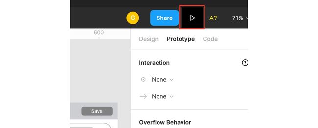
If you would like to check the screen flow on the prototype, then you can start the prototype by pressing the highlighted “play” button on right top menu.
如果您想检查原型上的屏幕流程,则可以通过按右上方菜单中突出显示的“播放”按钮来启动原型。
Figma Prototype Play Button Figma原型播放按钮It is convenient to deliver your prototype to end-users and other people in the team by sending them by hyperlink, the prototype work properly on browser without the need to install anything. Outsiders have got your link? No worry about the security issue as you can control the access right that only authorized person can view the prototype. You can visit this link and play with my sample prototype. The prototype is the same as the animated gif as shown below:
通过将超链接发送给最终用户和团队中的其他人,可以很方便地将原型交付给最终用户和其他人,该原型可以在浏览器上正常工作,而无需安装任何东西。 局外人有你的链接吗? 无需担心安全问题,因为您可以控制只有授权人员才能查看原型的访问权限。 您可以访问此链接并使用我的示例原型。 原型与动画gif相同,如下所示:
Prototype Demo 原型演示颜色主题 (Color Theme)
Creation of powerful and vibrant app is not possible without stunning color theme. Colors make your app more expressive so as to deliver a strong message and represent meaning such as green for nature, red for passion, etc. If you are the beginner of the color theme, then Material Design is a good starting point. Google created this system with the aim of building high quality digital experiences.
没有令人惊叹的色彩主题,就不可能创建功能强大且充满活力的应用程序。 颜色使您的应用程序更具表现力,以便传达强烈的信息并代表含义,例如绿色代表自然,红色代表热情等。如果您是颜色主题的初学者,那么Material Design是一个很好的起点。 Google创建此系统的目的是建立高质量的数字体验。
Material design provides color tool for us to experiment different combination of color themes.Here I define purple as the primary color and light blue as the secondary one.
材质设计为我们提供了色彩工具来尝试不同的色彩主题组合,这里我将紫色定义为主要颜色,将浅蓝色定义为主要颜色。
After applying color theme to the wireframe, the screen design now looks better and no longer in grayscale.
在将颜色主题应用于线框之后,屏幕设计现在看起来更好了,不再是灰度。
Screen Design with Color Theme 具有色彩主题的屏幕设计代码开发 (Code Development)
How to create button with rounded corners according to the screen design? Perhaps, you can quickly create button in HTML using cascading style sheets (CSS) if you are already familiar with CSS. Figma provides a handy function to generate CSS code so that you can create UI elements precisely based on the screen design. The screenshot shows the CSS code in Code tab when you select button rectangle and text respectively. Apart from CSS, you can get UI style definition for iOS and android in native code as well.
如何根据屏幕设计创建带有圆角的按钮? 也许,如果您已经熟悉CSS,则可以使用级联样式表(CSS)在HTML中快速创建按钮。 Figma提供了一个方便的功能来生成CSS代码,以便您可以根据屏幕设计精确地创建UI元素。 屏幕快照在“代码”选项卡中分别选择按钮矩形和文本时显示CSS代码。 除了CSS,您还可以使用本机代码获取iOS和android的UI样式定义。
Figma — CSS Code Figma — CSS代码最终思想 (Final Thought)
UX/UI design tool like Figma is so much user-friendly and easy to use. It allows us to play around and experiment the screen design no matter you are a professional UX/UI designer or not. As a developer, I not only can broaden our horizon to the domain of screen design, but also enjoy the satisfaction of the whole app development end-to-end instead of solely focusing on program code. Being versatile and agile perhaps are the important factors to success in the fast-pace and highly competitive environment, the exploration and acquisition of new skills in different domains is definitely beneficial to professional development.
UX / UI设计工具(例如Figma)非常易于使用且易于使用。 无论您是否是专业的UX / UI设计师,它都使我们能够进行实验并尝试屏幕设计。 作为开发人员,我不仅可以将我们的视野拓宽到屏幕设计领域,而且可以享受整个应用程序端到端的满意度,而不必仅仅关注程序代码。 灵活多变的敏捷能力可能是在快速,竞争激烈的环境中取得成功的重要因素,探索和掌握不同领域的新技能无疑对专业发展有利。
翻译自: https://medium.com/dev-genius/figma-how-tech-developer-pick-up-the-skills-of-ux-ui-design-c516aa20c7eb
figma设计


