网格布局中 justify-items 和 align-litems
justify-items 和 align-litems 是从整体上调整 网格项(grid items)中的内容 在 网格区域(grid area) 中的位置的。
也可以单独调整 某个网格项(grid items)中的内容,在这个网格项上使用 justify-self 和 align-self 属性。
justify-items
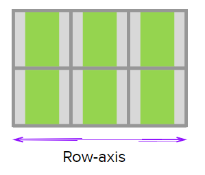
网格容器( grid container) 的属性,设置 网格项(grid items)中的内容(the content within grid items) 沿着行轴线(水平方向)上的对齐方式,适用于容器内的所有网格项。
如果要单独调整 某个网格项中的内容 沿着行轴线(水平方向)上的对齐方式,则可以在 这个网格项 上使用 justify-self 属性。
值:
start: 将 网格项中的内容 对齐到其网格区域(grid area)行轴线的起始边缘(Justifies content of grid items with the starting edge of the grid area along the row-axis)

end: 将 网格项中的内容 对齐到其网格区域(grid area)行轴线的结束边缘(Justifies content of grid items with the ending edge of the grid area along the row-axis)

center: 将网格项中的内容对齐到其网格区域(grid area)行轴线的中心位置(Justifies content of grid items in the center of the grid area along the row-axis)
stretch: 默认值,将 网格项中的内容 撑满其网格区域(grid area)(This is the default value. Fills up the width of the grid area.)

align-items
网格容器( grid container) 的属性,设置 网格项(grid items)中的内容(the content within grid items) 沿着列轴线(垂直方向)上的对齐方式,适用于容器内的所有网格项。
如果要单独调整 某个网格项中的内容 沿着列轴线(垂直方向)上的对齐方式,则可以在 这个网格项 上使用 align-self 属性。
值:
start: 将 网格项中的内容 对齐到其网格区域(grid area)列轴线的起始边缘(Aligns content of grid items with the starting edge of the grid area along the row-axis)

end: 将 网格项中的内容 对齐到其网格区域(grid area)列轴线的结束边缘(Aligns content of grid items with the ending edge of the grid area along the row-axis)

center: 将网格项中的内容对齐到其网格区域(grid area)列轴线的中心位置(Aligns content of grid items in the center of the grid area along the row-axis)

stretch: 默认值,将 网格项中的内容 撑满其网格区域(grid area)(This is the default value. Fills up the width of the grid area.)

举个栗子:
html主要代码:
    <div class="wrapper">
        <div class="box a">
            <p>This is box A. p>
        div>

        <div class="box b">
            <p>This is box B.p>
        div>

        <div class="box c">
            <p>This is box C.p>
        div>

        <div class="box d">
            <p>This is box D.p>
        div>

        <div class="box e">
            <p>Each of the boxes on the left has a grid area of 2 columns and 2 rows p>
            <p>The justify-items property is used to justify the content inside each grid-area.p>
            <p>Other values of justify-items are:p>
            <ul>
                <li>stretchli>
                <li>startli>
                <li>endli>
                <li>centerli>
            ul>
        div>
    div>
css主要代码:
        .wrapper {
            display: grid;
            /* 网格项中内容的对齐方式 */
            justify-items: start;
            grid-gap: 10px;
            grid-template-columns: repeat(6, 150px);
            grid-template-rows: repeat(4, 150px);
        }

        .a {
            grid-column: 1 / 3;
            grid-row: 1 / 3;
            background: rgba(232, 140, 217, 0.5);
        }

        .b {
            grid-column: 3 / 5;
            grid-row: 1 / 3;
            background:rgba(65, 193, 12, 0.5);
        }

        .c {
            grid-column: 1 / 3;
            grid-row: 3 / 5;
            background:rgba(151, 183, 241, 0.5);
        }

        .d {
            grid-column: 3 / 5;
            grid-row: 3 /5;
            background:rgba(232, 187, 140, 0.5);
        }

        .e {
            grid-column: 5 / 7;
            grid-row: 1 / 5;
            /* 网格项也可以用 align-self 属性单独调整自己列轴线(垂直方向)上的对齐方式 */
            align-self: start;
            background:#5ecfda3d;
        }
最终效果:

完整代码也贴出来:
<html lang="en">
<head>
    <meta charset="UTF-8">
    <meta name="viewport" content="width=device-width, initial-scale=1.0">
    <meta http-equiv="X-UA-Compatible" content="ie=edge">
    <title>grid demotitle>
    <style>
        * {
            padding: 0;
            margin: 0;
            font-size: 20px;
            color: #000;
        }

        ul{
            margin-left: 40px;
        }

        .wrapper {
            background: no-repeat url(https://s3-us-west-2.amazonaws.com/s.cdpn.io/12005/grid.png);
        }

        .box {
            border: 1px solid #444;
        }

        .wrapper {
            display: grid;
            /* 网格项中内容的对齐方式 */
            justify-items: start;
            grid-gap: 10px;
            grid-template-columns: repeat(6, 150px);
            grid-template-rows: repeat(4, 150px);
        }

        .a {
            grid-column: 1 / 3;
            grid-row: 1 / 3;
            background: rgba(232, 140, 217, 0.5);
        }

        .b {
            grid-column: 3 / 5;
            grid-row: 1 / 3;
            background:rgba(65, 193, 12, 0.5);
        }

        .c {
            grid-column: 1 / 3;
            grid-row: 3 / 5;
            background:rgba(151, 183, 241, 0.5);
        }

        .d {
            grid-column: 3 / 5;
            grid-row: 3 /5;
            background:rgba(232, 187, 140, 0.5);
        }

        .e {
            grid-column: 5 / 7;
            grid-row: 1 / 5;
            /* 网格项也可以用 align-self 属性单独调整自己列轴线(垂直方向)上的对齐方式 */
            align-self: start;
            background:#5ecfda3d;
        }
    style>
head>
<body>
    <div class="wrapper">
        <div class="box a">
            <p>This is box A. p>
        div>

        <div class="box b">
            <p>This is box B.p>
        div>

        <div class="box c">
            <p>This is box C.p>
        div>

        <div class="box d">
            <p>This is box D.p>
        div>

        <div class="box e">
            <p>Each of the boxes on the left has a grid area of 2 columns and 2 rows p>
            <p>The justify-items property is used to justify the content inside each grid-area.p>
            <p>Other values of justify-items are:p>
            <ul>
                <li>stretchli>
                <li>startli>
                <li>endli>
                <li>centerli>
            ul>
        div>
    div>
body>
html>