Qt6 QML Book/QtQuick控件/图像查看器
An Image Viewer
图像查看器
Let’s look at a larger example of how Qt Quick Controls are used. For this, we will create a simple image viewer.
让我们看一个关于如何使用Qt Quick控件的示例。为此,我们将创建一个简单的图像查看器。
First, we create it for desktop using the Fusion style, then we will refactor it for a mobile experience before having a look at the final code base.
首先,我们使用桌面样式Fusion创建它,然后在最终代码,我们将重构为移动端样式。
The Desktop Version
桌面版
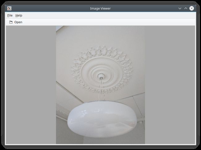
The desktop version is based around a classic application window with a menu bar, a tool bar and a document area. The application can be seen in action below.
桌面版本基于一个经典的应用程序窗口,该窗口具有一个菜单栏、一个工具栏和一个文档区域。应用程序可以在下面的操作中看到。
We use the Qt Creator project template for an empty Qt Quick application as a starting point. However, we replace the default Window element from the template with a ApplicationWindow from the QtQuick.Controls module. The code below shows main.qml where the window itself is created and setup with a default size and title.
我们使用QtCreator项目模板生成一个空的QtQuick应用程序的开始。但是,我们将模板中的默认Window元素类型替换为QtQuick.Controls模块中的ApplicationWindow。下面的代码显示了main.qml,其中创建窗口本身并使用默认大小和标题进行设置。
import QtQuick
import QtQuick.Controls
import Qt.labs.platform

ApplicationWindow {
    visible: true
    width: 640
    height: 480

    // ...

}
The ApplicationWindow consists of four main areas as shown below. The menu bar, tool bar and status bar are usually populated by instances of MenuBar, ToolBar or TabBar controls, while the contents area is where the children of the window go. Notice that the image viewer application does not feature a status bar; that is why it is missing from the code show here, as well as from the figure above.
ApplicationWindow由四个主要区域组成,如下所示。菜单栏、工具栏和状态栏通常由MenuBar、ToolBar或TabBar控件的实例填充,而内容区域则是窗口的子项所在。请注意,图像查看器应用程序没有状态栏;这就是为什么这里显示的代码和上图中都缺少它。

As we are targeting desktop, we enforce the use of the Fusion style. This can be done via a configuration file, environment variables, command line arguments, or programmatically in the C++ code. We do it the latter way by adding the following line to main.cpp:
当我们发布的桌面版程序时,我们强制使用Fusion样式。这可以通过配置文件、环境变量、命令行参数或C++编程方式来实现。我们采用最后一种方法,在main.cpp中添加以下行:
QQuickStyle::setStyle("Fusion");
We then start building the user interface in main.qml by adding an Image element as the contents. This element will hold the images when the user opens them, so for now it is just a placeholder. The background property is used to provide an element to the window to place behind the contents. This will be shown when there is no image loaded, and as borders around the image if the aspect ratio does not let it fill the contents area of the window.
然后,我们开始在main.qml中,通过添加一个Image元素对象作为内容,来构建用户界面。当用户打开图像时,这个元素将显示这些图像,现在它只是一个占位符。background属性用于向窗口提供一个元素对象,并放置在内容后面。当没有加载图像时,这将显示background元素对象,如果纵横比不匹配填充窗口的内容区域时,则显示为图像周围的边框。
ApplicationWindow {

    // ...

    background: Rectangle {
        color: "darkGray"
    }

    Image {
        id: image
        anchors.fill: parent
        fillMode: Image.PreserveAspectFit
        asynchronous: true
    }

    // ...

}
We then continue by adding the ToolBar. This is done using the toolBar property of the window. Inside the tool bar we add a Flow element which will let the contents fill the width of the control before overflowing to a new row. Inside the flow we place a ToolButton.
然后我们继续添加工具栏ToolBar。这是使用窗口的工具栏toolBar属性完成的。在工具栏中,我们添加了一个Flow元素类型,它将使内容在换新行前填充控件的宽度。在Flow元素类型中,我们放置了一个工具按钮ToolButton。
The ToolButton has a couple of interesting properties. The text is straight forward. However, the icon.name is taken from the freedesktop.org Icon Naming Specification. In that document, a list of standard icons are listed by name. By refering to such a name, Qt will pick out the correct icon from the current desktop theme.
ToolButton有几个有趣的属性。正文是直接显示的。然而,icon.name取自freedesktop.org Icon Naming Specification。在该文档中,标准图标列表按名称列出。通过引用这样的名称,Qt将从当前桌面主题中选择正确的图标。
In the onClicked signal handler of the ToolButton is the final piece of code. It calls the open method on the fileOpenDialog element.
在ToolButton的onClicked信号处理程序中,是最后一段代码。它调用fileOpenDialog元素对象上的open方法。
ApplicationWindow {

    // ...

    header: ToolBar {
        Flow {
            anchors.fill: parent
            ToolButton {
                text: qsTr("Open")
                icon.name: "document-open"
                onClicked: fileOpenDialog.open()
            }
        }
    }

    // ...

}
The fileOpenDialog element is a FileDialog control from the Qt.labs.platform module. The file dialog can be used to open or save files.
fileOpenDialog元素对象是来自Qt.labs.platform模块的FileDialog控件。“文件”对话框可用于打开或保存文件。
In the code we start by assigning a title. Then we set the starting folder using the StandardsPaths class. The StandardsPaths classholds links to common folders such as the user’s home, documents, and so on. After that we set a name filter that controls which files the user can see and pick using the dialog.
在代码中,我们首先指定一个标题。然后,我们使用StandardsPaths类设置起始文件夹。StandardsPaths类包含指向常用文件夹的链接,如用户的主目录、文档目录等。之后,我们设置了一个名称过滤器,用于控制用户可以使用对话框查看和选择哪些文件。
Finally, we reach the onAccepted signal handler where the Image element that holds the window contents is set to show the selected file. There is an onRejected signal as well, but we do not need to handle it in the image viewer application.
最后,我们看下onAccepted信号处理器,其中保存窗口内容的Image元素对象用来显示所选文件。还有一个onRejected信号处理器,但在image viewer应用程序中未使用。
ApplicationWindow {

    // ...

    FileDialog {
        id: fileOpenDialog
        title: "Select an image file"
        folder: StandardPaths.writableLocation(StandardPaths.DocumentsLocation)
        nameFilters: [
            "Image files (*.png *.jpeg *.jpg)",
        ]
        onAccepted: {
            image.source = fileOpenDialog.fileUrl
        }
    }

    // ...

}
We then continue with the MenuBar. To create a menu, one puts Menu elements inside the menu bar, and then populates each Menu with MenuItem elements.
然后我们继续看下菜单栏MenuBar。要创建菜单,可以将菜单Menu元素类型放入菜单栏中,然后用菜单元素类型MenuItem填充每个菜单。
In the code below, we create two menus, File and Help. Under File, we place Open using the same icon and action as the tool button in the tool bar. Under Help, you find About which triggers a call to the open method of the aboutDialog element.
在接下来的代码中,我们创建了两个菜单:文件File和帮助Help。在“文件”菜单下,我们放置“打开”项,并使用与工具栏中的工具按钮相同的图标和行为。在“帮助”菜单下,您可以找到“关于”项,此项触发了对aboutDialog元素对象的open方法的调用。
Notice that the ampersands (“&”) in the title property of the Menu and the text property of the MenuItem turn the following character into a keyboard shortcut; e.g. you reach the file menu by pressing Alt+F, followed by Alt+O to trigger the open item.
请注意,菜单Menu的title属性和菜单项MenuItem的text属性中的符号(&),可以将字符转换为键盘快捷键;例如.本例中,按Alt+F,进入文件菜单,按Alt+O触发打开。
ApplicationWindow {

    // ...

    menuBar: MenuBar {
        Menu {
            title: qsTr("&File")
            MenuItem {
                text: qsTr("&Open...")
                icon.name: "document-open"
                onTriggered: fileOpenDialog.open()
            }
        }

        Menu {
            title: qsTr("&Help")
            MenuItem {
                text: qsTr("&About...")
                onTriggered: aboutDialog.open()
            }
        }
    }

    // ...

}
The aboutDialog element is based on the Dialog control from the QtQuick.Controls module, which is the base for custom dialogs. The dialog we are about to create is shown in the figure below.
aboutDialog元素对象基于QtQuick.Controls模块中的Dialog控件。它是自定义对话框的基控件。我们要创建的对话框如下图所示。
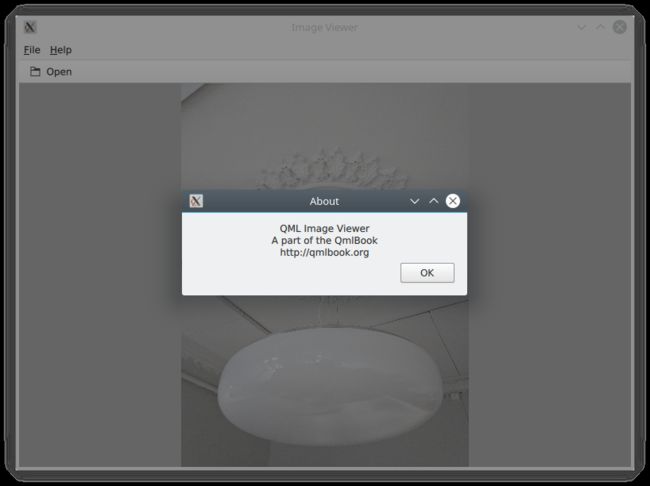
The code for the aboutDialog can be split into three parts. First, we setup the dialog window with a title. Then, we provide some contents for the dialog – in this case, a Label control. Finally, we opt to use a standard Ok button to close the dialog.
aboutDialog的代码可以分为三部分。首先,我们设计带有标题的对话框窗口。然后,我们为对话框提供一些内容——在本例中是一个标签Label控件。最后,我们选择使用标准的Ok按钮来关闭对话框。
ApplicationWindow {

    // ...

    Dialog {
        id: aboutDialog
        title: qsTr("About")
        Label {
            anchors.fill: parent
            text: qsTr("QML Image Viewer\nA part of the QmlBook\nhttp://qmlbook.org")
            horizontalAlignment: Text.AlignHCenter
        }

        standardButtons: StandardButton.Ok
    }

    // ...

}
The end result of all this is a functional, albeit simple, desktop application for viewing images.
最终一个功能强大但简单的桌面应用程序完成,可用于查看图像。
Moving to Mobile
移动设备移植
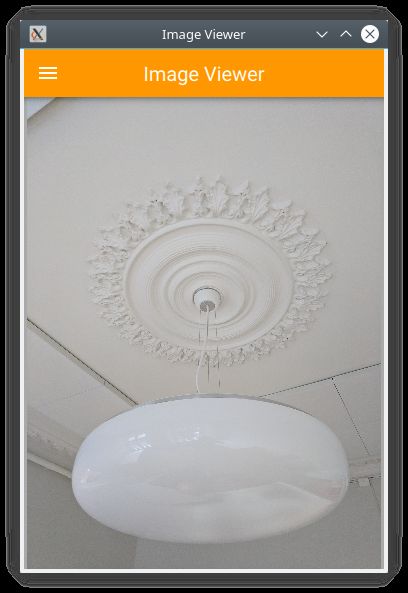
There are a number of differences in how a user interface is expected to look and behave on a mobile device compared to a desktop application. The biggest difference for our application is how the actions are accessed. Instead of a menu bar and a tool bar, we will use a drawer from which the user can pick the actions. The drawer can be swiped in from the side, but we also offer a hamburger button in the header. The resulting application with the drawer open can be seen below.
与桌面应用程序相比,移动设备上的用户界面在外观和行为方面存在许多差异。我们的应用程序最大的区别是如何访问操作。我们将使用一个侧边抽屉drawer,用户可以从中选择操作,而不是菜单栏和工具栏。抽屉可以从侧面滑入,但我们在顶部还提供了一个打开按钮。抽屉打开时的应用程序如下所示。

First of all, we need to change the style that is set in main.cpp from Fusion to Material:
首先,我们需要更改main.cpp中样式设置。从Fusion样式到Material样式:
QQuickStyle::setStyle("Material");
Then we start adapting the user interface. We start by replacing the menu with a drawer. In the code below, the Drawer component is added as a child to the ApplicationWindow. Inside the drawer, we put a ListView containing ItemDelegate instances. It also contains a ScrollIndicator used to show which part of a long list is being shown. As our list only consists of two items, the indicator is not visible in this example.
然后我们开始调整用户界面。我们先把菜单换成抽屉。在下面的代码中,抽屉组件Drawer作为子组件添加到ApplicationWindow。在抽屉中,我们放置了一个包含ItemDelegate实例的ListView。它还包含一个滚动指示器ScrollIndicator,用于长列表显示。由于我们的列表只包含两个项,因此在本例中该指示器不可见。
The drawer's ListView is populated from a ListModel where each ListItem corresponds to a menu item. Each time an item is clicked, in the onClicked method, the triggered method of the corresponding ListItem is called. This way, we can use a single delegate to trigger different actions.
抽屉的ListView由一个ListModel填充,其中每个ListItem对应一个菜单项。每次单击项时,在onClicked方法中,都会调用相应ListItem的triggered方法。这样,我们可以使用单个委托来触发不同的操作。
ApplicationWindow {

    // ...

    id: window

    Drawer {
        id: drawer

        width: Math.min(window.width, window.height) / 3 * 2
        height: window.height

        ListView {
            focus: true
            currentIndex: -1
            anchors.fill: parent

            delegate: ItemDelegate {
                width: parent.width
                text: model.text
                highlighted: ListView.isCurrentItem
                onClicked: {
                    drawer.close()
                    model.triggered()
                }
            }

            model: ListModel {
                ListElement {
                    text: qsTr("Open...")
                    triggered: function() { fileOpenDialog.open(); }
                }
                ListElement {
                    text: qsTr("About...")
                    triggered: function() { aboutDialog.open(); }
                }
            }

            ScrollIndicator.vertical: ScrollIndicator { }
        }
    }

    // ...

}
The next change is in the header of the ApplicationWindow. Instead of a desktop style toolbar, we add a button to open the drawer and a label for the title of our application.
下一个更改在ApplicationWindow的标题header中。与桌面样式的工具栏不同,我们添加了一个按钮来打开抽屉,并为应用程序的标题添加了一个标签。
The ToolBar contains two child elements: a ToolButton and a Label.
工具栏ToolBar包含两个子元素类型:工具按钮ToolButton和标签Label。
The ToolButton control opens the drawer. The corresponding close call can be found in the ListView delegate. When an item has been selected, the drawer is closed. The icon used for the ToolButton comes from the Material Design Icons page.
ToolButton控件打开抽屉。可以在ListView委托中找到相应的close调用。选择项目后,抽屉关闭。用于工具按钮ToolButton的图标来自“材质设计图标”页面。
ApplicationWindow {

    // ...

    header: ToolBar {
        ToolButton {
            id: menuButton
            anchors.left: parent.left
            anchors.verticalCenter: parent.verticalCenter
            icon.source: "images/baseline-menu-24px.svg"
            onClicked: drawer.open()
        }
        Label {
            anchors.centerIn: parent
            text: "Image Viewer"
            font.pixelSize: 20
            elide: Label.ElideRight
        }
    }

    // ...

}
Finally we make the background of the toolbar pretty — or at least orange. To do this, we alter the Material.background attached property. This comes from the QtQuick.Controls.Material module and only affects the Material style.
最后,我们把工具栏的背景弄得漂亮点——或者至少是橙色的。为了做到这一点,我们改变了Material.background附加属性。这来自QtQuick.Controls.Material模块,仅影响Material样式。
import QtQuick.Controls.Material

ApplicationWindow {

    // ...

    header: ToolBar {
        Material.background: Material.Orange

    // ...

}
With these few changes we have converted our desktop image viewer to a mobile-friendly version.
通过这些改动,我们已经将桌面图像查看器转换为一个移动友好的版本。
A Shared Codebase
共享代码库
In the past two sections we have looked at an image viewer developed for desktop use and then adapted it to mobile.
在上面两个部分中,我们介绍了一个为桌面使用而开发的图像查看器,然后将其适配于移动设备。
Looking at the code base, much of the code is still shared. The parts that are shared are mostly associated with the document of the application, i.e. the image. The changes have accounted for the different interaction patterns of desktop and mobile, respectively. Naturally, we would want to unify these code bases. QML supports this through the use of file selectors.
看看代码库,大部分代码仍然是共享的。共享的部分主要与应用程序的文档(如图像)有关。这些差异分别解释了桌面和移动设备的不同交互模式。当然,我们希望统一这些代码库。QML通过使用文件选择器来支持这一点。
A file selector lets us replace individual files based on which selectors are active. The Qt documentation maintains a list of selectors in the documentation for the QFileSelector class (link). In our case, we will make the desktop version the default and replace selected files when the android selector is encountered. During development you can set the environment variable QT_FILE_SELECTORS to android to simulate this.
通过文件选择器,我们可以根据选择器处于活动状态的文件替换单个文件。Qt文档维护QFileSelector类文档有选择器列表。在本例中,我们将使桌面版本成为默认版本,并在遇到android选择器时替换所选文件。在开发过程中,您可以将环境变量QT_FILE_SELECTORS设置为android,以模拟这种情况。
File Selector
文件选择器
File selectors work by replacing files with an alternative when a selector is present.
当存在选择器时,文件选择器会替换文件。
By creating a directory named +selector (where selector represents the name of a selector) in the same directory as the files that you want to replace, you can then place files with the same name as the file you want to replace inside the directory. When the selector is present, the file in the directory will be picked instead of the original file.
通过在与要替换的文件相同的目录中创建名为+selector(其中selector表示选择器的名称)的目录,可以将与要替换的文件同名的文件放置在目录中。当选择器存在时,将选择目录中的文件而不是原始文件。
The selectors are based on the platform: e.g. android, ios, osx, linux, qnx, and so on. They can also include the name of the Linux distribution used (if identified), e.g. debian, ubuntu, fedora. Finally, they also include the locale, e.g. en_US, sv_SE, etc.
选择器基于平台的:例如android、ios、osx、linux、qnx等。它们还可以包括所使用的Linux发行版的名称(如果已识别),例如debian、ubuntu、fedora。最后,它们还包括区域设置,例如en_US、sv_SE等。
It is also possible to add your own custom selectors.
也可以添加您自己的自定义选择器。
The first step to do this change is to isolate the shared code. We do this by creating the ImageViewerWindow element which will be used instead of the ApplicationWindow for both of our variants. This will consist of the dialogs, the Image element and the background. In order to make the open methods of the dialogs available to the platform specific code, we need to expose them through the functions openFileDialog and openAboutDialog.
进行此更改的第一步是隔离共享代码。我们通过创建ImageViewerWindow元素来实现这一点,对于我们的两个变体,该元素将代替ApplicationWindow使用。这将包括对话框、图像元素类型Image和背景。为了使对话框的open方法可使用平台特性代码,我们需要通过函数openFileDialog和openAboutDialog暴露它们。
import QtQuick
import QtQuick.Controls
import Qt.labs.platform

ApplicationWindow {
    function openFileDialog() { fileOpenDialog.open(); }
    function openAboutDialog() { aboutDialog.open(); }

    visible: true
    title: qsTr("Image Viewer")

    background: Rectangle {
        color: "darkGray"
    }

    Image {
        id: image
        anchors.fill: parent
        fillMode: Image.PreserveAspectFit
        asynchronous: true
    }

    FileDialog {
        id: fileOpenDialog

        // ...

    }

    Dialog {
        id: aboutDialog

        // ...

    }
}
Next, we create a new main.qml for our default style Fusion, i.e. the desktop version of the user interface.
接下来,我们创建一个新的main.qml用于我们的默认Fusion样式,即用户界面的桌面版。
Here, we base the user interface around the ImageViewerWindow instead of the ApplicationWindow. Then we add the platform specific parts to it, e.g. the MenuBar and ToolBar. The only changes to these is that the calls to open the respective dialogs are made to the new functions instead of directly to the dialog controls.
这里,我们将使用基于ImageViewerWindow的用户界面,而不是ApplicationWindow。然后,我们向其中添加平台特性的部分,例如菜单栏MenuBar和工具栏ToolBar。唯一的变化是,打开相应对话框是通过新函数的调用实现,而不是直接对打开对话框控件。
import QtQuick
import QtQuick.Controls

ImageViewerWindow {
    id: window

    width: 640
    height: 480

    menuBar: MenuBar {
        Menu {
            title: qsTr("&File")
            MenuItem {
                text: qsTr("&Open...")
                icon.name: "document-open"
                onTriggered: window.openFileDialog()
            }
        }

        Menu {
            title: qsTr("&Help")
            MenuItem {
                text: qsTr("&About...")
                onTriggered: window.openAboutDialog()
            }
        }
    }

    header: ToolBar {
        Flow {
            anchors.fill: parent
            ToolButton {
                text: qsTr("Open")
                icon.name: "document-open"
                onClicked: window.openFileDialog()
            }
        }
    }
}
Next, we have to create a mobile specific main.qml. This will be based around the Material theme. Here, we keep the Drawer and the mobile-specific toolbar. Again, the only change is how the dialogs are opened.
接下来,我们必须创建一个移动端的main.qml。这将以Material样式为基础。在这里,我们保留抽屉Drawer和移动端的工具栏。同样,唯一的变化是对话框的打开调用方式。
import QtQuick
import QtQuick.Controls
import QtQuick.Controls.Material

ImageViewerWindow {
    id: window

    width: 360
    height: 520

    Drawer {
        id: drawer

        // ...

        ListView {

            // ...

            model: ListModel {
                ListElement {
                    text: qsTr("Open...")
                    triggered: function(){ window.openFileDialog(); }
                }
                ListElement {
                    text: qsTr("About...")
                    triggered: function(){ window.openAboutDialog(); }
                }
            }

            // ...

        }
    }

    header: ToolBar {

        // ...

    }
}
The two main.qml files are placed in the file system as shown below. This lets the file selector that the QML engine automatically creates pick the right file. By default, the Fusion main.qml is loaded. If the android selector is present, then the Material main.qml is loaded instead.
这两个main.qml文件放置在文件系统中的位置,如下所示。这允许QML引擎自动创建的文件选择器,并选择正确的文件。默认情况下,Fusion样式的main.qml会加载。如果存在android选择器,则Material样式的main.qml会加载。

Until now the style has been set in in main.cpp. We could continue doing this and use #ifdef expressions to set different styles for different platforms. Instead we will use the file selector mechanism again and set the style using a configuration file. Below, you can see the file for the Material style, but the Fusion file is equally simple.
到目前为止,样式是在main.cpp设置的。我们可以继续这样做,并使用#ifdef表达式为不同的平台设置不同的样式。同样,我们也可以使用文件选择器机制,并使用配置文件设置样式。在下面,可以看到Material样式文件,Fusion样式文件也同样简单。
[Controls]
Style=Material
These changes has given us a joined codebase where all the document code is shared and only the differences in user interaction patterns differ. There are different ways to do this, e.g. keeping the document in a specific component that is included in the platform specific interfaces, or as in this example, by creating a common base that is extended by each platform. The best approach is best determined when you know how your specific code base looks and can decide how to separate the common from the unique.
这些更改为我们提供了一个联合的代码库,其中所有文档代码都是共享的,只有用户交互模式差异的代码不同。有不同的方法可以做到这一点,例如,将文件中的接口,实现平台特性的组件,或者如本例所示,通过创建由每个平台扩展的基元素类型来实现。最好的方法就是确定下平台特性的代码,并分离出通用的代码。
Native Dialogs
本地对话框
When using the image viewer you will notice that it uses a non-standard file selector dialog. This makes it look out of place.
使用图像查看器时,您会注意到它使用了非标准的文件选择器的对话框。这使它看起来不合适。
The Qt.labs.platform module can help us solve this. It provides QML bindings to native dialogs such as the file dialog, font dialog and colour dialog. It also provides APIs to create system tray icons, as well as system global menus that sits on top of the screen (e.g. as in OS X). The cost of this is a dependency on the QtWidgets module, as the widget based dialog is used as a fallback where the native support is missing.
Qt.labs.platform模块可以帮助我们解决这个问题。它提供了QML绑定的本地对话框(如文件对话框、字体对话框和颜色对话框)。它还提供用于创建系统托盘图标的API,以及位于屏幕顶部的系统全局菜单(例如,在OS X中)。这样做的代价是依赖于QtWidgets模块,它是作为窗体对话框本地支持的备份。
In order to integrate a native file dialog into the image viewer, we need to import the Qt.labs.platform module. As this module has name clashes with the QtQuick.Dialogs module which it replaces, it is important to remove the old import statement.
为了将本地文件对话框集成到图像查看器中,我们需要导入Qt.labs.platform模块。此模块的名字与QtQuick.Dialogs模块是冲突的。所以注意删除旧的导入语句。
In the actual file dialog element, we have to change how the folder property is set, and ensure that the onAccepted handler uses the file property instead of the fileUrl property. Apart from these details, the usage is identical to the FileDialog from QtQuick.Dialogs.
在实际的文件对话框元素类型中,我们必须更改folder属性,并确保onAccepted处理器使用file属性而不是fileUrl属性。除这些细节外,用法与QtQuick.Dialogs中的FileDialog相同。
import QtQuick
import QtQuick.Controls
import Qt.labs.platform

ApplicationWindow {

    // ...

    FileDialog {
        id: fileOpenDialog
        title: "Select an image file"
        folder: StandardPaths.writableLocation(StandardPaths.DocumentsLocation)
        nameFilters: [
            "Image files (*.png *.jpeg *.jpg)",
        ]
        onAccepted: {
            image.source = fileOpenDialog.file
        }
    }

    // ...

}
In addition to the QML changes, we also need to alter the project file of the image viewer to include the widgets module.
除了QML更改之外,我们还需要更改图像查看器的项目文件,以包含widgets模块。
QT += quick quickcontrols2 widgets
And we need to update main.qml to instantiate a QApplication object instead of a QGuiApplication object. This is because the QGuiApplication class contains the minimal environment needed for a graphical application, while QApplication extends QGuiApplication with features needed to support QtWidgets.
我们需要更新main.qml来实例化QApplication对象,而不是QGuiApplication对象。这是因为QGuiApplication类包含图形应用程序所需的最小环境,而QApplication扩展了QGuiApplication,支持使用QtWidgets。
include

// ...

int main(int argc, char *argv[])
{
    QApplication app(argc, argv);

    // ...

}
With these changes, the image viewer will now use native dialogs on most platforms. The platforms supported are iOS, Linux (with a GTK+ platform theme), macOS, Windows and WinRT. For Android, it will use a default Qt dialog provided by the QtWidgets module.
通过这些更改,图像查看器现在,在大多数平台上使用本地对话框。支持的平台包括iOS、Linux(带有GTK+平台风格)、macOS、Windows和WinRT。对于Android,它将使用QtWidgets模块提供的默认Qt对话框。
示例源码下载