一文掌握seurat的umap新姿势,定制你的UMAP图
大家好,欢迎来到单细胞图片美化专辑!本文ump图,大致有四种中,欢迎个性化定制。
目录:
-
1#1 将坐标轴进行缩放
-
2#2 给umap添加圆圈
-
3 #3.1美化标签
-
3#3.2 配色调整
-
4 # 4 我认为最美umap 图
首先读取seruat官网的pbmc示例数据,待画个性umap图
aths(c( "/home/data/t040413/R/x86_64-pc-linux-gnu-library/4.2","/home/data/t040413/R/yll/usr/local/lib/R/site-library","/home/data/refdir/Rlib/", "/usr/local/lib/R/library"))library(Seurat)library(SeuratData)library(dplyr)pbmc=readRDS("~/gzh/featureplot_dotplot_vlnplot/pbmc3k_final.rds")DimPlot(pbmc,label=TRUE)
-
1 将坐标轴进行缩放,这样的umap图你喜欢吗
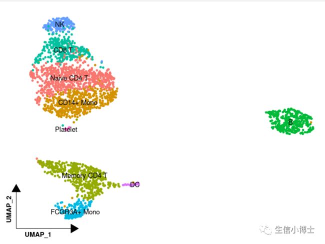
1#将坐标轴进行缩放##调用第三方包#install.packages('tidydr')library(tidydr)library(ggplot2)##绘图DimPlot(pbmc, reduction = "umap", label = TRUE, pt.size = 1.2) +tidydr::theme_dr(xlength = 0.2,ylength = 0.2,arrow = arrow(length = unit(0.2, "inches"),type = "closed")) +theme(panel.grid = element_blank(),axis.title = element_text(face = 2,hjust = 0.03)) +NoLegend()
-
2给umap添加圆圈,代码分为两步
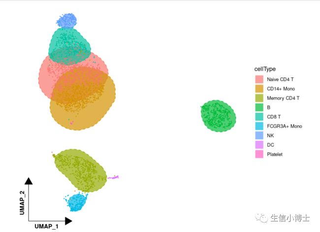
2给umap添加圆圈
2.1###首先提取umap数据table( [email protected])pbmc[['cellType']] = [email protected]umap = pbmc@[email protected] %>%as.data.frame() %>%cbind(cellType = [email protected]$cellType)head(umap)2.2##调用第三方包library(ggunchull)##绘图ggplot(umap,aes(x = UMAP_1, y = UMAP_2,fill = cellType, color = cellType)) +theme_dr(xlength = 0.2,ylength = 0.2,arrow = arrow(length = unit(0.2, "inches"),type = "closed")) +stat_unchull(alpha = 0.7, size = 0.5,lty = 2) +geom_point(size = 0.3,show.legend = F) +theme(aspect.ratio = 1,panel.background = element_blank(),panel.grid = element_blank(),axis.line = element_line(arrow = arrow(type = "closed")),axis.title = element_text(face = 2,hjust = 0.03)) +guides(fill = guide_legend(override.aes = list(colour = "white", linetype = 1, size = 1)))
-
3.1给umap图加方框

3 #3.1美化标签----##调用第三方包library(ggrepel)##提取umap数据pbmc[['cellType']] = [email protected]umap = pbmc@[email protected] %>%as.data.frame() %>%cbind(cellType = [email protected]$cellType)##计算标签中心位置区域celltypepos <- umap %>%group_by(cellType) %>%summarise(umap_1 = median(UMAP_1),umap_2 = median(UMAP_2))##画图p <- DimPlot(pbmc, reduction = "umap", label = FALSE, pt.size = 1.2) +theme_dr(xlength = 0.2,ylength = 0.2,arrow = arrow(length = unit(0.2, "inches"),type = "closed")) +theme(panel.grid = element_blank(),axis.title = element_text(face = 2,hjust = 0.03)) +NoLegend() +geom_label_repel(aes(x = umap_1,y = umap_2,label = cellType,color = cellType),fontface = "bold",data = celltypepos,box.padding = 0.5)p
-
3.2 不同杂志的配色方案,可以自定义配色方案。。这里列举四例
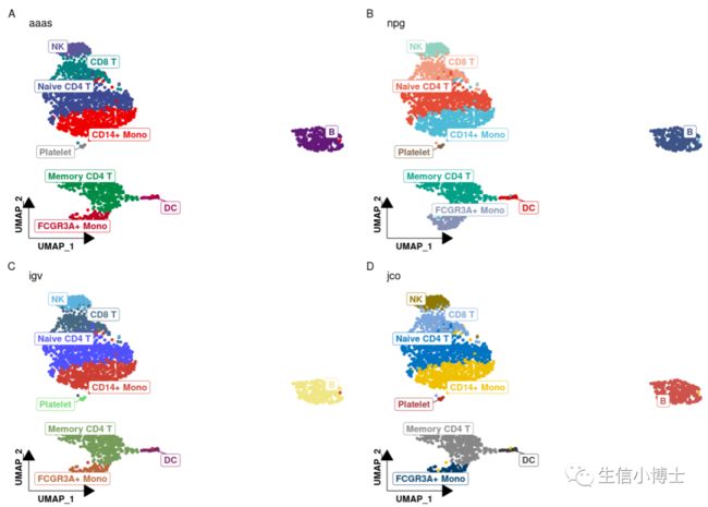
3#3.2 配色调整----##调用第三方包library(ggsci)##随机选取四种色系展示p1 <- p + scale_color_aaas() + labs(title = "aaas", tag = "A")p2 <- p + scale_color_npg() + labs(title = "npg", tag = "B")p3 <- p + scale_color_igv() + labs(title = "igv", tag = "C")p4 <- p + scale_color_jco() + labs(title = "jco", tag = "D")##图形组合patchwork::wrap_plots(p1,p2,p3,p4,ncol = 2)
-
4. 我认为最美的个性化umap图
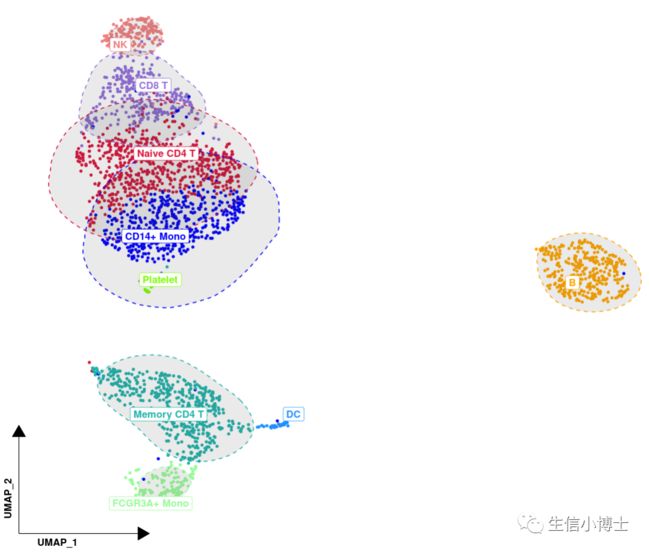
4 # 4 最美umap 图 -------4.1 #添加标签在图上 ,计算每个cluster的median 坐标位置pbmc[['cell_type']] = [email protected]umap = pbmc@[email protected] %>% #坐标信息as.data.frame() %>%cbind(cell_type = [email protected]$cell_type) # 注释后的cell_type信息head(umap)4.2 #计算每个细胞类型的median 坐标位置,留作在图上加标签cell_type_med <- umap %>%group_by(cell_type) %>%summarise(UMAP_1 = median(UMAP_1),UMAP_2 = median(UMAP_2))head(cell_type_med)4.3 #设定自己喜欢的颜色allcolour=c("#DC143C","#0000FF","#20B2AA","#FFA500","#9370DB","#98FB98","#F08080","#1E90FF","#7CFC00","#FFFF00", "#808000","#FF00FF","#FA8072","#7B68EE","#9400D3","#800080","#A0522D","#D2B48C","#D2691E","#87CEEB","#40E0D0","#5F9EA0", "#FF1493","#0000CD","#008B8B","#FFE4B5","#8A2BE2","#228B22","#E9967A","#4682B4","#32CD32","#F0E68C","#FFFFE0","#EE82EE", "#FF6347","#6A5ACD","#9932CC","#8B008B","#8B4513","#DEB887")p <- ggplot(umap,aes(x= UMAP_1 , y = UMAP_2 ,color = cell_type)) +geom_point(size = 1 , alpha =1 ) +scale_color_manual(values = allcolour);pp +theme(legend.title = element_blank(), #去掉legend.titlelegend.key=element_rect(fill='white'), #legend.text = element_text(size=20), #设置legend标签的大小legend.key.size=unit(1,'cm') ) + # 设置legend标签之间的大小guides(color = guide_legend(override.aes = list(size=5))) + #设置legend中 点的大小#缩放坐标轴tidydr:: theme_dr(xlength = 0.2,ylength = 0.2,arrow = arrow(length = unit(0.2, "inches"),type = "closed")) +#添加圈圈ggunchull::stat_unchull(alpha = 0.1, size = 0.5,lty = 2) +#添加注释 repel防止标签重叠,把注释加到图片的点上去ggrepel:: geom_label_repel(aes(label=cell_type), fontface="bold",data = cell_type_med,point.padding=unit(0.3, "lines")) +# #去掉legend# ggrepel::geom_label_repel(aes(label=cell_type), fontface="bold",data = cell_type_med,# point.padding=unit(0.5, "lines")) +theme(legend.position = "none") +#去掉网格theme(panel.grid = element_blank(),axis.title = element_text(face = 2,hjust = 0.03))head(umap)# #去掉网格线,坐标轴和背景色# theme(panel.grid.major = element_blank(), #主网格线# panel.grid.minor = element_blank(), #次网格线# panel.border = element_blank(), #边框# axis.title = element_blank(), #轴标题# axis.text = element_blank(), # 文本# axis.ticks = element_blank(),# panel.background = element_rect(fill = 'white'), #背景色# plot.background=element_rect(fill="white")) +#调整标签大小,标签点的大小以及 标签之间的距离
如果你对umap画图所用到的数据不理解,可以回看我的第三场直播,让你举一反三、触类旁通
单细胞直播三seurat数据结构与数据可视化