CSS特效026:扇骨打开关闭的动画
CSS常用示例100+专栏目录
本专栏记录的是经常使用的CSS示例与技巧,主要包含CSS布局,CSS特效,CSS花边信息三部分内容。其中CSS布局主要是列出一些常用的CSS布局信息点,CSS特效主要是一些动画示例,CSS花边是描述了一些CSS相关的库、知识点、理论篇章等。 因为常用所以记录、展示、分享,希望能给您带来帮助。
文章目录
-
- 效果图
- 源代码
- CSS基础知识点
- 结尾语
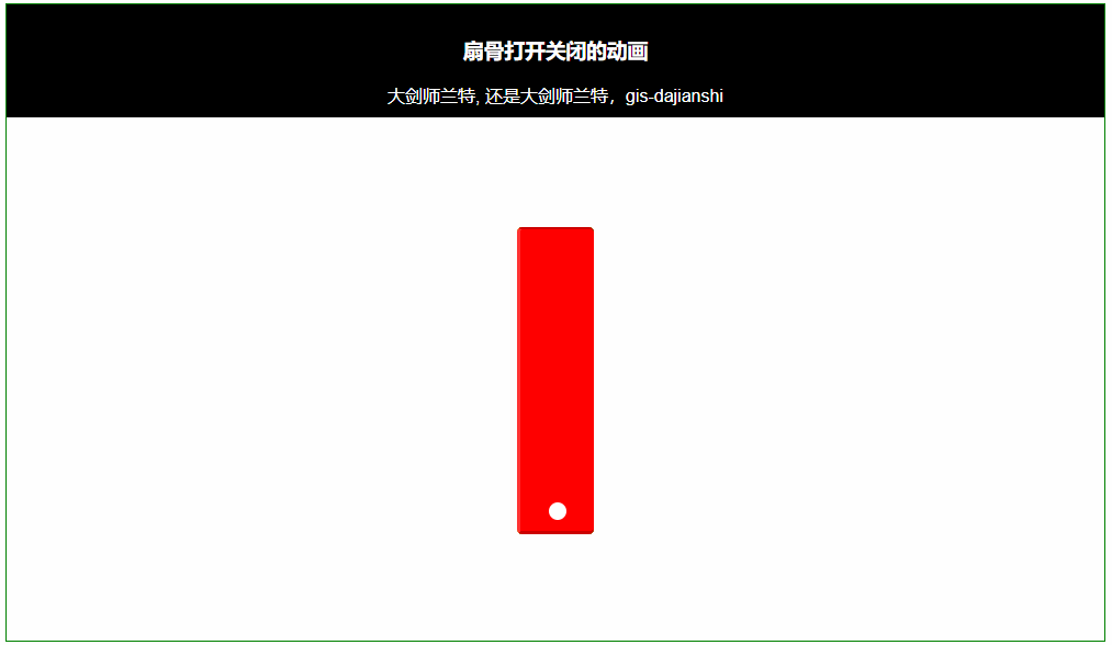
css实战中,怎么绘制扇骨打开关闭的动画呢?这里利用transform的rotate旋转特性,并且在不同的百分比时间段,控制的位置不同。同时利用cubic-bezier,是的旋转起来更为丝滑。
效果图
源代码
/*
* @Author: 大剑师兰特(xiaozhuanlan),还是大剑师兰特(CSDN)
* @此源代码版权归大剑师兰特所有,可供学习或商业项目中借鉴,未经授权,不得重复地发表到博客、论坛,问答,git等公共空间或网站中。
* @Email: [email protected]
* @weixin: gis-dajianshi
* @First published in CSDN
* @First published time: 2023-12-05
*/
<template>
	<div class="container">
		<div class="top">
			<h3>扇骨打开关闭的动画</h3>
			<div class="author">大剑师兰特, 还是大剑师兰特,gis-dajianshi</div>
		</div>
		<div class="dajianshi">
			<div class="one"></div>
			<div class="one"></div>
			<div class="one"></div>
			<div class="one"></div>
			<div class="one"></div>
			<div class="one"></div>
		</div>
	</div>
</template>

<style scoped>
	.container {
		width: 1000px;
		height: 580px;
		margin: 50px auto;
		border: 1px solid green;
		position: relative;
	}

	.top {
		margin: 0 auto 0px;
		padding: 10px 0;
		background: black;
		color: #fff;
	}

	.dajianshi {
		width: 100%;
		height: 400px;
		text-align: center;
		position: relative;
	}

	.one {
		width: 70px;
		height: 280px;
		position: absolute;
		top: 100px;
		border-radius: 5px;
		border-top: solid 2px rgba(0, 0, 0, .2);
		border-left: solid 3px rgba(255, 255, 255, .2);
		border-bottom: solid 3px rgba(0, 0, 0, .2);
		text-align: center;
		box-sizing: border-box;
		transform-origin: center 90%;
		display: inline-block;
		backface-visibility: hidden;
		margin-left: -35px;
		transform: rotate(0deg);
	}

	.one:before {
		width: 16px;
		height: 16px;
		content: "";
		background-color: white;
		display: inline-block;
		border-radius: 8px;
		bottom: 10px;
		position: absolute;
		margin-left: -8px;
	}

	.one:nth-child(1) {
		background-color: purple;
		animation: purple-move 5s cubic-bezier(0.4, 0.0, 0.2, 1) infinite;
	}

	.one:nth-child(2) {
		background-color: blue;
		animation: blue-move 5s cubic-bezier(0.4, 0.0, 0.2, 1) infinite;
	}

	.one:nth-child(3) {
		background-color: green;
		animation: green-move 5s cubic-bezier(0.4, 0.0, 0.2, 1) infinite;
	}

	.one:nth-child(4) {
		background-color: yellow;
		animation: yellow-move 5s cubic-bezier(0.4, 0.0, 0.2, 1) infinite;
	}

	.one:nth-child(5) {
		background-color: orange;
		animation: orange-move 5s cubic-bezier(0.4, 0.0, 0.2, 1) infinite;
	}

	.one:nth-child(6) {
		background-color: red;
		animation: red-move 5s cubic-bezier(0.4, 0.0, 0.2, 1) infinite;
	}


	@keyframes purple-move {
		0% {
			transform: rotate(0deg);
		}

		30%,
		70% {
			transform: rotate(-60deg);
		}

		90%,
		10% {
			transform: rotate(0deg);
		}
	}

	@keyframes blue-move {
		0% {
			transform: rotate(0deg);
		}

		30%,
		70% {
			transform: rotate(-40deg);
		}

		90%,
		10% {
			transform: rotate(0deg);
		}
	}

	@keyframes green-move {
		0% {
			transform: rotate(0deg);
		}

		30%,
		70% {
			transform: rotate(-15deg);
		}

		90%,
		10% {
			transform: rotate(0deg);
		}
	}

	@keyframes yellow-move {
		0% {
			transform: rotate(0deg);
		}

		30%,
		70% {
			transform: rotate(15deg);
		}

		90%,
		10% {
			transform: rotate(0deg);
		}
	}

	@keyframes orange-move {
		0% {
			transform: rotate(0deg);
		}
		30%,
		70% {
			transform: rotate(40deg);
		}

		90%,
		10% {
			transform: rotate(0deg);
		}
	}

	@keyframes red-move {
		0% {
			transform: rotate(0deg);
		}

		30%,
		70% {
			transform: rotate(60deg);
		}

		90%,
		10% {
			transform: rotate(0deg);
		}
	}
</style>
CSS基础知识点
1.CSS样式表
2.基础选择器:(1)标签选择器,(2)类选择器,(3)id选择器,(4)通配符选择器
3.复合选择器:(1)后代选择器,(2)子选择器,(3)并集选择器,(4)交集选择器,(5)伪类选择器。
4.字体样式属性:(1)字体大小font-size,(2)字体类型font-family,(3)字体粗细font-weight,(4)字体风格font-style
5.文本外观样式:(1)设置文本颜色color,(2)word-spacing,(3)letter-spacing,(4)line-height,(5)text-transform,(6)text-decoration,(7)text-align,(8)text-indent,(9)white-space
6.文本外观属性:(1)text-shadow,(2)overflow
7.CSS层叠性、继承性及优先级
8.边框介绍
8.1边框属性:(1)border-style,(2)border-width,(3)border-color,(4)border-radius
8.2内边距属性
8.3外边距属性
8.4box-shadow
9.背景属性
9.1背景颜色
9.2背景图片:(1)background-repeat,(2)background-position,(3)background-attachment,(4)background-size,(5)background-origin,(6)background-clip,(7)复合写法,(8)不透明
10.元素的类型
11.span标签
12.display
13.表格标签:(1)table标签,(2)tr标签,(3)td标签,(4)th标签,(5)表格边框,(6)折叠边框,(7)表格宽度和高度,(8)表格边框间距border-spacing,(9)表格标题位置caption-side
14.表单
14.1创建表单:(1)标签
14.2表单控件:(1)input控件,(2)input/标签的type属性,(3)textarea控件,(4)select控件
15.CSS盒子模型:(1)边框(border),(2)内边距(padding),(3)外边距(margin),(4)清除内外边距,(5)盒子模型
16.浮动布局:(1)传统网页布局,(2)浮动简介,(3)浮动特性,(4)清除浮动
17.定位布局:(1)定位组成,(2)相对定位relative,(3)绝对定位absolute,(4)子绝父相,(5)固定定位fixed,(6)定位叠放次序z-index,(7)定位拓展
三.其他
1.圆角边框:(1)圆形,(2)圆角矩形
2.盒子阴影
3.文字阴影
4.用户界面样式:(1)鼠标样式 cursor,(2)轮廓线 outline,(3)防止拖拽文本域 resize,
5.过渡 transition
结尾语
CSS的应用无处不在,希望某个片段就能帮助你,欢迎学习GIS的朋友一起交流。
《 Openlayers 综合示例200+ 》,
《 leaflet示例教程100+ 》,
《 Cesium示例教程100+》,
《MapboxGL示例教程100+》。