前端学习笔记之CSS3浮动定位与背景样式(三)
CSS3浮动定位与背景样式
浮动与定位
浮动的基本概念
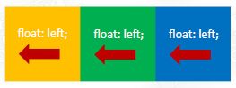
浮动用来实现并排
- 浮动的最本质功能:用来实现并排
浮动的使用
- 浮动使用要点:要浮动,并排的盒子都要设置浮动
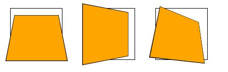
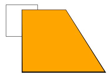
- 父盒子要有足够的宽度,否则子盒子会掉下去
浮动的顺序贴靠特性
- 子盒子会按顺序进行贴靠,如果没有足够空间,则会寻找再前一个兄弟元素

- 浮动的元素不再区分块级元素、行内元素,已经脱离了标准文档流,一律能够设置宽度和高度,即使它是span或者a标签等
<style>
        span {
            float: left;
            width: 100px;
            height: 30px;
            background-color: orange;
            margin-right: 10px;
        }
    style>
head>

<body>
    <span>1span>
    <span>2span>
    <span>3span>
    <span>4span>
body>
- float:right;即可设置右浮动
DOCTYPE html>
<html lang="en">
<head>
<meta charset="UTF-8">
<meta http-equiv="X-UA-Compatible" content="IE=edge">
<meta name="viewport" content="width=device-width, initial-scale=1.0">
<title>浮动title>
<style>
*{
margin: 0;
padding: 0;
}
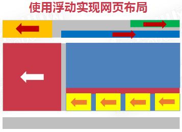
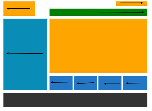
header{
width: 1000px;
height: 100px;
margin: 0 auto;
}
.content{
width: 1000px;
height: 500px;
margin: 20px auto;
}
footer{
width: 1000px;
height: 100px;
margin: 0px auto;
background-color: #333;
}
header .logo{
float: left;
width: 220px;
height: 100px;
background-color: orange;
}
header .login{
float: right;
width:220px;
height: 30px;
background-color: orange;
}
nav {
float: right;
width: 680px;
height: 50px;
margin-top: 20px;
background-color: green;
}
.content .ad{
float: left;
height: 100%;
width: 300px;
background-color: rgb(9, 141, 182)
}
.content main{
float: right;
width: 680px;
height: 500px;
}
.content main .banner{
width:680px;
height:380px;
background-color: orange;
}
.content main .pics {
width: 680px;
height: 100px;
margin-top: 20px;
}
.content main .pics ul{
list-style: none;
}
.content main .pics ul li{
float: left;
height: 100px;
width:160px;
margin-right: 10px;
background-color: rgb(35, 119, 197);
}
.content main .pics ul li:last-child{
width: 170px;
margin-right: 0;
}
style>
head>
<body>
<header>
<div class="logo">div>
<div class="login">div>
<nav>nav>
header>
<section class="content">
<aside class="ad">aside>
<main>
<div class="banner">div>
<div class="pics">
<ul>
<li>li>
<li>li>
<li>li>
<li>li>
ul>
div>
main>
section>
<footer>footer>
body>
html>
注意事项
- 垂直显示的盒子,不要设置浮动,只有并排显示的盒子才要设置浮动!
- “大盒子带着小盒子跑”,一个大盒子中,又是一个小天地,内部可以继续使用浮动
- 超市售卖的塑料袋0.3元一个,div是免费的!不要节约盒子!
- 大同、保定、太原、石家庄都没有浮动,它们并排的原因是:山西和河北浮动了!自然就“营造了两个并排的大盒子”

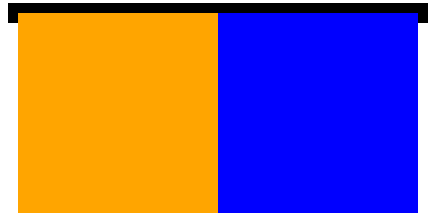
BFC规范和浏览器差异
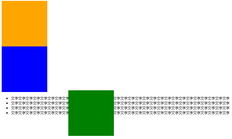
- BFC(Box Formatting Context,块级格式化上下文)是页面上的一个隔离的独立容器,容器里面的子元素不会影响到外面的元素,反之亦然。
- 一个盒子不设置height,当内容子元素都浮动时,无法撑起自身
- 这个盒子没有形成BFC
<style>
        .box{
            width:400px;
            border:10px solid #000;
        }
        .box .c1{
            width:200px;
            height: 200px;
            background-color: orange;
            float: left;
        }
        .box .c2{
            width:200px;
            height: 200px;
            background-color: blue;
            float: left;
        }
    style>
head>
<body>
    <div class="box">
        <div class="c1">div>
        <div class="c2">div>
    div>
body>
盒子没有设置高度未形成BFC,子盒子设置为浮动时,父盒子高度变为0;
如何创建BFC
- 方法①:float的值不是none
- 将父盒子的也设置为浮动即可
- 会与其他行内元素并排浮动
- 方法②:position的值不是static或者relative
- 方法③:display的值是inline-block、flex或者inline-flex
- 将块级元素变为行内块元素后会与其他行内元素(a)并排显示。
- 方法④:overflow:hidden;
什么是overflow:hidden;
- overflow:hidden;表示溢出隐藏,溢出盒子边框的内容将会被隐藏
<head>
    <meta charset="UTF-8">
    <meta http-equiv="X-UA-Compatible" content="IE=edge">
    <meta name="viewport" content="width=device-width, initial-scale=1.0">
    <title>Documenttitle>
    <style>
        div {
            width: 200px;
            height: 200px;
            padding: 50px;
            border: 1px solid #000;
            /* 溢出盒子边框的内容将被隐藏,但是盒子的padding部分的溢出还在 */
            overflow:hidden;
        }
    style>
head>

<body>
    <div>
你好我是文字你好我是文字你好我是文字你好我是文字你好我是文字你好我是文字你好我是文字你好我是文字你好我是文字你好我是文字你好我是文字你好我是文字你好我是文字你好我是文字你好我是文字你好我是文字你好我是文字你好我是文字你好我是文字你好我是文字你好我是文字你好我是文字你好我是文字你好我是文字你好我是文字你好我是文字
    div>
body>

- overflow:hidden;是非常好用的让盒子形成BFC的方法
BFC的其他作用
- BFC可以取消盒子margin塌陷
- BFC可以可以阻止元素被浮动元素覆盖
<style>
        * {
            margin: 0;
            padding: 0;
        }

        p {
            width: 200px;
            height: 200px;
            background-color: orange;
            margin: 50px;
        }

        div {
            overflow: hidden;
        }

        .s1{
            float: left;
            width: 300px;
            height: 300px;
            background-color: red;
        }
        .s2{
            /*如果不设置overflow则蓝色盒子将会隐藏至红色盒子中*/
            overflow: hidden;
            width: 200px;
            height: 200px;
            background-color: blue;
        }
    style>
head>

<body>
    <div>
        <p>p>
    div>
    <div>
        <p>p>
    div>

    <section class="s1">section>
    <section class="s2">section>
body>

浏览器差异
- IE6、7浏览器使用haslayout机制,和BFC规范略有差异,比如IE浏览器可以使用zoom:1属性“让盒子拥有layout”
- 如果要制作兼容到IE6、7的网页时,尽量让网页布局变得简单,内部有浮动的盒子要设置height属性,规范编程,不要“玩杂技”
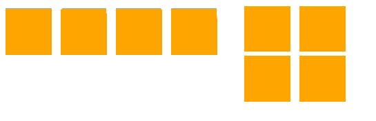
清除浮动
清除浮动:浮动一定要封闭到一个盒子中,否则就会对页面后续元素产生影响
- 清除浮动方法1:让内部有浮动的父盒子形成BFC,它就能关闭住内部的浮动。此时最好的方法就是overflow:hidden属性。
    <style>
        * {
            margin: 0;
            padding: 0;
        }
		/*若未设置div的overflow则会变成左图,设置后变为右图*/
        div {
            overflow: hidden;
            margin-bottom: 10px;
        }

        p {
            float: left;
            width: 100px;
            height: 100px;
            background-color: orange;
            margin-right: 20px;
        }
    style>
head>

<body>
    <div>
        <p>p>
        <p>p>
    div>
    <div>
        <p>p>
        <p>p>
    div>
body>
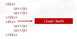
- 清除浮动方法2:给后面的父盒子设置clear:both属性。clear表示清除浮动对自己的影响,both表示左右浮动都清除,但这种方法无法给div元素设置margin,不推荐
- 清除浮动方法3:使用::after伪元素给盒子添加最后一个子元素,并且给::after设置clear:both。
 <style>
        * {
            margin: 0;
            padding: 0;
        }

        .clearfix::after {
            content: '';
            clear: both;
            /* 转为块级元素 */
            display: block;
        }

        div {
            margin-bottom: 10px;
        }

        p {
            float: left;
            width: 100px;
            height: 100px;
            background-color: orange;
            margin-right: 20px;
        }
    style>
head>

<body>
    <div class="clearfix">
        <p>p>
        <p>p>
    div>
    <div class="clearfix">
        <p>p>
        <p>p>
    div>
body>
- 清除浮动方法4:在两个父盒子之间“隔墙”,隔一个携带clear:both的盒子
<style>
        * {
            margin: 0;
            padding: 0;
        }

        p {
            float: left;
            width: 100px;
            height: 100px;
            background-color: orange;
            margin-right: 20px;
        }

        .cl{
            clear: both;
        }

        .h20 {
            height: 20px;
        }

        .h22 {
            height: 22px;
        }
    style>
head>

<body>
    <div>
        <p>p>
        <p>p>
    div>
    <div class="cl h20">div>
    <div>
        <p>p>
        <p>p>
    div>
相对定位
- 相对定位:盒子可以相对自己原来的位置进行位置调整,称为相对定位
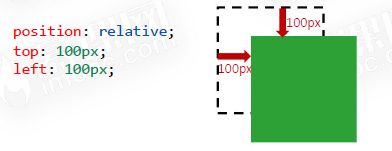
位置描述词
- left 向右移动;right向左移动;top向下移动; bottom向上移动
- 值可以为负数,即往规定方向相反移动
性质
- 相对定位的元素,会在“老家留坑”,本质上仍然是在原来的位置,只不过渲染在新的地方而已,渲染的图形可以比喻成“影子”,不会对页面其他元素产生任何影响
用途
- 相对定位用来微调元素位置
- 相对定位的元素,可以当做绝对定位的参考盒子
DOCTYPE html>
<html lang="en">
<head>
<meta charset="UTF-8">
<meta name="viewport" content="width=device-width, initial-scale=1.0">
<title>Documenttitle>
<style>
*{
margin: 0;
padding: 0;
}
div{
width: 400px;
height: 400px;
border: 1px solid #000;
margin: 40px auto;
}
p {
width: 100px;
height: 100px;
background-color: orange;
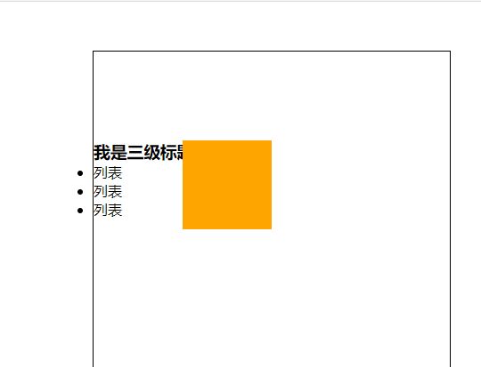
position: relative;
top: 100px; /* 表示距离原来位置向下100px */
left: 100px; /* 表示距离原来位置向右100px,若为负数则为向左浮动 */
/*渲染后的东西类似与一个影子不影响其他布局,其位置仍然在之前*/
}
style>
head>
<body>
<div>
<p>p>
<h3>我是三级标题h3>
<ul>
<li>列表li>
<li>列表li>
<li>列表li>
ul>
div>
body>
html>

DOCTYPE html>
<html lang="en">
<head>
    <meta charset="UTF-8">
    <meta http-equiv="X-UA-Compatible" content="IE=edge">
    <meta name="viewport" content="width=device-width, initial-scale=1.0">
    <title>Documenttitle>
    <style>
        *{
            margin: 0;
            padding: 0;
        }
        nav{
            height: 40px;
            width: 960px;
            margin: 40px auto;
        }
        nav ul{
            list-style: none;
        }
        nav ul li{
            float:left;
            width:120px;
            height: 40px;
            text-align: center;
            line-height: 40px;
        }
        nav ul li a{
            display: block;
            width: 120px;
            height: 40px;
            background-color: orange;
            color: white;
            text-decoration: none;
        }
        nav ul li a:hover{
            border-top: 3px solid red;
            background-color: gold;
            position: relative;
            top:-3px;
        }
    style>
head>
<body>
    <nav>
        <ul>
            <li><a href="">网站栏目a>li>
            <li><a href="">网站栏目a>li>
            <li><a href="">网站栏目a>li>
            <li><a href="">网站栏目a>li>
            <li><a href="">网站栏目a>li>
            <li><a href="">网站栏目a>li>
            <li><a href="">网站栏目a>li>
            <li><a href="">网站栏目a>li>
        ul>
    nav>
body>
html>
绝对定位
- 绝对定位:盒子可以在浏览器中以坐标进行位置精准描述,拥有自己的绝对位置
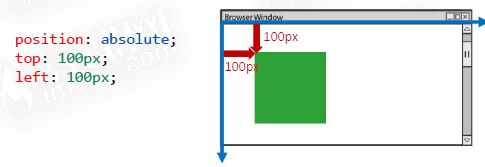
位置描述词
- left 到左边的距离;right到右边的距离;top到上边的距离; bottom到下边的距离
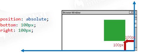
    <style>
        .box {
            position: absolute;
            bottom: 300px;
            right: 200px;
            width: 200px;
            height: 200px;
            background-color: orange;
        }
    style>
head>
<body>
    <div class="box">div>
body>
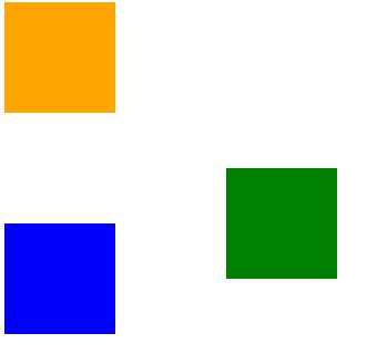
绝对定位脱离标准文档流
- 绝对定位的元素脱离标准文档流,将释放自己的位置,对其他元素不会产生任何干扰,而是对它们进行压盖
- 脱离标准文档流的方法:浮动、绝对定位、固定定位
- 脱离标准文档流的盒子一定要设置宽度和高度
DOCTYPE html>
<html lang="en">
<head>
    <meta charset="UTF-8">
    <meta name="viewport" content="width=device-width, initial-scale=1.0">
    <title>Documenttitle>
    <style>
        .box1 {
            width: 200px;
            height: 200px;
            background-color: orange;
        }
        .box2 {
            width: 200px;
            height: 200px;
            background-color: green;
            position: absolute;
            top: 400px;
            left: 300px;
        }
        .box3 {
            width: 200px;
            height: 200px;
            background-color: blue;
        }
    style>
head>
<body>
    <div class="box1">div>
    <div class="box2">div>
    <div class="box3">div>
    <ul>
        <li>文字文字文字文字文字文字文字文字文字文字文字文字文字文字文字文字文字文字文字文字文字文字文字文字文字文字文字文字文字文字li>
        <li>文字文字文字文字文字文字文字文字文字文字文字文字文字文字文字文字文字文字文字文字文字文字文字文字文字文字文字文字文字文字li>
        <li>文字文字文字文字文字文字文字文字文字文字文字文字文字文字文字文字文字文字文字文字文字文字文字文字文字文字文字文字文字文字li>
        <li>文字文字文字文字文字文字文字文字文字文字文字文字文字文字文字文字文字文字文字文字文字文字文字文字文字文字文字文字文字文字li>
    ul>
body>
html>
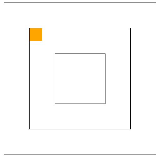
绝对定位的参考盒子
- 绝对定位的盒子并不是永远以浏览器作为基准点
- 绝对定位的盒子会以自己祖先元素中,离自己最近的拥有定位属性(包括绝对定位和相对定位)的盒子,当做基准点。这个盒子通常是相对定位的,所以这个性质也叫作“子绝父相”

DOCTYPE html>
<html lang="en">
<head>
    <meta charset="UTF-8">
    <meta name="viewport" content="width=device-width, initial-scale=1.0">
    <title>Documenttitle>
    <style>
        *{
            margin: 0;
            padding: 0;
        }
        .box1{
            width: 402px;
            height: 402px;
            border: 1px solid #000;
            padding: 100px;
            margin: 0 auto;
        }
        .box2 {
            width: 200px;
            height: 200px;
            padding: 100px;
            border: 1px solid #000;
            position: relative;  /*设置在此即会以此为相对原点*/
        }
        .box3 {
            width: 98px;
            height: 98px;
            padding: 50px;
            border: 1px solid #000;
        }
        p {
            width: 50px;
            height: 50px;
            background-color: orange;
            position: absolute;
            top: 0;
            left: 0;
        }
    style>
head>
<body>
    <div class="box1">
        <div class="box2">
            <div class="box3">
                <p>p>
            div>
        div>
    div>
body>
html>
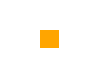
绝对定位的盒子垂直居中
- 绝对定位的盒子垂直居中是一个非常实用的技术
position: absolute;
top: 50%;
margin-top: -自己高度一半;
<style>
        * {
            margin: 0;
            padding: 0;
        }

        div {
            width: 400px;
            height: 300px;
            border: 1px solid #000;
            margin: 40px auto;
            position: relative;
        }

        p {
            width: 80px;
            height: 80px;
            background-color: orange;
            position: absolute;
            top: 50%;
            left: 50%;
            margin-top: -40px;
            margin-left: -40px;
        }
    style>
head>

<body>
    <div>
        <p>p>
    div>
body>
堆叠顺序z-index属性
- 绝对定位的元素z-index属性是一个没有单位的正整数,数值大的能够压住数值小的

<style>
        .box1 {
            width: 300px;
            height: 300px;
            background-color: orange;
            position: absolute;
            top: 100px;
            left: 100px;
            z-index: 9999;
        }

        .box2 {
            width: 300px;
            height: 300px;
            background-color: blue;
            position: absolute;
            top: 200px;
            left: 200px;
            z-index: 999;
        }
    style>
head>

<body>
    <div class="box1">div>
    <div class="box2">div>
body>
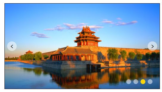
绝对定位的用途
- 绝对定位用来制作“压盖”、“遮罩”效果
- 绝对定位用来结合CSS精灵使用
- 绝对定位可以结合JS实现动画
<style>
        * {
            margin: 0;
            padding: 0;
        }

        .carousel {
            width: 650px;
            height: 360px;
            border: 1px solid #000;
            margin: 40px auto;
            position: relative;
        }

        .carousel .btn {
            position: absolute;
            width: 40px;
            height: 40px;
            margin-top: -20px;
            top: 50%;
            /* 圆形 */
            border-radius: 50%;
            text-align: center;
            line-height: 40px;
            background-color: rgba(255, 255, 255, .5);
            /* 鼠标为小手 */
            cursor: pointer;
            font-family: consolas;
            font-size: 26px;
        }

        .carousel .btn:hover {
            background-color: gold;
            color: white;
        }

        .carousel .leftbtn {
            left: 10px;
        }

        .carousel .rightbtn {
            right: 10px;
        }
        .carousel ol {
            position: absolute;
            width: 120px;
            height: 20px;
            right: 20px;
            bottom: 20px;
            list-style: none;
        }
        .carousel ol li {
            float: left;
            width: 20px;
            height: 20px;
            background-color: rgba(255, 255, 255, .5);
            /* 变为圆形 */
            border-radius: 50%;
            margin-right: 10px;
        }
        .carousel ol li.current {
            background-color: gold;
        }
    style>
head>

<body>
    <div class="carousel">
        <img src="images/0.jpg" alt="">
        <a class="leftbtn btn"><a>
        <a class="rightbtn btn">>a>
        <ol>
            <li>li>
            <li>li>
            <li class="current">li>
            <li>li>
        ol>
    div>
body>
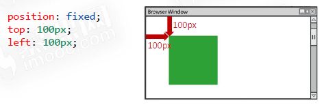
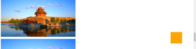
固定定位
- 固定定位:不管页面如何卷动,它永远固定在那里
DOCTYPE html>
<html lang="en">
<head>
    <meta charset="UTF-8">
    <meta name="viewport" content="width=device-width, initial-scale=1.0">
    <title>Documenttitle>
    <style>
        .box {
            position: fixed;
            bottom: 100px;
            right: 100px;
            width: 100px;
            height: 100px;
            background-color: orange;
        }
    style>
head>
<body>
    <div class="box">div>
    <p>
        <img src="images/0.jpg" alt="">
    p>
    <p>
        <img src="images/0.jpg" alt="">
    p>
    <p>
        <img src="images/0.jpg" alt="">
    p>
    <p>
        <img src="images/0.jpg" alt="">
    p>
    <p>
        <img src="images/0.jpg" alt="">
    p>
    <p>
        <img src="images/0.jpg" alt="">
    p>
body>
html>
注意事项
- 固定定位只能以页面为参考点,没有子固父相这个性质
- 固定定位脱离标准文档流
用途
- 固定定位的用途:“返回顶部”、“楼层导航”
小慕医生
边框与圆角
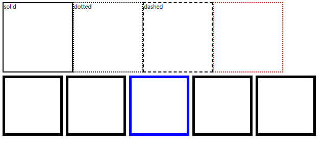
border属性
- border属性需要三个要素
border: 1px solid red;
        线宽 线型  线颜色
线型
- solid 实线
- dashed 虚线
- dotted 点状线
<style>
        .box{
            overflow: hidden;
            width: 100%;
        }
        div[class]{
            float: left;
        }
        .box1 {
            width: 200px;
            height: 200px;
            border: 3px solid #000;
            margin-bottom: 10px;
        }
        .box2 {
            width: 200px;
            height: 200px;
            border: 3px dotted #000;
            margin-bottom: 10px;
        }
        .box3 {
            width: 200px;
            height: 200px;
            border: 3px dashed #000;
            margin-bottom: 10px;
        }
        .box4 {
            width: 200px;
            height: 200px;
            border-width: 3px;
            border-style: dotted;
            border-color: red;
        }
        section {
            float: left;
            width: 160px;
            height: 160px;
            border: 8px solid #000;
            margin-right: 10px;
        }
        section.spec {
            border-color: blue;
        }
    style>
head>
<body>
    <div class="box">
        <div class="box1">soliddiv>
        <div class="box2">dotteddiv>
        <div class="box3">dasheddiv>
        <div class="box4">div>
    div>
    <section>section>
    <section>section>
    <section class="spec">section>
    <section>section>
    <section>section>
body>
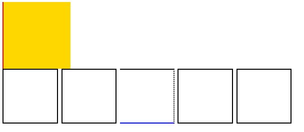
边框的三要素小属性
边框三要素可以拆分为小属性
- border-width 线宽
- border-style 线型
- border-color 线颜色
四个方向的边框
- border-top 上边框
- border-right 右边框
- border-bottom 下边框
- border-left 左边框
DOCTYPE html>
<html lang="en">
<head>
    <meta charset="UTF-8">
    <meta name="viewport" content="width=device-width, initial-scale=1.0">
    <title>Documenttitle>
    <style>
        .box1{
            width: 200px;
            height: 200px;
            background-color: gold;
            border-left: 3px solid red;
        }
        section {
            float: left;
            width: 160px;
            height: 160px;
            border: 3px solid #000;
            margin-right: 10px;
        }
        section.spec {
            border-bottom-color: blue;
            border-right-style: dotted;
            border-left: none;
        }
    style>
head>
<body>
    <div class="box1">div>
    <section>section>
    <section>section>
    <section class="spec">section>
    <section>section>
    <section>section>
body>
html>
四个方向边框的三要素小属性
- border-top-width 上边框宽度
- border-top-style 上边框线型
- border-top-color 上边框颜色
- border-right-width 右边框宽度
- border-right-style 右边框线型
- border-right-color 右边框颜色
- border-bottom-width 下边框宽度
- border-bottom-style 下边框线型
- border-bottom-color 下边框颜色
- border-left-width 左边框宽度
- border-left-style 左边框线型
- border-left-color 左边框颜色
去掉边框
border-left: none;属性即可去掉左边框,以此类推
利用边框制作三角形
可以巧妙的利用边框的特性制作三角形
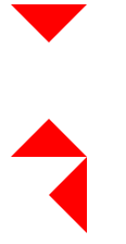
<style>
        .box1 {
            width: 0;
            height: 0;
            /* transparent是透明色 */
            border: 20px solid transparent;
            border-top-color: red;
        }
        .box2 {
            width: 0;
            height: 0;
            /* transparent是透明色 */
            border: 20px solid transparent;
            border-bottom-color: red;
        }
        .box3 {
            width: 0;
            height: 0;
            /* transparent是透明色 */
            border: 20px solid transparent;
            border-right-color: red;
        }
    style>
head>
<body>
    <div class="box1">div>
    <div class="box2">div>
    <div class="box3">div>
body>
圆角
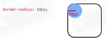
border-radius属性
- border-radius属性的值通常为px单位,表示圆角的半径
单独设置4个圆角
- border-radius属性可以单独设置四个圆角
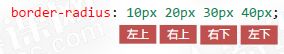
-
如果设置两个值,表示左上角和右下角使用第一个值,右上角和左下角使用第二个值。
-
如果设置三个值,表示左上角使用第一个值,右上角和左下角使用第二个值,右下角使用第三个值。
-
也可以使用小属性
- border-top-left-radius 左上角
- border-top-right-radius 右上角
- border-bottom-left-radius 左下角
- border-bottom-right-radius 右下角
百分比为单位
- border-radius属性的值也可以用百分比做单位,表示圆角起始于每条边的哪里

正圆形
- 正方形盒子如果设置的border-radius属性为50%,就是正圆形
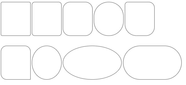
<style>
        div {
            padding-top:30px;
            margin-bottom: 20px;
        }
        .ab{
            float: left;
            margin-right: 10px;
        }
        .box{
            width: 1200px;
            margin:0 auto;
            overflow: hidden;
        }
        .boxx{
            width: 1400px;
            margin: 0 auto;
        }
        .box1 {
            width: 200px;
            height: 200px;
            border: 1px solid #000;
            border-radius: 10px;
        }

        .box2 {
            width: 200px;
            height: 200px;
            border: 1px solid #000;
            border-radius: 20px;
        }

        .box3 {
            width: 200px;
            height: 200px;
            border: 1px solid #000;
            border-radius: 50px;
        }

        .box4 {
            width: 200px;
            height: 200px;
            border: 1px solid #000;
            border-radius: 100px;
        }

        .box5 {
            width: 200px;
            height: 200px;
            border: 1px solid #000;
            border-radius: 20px 40px 60px 80px;
        }

        .box6 {
            width: 200px;
            height: 200px;
            border: 1px solid #000;
            border-radius: 40px;
            border-bottom-right-radius: 0;
        }

        .box7 {
            width: 200px;
            height: 200px;
            border: 1px solid #000;
            border-radius: 50%;
        }

        .box8 {
            width: 400px;
            height: 200px;
            border: 1px solid #000;
            border-radius: 50%;
        }

        .box9 {
            width: 400px;
            height: 200px;
            border: 1px solid #000;
            border-radius: 200px;
        }
    style>
head>

<body>
    <div class="box">
        <div class="ab box1">div>
        <div class="ab box2">div>
        <div class="ab box3">div>
        <div class="ab box4">div>
        <div class="ab box5">div>
    div>
    <div class="boxx">
        <div class="ab box6">div>
        <div class="ab box7">div>
        <div class="ab box8">div>
        <div class="ab box9">div>
    div>
body>
盒子阴影
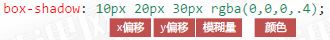
box-shadow属性
- box-shadow属性用来实现盒子的阴影
阴影延展
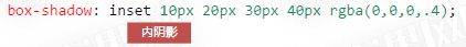
内阴影
- box-shadow属性值前加inset单词,表示内阴影
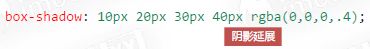
多阴影
- box-shadow属性值可以用逗号隔开多个,表示携带多个阴影

<style>
        div{
            margin:35px 30px;
            float: left;
        }
        .box1 {
            width: 200px;
            height: 200px;
            background-color: white;
            border: 1px solid #000;
            box-shadow: 2px 2px 10px rgba(0,0,0,.4);
            margin-bottom: 10px;
        }
        .box2 {
            width: 200px;
            height: 200px;
            background-color: white;
            border: 1px solid #000;
            box-shadow: 2px 2px 10px 10px rgba(0,0,0,.4);
            margin-bottom: 10px;
        }
        .box3 {
            width: 200px;
            height: 200px;
            background-color: white;
            border: 1px solid #000;
            box-shadow: inset 0px 0px 10px red;
            margin-bottom: 10px;
        }
        .box4 {
            width: 200px;
            height: 200px;
            background-color: white;
            border: 1px solid #000;
            box-shadow: 2px 2px 30px red, 4px 4px 40px blue, 6px 6px 50px green, inset 0px 0px 6px orange;
            margin-bottom: 10px;
        }
    style>
head>
<body>
    <div class="box1">div>
    <div class="box2">div>
    <div class="box3">div>
    <div class="box4">div>
body>
背景与渐变
背景颜色基础知识
background-color属性
-
background-color属性表示背景颜色
-
背景颜色可以用十六进制、rgb()、rgba()表示法表示
-
padding区域是有背景颜色的
<style>
        body {
            background-color:
        }
        .box {
            padding: 100px;
            width: 200px;
            height: 200px;
            background-color: rgba(0,0,0,.5);
            border: 1px solid #000;
        }
    style>
head>
<body>
    <div class="box">
        123
    div>
body>
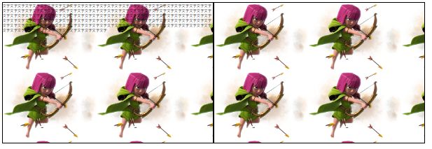
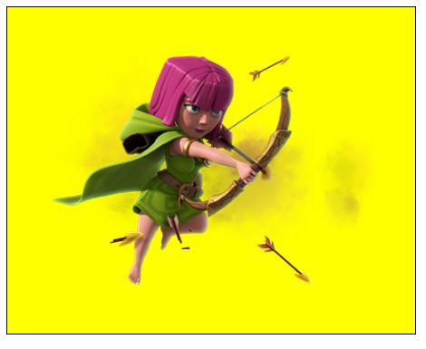
background-image属性
-
background-image属性用来设置背景图片,图片路径要写到url()圆括号中,可以是相对路径,也可以是http://开头的绝对路径
background-image: url(images/bg1.jpg); -
如果样式表是外链的,那么要书写从CSS出发到图片的路径,而不是从html出发
.box2{
	float:left;
    width: 900px;
    height: 600px;
    border: 1px solid #000;
    background-image: url(../images/archer.png);
}
<link rel="stylesheet" href="css/css.css">
<style>
        .box1 {
            float:left;
            width: 900px;
            height: 600px;
            border: 1px solid #000;
            background-image: url(images/archer.png);
        }
style>
head>
<body>
    <div class="box1">
        文字文字文字文字文字文字文字文字文字文字文字文字文字文字文字文字文字文字文字文字文字文字文字文字文字文字文字文字文字文字文字文字文字文字文字文字文字文字文字文字文字文字文字文字文字文字文字文字文字文字文字文字文字文字文字文字文字文字文字文字文字文字文字文字文字文字文字文字文字文字文字文字文字文字文字文字文字文字文字文字文字文
    div>
    <div class="box2">div>
body>
背景图片的重复模式
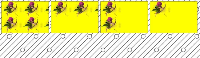
background-repeat属性
- background-repeat属性用来设置背景的重复模式
| 值 | 意义 |
|---|---|
| repeat | x、y均平铺(默认) |
| repeat-x; | x平铺 |
| repeat-y; | y平铺 |
| no-repeat; | 不平铺 |
<style>
        div {
            width: 900px;
            height: 600px;
            float: left;
            border: 1px solid #000;
            margin: 20px 20px;
            margin-bottom: 10px;
            background: yellow url(images/archer.png);
        }

        .box1 {
            /* 默认 */
            background-repeat: repeat;
        }

        .box2 {
            /* 默认 */
            background-repeat: repeat-x;
        }

        .box3 {
            /* 默认 */
            background-repeat: repeat-y;
        }

        .box4 {
            /* 默认 */
            background-repeat: no-repeat;
        }

        body {
            background-image: url(images/bg1.png);
        }
    style>
head>

<body>
    <div class="box1">div>
    <div class="box2">div>
    <div class="box3">div>
    <div class="box4">div>
body>
背景尺寸
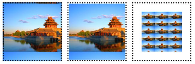
background-size属性
-
background-size属性用来设置背景图片的尺寸,兼容到IE9
```css background-size: 100px 200px; 宽度 高度 ``` -
值也可以用百分数来设置,表示为盒子宽、高的百分之多少
-
需要等比例设置的值,写auto
contain和cover
- contain和cover是两个特殊的background-size的值
- contain表示将背景图片智能改变尺寸以容纳到盒子里
- cover表示将背景图片智能改变尺寸以撑满盒子

<style>
        div{
            float: left;
            margin:10px 20px;
        }
        .box1 {
            width: 500px;
            height: 300px;
            border: 1px solid #000;
            background-image: url(images/0.jpg);
            /* 背景尺寸 */
            background-size: 300px auto;
            margin-bottom: 10px;
        }
        .box2 {
            width: 500px;
            height: 300px;
            border: 1px solid #000;
            background-image: url(images/0.jpg);
            /* 背景尺寸 */
            background-size: 25% 25%;
            margin-bottom: 10px;
        }
        .box3 {
            width: 400px;
            height: 300px;
            border: 1px solid #000;
            background-image: url(images/0.jpg);
            /* 背景尺寸 */
            background-size: contain;
            background-repeat: no-repeat;
            margin-bottom: 10px;
        }
        .box4 {
            width: 400px;
            height: 300px;
            border: 1px solid #000;
            background-image: url(images/0.jpg);
            /* 背景尺寸 */
            background-size: cover;
            background-repeat: no-repeat;
            margin-bottom: 10px;
        }
    style>
head>
<body>
    <div class="box1">div>
    <div class="box2">div>
    <div class="box3">div>
    <div class="box4">div>
body>
实现背景从无到有,先令背景为display:none,再 .contain : hover div{display:block;}
<style>
        a {
            text-decoration: none;
        }

        ul {
            list-style: none;
        }

        div {
            background-image:url(http://climg.mukewang.com/582c39e50001b08102000065.jpg);
            width: 100px;
            height: 100px;
            display: none;
            border: 2px solid red;
            background-repeat: no-repeat;
        }

        /* 补充代码 */
        .length:hover div {
            display: block;
            background-size: 100px 100px;
        }

        .percent:hover div {
            display: block;
            background-size: 50% 50%;
        }

        .cover:hover div {
            display: block;
            background-size: cover;
        }

        .contain:hover div {
            display: block;
            background-size: contain;
        }
    style>

head>

<body>
    <h2>background-size不同属性值不同效果h2>
    <ul>
        <li class='length'>
            <h3><a href="">100px 100pxa>h3>
            <div>div>
        li>
        <li class='percent'>
            <h3><a href="">50% 50%a>h3>
            <div>div>
        li>
        <li class='cover'>
            <h3><a href="">covera>h3>
            <div>div>
        li>
        <li class='contain'>
            <h3><a href="">containa>h3>
            <div>div>
        li>

    ul>
body>
背景裁切
background-clip属性
background-clip 属性用来设置元素的背景裁切到哪个盒子。兼容到IE9。
| 值 | 意义 |
|---|---|
| border-box | 背景延伸至边框(默认值) |
| padding-box | 背景延伸至内边(padding),不会绘制到边框处(仅在dotted、dashed边框可察觉) |
| content-box | 背景被裁剪至内容区 |
<style>
div{
            float: left;
            margin: 20px 20px;
        }
        .box1 {
            width: 300px;
            height: 300px;
            border: 10px dotted #000;
            padding: 60px;
            background-image: url(images/0.jpg);
            margin-bottom: 10px;
        }

        .box2 {
            width: 300px;
            height: 300px;
            border: 10px dotted #000;
            padding: 60px;
            background-image: url(images/0.jpg);
            /* 背景裁切到padding区域,此时就不会在点状线、虚线边框底下渲染 */
            background-clip: padding-box;
            margin-bottom: 10px;
        }

        .box3 {
            width: 300px;
            height: 300px;
            border: 10px dotted #000;
            padding: 60px;
            background-image: url(images/0.jpg);
            /* 背景裁切到内容区域 */
            background-clip: content-box;
            background-size: 100px auto;
            /* 背景起源 */
            background-origin: content-box;
        }
    style>
head>

<body>
    <div class="box1">div>
    <div class="box2">div>
    <div class="box3">div>
body>
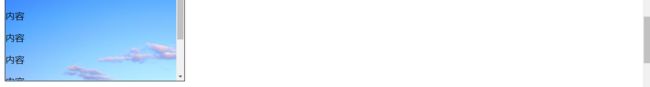
背景固定
background-attachment属性
- background-attachment 属性决定背景图像的位置是在视口内固定,或者随着包含它的区块滚动。
| 值 | 意义 |
|---|---|
| fixed | 无论内外的滚动条怎么动,背景固定在一个位置不动, 自己滚动条不动,外部滚动条不动 |
| local | 内部滚动条动背景也动,外部滚动条动内部不动 自己滚动条动,外部滚动条动 |
| scroll | 无论内部的滚动条怎么动,背景固定在一个位置不动,但外部动他也会动 自己滚动条不动,外部滚动条动(默认) |
<style>
        .box1 {
            width: 300px;
            height: 300px;
            border: 1px solid #000;
            /* 纵向溢出的内容,用滚动条显示 */
            overflow-y: scroll;
            background-image: url(images/0.jpg);
            /*制作视差效果*/
            background-attachment: fixed;
        }
        body {
            height: 3000px;
        }
    style>
head>
<body>
    <div class="box1">
        <p>内容p>
        <p>内容p>
        <p>内容p>
        <p>内容p>
        <p>内容p>
        <p>内容p>
        <p>内容p>
        <p>内容p>
        <p>内容p>
        <p>内容p>
        <p>内容p>
    div>
背景图片位置
background-position属性
- background-position属性可以设置背景图片出现在盒子的什么位置
background-position: 100px 200px;
- 可以用top、bottom、center、left、right描述图片出现的位置
- 若只设置一个值第二个值默认是center

<style>
        div{
            float: left;
            margin:10px 10px;
        }
        .box1 {
            width: 400px;
            height: 300px;
            border: 1px solid #000;
            margin-bottom: 10px;
            background-image: url(images/0.jpg);
            background-repeat: no-repeat;
            background-size: 50% auto;
            /* 背景位置 */
            background-position: 100px 150px;
        }

        .box2 {
            width: 400px;
            height: 300px;
            border: 1px solid #000;
            margin-bottom: 10px;
            background-image: url(images/0.jpg);
            background-repeat: no-repeat;
            background-size: 50% auto;
            /* 背景位置 */
            background-position: center center;
        }

        .box3 {
            width: 400px;
            height: 300px;
            border: 1px solid #000;
            margin-bottom: 10px;
            background-image: url(images/0.jpg);
            background-repeat: no-repeat;
            background-size: 50% auto;
            /* 背景位置 */
            background-position: center bottom;
        }

        .box4 {
            width: 400px;
            height: 300px;
            border: 1px solid #000;
            margin-bottom: 10px;
            background-image: url(images/0.jpg);
            background-repeat: no-repeat;
            background-size: 50% auto;
            /* 背景位置 */
            background-position: right top;
        }

        .box5 {
            width: 400px;
            height: 300px;
            border: 1px solid #000;
            margin-bottom: 10px;
            background-image: url(images/0.jpg);
            background-repeat: no-repeat;
            background-size: cover;
            background-position: center center;
        }

        .box6 {
            width: 400px;
            height: 300px;
            border: 1px solid #000;
            margin-bottom: 10px;
            background-image: url(images/0.jpg);
            background-repeat: no-repeat;
            background-size: contain;
            background-position: center center;
        }
    style>
head>
<body>
    <div class="box1">div>
    <div class="box2">div>
    <div class="box3">div>
    <div class="box4">div>
    <div class="box5">div>
    <div class="box6">div>
body>
CSS精灵
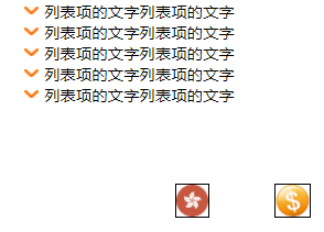
- CSS精灵:将多个小图标合并制作到一张图片上,使用background-position属性单独显示其中一个,这样的技术叫做CSS精灵技术,也叫作CSS雪碧图。
- 需要作用在包含图片的小元素上比如
或者等,并在此标签上定义背景图片以及width和height属性并调整至小图标的实际大小,调整background-position属性使其背景图片挪动至图标所在位置(使用负数)并显示其正确的样子,不要在外部的盒子中直接使用。 - CSS精灵可以减少HTTP请求数,加快网页显示速度。缺点也很明显:不方便测量、后期改动麻烦。
 <style>
        .money {
            position: absolute;
            top: 200px;
            left: 300px;
            width: 34px;
            height: 32px;
            border: 1px solid #000;
            background-image: url(images/sprites.png);
            background-position: -66px -488px;
        }
        .zjh {
            position: absolute;
            top: 200px;
            left: 200px;
            width: 32px;
            height: 32px;
            border: 1px solid #000;
            background-image: url(images/sprites.png);
            background-position: 0 -980px;
        }
        ul {
            list-style: none;
        }
        ul li {
            position: relative;
            padding-left: 20px;
        }
        i.dg {
            position: absolute;
            top: 5px;
            left: 0;
            width: 14px;
            height: 8px;
            background-image: url(images/sprites.png);
            background-position: 0 -12px;
        }
    style>
head>
<body>
    <i class="money">i>
    <i class="zjh">i>
    <ul>
        <li><i class="dg">i>列表项的文字列表项的文字li>
        <li><i class="dg">i>列表项的文字列表项的文字li>
        <li><i class="dg">i>列表项的文字列表项的文字li>
        <li><i class="dg">i>列表项的文字列表项的文字li>
        <li><i class="dg">i>列表项的文字列表项的文字li>
    ul>
body>
background综合属性
- 一些常用的背景相关小属性,可以合写到一条background属性中

<style>
        .box {
            width: 500px;
            height: 400px;
            border: 1px solid #000;
            background: yellow url(images/archer.png) no-repeat center center;
        }
    style>
head>
<body>
    <div class="box">div>
body>
- 设置多个背景图
div {
      width: 700px;
      height: 800px;
      margin:0 auto;
      background:url('images/111.png') 50%   0,
      url('images/222.png') center top 180px  ,
      url('images/333.png') center top 360px  ;

      background-repeat:no-repeat;
    }
- 设置小精灵
.banner .center .left-btn {
    position: absolute;
    left: 0;
    top: 50%;
    margin-top: -37px;
    width: 56px;
    height: 74px;
    background: url(../images/icons.png) no-repeat -42px -31px;
    border-radius: 6px;
}
背景渐变
线性渐变
- 盒子的background-image属性可以用linear-gradient()形式创建线性渐变背景
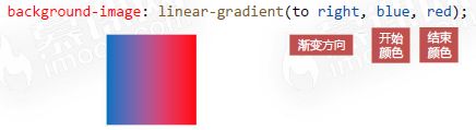
-
渐变方向也可以写成度数
```css background-image: linear-gradient(45deg, blue, red); deg表示度数 /*默认从顶部往下渐变(180deg),0deg表示从底部网上,90deg表示从左到右,270deg表示从右到左*/ ``` -
可以有多个颜色值,并且可以用百分数定义它们出现的位置
linear-gradient(to bottom, blue, yellow 20%, red);
								  中间色  占据比重
浏览器私有前缀
不同浏览器有不同的私有前缀,用来对试验性质的CSS属性加以标识
| 品牌 | 前缀 |
|---|---|
| Chrome | -webkit- |
| Firefox | -moz- |
| Edge、IE | -ms- |
| 欧朋 | -o- |

<style>
        div{
            float: left;
            margin: 10px 20px;
        }
        .box1 {
            width: 200px;
            height: 200px;
            border: 1px solid #000;
            margin-bottom: 10px;
            background-image: -webkit-linear-gradient(to right, red, blue);
            background-image: -moz-linear-gradient(to right, red, blue);
            background-image: -ms-linear-gradient(to right, red, blue);
            background-image: -o-linear-gradient(to right, red, blue);
            background-image: linear-gradient(to right, red, blue);
        }

        .box2 {
            width: 200px;
            height: 200px;
            border: 1px solid #000;
            margin-bottom: 10px;
            background-image: linear-gradient(45deg, red, blue);
        }

        .box3 {
            width: 200px;
            height: 200px;
            border: 1px solid #000;
            margin-bottom: 10px;
            background-image: linear-gradient(to right, red, yellow, orange, green, blue, purple);
        }

        .box4 {
            width: 200px;
            height: 200px;
            border: 1px solid #000;
            margin-bottom: 10px;
            background-image: linear-gradient(to right, red, yellow 20%, blue);
        }

        .box5 {
            width: 200px;
            height: 200px;
            border: 1px solid #000;
            margin-bottom: 10px;
            background-image: linear-gradient(to right, red, yellow 80%, blue);
        }
    style>
head>

<body>
    <div class="box1">div>
    <div class="box2">div>
    <div class="box3">div>
    <div class="box4">div>
    <div class="box5">div>
body>
径向渐变
- 盒子的background-image属性可以用radial-gradient()形式创建径向渐变背景


<style>
        .box {
            width: 200px;
            height: 200px;
            border: 1px solid #000;
            background-image: radial-gradient(50% 50%, white,red, rgb(211, 211, 211));
        }
    style>
head>

<body>
    <div class="box">div>