python数据分析
一、目的
根据上课讲的吴迪老师的微信好友数据分析,请选择你的微信好友数据,或者你的qq好友数据,或者你的班级同学数据,或者其他你能获取的其他人物数据作为分析对象。然后利用上课讲的技术,但不限于,对其进行数据分析。比如分析微信好友数据,可以可视化好友男女比例分布,可视化省份来源,可视化签名的情感强度值等等。
要求:
1分析数据用xls或者csv格式存储。
2.代码用py文件附件形式上传,方便我的下载。
3.在作业里可以介绍你的主要功能和可视化截图。
4.根据功能完整性和结果的酷给分。
二、准备的文档
三、源代码及运行结果截图
1.饼状图统计好友男女比例
import csv
from pyecharts.charts import Pie
from pyecharts.charts import Bar
#用于设值全局配置和系列配置
from pyecharts import options as opts
'''
例子1:饼状图统计好友男女比例
'''
# 1.1 读取csv文件,把性别信息读取出来
def getSex(filename):
lstsex = []
with open(filename,'r') as fr:
reader = csv.reader(fr)
for i in reader:
lstsex.append(i[4])
return lstsex
# 1.2 性别pyecharts可视化
def VisualSexpyechart(lstsex):
sex = dict()
# 2.1 提取好友性别信息,从1开始,因为第0个是自己
for f in lstsex[1:]:
if f == '1': # 男
sex['man'] = sex.get('man',0) + 1
elif f== '2': # 女
sex['women'] = sex.get('women',0) + 1
else: # 未知
sex['unknown'] = sex.get('unknown',0) + 1
# 在屏幕上打印出来
total = len(lstsex[1:])
# 2.2打印出自己的好友性别比例
print("男性好友:%.2f%%" %(float(sex['man']) / total*100) + '\n' + "女性好友:%.2f%%" %(float(sex['women']) / total*100) +
"不明性别好友:%.2f%%" %(float(sex['unknown']) / total*100))
# 2.3使用pyecharts饼状图
attr = ['男性好友','女性好友','不明性别好友']
value = [sex['man'],sex['women'],sex['unknown']]
# 饼图用的数据格式是[(key1,value1),(key2,value2)],所以先使用 zip函数将二者进行组合
data_pair = [list(z) for z in zip(attr, value)]
# 初始化配置项,内部可设置颜色
(
Pie(init_opts=opts.InitOpts(bg_color="white"))
.add(
# 系列名称,即该饼图的名称
series_name="性别分析",
# 系列数据项,格式为[(key1,value1),(key2,value2)]
data_pair=data_pair,
# 通过半径区分数据大小 “radius” 和 “area” 两种
rosetype='',
# 饼图的半径,设置成默认百分比,相对于容器高宽中较小的一项的一半
radius="55%",
# 饼图的圆心,第一项是相对于容器的宽度,第二项是相对于容器的高度
center=["50%", "50%"],
# 标签配置项
label_opts=opts.LabelOpts(is_show=True, position="center"),
)
# 全局设置
.set_global_opts(
# 设置标题
title_opts=opts.TitleOpts(
# 名字
title="微信好友性别比例",
# 组件距离容器左侧的位置
pos_left="center",
# 组件距离容器上方的像素值
pos_top="20",
# 设置标题颜色
title_textstyle_opts=opts.TextStyleOpts(color="black"),
),
# 图例配置项,参数 是否显示图里组件
legend_opts=opts.LegendOpts(is_show=True),
)
# 系列设置
.set_series_opts(
tooltip_opts=opts.TooltipOpts(
trigger="item", formatter="{a}
{b}: {c} ({d}%)"
),
# 设置标签颜色
label_opts=opts.LabelOpts(color="black"),
)
.render('好友性别比例.html')
)
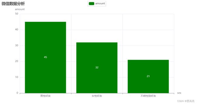
# 1.3 性别pyecharts 柱状图可视化
def VisualSexpyechart2(lstsex):
sex = dict()
# 2.1 提取好友性别信息,从1开始,因为第0个是自己
for f in lstsex[1:]:
if f == '1': # 男
sex['man'] = sex.get('man', 0) + 1
elif f == '2': # 女
sex['women'] = sex.get('women', 0) + 1
else: # 未知
sex['unknown'] = sex.get('unknown', 0) + 1
# 在屏幕上打印出来
total = len(lstsex[1:])
# 2.2打印出自己的好友性别比例
print(
"男性好友:%.2f%%" % (float(sex['man']) / total * 100) + '\n' + "女性好友:%.2f%%" % (
float(sex['women']) / total * 100) + '\n' +
"不明性别好友:%.2f%%" % (float(sex['unknown']) / total * 100))
# 2.3使用pyecharts饼状图
attr = ['男性好友', '女性好友', '不明性别好友']
value = [sex['man'], sex['women'], sex['unknown']]
# # 饼图用的数据格式是[(key1,value1),(key2,value2)],所以先使用 zip函数将二者进行组合
# data_pair = [list(z) for z in zip(attr, value)]
# 初始化配置项,内部可设置颜色
bar = (
Bar()
.add_xaxis(attr)
.add_yaxis("amount", value, color='green')
.set_global_opts(
title_opts=opts.TitleOpts(title='微信数据分析'),
yaxis_opts=opts.AxisOpts(name="amount"),
xaxis_opts=opts.AxisOpts(name="sex")
)
).render('好友性别比例2.html')
if __name__ == '__main__':
# 1
lstsex = getSex('./我的微信好友信息.csv')
VisualSexpyechart(lstsex)
VisualSexpyechart2(lstsex)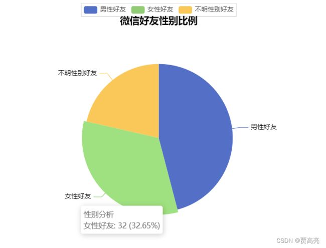
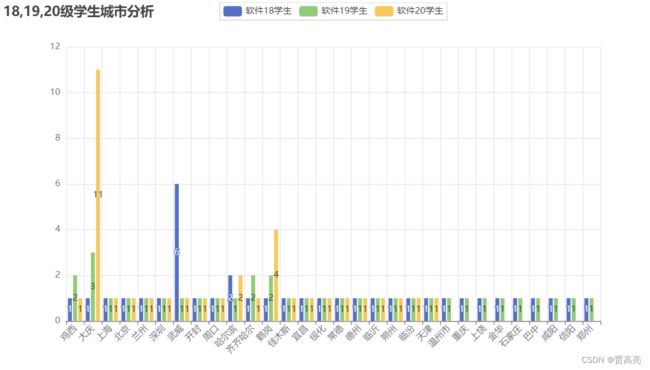
2.柱状图学生省份和城市分析
from pyecharts.charts import Bar
#用于设值全局配置和系列配置
from pyecharts import options as opts
import xlrd

'''
    例子2:柱状图学生省份和城市分析
'''
# 2.1读取省份信息
def getProvince(filename):
    Province1 = {}
    Province2 = {}
    Province3 = {}
    a = []
    flag = 0
    for filename_kid in filename:
        flag += 1
        rd = xlrd.open_workbook(filename_kid)
        all_sheet = rd.sheet_names()
        for sheet_kid in all_sheet:
            table = rd.sheet_by_name(sheet_kid)
            nrows = table.nrows
            for i in range(nrows - 1):
                province = table.cell(i + 1, 6).value
                if flag == 1:
                    Province1[province] = Province1.get(province, 0) + 1
                elif flag == 2:
                    Province2[province] = Province2.get(province, 0) + 1
                else:
                    Province3[province] = Province3.get(province, 0) + 1
        if flag == 1:
            a.append(Province1)
        elif flag == 2:
            a.append(Province2)
        else:
            a.append(Province3)
    return a
# 2.2省份可视化
def Provincepyechart(province_list):
    province_dict = ['黑龙江', '四川', '天津', '内蒙古', '江苏', '海南', '辽宁', '陕西', '浙江', '河南', '山西', '湖北', '广西', '重庆', '吉林', '贵州',
                     '云南', '河北', '山东']
    province1_dict = province_list[0]
    province2_dict = province_list[1]
    province3_dict = province_list[2]
    province1 = []
    province2 = []
    province3 = []
    value1 = []
    value2 = []
    value3 = []
    for key, value in province1_dict.items():
        province1.append(key)
        value1.append(value)
    for key, value in province2_dict.items():
        province2.append(key)
        value2.append(value)
    for key, value in province3_dict.items():
        province3.append(key)
        value3.append(value)
    print(province1)
    print(province2)
    print(province3)
    bar = (
        Bar()
            .add_xaxis(province_dict)
            .add_yaxis('软件18学生', value1)

            .add_yaxis('软件19学生', value2)

            .add_yaxis('软件20学生', value3)
            .set_global_opts(title_opts=opts.TitleOpts(title="18,19,20级学生省份分析"),
                             xaxis_opts=opts.AxisOpts(
                                 axislabel_opts=opts.LabelOpts(
                                     rotate=45,  # Optional[Numeric]
                                 )
                             )
                             ))
    bar.render('18,19,20级学生省份分析.html')
# 2.3读取城市信息
def getCity(filename):
    City1 = {}
    City2 = {}
    City3 = {}
    a = []
    flag = 0
    for filename_kid in filename:
        flag += 1
        rd = xlrd.open_workbook(filename_kid)
        all_sheet = rd.sheet_names()
        for sheet_kid in all_sheet:
            table = rd.sheet_by_name(sheet_kid)
            nrows = table.nrows
            for i in range(nrows - 1):
                City = table.cell(i + 1, 7).value
                if flag == 1:
                    City1[City] = City1.get(City, 0) + 1
                elif flag == 2:
                    City2[City] = City2.get(City, 0) + 1
                else:
                    City3[City] = City3.get(City, 0) + 1
        if flag == 1:
            a.append(City1)
        elif flag == 2:
            a.append(City2)
        else:
            a.append(City3)
    return a
# 2.4城市可视化
def cityPyechart(city_list):
    city_dict = ['鸡西', '大庆', '上海', '北京', '兰州', '深圳', '武威', '开封', '周口', '哈尔滨', '齐齐哈尔', '鹤岗', '佳木斯', '宜昌', '绥化',
                 '常德', '德州', '临沂', '朔州', '临汾', '天津', '温州市', '重庆', '上饶', '金华', '石家庄', '巴中', '咸阳', '信阳','郑州']
    city1_dict = city_list[0]
    city2_dict = city_list[1]
    city3_dict = city_list[2]
    city1 = []
    city2 = []
    city3 = []
    value1 = []
    value2 = []
    value3 = []
    for key, value in city1_dict.items():
        city1.append(key)
        value1.append(value)
    for key, value in city2_dict.items():
        city2.append(key)
        value2.append(value)
    for key, value in city3_dict.items():
        city3.append(key)
        value3.append(value)
    print(city1)
    print(city2)
    print(city3)
    bar = (
        Bar()
            .add_xaxis(city_dict)
            .add_yaxis('软件18学生', value1)

            .add_yaxis('软件19学生', value2)

            .add_yaxis('软件20学生', value3)
            .set_global_opts(title_opts=opts.TitleOpts(title="18,19,20级学生城市分析"),
                             xaxis_opts=opts.AxisOpts(
                                 axislabel_opts=opts.LabelOpts(
                                     rotate=45,  # Optional[Numeric]
                                 )
                             )
                             ))
    bar.render('18,19,20级学生城市分析.html')

if __name__ == '__main__':
    # 2
    province_list = getProvince(['软件181学生详细名单.xls', '软件191学生详细名单.xls', '软件201学生详细名单.xls'])
    Provincepyechart(province_list)
    City_list = getCity(['软件181学生详细名单.xls', '软件191学生详细名单.xls', '软件201学生详细名单.xls'])
    cityPyechart(City_list)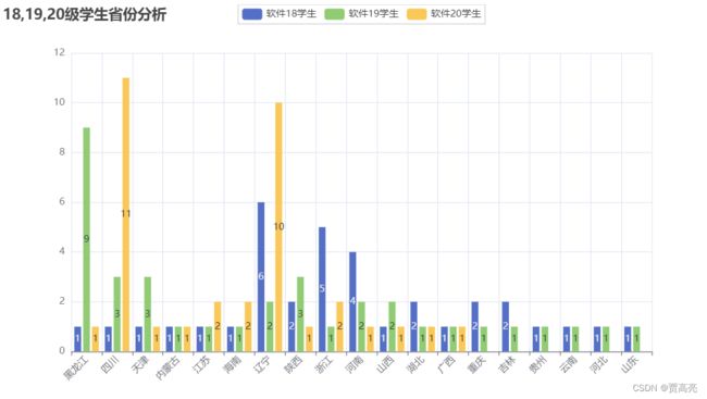
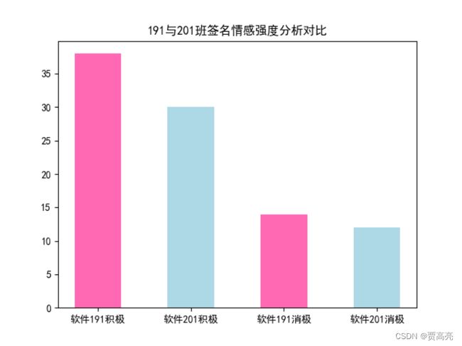
3.分析191,201学生情感
import re
import jieba
#用于设值全局配置和系列配置
import numpy as np
import xlrd
from snownlp import SnowNLP
import matplotlib.pyplot as plt

'''
    例子3:分析191,201学生情感
'''
plt.rcParams['font.sans-serif'] = ['SimHei']
plt.rcParams['axes.unicode_minus'] = False
# 3.1 读取Excel表格,保存txt文件词性,分析情感强度
def getStrong(filename,save):
    data = xlrd.open_workbook(filename,'r',encoding_override='utf-8')
    temp = []
    name = []
    tables = data.sheets()
    for i in range(len(tables)):
        list = data.sheet_by_index(i)
        rows = list.nrows
        for j in range(rows):
            if j== 0:
                continue
            name.append(list.row_values(j)[3])
            temp.append(list.row_values(j)[16])
        file = open(f"{save}",'a',encoding='utf-8')
        i = 0
        for ld in temp:
            signature = ld.strip().replace("emoji","").replace("span","").replace("class","")
            rec = re.compile("lf\d+\w*|[<>/=]]")
            signature = rec.sub("",signature)
            if signature != "":
                file.write(name[i]+" : " +signature)
                s = SnowNLP(signature)
                if s.sentiments > 0.5:
                    file.write(" : 积极!\n")
                elif s.sentiments <= 0.5:
                    file.write(" : 消极!\n")
                i+=1
# 3.2 统计两个班级积极与消极数量
def counter(save):
    # https://blog.csdn.net/weixin_38762584/article/details/115023975
    # f’{}’ 用法等同于 format用法的简单使用,更加方便
    txt = open(f"{save}", encoding="utf-8").read()
    need_words = open("./qingxu.txt", encoding="utf-8").read()
    find = need_words.split()
    jieba.load_userdict('./qingxu.txt')
    words = jieba.lcut(txt)
    counts = {}
    for word in words:
        counts[word] = counts.get(word,0) + 1
    lst=[]
    for i in range(len(find)):
        try :
            print(find[i],counts[find[i]])
        except:
            lst.append(find[i])
    a = counts[find[0]]
    b = counts[find[1]]
    return a,b

if __name__ == '__main__':
    # 3
    # 保存两个班级人生格言
    getStrong("./软件191学生详细名单.xls", "./191-Signature.txt")
    getStrong("./软件201学生详细名单.xls", "./201-Signature.txt")
    # 获取两个班级格言积极与消极人数
    a, b = counter("./191-Signature.txt")
    c, d = counter("./201-Signature.txt")
    # matplotlib绘图
    x = np.array(['软件191积极', '软件201积极', '软件191消极', '软件201消极'])
    y = np.array([a, c, b, d])
    plt.bar(x, y, color=["hotpink", "lightblue", "hotpink", "lightblue"], width=0.5)
    plt.title('191与201班签名情感强度分析对比')
    plt.show()
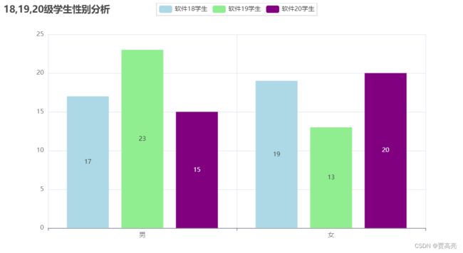
4.柱状图18·19·20级学生男女比例
from pyecharts.charts import Bar
#用于设值全局配置和系列配置
from pyecharts import options as opts
import xlrd

'''
    例子4:柱状图18·19·20级学生男女比例
'''
# 4.1 读取xls文件,把性别信息读取出来
def getProvince1(filename):
    Province1 = {}
    Province2 = {}
    Province3 = {}
    a = []
    flag = 0
    for filename_kid in filename:
        flag += 1
        rd = xlrd.open_workbook_xls(filename_kid)   #xlrd.open_workbook()不支持xls文件
        all_sheet = rd.sheet_names()
        for sheet_kid in all_sheet:
            table = rd.sheet_by_name(sheet_kid)
            nrows = table.nrows
            for i in range(nrows-1):
                province = table.cell(i+1, 5).value
                if flag == 1:
                    Province1[province] = Province1.get(province, 0) + 1
                elif flag == 2:
                    Province2[province] = Province2.get(province, 0) + 1
                else:
                    Province3[province] = Province3.get(province, 0) + 1
        if flag == 1:
            a.append(Province1)
        elif flag == 2:
            a.append(Province2)
        else:
            a.append(Province3)
    return a

# 4.2 性别可视化
def VisualSexpyechart1(province_list):
    province1_dict = province_list[0]
    province2_dict = province_list[1]
    province3_dict = province_list[2]
    province1 = []
    province2 = []
    province3 = []
    value1 = []
    value2 = []
    value3 = []
    for key,value in province1_dict.items():
        province1.append(key)
        value1.append(value)
    for key,value in province2_dict.items():
        province2.append(key)
        value2.append(value)
    for key,value in province3_dict.items():
        province3.append(key)
        value3.append(value)
    print(province1)
    print(province2)
    print(province3)
    bar = (
        Bar()
            .add_xaxis(province1)
            .add_yaxis('软件18学生', value1,color='lightblue')

            .add_yaxis('软件19学生', value2,color='lightgreen')

            .add_yaxis('软件20学生', value3,color='purple')
            .set_global_opts(title_opts=opts.TitleOpts(title="18,19,20级学生性别分析"))
    )
    bar.render('18,19,20级学生性别分析.html')

if __name__ == '__main__':
    # 4
    province_list1 = getProvince1(['./软件181学生详细名单.xls', './软件191学生详细名单.xls', './软件201学生详细名单.xls'])
    VisualSexpyechart1(province_list1)
5.关系图example
#用于设值全局配置和系列配置
from pyecharts import options as opts
import xlrd
from pyecharts.charts import Graph

'''
    例子5:关系图example
'''
def getRoom(filename):
    Room={}
    data= xlrd.open_workbook(filename,'r',encoding_override='utf-8')
    table= data.sheets()[0]
    rows=table.nrows
    for i in range(rows):
        if i==0:
            continue
        Room[table.row_values(i)[3]]=table.row_values(i)[9]
    print(Room)
    return Room
def RoomSee(Room):
    nodes = []
    for i in Room:
       nodes.append({"name": i, "symbolSize": 5})
    links = []
    for i in Room:
           for j in Room:
              if Room[i]==Room[j]:
                links.append({"source": i, "target": j})

    graph= (
        Graph()
        .add("", nodes, links, repulsion=8000)
        .set_global_opts(title_opts=opts.TitleOpts(title="Graph-基本示例"))
    )
    graph.render('关系图.html')

if __name__ == '__main__':
    # 5
    RoomSee(getRoom("软件201学生详细名单.xls"))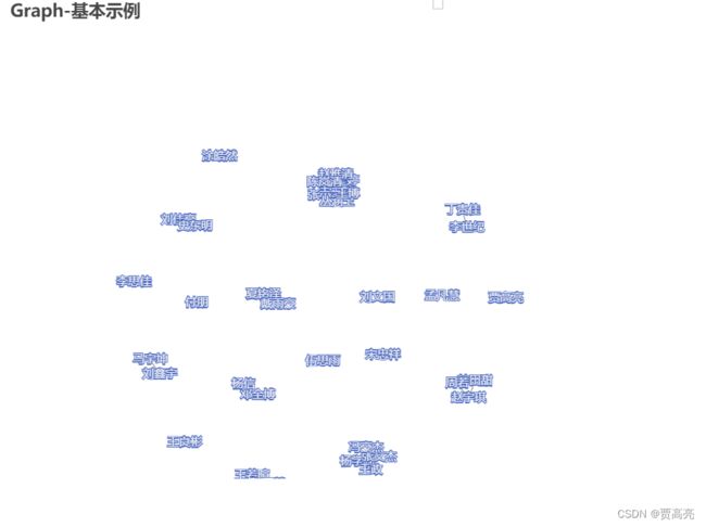
6.词云
from pyecharts import options
from pyecharts.charts import WordCloud
import csv
import re
import jieba

'''
    例子6:词云
'''
def getInfo(filename,index):
    lstdata = []
    with open(filename,'r') as fr:
        reader = csv.reader(fr)
        for i in reader:
            if i!='':
                lstdata.append(i[index])
        file = open('./sign.txt','a',encoding='utf-8')
        for ld in lstdata:
            signature = ld.strip().replace("emoji",'').replace("span",'').replace("class",'')
            rec = re.compile("lf\d+\w*|[<>/=]")
            signature = rec.sub("",signature)
            file.write(signature+"\n")
# 2 生成云图
def create_word_cloud(filename):
    # 读取文件内容
    text = open("./{}.txt".format(filename),encoding='utf-8').read()
    # 结巴分词,精确模式
    wordlist = jieba.lcut(text,cut_all=True)
    counts = {} # 通过键值对的形式存储词语及其出现的次数
    words = []
    for word in wordlist:
        if len(word) == 1: # 单个词语不计算在内
            continue
        else:
            counts[word] = counts.get(word,0) + 1 # 遍历所有词语,每出现一次其对应的值加1

    for key,value in counts.items():
        words.append((key,value))

    w = (
        WordCloud()
            .add("",words)
            .set_global_opts(title_opts=options.TitleOpts(title="词云"))
            .render('./变形词云.html')
    )

if __name__ == '__main__':
    # 6
    getInfo("./我的微信好友信息.csv", 5)
    create_word_cloud("sign")
7.好友省份地图可视化
import csv
from collections import Counter
# 1.读取csv文件,把性别信息读取出来
from pyecharts import options as opts
from pyecharts.charts import Map

'''
    例子7:好友省份地图可视化
'''
def getInfo(filename,index):
    lstdata = []
    with open(filename,'r') as fr:
        reader = csv.reader(fr)
        for i in reader:
            lstdata.append(i[index])
    return lstdata

# 2.省份可视化
def province_Map(lstprovince):
    lstprovincenew = []
    # 2.1 去掉空白的项
    for i in lstprovince:
        if i == " ":pass
        else: lstprovincenew.append(i)
    # 2.2 统计每个城市出现的次数
    data = Counter(lstprovincenew).most_common(15) # 使用Counter类统计出现的次数,并转换为元组列表
    print(data)
    # 2.3 根据省份数据生成地图
    c = (
        # Map() 里通过添加 init_opts 参数可以配置初始化画布大小。
        # Map(init_opts=opts.InitOpts(height="1000px", width="1500px"))
        Map()
            .add(
                series_name="好友省份",
                data_pair=data,
                maptype='china',# china-cities
                is_selected=True,
                # 是否启用鼠标滚轮缩放和拖动平移,默认为True
                is_roam=True,
                # 是否显示图形标记,默认为True
                is_map_symbol_show=True,
                # 图元样式配置
                # 图元样式配置的 areaColor 为区域颜色, borderColor 为边框颜色,
                # 其中 normal 为常规模式下的,emphasis 为强调样式下的,即鼠标移动到区域上的显示。
                itemstyle_opts={
                    # 常规显示
                    "normal": {"areaColor": "white", "borderColor": "red"},
                    # 强调颜色
                    "emphasis": {"areaColor": "rgba(0,0,0,1)"}
                }
            )
            .set_global_opts(
                # 设置标题
                title_opts=opts.TitleOpts(
                    # 主标题
                    title="省份地图",
                    # 副标题
                    subtitle="吴迪的好友省份数据",
                    # 组件距离容器左侧的位置
                    pos_left="left",
                    # 组件距离容器上方的像素值
                    pos_top="20",
                    # 设置标题颜色
                    title_textstyle_opts=opts.TextStyleOpts(color="#404a59",font_size=24)
                ),
                # 图例配置项,参数 是否显示图里组件
                legend_opts=opts.LegendOpts(is_show=True),
                # 设置分段显示
                visualmap_opts=opts.VisualMapOpts(max_=60, is_piecewise=True)
            )
            # 关闭标签(地图上的省份名称)名称显示,系列配置项里的标签加上color="bule" 参数可设置标签颜色为蓝色。
            .set_series_opts(
                label_opts=opts.LabelOpts(
                    is_show=True,
                    color='blue')
            )
        .render("./吴迪好友省份分布.html")
    )

if __name__ == '__main__':
    # 7
    lstdata = getInfo("./我的微信好友信息.csv", 3)
    province_Map(lstdata)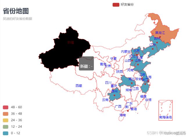
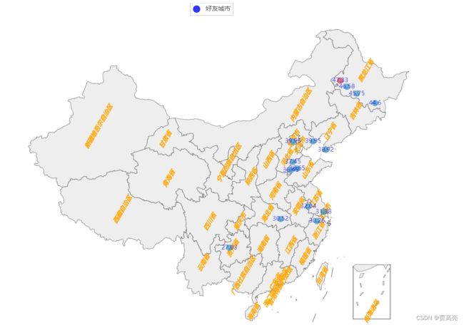
8.好友城市地图分析
import csv
#用于设值全局配置和系列配置
from pyecharts import options as opts
from collections import Counter
from pyecharts.charts import Geo

'''
    例子8:好友城市地图分析
'''
# 8.1 获取数据
def getInfo2(filename,index):
    lstdata = []
    with open(filename,'r') as fr:
        reader = csv.reader(fr)
        for i in reader:
            if i[index]=="City": pass
            else: lstdata.append(i[index])
    return lstdata

# 8.2 城市地图可视化
def city_Map(lstcity):
    lstcitynew = []
    # 2.1 去掉空白的项
    for i in lstcity:
        if i == "":pass
        else: lstcitynew.append(i)
    # 2.2 统计每个城市出现的次数
    data = Counter(lstcitynew).most_common(15) # 使用Counter类统计出现的次数,并转换为元组列表
    print(list(data))
    # 2.3 根据省份数据生成地图
    c = (
        # Geo() 里通过添加 init_opts 参数可以配置初始化画布大小。
        # Geo(init_opts=opts.InitOpts(height="1000px", width="1500px"))
          Geo(init_opts=opts.InitOpts(
                                width="1600px",
                                height="1000px",
                                page_title="我的",  # 网页标题
                                )
            )

            .add_schema(maptype="china", # china-cities
                        label_opts=opts.LabelOpts(is_show=True,
                                                  position='inside',  # 标签的位置。
                                                  font_size=12,  # 文字的字体大小
                                                  color="orange",  # 文字的颜色。如果设置为 'auto',则为视觉映射得到的颜色,如系列色。
                                                  font_style='italic',
                                                  font_weight='bold',
                                                  font_family='Arial',
                                                  rotate=60,  # 标签旋转。从 -90 度到 90 度。正值是逆时针。
                                                  margin=8,  # 刻度标签与轴线之间的距离。
                                                  )
                        )
            .add(
                series_name="好友城市",
                data_pair=data,
                # type_=ChartType.HEATMAP, # Geo 图类型,
                symbol="circle", # 标记图形形状,提供的标记类型包括 'circle', 'rect', 'roundRect', 'triangle','diamond', 'pin', 'arrow', 'none'
                symbol_size=12,  # 标记的大小
                blur_size=15,  # 每个点的大小
                point_size=10,  # 每个点模糊的大小,
                color="blue",  # 系列 label 颜色
                is_selected=True
            )
            .set_global_opts(
                # 设置标题
                title_opts=opts.TitleOpts(
                    # 主标题
                    title="城市地图",
                    # 副标题
                    subtitle="吴迪的好友城市数据",
                    # 组件距离容器左侧的位置
                    pos_left="left",
                    # 组件距离容器上方的像素值
                    pos_top="20",
                    # 设置标题颜色
                    title_textstyle_opts=opts.TextStyleOpts(color="#404a59",font_size=24)
                ),
                # 图例配置项,参数 是否显示图里组件
                legend_opts=opts.LegendOpts(is_show=True),
                # 设置分段显示
                visualmap_opts=opts.VisualMapOpts(max_=40, is_piecewise=True)
            )
            # 关闭标签(地图上的省份名称)名称显示,系列配置项里的标签加上color="bule" 参数可设置标签颜色为蓝色。
            .set_series_opts(
                label_opts=opts.LabelOpts(
                    is_show=True,
                    color='blue')
            )
        .render("./我的好友城市分布.html")
    )

if __name__ == '__main__':
    # 8
    lstdata = getInfo2("./我的微信好友信息.csv", 1)
    city_Map(lstdata)