Echerts 绘制折线图
最近想画个折线图,展示业务的走势,选择用的是echarts,这里记录下来,方便查看。
详细介绍可以去官网查看demo哦 -> 官网地址
前端开发语言:vue
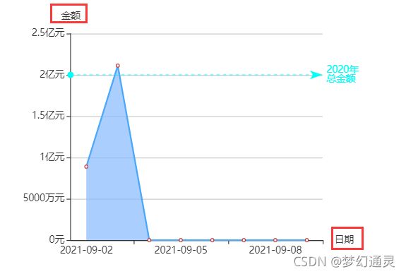
先放一张最终的折线效果图,横坐标是日期,纵坐标是金额。

带着问题往下看
1、横纵坐标怎么加?
echarts 折线图接收的参数是数组,注意不能是字符串哦。
xAxis: {
		type: 'category',
        name: '日期', // 坐标名字
        nameLocation: 'end', // 坐标位置,支持start,end,middle
		data: dateList // 数组,这里是从后端获取的结果
 	},
yAxis: {
	type: 'value',
    name: '金额',  // 坐标名字
    nameLocation: 'end', // 坐标位置,支持start,end,middle
    axisLabel: {
      formatter: '{value}元' // 纵坐标单位
   }
}
效果如下图所示。
2、纵坐标单位如何自适应?
金额的数量级不一样,有元、万元、亿元等,要求根据实际结果来显示。在
y 轴 axisLabel 中根据 value 的值来显示和加单位。(注意不要写错哦)
yAxis: {
	type: 'value',
    name: '金额',  // 坐标名字
    nameLocation: 'end', // 坐标位置,支持start,end,middle
    axisLabel: {
          function(value,index){
             if(value >= 100000000){
               return value / 100000000 + '亿元';
             } else if(value > 10000){
               return value / 10000 + '万元';
             } else {
               return value + '元';
             }
          }
     }
}
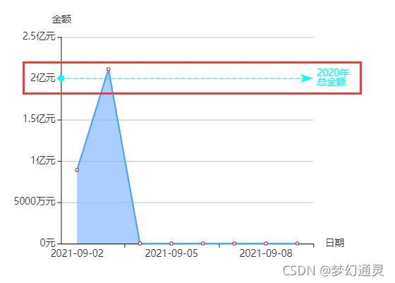
3、水平的标记线要怎么设置呢?
在 series 中设置 类型,数值等属性
series: [{
      type: 'line',
      smooth: true, // 平滑曲线
      data: 200000,
      markLine: {
          silent: true,
          lineStyle: {
            normal: {
              color: '#01fef9'   // 这儿设置安全基线颜色
            }
          },
          data: [{
              yAxis: 200000000 // 这里可以写死数值
          }],
          label: {
            normal: {
              formatter: '2020年\n总金额' // 这儿设置安全基线
            }
          },
      },
  }]
效果如下图所示。
4、鼠标放上显示横纵坐标值的效果如何实现?
在每个红色圆点,鼠标放上会显示数值要如何实现,echart自带的属性,tooltip 为空即可, 只要添加上即可。
tooltip: {},
效果如下图所示。

下面是vue前端的代码实现。
第一块、页面布局,设置折现图名称等
<el-col :span="8">
  <div class="border_one">
  <div class="chart_name">
    <div class="con_title">X-Y轴图div>
  div>
  <div id="lineChart" style="width: 100%;height:400px;">
  div>
  div>
el-col>
第二块、页面发起后端调用与处理
getLineData() {
	 // 根据 id 获取折线图对象
     this.myLineChart = echarts.init(document.getElementById('lineChart'));
     // 页面加载
     this.myLineChart.showLoading({
       text: '数据正在努力加载...',
       color: '#409EFF',
       textColor: '#000'
     });
     let params = {}
     this.$nextTick(() => {
     	// 发起后端请求
       this.$axios.post(this.queryLineUrl, params).then(res => {
           let code = res.data
           if (code && code === "1") {
             this.myLineChart.hideLoading();
             this.lineData = res.data;
             // 解析数据
             this.commonLineData();
           } else {
             this.lineObjData = {};
             return
           }
       })
   })
}
第三步、数据解析与页面展示
页面渲染的属性参数比较多,可以边加边看效果,前端是细心的活
commonLineData() {
	let dateList = []
	let dataValue = []
	dateList = this.lineData.dateArr
	dataValue = this.lineData.payAmountArr
	// 绘制图表
	let option = {
	  	tooltip: {},
       	legend: {
	        orient: 'horizontal',
	        x: 'left',
	        y: 'top',
	        data: dataValue
       },
		xAxis: {
			type: 'category',
           	name: '日期', // 坐标名字
            nameLocation: 'end', // 坐标位置,支持start,end,middle
			data: dateList
	  },
	   yAxis: {
		    type: 'value',
	        name: '金额',  // 坐标名字
	        nameLocation: 'end', // 坐标位置 start,end,middle
	        scale: true,
	       axisLabel: {
	          function(value,index){
	            if(value >= 100000000){
	               return value / 100000000 + '亿元';
	            } else if(value > 10000){
	                 return value / 10000 + '万元';
	            } else {
	                return value + '元';
	           }
	        }
	     }
	  },
		grid: {
			left: '5%',
			right: '14%',
			containLabel: true
		},
		series: [{
	 		data: dataValue,
	 		type: 'line',
	 		areaStyle: {
	 			 color: new echarts.graphic.LinearGradient(0, 0, 0, 1, // 变化度
	          // 三种由深及浅的颜色
					[{
						offset: 0,
						color: '#87bafe'
					}, {
						offset: 0.5,
						color: '#87bafe'
					}, {
						offset: 1,
						color: '#87bafe'
					} ])
		 		},
			itemStyle: {
				normal: {
					 lineStyle: {
						 color: '#4aa7f9'
					 }
				 }
			}
		}, {
           type: 'line',
           smooth: true, // 平滑曲线
           data: 200000,
           markLine: {
               silent: true,
               lineStyle: {
                 normal: {
                   color: '#01fef9'   // 安全基线颜色
                 }
               },
               data: [{
                   yAxis: 200000000
               }],
               label: {
                 normal: {
                   formatter: '2020年\n总金额' // 安全基线
                 }
               },
           },
       }]
	 };
	  // 渲染
	  this.myLineChart.setOption(option, true);
	  window.onresize = () => {
	     this.myLineChart.resize();
	}
}
以上用 Echarts 绘制折线图的过程,小伙伴可以动手试试,有问题可以留言哦~