HarmonyOS应用开发学习笔记 UI布局学习 栅格布局(GridRow/GridCol)
HarmonyOS应用开发学习笔记 UI布局学习 相对布局 (RelativeContainer)
官方文档:栅格布局(GridRow/GridCol)
一、代码示例

Row() {
  GridRow({ columns: 4 }) {
    ForEach(this.bgColors, (item, index) => {
      GridCol() {
        Row() {
          Text(`${index + 1}`)
        }.width('100%').height('50')
      }.backgroundColor(item)
    })
  }
  .width('100%').height('100%')
  .onBreakpointChange((breakpoint) => {
    this.currentBp = breakpoint
  })
}
.height(160)
.border({ color: Color.Blue, width: 2 })
.width('90%')
Row() {
  GridRow({ columns: 8 }) {
    ForEach(this.bgColors, (item, index) => {
      GridCol() {
        Row() {
          Text(`${index + 1}`)
        }.width('100%').height('50')
      }.backgroundColor(item)
    })
  }
  .width('100%').height('100%')
  .onBreakpointChange((breakpoint) => {
    this.currentBp = breakpoint
  })
}
.height(160)
.border({ color: Color.Blue, width: 2 })
.width('90%')
二、常用属性
1、排列方向
- 通过设置GridRow的direction属性来指定栅格子组件在栅格容器中的排列方向
| 代码 | 描述 |
|---|---|
| GridRowDirection.Row | 从左往右排列 |
| GridRowDirection.RowReverse | 从右往左排列 |
- 左往右排列
//子组件默认从左往右排列
GridRow({ direction: GridRowDirection.Row }){}
- 子组件从右往左排列
GridRow({ direction: GridRowDirection.RowReverse }){}

2、子组件间距
当gutter类型为number时,同时设置栅格子组件间水平和垂直方向边距且相等。下例中,设置子组件水平与垂直方向距离相邻元素的间距为10。
- 垂直和水平间距都为10
GridRow({ gutter: 10 }){}

- x属性为水平方向间距,y为垂直方向间距
GridRow({ gutter: { x: 20, y: 50 } }){}

3、子组件GridCol
- 通过给GridCol传参或者设置属性两种方式
| 代码 | 描述 |
|---|---|
| span | 占用列数 |
| offset | 偏移列数 |
| order | 元素序号 |
设置span
GridCol({ span: 2 }){}
GridCol({ span: { xs: 1, sm: 2, md: 3, lg: 4 } }){}
GridCol(){}.span(2)
GridCol(){}.span({ xs: 1, sm: 2, md: 3, lg: 4 })
设置offset
GridCol({ offset: 2 }){}
GridCol({ offset: { xs: 2, sm: 2, md: 2, lg: 2 } }){}
GridCol(){}.offset(2)
GridCol(){}.offset({ xs: 1, sm: 2, md: 3, lg: 4 })
设置order
GridCol({ order: 2 }){}
GridCol({ order: { xs: 1, sm: 2, md: 3, lg: 4 } }){}
GridCol(){}.order(2)
GridCol(){}.order({ xs: 1, sm: 2, md: 3, lg: 4 })
三、不同尺寸的适配
GridRow为栅格容器组件,需与栅格子组件GridCol在栅格布局场景中联合使用。
栅格系统默认断点将设备宽度分为xs、sm、md、lg四类,尺寸范围如下:
| 断点名称 | 取值范围(vp) | 设备描述 |
|---|---|---|
| xs | [0, 320) | 最小宽度类型设备。 |
| sm | [320, 520) | 小宽度类型设备。 |
| md | [520, 840) | 中等宽度类型设备。 |
| lg | [840, +∞) | 大宽度类型设备。 |
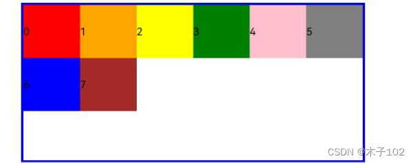
- 例如,使用栅格的默认列数12列,通过断点设置将应用宽度分成六个区间,在各区间中,每个栅格子元素占用的列数均不同。
@State bgColors: Color[] = [Color.Red, Color.Orange, Color.Yellow, Color.Green, Color.Pink, Color.Grey, Color.Blue, Color.Brown];
...
GridRow({
  breakpoints: {
    value: ['200vp', '300vp', '400vp', '500vp', '600vp'],
    reference: BreakpointsReference.WindowSize
  }
}) {
   ForEach(this.bgColors, (color, index) => {
     GridCol({
       span: {
         xs: 2, // 在最小宽度类型设备上,栅格子组件占据的栅格容器2列。
         sm: 3, // 在小宽度类型设备上,栅格子组件占据的栅格容器3列。
         md: 4, // 在中等宽度类型设备上,栅格子组件占据的栅格容器4列。
         lg: 6, // 在大宽度类型设备上,栅格子组件占据的栅格容器6列。
         xl: 8, // 在特大宽度类型设备上,栅格子组件占据的栅格容器8列。
         xxl: 12 // 在超大宽度类型设备上,栅格子组件占据的栅格容器12列。
       }
     }) {
       Row() {
         Text(`${index}`)
       }.width("100%").height('50vp')
     }.backgroundColor(color)
   })
}