- 基于 Vue + RuoYi 架构设计的商城Web/小程序实训课程
速易达网络
springbootuni-appvue.js
以下是基于Vue+RuoYi架构设计的商城Web/小程序实训课程方案,结合企业级开发需求与教学实践,涵盖全栈技术栈与实战模块:一、课程概述目标:通过Vue前端+RuoYi后端(SpringBoot)开发企业级电商系统,实现多终端(Web/H5/小程序)适配,覆盖从架构设计到部署上线的全流程。周期:8周(建议每日3小时)适合人群:具备基础Java/Vue知识的开发者,熟悉HTML/CSS/JavaS
- 微信小程序实现websocket及单人聊天功能
蝶妹妹
微信小程序websocket小程序
一、什么是websocket:WebSocket是HTML5下一种新的协议(websocket协议本质上是一个基于tcp的协议)它实现了浏览器与服务器全双工通信,能更好的节省服务器资源和带宽并达到实时通讯的目的Websocket是一个持久化的协议二、websocket的原理:websocket约定了一个通信的规范,通过一个握手的机制,客户端和服务器之间能建立一个类似tcp的连接,从而方便它们之间的
- springboot+websocket+微信小程序(实现后端主动推送消息 小程序的实时报警功能)
Listitem本项目主要实现的需求为:主要功能汽车在行驶的过程中如果前方遇到限高杆,车前的摄像头在安全距离前测出限高杆的高度后,小程序能够实时报警(当前车辆内否安全通过)。次要功能1.车主利用微信用户名登录后能够绑定车牌,实现车牌的增删改查2.车主可以为自己的车牌号添加家庭成员(绑定微信用户名的方式)3.简单权限管理(车主拥有其名下车牌的增删改查权限,家庭成员则没有)实现方式1.后端使用spri
- uniapp+vue写小程序页面,实现一张图片默认放大后,可以在容器内上下左右拖动查看
1.组件chargingimageViewerimport{ref,onMounted,computed}from'vue';constprops=defineProps({imageUrl:{type:String,required:true,},});//视图容器尺寸constVIEW_WIDTH=750;//微信小程序设计稿宽度constVIEW_HEIGHT=1800;//缩放限制cons
- 提名 Apache ShardingSphere Committer,说说方法
优质资源分享学习路线指引(点击解锁)知识定位人群定位Python实战微信订餐小程序进阶级本课程是pythonflask+微信小程序的完美结合,从项目搭建到腾讯云部署上线,打造一个全栈订餐系统。Python量化交易实战入门级手把手带你打造一个易扩展、更安全、效率更高的量化交易系统文章首发在公众号(龙台的技术笔记),之后同步到博客园和个人网站:xiaomage.info就在前几天,收到了ApacheS
- 鸿蒙中 错误日志和崩溃日志上报
梦想不只是梦与想
鸿蒙harmonyos华为鸿蒙日志上报
本文同步发表于我的微信公众号,微信搜索程语新视界即可关注,每个工作日都有文章更新鸿蒙(HarmonyOS)中,系统提供了完整的错误日志和崩溃日志上报机制,包含现成的API和工具类支持。具体实现,如下:一系统原生API支持错误管理(errorManager)功能:捕获应用未处理的异常(如JSCrash),支持自定义错误回调。核心API:importerrorManagerfrom'@ohos.app
- uniapp(vue3) - 实现天气预报气象温度双折线图一周气温变化曲线图,uniApp使用秋云uCharts图表插件做天气预报折线图示例代码(全端兼容H5网页、小程序、安卓/苹果app、nvue)
十一猫咪爱养鱼
前端组件与功能(开箱即用)uniapp常见问题解决uni-app天气预报未来一周天气温度天气预报温度折线图表uniapp做天气预报曲线图绘制最低温度和最高温度曲线图uniapp天气预报示例代码
效果图在uni-app手机h5网页网站/支付宝微信小程序/安卓app/苹果app/nvue等(全平台兼容)开发中,实现uniapp天气预报双折线图温度图表示例源码,展示未来7天一周的天气温度情况点状折线图天气预报,Uniapp全平台实现气象监测页面查看温度变化,可自行修改优化线条颜色、粗细、数值及背景图等自由修改,提供完整源码!新手小白直接复制源码运行后简单修改即可。引入插件如果你已经引入过了,这
- uniapp__微信小程序使用秋云ucharts折线图双轴
技术需要沉淀gogo
秋云echartsuni-app微信小程序小程序
1、子组件exportdefault{props:{chartData:{type:Object,required:true},color:{type:Array,default:()=>["#1890FF","#91CB74"]},yAxisMax:{type:Number,default:5},yAxisMin:{type:Number,default:0}},computed:{comput
- 【微信小程序学习笔记】
微信小程序学习笔记环境介绍分包加载小程序用户登录条件编译指令环境介绍uni-app,vue,c#文档:https://zh.uniapp.dcloud.io/分包加载为什么要分包加载分包加载是小程序的加载速度手段小程序的单个包不能超过2m启用分包加载subPackages:下载app.json文件中root:分包所在的目录pages:分包包含的页面"subPackages":[{"root":"p
- 网络请求——微信小程序学习笔记
十年之少
微信小程序学习笔记微信小程序学习笔记
1.前言发起网络请求,即发起HTTPS网络请求,注意必须是HTTPS。2.使用前注意事项使用前注意事项可参考官网文档:基础能力/网络/使用说明简单的来说,为了安全,服务器域名必须要备案,如果只是想测试一下,可以设置项目属性中设置不校验域名。2.1测试版-项目配置不校验域名微信开发者工具中打开需要配置的项目,点击【详情】,选择【本地设置】,勾选【不校验合法域名……】。2.2配置request合法域名
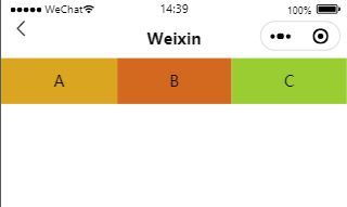
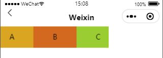
- 微信小程序学习笔记:选项卡
uMson_n
微信小程序
第一步:在.js文件里定义数据:data:{tabs:["选项1","选项2","选项3","选项4"],checked:0},tabs表示有几个选项,checked表示当前选中的是哪一页的索引。第二步:在.wxml编写代码:{{item}}页面{{index+1}}
- 微信小程序学习笔记(7)
。。。。。.....
微信小程序前端
一、小程序API的3大分类①事件监听API特点:以on开头,用来监听某些事件的触发举例:wx.onWindowResize(functioncallback)监听窗口尺寸变化的事件②同步API特点1:以Sync结尾的API都是同步API特点2:同步API的执行结果,可以通过函数返回值直接获取,如果执行出错会抛出异常举例:wx.setStorageSync(‘key’,’value’)向本地存储中写
- 微信小程序|流浪动物救助小程序的设计与实现
qq_469603589
微信小程序小程序微信小程序
作者主页:编程指南针作者简介:Java领域优质创作者、CSDN博客专家、CSDN内容合伙人、掘金特邀作者、阿里云博客专家、51CTO特邀作者、多年架构师设计经验、腾讯课堂常驻讲师主要内容:Java项目、Python项目、前端项目、人工智能与大数据、简历模板、学习资料、面试题库、技术互助收藏点赞不迷路关注作者有好处文末获取源码项目编号:L-BS-XZBS-30一,环境介绍语言环境:Java:jdk1
- 基于uniapp微信小程+SpringBoot+Vue的流浪动物救助领养系统设计和实现(源码+论文+部署讲解等)
博主介绍:✌全网粉丝50W+,csdn特邀作者、博客专家、CSDN新星计划导师、Java领域优质创作者,博客之星、掘金/华为云/阿里云/InfoQ等平台优质作者、专注于Java技术领域和学生毕业项目实战,高校老师/讲师/同行前辈交流✌技术范围:SpringBoot、Vue、SSM、HLMT、Jsp、PHP、Nodejs、Python、爬虫、数据可视化、小程序、安卓app、大数据、物联网、机器学习等
- 推客系统小程序终极指南:从0到1构建自动化分销帝国,让客户疯狂帮你卖货!
ywyy6798
推客系统推客小程序小程序推客分销系统短剧推客系统开发推客小程序开发
前言:为什么你需要一个推客系统?在流量成本飙升的今天,企业面临三大核心挑战:获客难:传统广告投放ROI持续下降,单客成本突破行业警戒线留存差:用户忠诚度低,复购率不足20%增长慢:依赖少数销售精英,无法形成规模化裂变推客系统的本质:通过“社交关系+智能激励”重构商业增长模型,让每个客户都成为你的“销售员”。数据证明:使用分销系统的企业,客户终身价值(LTV)平均提升3-5倍裂变获客成本比广告投放低
- 基于开源AI大模型AI智能名片S2B2C商城小程序的流量转化与价值沉淀研究
说私域
开源人工智能小程序
摘要:在数字化商业生态中,公域流量转化已成为企业竞争的核心战场。本文以开源AI大模型AI智能名片S2B2C商城小程序为研究对象,结合服装、健康食品、快时尚等行业的实践案例,系统分析其通过技术赋能实现精准获客、用户留存与商业闭环的机制。研究发现,该系统通过“AI算法+用户行为分析”双轮驱动,将公域流量转化为高黏性私域用户,同时提出“尊重用户价值”的伦理框架,警示企业需警惕流量霸凌与数据滥用风险。研究
- 基于开源链动2+1模式AI智能名片S2B2C商城小程序的场景零售创新研究
说私域
开源人工智能小程序
摘要:本文聚焦场景消费逻辑,探讨开源链动2+1模式AI智能名片S2B2C商城小程序在场景零售中的应用。通过分析场景消费中消费者体验的关键作用,结合该技术组合的特性,阐述其如何优化场景内容、增强场景美感,为消费者创造超乎预期的体验,进而为零售企业场景零售创新提供理论支持与实践路径。研究表明,该技术组合通过数字化工具与商业模式的创新融合,有效提升了场景零售的运营效率与用户体验,推动了零售行业的转型升级
- 微信办公泄密频发?企业如何兼顾效率与安全?如方工程文控给出答案!
Ru_fang
安全网络大数据
引言在数字化办公日益普及的今天,信息安全管理成为企业不可忽视的重要课题。尽管便捷的即时通讯工具为工作带来了效率提升,但随之而来的数据泄露风险也日益凸显。近期,某单位因员工通过微信传输涉密文件导致全员追责的事件,再次为企业敲响了警钟。如何在享受移动办公便利的同时,有效规避信息安全风险?工程文控系统通过技术手段为企业构建了可靠的安全防护体系。一、移动办公的潜在风险:常见误区剖析1.“私发或群发无风险”
- uniapp app打开小程序/app分享小程序卡片
不法
uniapp小程序uni-app小程序
app打开小程序plus.share.getServices(function(services){varservice=services.find(function(service){returnservice.id==='weixin';});if(service){service.launchMiniProgram({id:'gh_**********02',//替换为实际的小程序"原始id
- uniapp APP中内嵌webview的H5与APP相互通讯动态传参
夕溯流光
uni-appwebviewjavascript前端
文章目录概要思路代码概要在使用uni-app开发app的过程中使用到公司其他项目h5的页面,app项目中使用了web-view来进行内嵌,h5项目中核心功能是调用扫一扫进行扫码,由于h5本身基于微信开发,可以直接调用this.$wx.scanQRCode()实现扫一扫功能,但通过web-view嵌入app中,无法使用微信环境,导致直接调用摄像头失败,点击没有反应。思路后面看到web-view可以跟
- Python|读取word文档表格内容
算法与编程之美
算法之美编程语言人工智能python数据挖掘数据可视化
本文首发于微信公众号:"算法与编程之美",欢迎关注,及时了解更多此系列文章。引言在日常生活里,不管是办公、学习还是制作邀请函、请柬、简历等等,我们都会使用一个软件MicrosoftOfficeWord,OfficeWord是微软公司的一个收费文字处理应用程序,是最流行的文字处理程序之一,它虽功能强大,但简学易懂,但同时也有一个缺点,当一个Word文档储存的内容特别庞大的时候,使用者想要提取自己想要
- 突发!微信链接被拦截?微信内打不开,已停止访问该怎么办?提示复制去浏览器打开?
小北网络知识分享
链接问题微信计算机网络开发语言网络安全
精心制作的营销链接刚分享到微信群,瞬间弹出「已停止访问该网页」的提示?数据显示,2025年上半年微信拦截违规链接超2亿条,其中60%的运营者因不了解规则导致解封失败。别慌!本文结合最新政策与实战案例,手把手教你快速定位问题、72小时高效解封,并建立长效防封机制。一、拦截真相:微信系统紧盯的5大「高危行为」微信的智能拦截系统基于内容安全、技术合规、用户反馈三大维度,以下行为极易触发「红色警报」:1.
- 推客小程序系统开发全解析:从概念到落地的完整指南
ywyy6798
小程序微信小程序推客分销推客系统推客小程序短剧系统推客系统开发
一、推客小程序概述:新时代社交电商利器推客小程序是近年来在社交电商领域兴起的一种创新型营销工具,它结合了小程序轻量级、易传播的特点与社交裂变营销的强大势能,为企业提供了一种低成本、高效率的用户增长和商品销售解决方案。核心价值体现:用户裂变引擎:通过社交分享激励机制,实现用户几何级数增长销售转化加速器:缩短用户从认知到购买的路径,提升转化率私域流量沉淀池:帮助企业构建可持续运营的用户资产数据驱动决策
- 策略模式 - Flutter中的算法超市,运行时自由切换“计算法则“!
明似水
flutter策略模式flutter算法
痛点场景:支付流程的if-else地狱假设你正在开发一个电商App,需要支持多种支付方式:voidprocessPayment(Stringmethod,doubleamount){if(method=='alipay'){print('调用支付宝SDK,支付¥$amount');//支付宝特定逻辑...}elseif(method=='wechat'){print('调用微信支付SDK,支付¥$
- C语言比较三个数的大小
a_Dragon1
C语言学习记录
C语言入门基础小程序(一)输入3个数,并且比较大小#includevoidmain(){floata,b,c,t;printf("请输入三个数:");scanf("%f,%f,%f",&a,&b,&c);if(a>b){t=a;a=b;b=t;}if(a>c){t=a;a=c;c=t;}if(b>c){t=b;b=c;c=t;}printf("%.2f,%.2f,%.2f\n",a,b,c);}
- 关于微信小程序实例源码的研究过程(一)
tommy___2005
微信小程序小程序
1部署微信小程序示例源码通过开始|微信开放文档指引,申请微信小程序账号、安装开发者工具,就可以在开放文档的帮助下,进行微信小程序开发了。在了解微信小程序的运行的基础逻辑和框架后,就可以学习微信小程序实例源码了。该源码的git地址为:https://github.com/wechat-miniprogram/miniprogram-demo。根据超级完整的Git的下载、安装、配置与使用以及命令_gi
- 2024全新版视频短剧SAAS系统/影视短剧小程序/短剧APP小程序源码
酷讯网络_240870160
酷讯部落格小程序
2024最新版视频短剧SAAS系统源码影视短剧小程序源码附完整搭建教程1.依旧采用saas版本2.目前支持微信小程序和公众号h53.fenxiao商等级自定义价格配置4.二级fenxiao功能5.vip会员功能6.强大的卡密兑换(vip卡密,积分卡密,经销商卡密)7.多个云存储平台配置,自己的视频可自由选择存储平台8.支持批量导入9.支持接口采集-- -- 实例-- 存储过程名为:getUserInfo-- 参数为:date_day日期格式:2008-03-08-- BEGINdecla
- mysql 和 sqlite 区别
Array_06
sqlite
转载:
http://www.cnblogs.com/ygm900/p/3460663.html
mysql 和 sqlite 区别
SQLITE是单机数据库。功能简约,小型化,追求最大磁盘效率
MYSQL是完善的服务器数据库。功能全面,综合化,追求最大并发效率
MYSQL、Sybase、Oracle等这些都是试用于服务器数据量大功能多需要安装,例如网站访问量比较大的。而sq
- pinyin4j使用
oloz
pinyin4j
首先需要pinyin4j的jar包支持;jar包已上传至附件内
方法一:把汉字转换为拼音;例如:编程转换后则为biancheng
/**
* 将汉字转换为全拼
* @param src 你的需要转换的汉字
* @param isUPPERCASE 是否转换为大写的拼音; true:转换为大写;fal
- 微博发送私信
随意而生
微博
在前面文章中说了如和获取登陆时候所需要的cookie,现在只要拿到最后登陆所需要的cookie,然后抓包分析一下微博私信发送界面
http://weibo.com/message/history?uid=****&name=****
可以发现其发送提交的Post请求和其中的数据,
让后用程序模拟发送POST请求中的数据,带着cookie发送到私信的接入口,就可以实现发私信的功能了。
- jsp
香水浓
jsp
JSP初始化
容器载入JSP文件后,它会在为请求提供任何服务前调用jspInit()方法。如果您需要执行自定义的JSP初始化任务,复写jspInit()方法就行了
JSP执行
这一阶段描述了JSP生命周期中一切与请求相关的交互行为,直到被销毁。
当JSP网页完成初始化后
- 在 Windows 上安装 SVN Subversion 服务端
AdyZhang
SVN
在 Windows 上安装 SVN Subversion 服务端2009-09-16高宏伟哈尔滨市道里区通达街291号
最佳阅读效果请访问原地址:http://blog.donews.com/dukejoe/archive/2009/09/16/1560917.aspx
现在的Subversion已经足够稳定,而且已经进入了它的黄金时段。我们看到大量的项目都在使
- android开发中如何使用 alertDialog从listView中删除数据?
aijuans
android
我现在使用listView展示了很多的配置信息,我现在想在点击其中一条的时候填出 alertDialog,点击确认后就删除该条数据,( ArrayAdapter ,ArrayList,listView 全部删除),我知道在 下面的onItemLongClick 方法中 参数 arg2 是选中的序号,但是我不知道如何继续处理下去 1 2 3
- jdk-6u26-linux-x64.bin 安装
baalwolf
linux
1.上传安装文件(jdk-6u26-linux-x64.bin)
2.修改权限
[root@localhost ~]# ls -l /usr/local/jdk-6u26-linux-x64.bin
3.执行安装文件
[root@localhost ~]# cd /usr/local
[root@localhost local]# ./jdk-6u26-linux-x64.bin&nbs
- MongoDB经典面试题集锦
BigBird2012
mongodb
1.什么是NoSQL数据库?NoSQL和RDBMS有什么区别?在哪些情况下使用和不使用NoSQL数据库?
NoSQL是非关系型数据库,NoSQL = Not Only SQL。
关系型数据库采用的结构化的数据,NoSQL采用的是键值对的方式存储数据。
在处理非结构化/半结构化的大数据时;在水平方向上进行扩展时;随时应对动态增加的数据项时可以优先考虑使用NoSQL数据库。
在考虑数据库的成熟
- JavaScript异步编程Promise模式的6个特性
bijian1013
JavaScriptPromise
Promise是一个非常有价值的构造器,能够帮助你避免使用镶套匿名方法,而使用更具有可读性的方式组装异步代码。这里我们将介绍6个最简单的特性。
在我们开始正式介绍之前,我们想看看Javascript Promise的样子:
var p = new Promise(function(r
- [Zookeeper学习笔记之八]Zookeeper源代码分析之Zookeeper.ZKWatchManager
bit1129
zookeeper
ClientWatchManager接口
//接口的唯一方法materialize用于确定那些Watcher需要被通知
//确定Watcher需要三方面的因素1.事件状态 2.事件类型 3.znode的path
public interface ClientWatchManager {
/**
* Return a set of watchers that should
- 【Scala十五】Scala核心九:隐式转换之二
bit1129
scala
隐式转换存在的必要性,
在Java Swing中,按钮点击事件的处理,转换为Scala的的写法如下:
val button = new JButton
button.addActionListener(
new ActionListener {
def actionPerformed(event: ActionEvent) {
- Android JSON数据的解析与封装小Demo
ronin47
转自:http://www.open-open.com/lib/view/open1420529336406.html
package com.example.jsondemo;
import org.json.JSONArray;
import org.json.JSONException;
import org.json.JSONObject;
impor
- [设计]字体创意设计方法谈
brotherlamp
UIui自学ui视频ui教程ui资料
从古至今,文字在我们的生活中是必不可少的事物,我们不能想象没有文字的世界将会是怎样。在平面设计中,UI设计师在文字上所花的心思和功夫最多,因为文字能直观地表达UI设计师所的意念。在文字上的创造设计,直接反映出平面作品的主题。
如设计一幅戴尔笔记本电脑的广告海报,假设海报上没有出现“戴尔”两个文字,即使放上所有戴尔笔记本电脑的图片都不能让人们得知这些电脑是什么品牌。只要写上“戴尔笔
- 单调队列-用一个长度为k的窗在整数数列上移动,求窗里面所包含的数的最大值
bylijinnan
java算法面试题
import java.util.LinkedList;
/*
单调队列 滑动窗口
单调队列是这样的一个队列:队列里面的元素是有序的,是递增或者递减
题目:给定一个长度为N的整数数列a(i),i=0,1,...,N-1和窗长度k.
要求:f(i) = max{a(i-k+1),a(i-k+2),..., a(i)},i = 0,1,...,N-1
问题的另一种描述就
- struts2处理一个form多个submit
chiangfai
struts2
web应用中,为完成不同工作,一个jsp的form标签可能有多个submit。如下代码:
<s:form action="submit" method="post" namespace="/my">
<s:textfield name="msg" label="叙述:">
- shell查找上个月,陷阱及野路子
chenchao051
shell
date -d "-1 month" +%F
以上这段代码,假如在2012/10/31执行,结果并不会出现你预计的9月份,而是会出现八月份,原因是10月份有31天,9月份30天,所以-1 month在10月份看来要减去31天,所以直接到了8月31日这天,这不靠谱。
野路子解决:假设当天日期大于15号
- mysql导出数据中文乱码问题
daizj
mysql中文乱码导数据
解决mysql导入导出数据乱码问题方法:
1、进入mysql,通过如下命令查看数据库编码方式:
mysql> show variables like 'character_set_%';
+--------------------------+----------------------------------------+
| Variable_name&nbs
- SAE部署Smarty出现:Uncaught exception 'SmartyException' with message 'unable to write
dcj3sjt126com
PHPsmartysae
对于SAE出现的问题:Uncaught exception 'SmartyException' with message 'unable to write file...。
官方给出了详细的FAQ:http://sae.sina.com.cn/?m=faqs&catId=11#show_213
解决方案为:
01
$path
- 《教父》系列台词
dcj3sjt126com
Your love is also your weak point.
你的所爱同时也是你的弱点。
If anything in this life is certain, if history has taught us anything, it is
that you can kill anyone.
不顾家的人永远不可能成为一个真正的男人。 &
- mongodb安装与使用
dyy_gusi
mongo
一.MongoDB安装和启动,widndows和linux基本相同
1.下载数据库,
linux:mongodb-linux-x86_64-ubuntu1404-3.0.3.tgz
2.解压文件,并且放置到合适的位置
tar -vxf mongodb-linux-x86_64-ubun
- Git排除目录
geeksun
git
在Git的版本控制中,可能有些文件是不需要加入控制的,那我们在提交代码时就需要忽略这些文件,下面讲讲应该怎么给Git配置一些忽略规则。
有三种方法可以忽略掉这些文件,这三种方法都能达到目的,只不过适用情景不一样。
1. 针对单一工程排除文件
这种方式会让这个工程的所有修改者在克隆代码的同时,也能克隆到过滤规则,而不用自己再写一份,这就能保证所有修改者应用的都是同一
- Ubuntu 创建开机自启动脚本的方法
hongtoushizi
ubuntu
转载自: http://rongjih.blog.163.com/blog/static/33574461201111504843245/
Ubuntu 创建开机自启动脚本的步骤如下:
1) 将你的启动脚本复制到 /etc/init.d目录下 以下假设你的脚本文件名为 test。
2) 设置脚本文件的权限 $ sudo chmod 755
- 第八章 流量复制/AB测试/协程
jinnianshilongnian
nginxluacoroutine
流量复制
在实际开发中经常涉及到项目的升级,而该升级不能简单的上线就完事了,需要验证该升级是否兼容老的上线,因此可能需要并行运行两个项目一段时间进行数据比对和校验,待没问题后再进行上线。这其实就需要进行流量复制,把流量复制到其他服务器上,一种方式是使用如tcpcopy引流;另外我们还可以使用nginx的HttpLuaModule模块中的ngx.location.capture_multi进行并发
- 电商系统商品表设计
lkl
DROP TABLE IF EXISTS `category`; -- 类目表
/*!40101 SET @saved_cs_client = @@character_set_client */;
/*!40101 SET character_set_client = utf8 */;
CREATE TABLE `category` (
`id` int(11) NOT NUL
- 修改phpMyAdmin导入SQL文件的大小限制
pda158
sqlmysql
用phpMyAdmin导入mysql数据库时,我的10M的
数据库不能导入,提示mysql数据库最大只能导入2M。
phpMyAdmin数据库导入出错: You probably tried to upload too large file. Please refer to documentation for ways to workaround this limit.
- Tomcat性能调优方案
Sobfist
apachejvmtomcat应用服务器
一、操作系统调优
对于操作系统优化来说,是尽可能的增大可使用的内存容量、提高CPU的频率,保证文件系统的读写速率等。经过压力测试验证,在并发连接很多的情况下,CPU的处理能力越强,系统运行速度越快。。
【适用场景】 任何项目。
二、Java虚拟机调优
应该选择SUN的JVM,在满足项目需要的前提下,尽量选用版本较高的JVM,一般来说高版本产品在速度和效率上比低版本会有改进。
J
- SQLServer学习笔记
vipbooks
数据结构xml
1、create database school 创建数据库school
2、drop database school 删除数据库school
3、use school 连接到school数据库,使其成为当前数据库
4、create table class(classID int primary key identity not null)
创建一个名为class的表,其有一