Python画球面投影图
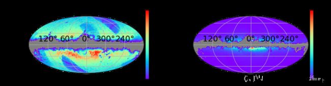
天文学研究中,有时候需要画的并不是传统的XYZ坐标系,而是需要画一个形如这样子的球面投影图:
下面讲一下这种图怎么画
1. 首先要安装healpy包
pip install healpy2. 然后导入包
如果之前安装过healpy,有的会提示不存在healpy.newvisufunc,更新一下healpy即可
from healpy.newvisufunc import projview, newprojplot
import numpy as np
import matplotlib.pyplot as plt
3. 指定空间分辨率
这里指定nside参数为32,nside越大,空间分辨率越好
nside=32
npix = hp.nside2npix(nside)
4.把数据转换到healpix index
假设你的数据保存在一个dataframe中,银经和银纬的列名分别是l和b,注意纬度这里需要用90减去银纬,并且经度和纬度都需要转换为弧度制
indices = hp.ang2pix(nside,list(np.radians(90. - data.b)),list(np.radians(data.l)))
indi, counts = np.unique(indices,return_counts=True)

hpx_map = np.zeros(npix, dtype=int)
hpx_map[indi] = counts
5.对没有数据区域的处理
有时候部分空间上是没有数据的,但是healpy默认会把没有计为0,所以我们需要把0用nan替换
hpx_map = np.where(hpx_map == 0, np.nan, hpx_map)6. 画图
projview(hpx_map,cmap='rainbow',graticule=1,graticule_labels=1,
         fontsize={'cbar_label':18,'cbar_tick_label':13},
         cb_orientation='vertical')
cmap表示颜色的colormap,graticule=1表示显示经纬线,graticule_labels=1表示显示那些0°,30°的标识,fontsize里的表示那些经纬线和标识的字体大小,cb_orientation='vertical'表示把colorbar的线条画到右边,默认是下边
7.加label
projview图和常见的plt.plot一样,也可以通过plt.xlabel(),plt.title()加横纵坐标的名字和图片的名字,也可以通过plt.tick_params来修改colorbar的线条的长短
plt.tick_params(labelsize=18)
plt.xlabel('GL (°)',size=18)
plt.ylabel('GB (°)',size=18)
plt.title('Dwarf',size=18)
完整的代码如下:
from healpy.newvisufunc import projview, newprojplot
import numpy as np
import matplotlib.pyplot as plt

nside=32
npix = hp.nside2npix(nside)

indices = hp.ang2pix(nside,list(np.radians(90. - dwarf.b)),list(np.radians(dwarf.l)))
indi, counts = np.unique(indices,return_counts=True)

hpx_map = np.zeros(npix, dtype=int)
hpx_map[indi] = counts
hpx_map = np.where(hpx_map == 0, np.nan, hpx_map)

projview(hpx_map,cmap='rainbow',graticule=1,graticule_labels=1,
         fontsize={'cbar_label':18,'cbar_tick_label':13},
         cb_orientation='vertical'))
plt.tick_params(labelsize=18)
plt.xlabel('GL (°)',size=18)
plt.ylabel('GB (°)',size=18)
plt.title('Dwarf',size=18)
8.多子图操作
有时候我们需要把多个球面投影图画到一张大图上,那么只需要在projviwe()函数中加入一个参数sub,类似于
projview(hpx_map,cmap='rainbow',graticule=1,graticule_labels=1,
         fontsize={'cbar_label':18,'cbar_tick_label':13},
         cb_orientation='vertical',sub=(1,2,1))
另一个图加入sub=(1,2,2),就可以画出一行两列的两个子图,这些数字的含义和plt.subplot()一样,一个例子如下,把矮星和巨星的空间分布画到一张大图里,也就是文章开头的图片
from healpy.newvisufunc import projview, newprojplot
import numpy as np
import matplotlib.pyplot as plt

pri_size = 18

plt.figure(figsize=(10,4))

nside=32
npix = hp.nside2npix(nside)

indices = hp.ang2pix(nside,list(np.radians(90. - dwarf.b)),list(np.radians(dwarf.l)))
indi, counts = np.unique(indices,return_counts=True)

hpx_map = np.zeros(npix, dtype=int)
hpx_map[indi] = counts
hpx_map = np.where(hpx_map == 0, np.nan, hpx_map)

projview(hpx_map,cmap='rainbow',graticule=1,graticule_labels=1,
         fontsize={'cbar_label':pri_size,'cbar_tick_label':pri_size-5},
         cb_orientation='vertical',sub=(1,2,1))
plt.tick_params(labelsize=pri_size)
plt.xlabel('GL (°)',size=pri_size)
plt.ylabel('GB (°)',size=pri_size)
plt.title('Dwarf',size=pri_size)


indices = hp.ang2pix(nside,list(np.radians(90. - giant.b)),list(np.radians(giant.l)))
indi, counts = np.unique(indices,return_counts=True)

hpx_map = np.zeros(npix, dtype=int)
hpx_map[indi] = counts
hpx_map = np.where(hpx_map == 0, np.nan, hpx_map)

projview(hpx_map,cmap='rainbow',graticule=1,graticule_labels=1,
         fontsize={'cbar_label':pri_size,'cbar_tick_label':pri_size-5},
         cb_orientation='vertical',sub=(1,2,2))
plt.tick_params(labelsize=pri_size)
plt.xlabel('GL (°)',size=pri_size)
plt.ylabel('GB (°)',size=pri_size)
plt.title('Giant',size=pri_size)
更多关于healpy的操作可以参考healpy的官方文档,官方文档里是有教程的