西班牙高速列车票价预测分析--数据分析实战
介绍
近年来,我们国高铁的飞速发展相信大家都有目共睹。然而,在我们国家高铁的票价是国家规定的,一般都是一年四季不会改变的。然而国外与国内不同,它们的高铁票价不是定死的,会根据市场来进行适当的调节,与飞机的票价类似。因此,本次挑战要求你对西班牙的高铁价格进行预测。
知识点
- 数据清洗
- 特征工程
- 预测模型构建
数据集预处理
数据在资源里。现在先来加载数据,通过下面代码下载数据。
加载并预览数据前五行
import pandas as pd
df = pd.read_csv('./Spanish.csv')
df.head()
从上面的输出结果我们可以看到,数据中主要为高铁的一些基本运营信息,例如出发时间,出发地点等,每个列的具体含义如下:
- insert_date:收集价格并写入数据库的日期和时间;
- origin:出发城市;
- destination:目的地城市;
- start_date:火车出发时间(欧洲中部时间);
- end_date:火车到达时间(欧洲中部时间);
- train_type:列车服务名称;
- price:价格(欧元);
- train_class:票舱等级,如商务座等;
- fare:票价,往返等。
我们可以将关于时间的列都拆分开来,拆分成为年、月、日等数值信息。
for col in ['insert_date', 'start_date', 'end_date']:
    date_col = pd.to_datetime(df[col])
    df[col + '_hour'] = date_col.dt.hour
    df[col + '_minute'] = date_col.dt.minute
    df[col + '_second'] = date_col.dt.second
    df[col + '_weekday'] = date_col.dt.weekday_name
    df[col + '_day'] = date_col.dt.day
    df[col + '_month'] = date_col.dt.month
    df[col + '_year'] = date_col.dt.year
    del df[col]
df.head()
现在我们已经得到一个相对完整的数据,我们看一一下数据找那个是否存在缺失值。
df.isnull().sum().sort_values(ascending=False)[:5]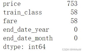
从上面的结果可以看到,price 、train_class 、 fare 都存在缺失值。现在直接对含缺失值的行进行删除。
df_drop = df.dropna()
df_drop.isnull().sum().sort_values(ascending=False)[:5]
特征工程
由于数据集中存在一些字符型特征,如 train_class 列中的取值 Turista 、Preferente 等,现在要将这些字符型特征转化为相应的数字,以便后续的算法能够运行。
from sklearn import preprocessing
# 取出非数值的列
categorical_feats = [
    f for f in df_drop.columns if df_drop[f].dtype == 'object']
# 对非数值的列进行编码
for col in categorical_feats:
    lb = preprocessing.LabelEncoder()
    lb.fit(list(df_drop[col].values.astype('str')))
    df_drop[col] = lb.transform(list(df_drop[col].values.astype('str')))
df_drop = df_drop.drop(['Unnamed: 0'], axis=1)
df_drop.head()
我们要预测的列为 price ,即车票的价格。因此,现在来取出特征集和目标集。
X = df_drop.drop(columns='price')
y = df_drop['price'].values
构建模型
划分训练集和测试集。
from sklearn.model_selection import train_test_split

train_X, test_X, train_y, test_y = train_test_split(
    X, y, test_size=0.5, random_state=2020)
打印数据集的形状。
train_X.shape, train_y.shape, test_X.shape, test_y.shape![]()
构建预测模型,并训练。然后使用训练好的模型对测试集进行预测。
使用线性回归模型 LinearRegression 进行预测。使用 mean_squared_error 评估模型。
from sklearn.linear_model import LinearRegression
from sklearn.metrics import mean_squared_error

model = LinearRegression()
model.fit(train_X, train_y)
y_pred = model.predict(test_X)
mean_squared_error(y_pred, test_y)
![]()
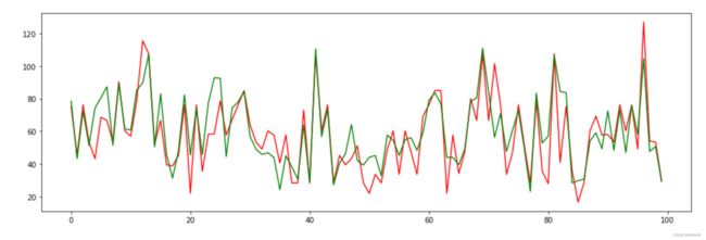
为了直观的观测模型的拟合预测情况,我们可分别画出预测出的价格和真实的价格。 使用 Matplotlib 工具分别画出预测出的价格和真实的价格。图的尺寸设置为(16,5)。真实价格用红线表示,预测价格用绿线表示。且真实价格和预测价格都只画出前 100 个值。
from matplotlib import pyplot as plt
%matplotlib inline

fig1, ax1 = plt.subplots(figsize=(16, 5))
plt.plot(test_y[:100], color='r')
plt.plot(y_pred[:100], color='g')