matplotlib之Figure类和Axes详解
Figure类
class
matplotlib.figure.Figure(figsize=None, dpi=None, facecolor=None, edgecolor=None, linewidth=0.0, frameon=None, subplotpars=None, tight_layout=None, constrained_layout=None)
看过前面文章就众所周知了,plt.figure会返回一个matplotlib.figure.Figure实例,正如plt.plot()一样,我们可以在绘图的时候通过**kwargs指定对应线的各种属性,也可以事后通过面向对象的方式来调用相应的setter方法来设置线的各种属性,这里的plt.figure()也是一样的,我们可以通过调用相应的setter放来来修改。下面通过几个例子来看一下:
第一个是set_facecolor,设置背景色
fig = plt.figure()
fig.suptitle('Figure: sample for Line2D # set_marker')
fig.set_facecolor('g')
plt.plot([1,4,2,3])
plt.show()

第二个是set_size_inches, 设置figure的尺寸大小
fig.set_size_inches(7, 7)   #((7,7))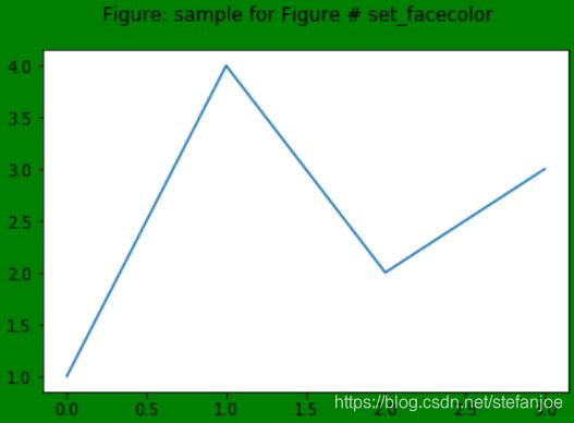
这里再介绍其他的几个常用的方法。
1. fig.add_subplot()和fig.add_axes()这两个方法在之前的文章中已经介绍过了,这里就不介绍了。
2. fig.gca(),gca全称是get current axes,就是获得当前的坐标轴的句柄,我们也可以在创建的时候就保留下该句柄,同时fig.gca()等价于plt.gca()。
官网介绍:Get the current axes, creating one if necessary.
3. fig.get_axes(),获得当前figure中所有的坐标系axes
fig = plt.figure()
plt.subplot(221)
plt.plot([1,2,3,4])
plt.subplot(224)
plt.plot([1,2,3,4])
axes = fig.get_axes()
print(axes)
plt.show()
代码输出:[
可以通过axes[N]调用第N个坐标系。
4. fig.savefig(fname),保存figure到磁盘上
Axes类
先展示一下Axes类的继承关系:
![]()
class
matplotlib.axes.Axes(fig, rect, facecolor=None, frameon=True, sharex=None, sharey=None, label='', xscale=None, yscale=None, box_aspect=None, **kwargs)
通过调用plt.subplot()会产生一个Axes类实例,同样面向对象有对应的方法,这里简要介绍几个。
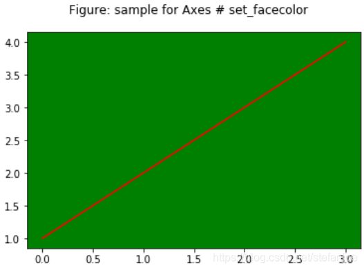
第一个是set_facecolor,设置背景颜色
fig = plt.figure()
fig.suptitle('Figure: sample for Axes # set_facecolor')
axes = plt.subplot(111)
axes.set_facecolor('g')
plt.plot([1,2,3,4], 'r')
plt.show()

第二个是set_axis_off,设置坐标轴是否显示
axes.set_axis_off()

第三个是set_frame_off, 设置坐标轴边框是否显示
axes.set_facecolor('g')

第四个是set_xlim,设置x坐标轴显示的限制区域,set_ylim类似
axes.set_xlim(2,4)

第五个是set_xlabel,设置x坐标轴的标签,set_ylabel类似
axes.set_xlabel('xlabel')

第六个是set_xticks,设置x坐标轴的刻度显示, set_yticks类似

除了上面的设置各种属性外,还有一些比较常用的方法:axes.plot()、axes.pie()、axes.hist()等方法。
也可以通过plt.axes直接创建一个坐标系,如下:
ax = plt.axes([0.1, 0.1, 0.8, 0.8])
labels = ['Spring', 'Summer', 'Autumn', 'Winter']
x = [12, 30, 45, 10]
explode = (0.2, 0.05, 0.05, 0.05)
plt.pie(x, explode=explode, labels=labels, autopct='%1.1f%%', startangle=30)
plt.title('Rainy days by season')
plt.show()