短期气候Python绘图——EOF(经验正交函数分解)大气环流基本状况
一、要求
掌握大气环流分型的基本方法 --EOF(经验正交函数分解)大气环流基本状况;
熟悉EOF方法和程序的应用,气象绘图;
二、资料说明
NCEP/NCAR 1948-2008年(61年)的500百帕月平均高度场资料,资料范围为(900S-900N,00-3600E),网格距为2.50×2.50,纬向格点数为144,经向格点数为73,资料为GRD格式,资料从南到北、自西向东排列,每月为一个记录,按年逐月排放。
三、方法说明
EOF功能:从一个气象场多次观测资料中识别出主要空间型及其时间演变规律。EOF展开就是将气象变量场分解为空间函数(V)和时间函数(T)两部分的乘积之和:X=VT。
四、代码
import numpy as np
import xarray as xr
from eofs.xarray import Eof
import matplotlib.pyplot as plt
import matplotlib.dates as mdates
import matplotlib.ticker as ticker
import cartopy.mpl.ticker as cticker
import cartopy.crs as ccrs
import cartopy.feature as cfeature
from cartopy.mpl.ticker import (LongitudeFormatter, LatitudeFormatter, LatitudeLocator, LongitudeLocator)
import cmaps
import warnings
warnings.filterwarnings('ignore')

from pylab import *
mpl.rcParams['font.sans-serif'] = ['SimHei']
plt.rcParams['axes.unicode_minus'] = False

# 数据读取与处理
filename = 'hgt500.grd'
data = np.fromfile(filename,dtype=np.float32)
data = data.reshape((732, 73, 144))
data = np.array(data)
# 选中每年的1月
hgt1 = np.zeros((61,73,144))
j=0
for i in range(0,732,12):
    hgt1[j,:,:] = data[i,:,:]
    j=j+1
mjanhgt = np.zeros((73,144))
for j in range(61):
    mjanhgt = hgt1[j,:,:]+mjanhgt
mjanhgt = mjanhgt/61.
# 选中经纬度范围
hgt = np.zeros((61,21,41))
for t in range(61):
    hgt[t,:,:] = hgt1[t,44:65,16:57]
#hgt = np.flip(hgt, axis=0)
lon1 = np.arange(0, 360, 2.5)  # 经度40-140E(间隔2.5度)
lat1 = np.arange(-90, 92.5, 2.5)
lon = np.arange(40, 142.5, 2.5)  # 经度40-140E(间隔2.5度)
lat = np.arange(20, 72.5, 2.5)  # 纬度20N~70N(间隔2.5度)
#lon = np.flip(lon)
time = xr.cftime_range(start='1948-01', end='2009-01', freq='Y') #时间
ds = xr.Dataset({'hgt': (['time', 'lat', 'lon'], hgt)},
               coords={'time': time, 'lat': lat, 'lon': lon})
#print(ds)

def draw(hgt, lon, lat):
    # 绘制地图底图
    fig = plt.figure(figsize=(10, 6))
    proj = ccrs.PlateCarree(central_longitude=180)
    leftlon, rightlon, lowerlat, upperlat = (0, 360, -90, 90)
    img_extent = [leftlon, rightlon, lowerlat, upperlat]

    m = int(np.min(hgt))
    n = int(np.max(hgt))
    ax = fig.add_axes([0.06, 0., 0.9, 1], projection=proj)
    c = ax.contour(lon, lat, hgt,levels=np.arange(m, n, 40),transform=ccrs.PlateCarree(),cmap=jet())
    ax.add_feature(cfeature.COASTLINE.with_scale('50m'))
    ax.add_feature(cfeature.LAKES)
    ax.set_extent(img_extent, crs=ccrs.PlateCarree())
    ax.set_xticks(np.arange(leftlon, rightlon + 20, 20), crs=ccrs.PlateCarree())
    ax.set_yticks(np.arange(lowerlat, upperlat + 20, 20), crs=ccrs.PlateCarree())
    lon_formatter = cticker.LongitudeFormatter()
    lat_formatter = cticker.LatitudeFormatter()
    ax.xaxis.set_major_formatter(lon_formatter)
    ax.yaxis.set_major_formatter(lat_formatter)
    #ax.set_title(name, loc='center', fontsize=16)
    xlocs = np.arange(leftlon, rightlon, 20)
    ylocs = np.arange(lowerlat, upperlat, 20)
    #plt.colorbar(c, shrink = 0.4, pad = 0.06)
    plt.clabel(c, fontsize=8)
    # plt.savefig(r'C:\Users\HUAWEI\Desktop\700hPa露点温度差20时.png')
    plt.show()

draw(mjanhgt, lon1, lat1)
#计算网格点的权重
coslat = np.cos(np.deg2rad(ds.coords['lat'].values))
wgts = np.sqrt(coslat)[..., np.newaxis]
# 计算EOF分解
solver = Eof(ds['hgt'], weights=wgts, center=True) # 权重:weights=wgts,
eofs = solver.eofs(neofs=5, eofscaling=2)
pcs = solver.pcs(npcs=5, pcscaling=0)
variance = solver.varianceFraction(neigs=5)
# 绘制方差解释率图
plt.figure(figsize=(5, 4),dpi=100)
plt.plot(np.arange(1, 6), variance[:5]*100, 'o-')
plt.xlabel('EOF modes')
plt.ylabel('Variance explained (%)')
plt.title('Variance explained by EOF modes')
plt.grid()
# 在每个点上添加文本标签
for i, v in enumerate(variance.values[:5]*100):
plt.text(i+1, v+0.9, f'{v:.2f}', fontsize=8, color='black')
plt.show()
def mapart(ax):
'''添加地图元素'''
# 指定投影为经纬度投影,并指定中心经度为180°
projection = ccrs.PlateCarree(central_longitude=0)
# 设置地图范围
ax.set_extent([40,140, 20, 70], crs=ccrs.PlateCarree(central_longitude=0))
# 设置经纬度标签
ax.set_xticks([40,60,80,100,120,140], crs=projection)
ax.set_yticks([20, 30, 40, 50, 60, 70], crs=projection)
# 给标签添加对应的N,S,E,W
lon_formatter = LongitudeFormatter(zero_direction_label=True)
lat_formatter = LatitudeFormatter()
ax.xaxis.set_major_formatter(lon_formatter)
ax.yaxis.set_major_formatter(lat_formatter)
# 添加海岸线
ax.coastlines(color='k', lw=0.5)
# 添加陆地
ax.add_feature(cfeature.LAND, facecolor='white')
def eof_contourf(EOFs, PCs, pers):
'''
绘制EOF填充图
'''
plt.close
# 将方差转换为百分数的形式,如0.55变为55%
pers = (pers * 100).values
# 指定画布大小以及像素
fig = plt.figure(figsize=(11, 14))
# 指定投影为经纬度投影,中心经纬度为20°
projection = ccrs.PlateCarree(central_longitude=0)
# 将横坐标转换为日期格式
dates_num = [mdates.date2num(t) for t in time]
# 绘制第一个子图
ax1 = fig.add_subplot(3, 2, 1, projection=projection)
# 为第一个子图添加地图底图
mapart(ax1)
# 在第一个地图上绘制第一空间模态的填充色图,EOFs[0]表示从EOF中取出第一个空间模态
p = ax1.contourf(ds.lon,ds.lat,EOFs[0],levels=np.arange(-75, 76, 5), cmap=plt.get_cmap('RdBu_r'),transform=ccrs.PlateCarree(),extend='both')
ps = ax1.contour(ds.lon,ds.lat,EOFs[0],levels=np.arange(-75, 76, 10), linewidths=0.7, colors='k', linestyles='--',transform=ccrs.PlateCarree())
ax1.clabel(ps, fontsize=7, fmt='%3.1f')
print(np.max(EOFs[0]))
# 为第一个子图添加标题,其中,pers[0]表示从pers中取出第一个空间模态对应的方差贡献率
ax1.set_title('mode1 (%s' % (round(pers[0], 2)) + "%)", loc='left')
ax1.set_aspect(1)
# 绘制第二个子图
ax2 = fig.add_subplot(3, 2, 2)
ax2.set_xticks(dates_num[::4])
ax2.xaxis.set_major_formatter(mdates.DateFormatter('%Y'))
ax2.xaxis.set_major_locator(ticker.FixedLocator(dates_num[::4]))
b = ax2.bar(dates_num, PCs[:, 0], width=50, color='r')
# 对时间系数值小于0的柱子设置为蓝色
for bar, height in zip(b, PCs[:, 0]):
if height < 0:
bar.set(color='blue')
# 为第二个子图添加标题
ax2.set_title('PC1' % (round(pers[0], 2)), loc='left')
# 后面ax3和ax5与ax1绘制方法相同,ax4和ax6与ax2绘制方法相同,不再注释
ax3 = fig.add_subplot(3, 2, 3, projection=projection)
mapart(ax3)
pp = ax3.contourf(ds.lon,ds.lat,EOFs[1], levels=np.arange(-75, 76, 5),cmap=plt.get_cmap('RdBu_r'),transform=ccrs.PlateCarree(),extend='both')
pps = ax3.contour(ds.lon, ds.lat, EOFs[1], levels=np.arange(-75, 76, 10), linewidths=0.7, colors='k', linestyles='--',
transform=ccrs.PlateCarree())
print(np.max(EOFs[1]))
ax3.clabel(pps, fontsize=7, fmt='%3.1f')
ax3.set_title('mode2 (%s' % (round(pers[1], 2)) + "%)", loc='left')
ax3.set_aspect(1)
ax4 = fig.add_subplot(3, 2, 4)
ax4.set_xticks(dates_num[::4]) # 每9年的1月作为横坐标标签
ax4.xaxis.set_major_formatter(mdates.DateFormatter('%Y'))
ax4.xaxis.set_major_locator(ticker.FixedLocator(dates_num[::4])) # 每9年的1月作为横坐标刻度线
ax4.set_title('PC2' % (round(pers[1], 2)), loc='left')
bb = ax4.bar(dates_num, PCs[:, 1], width=50, color='r')
for bar, height in zip(bb, PCs[:, 1]):
if height < 0:
bar.set(color='blue')
'''n = len(PCs[:,1])
hb = hgxs(n, PCs[:,1])
qs = np.zeros(n)
for i in range(n):
qs[i] = (i+1) * hb[1] + hb[0]
bbq = ax4.plot(dates_num, qs, c='k', linewidth=2, label='线性趋势')'''
ax5 = fig.add_subplot(3, 2, 5, projection=projection)
mapart(ax5)
ppp = ax5.contourf(ds.lon, ds.lat, EOFs[2],levels=np.arange(-75, 76, 5),cmap=plt.get_cmap('RdBu_r'), transform=ccrs.PlateCarree(),
extend='both')
ppps = ax5.contour(ds.lon, ds.lat, EOFs[2],levels=np.arange(-75, 76, 10), linewidths=0.7, colors='k', linestyles='--',
transform=ccrs.PlateCarree())
print(np.max(EOFs[2]))
ax5.clabel(ppps, fontsize=7, fmt='%3.1f')
ax5.set_title('mode3 (%s' % (round(pers[2], 2)) + "%)", loc='left')
ax5.set_aspect(1)
ax6 = fig.add_subplot(3, 2, 6)
ax6.set_xticks(dates_num[::4]) # 每9年的1月作为横坐标标签
ax6.xaxis.set_major_formatter(mdates.DateFormatter('%Y'))
ax6.xaxis.set_major_locator(ticker.FixedLocator(dates_num[::4])) # 每9年的1月作为横坐标刻度线
ax6.set_title('PC3' % (round(pers[2], 2)), loc='left')
bbb = ax6.bar(dates_num, PCs[:, 2], width=50, color='r')
for bar, height in zip(bbb, PCs[:, 2]):
if height < 0:
bar.set(color='blue')
# 为柱状图添加0标准线
ax2.axhline(y=0, linewidth=1, color='k', linestyle='-')
ax4.axhline(y=0, linewidth=1, color='k', linestyle='-')
ax6.axhline(y=0, linewidth=1, color='k', linestyle='-')
#ax8.axhline(y=0, linewidth=1, color='k', linestyle='-')
# 在图边留白边放colorbar
fig.subplots_adjust(bottom=0.1)
# colorbar位置: 左 下 宽 高
l = 0.1
b = 0.67
w = 0.01
h = 0.2
# 对应 l,b,w,h;设置colorbar位置;
rect = [l, b, w, h]
cbar_ax = fig.add_axes(rect)
# 绘制colorbar
c = plt.colorbar(p, cax=cbar_ax, orientation='vertical', aspect=20, pad=0.1)
# 设置colorbar的标签大小
c.ax.tick_params(labelsize=10)
# colorbar位置: 左 下 宽 高
l = 0.1
b = 0.39
w = 0.01
h = 0.2
# 对应 l,b,w,h;设置colorbar位置;
rect = [l, b, w, h]
cbar_ax = fig.add_axes(rect)
# 绘制colorbar
c = plt.colorbar(pp, cax=cbar_ax, orientation='vertical', aspect=20, pad=0.1)
# 设置colorbar的标签大小
c.ax.tick_params(labelsize=10)
# colorbar位置: 左 下 宽 高
l = 0.1
b = 0.11
w = 0.01
h = 0.2
# 对应 l,b,w,h;设置colorbar位置;
rect = [l, b, w, h]
cbar_ax = fig.add_axes(rect)
# 绘制colorbar
c = plt.colorbar(ppp, cax=cbar_ax, orientation='vertical', aspect=20, pad=0.1)
# 设置colorbar的标签大小
c.ax.tick_params(labelsize=10)
# 调整子图之间的间距
plt.subplots_adjust(wspace=0.1, hspace=0.3)
plt.show()
eof_contourf(eofs[:3]*(-1), pcs[:, :3]*(-1), variance[:3])五、结果
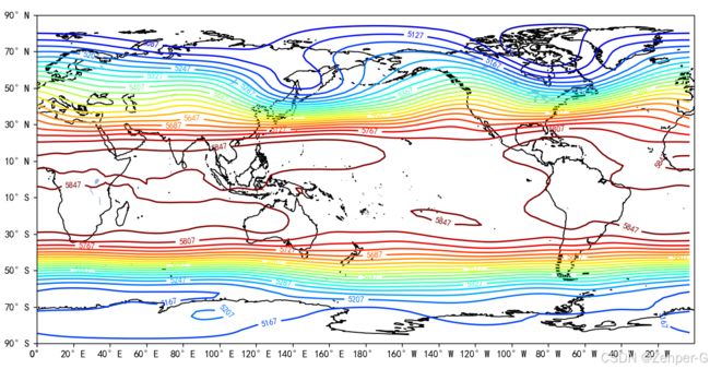
图 1 1948-2008年1月份500hPa平均高度场
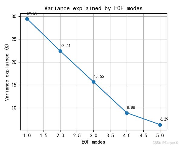
图 2 方差贡献率
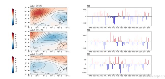
图 3 第1~3特征向量场与时间系数
表 1 欧亚(20-70°N;40-140°E)1月份500hPa平均高度场特征值的方差贡献率以及累计方差贡献率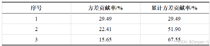
六、结语
结合特征向量场以及时间系数可以分析500hPa高度场的空间分布特征与时间变化,如第一模态,正值中心位于贝加尔湖与里海之间,负值中心位于日本海,说明这两个地区的高度场变化相反。若负值所在的东亚为负异常时,正值所在蒙新高地区域为正异常,即东亚的槽加强或脊减弱时,蒙新高地脊加强或槽减弱。同时正值与负值中心所在区域的高度场变化幅度也是最大的。
其他模态的分析与第一模态类似,反应的也是高度场的异常。但是哪一种模态是主要的,需要结合方差贡献率来分析,本次案例的前三个模态差距不大,且累计方差贡献率未达到80%或90%,前三个模态不能包含所有的欧亚主要的高度场形势。
由于本人水平限制,多有错误,欢迎批评指正!