这样画箱线图,为你的SCI论文增色!
高级箱线图的绘制
下面的箱线图比较美观,非常适合数据量不大、且分布明显的时候使用。
在论文撰写中,图表的清晰和吸引人的展示方式是至关重要的。箱线图(Whisker Plot)是一种展示数据分布的经典工具,它不仅可以清楚地显示数据的中心趋势、散布和异常值,还能以视觉上吸引人的方式呈现这些信息。
尤其是在撰写SCI论文时,如何通过图表清晰地传达研究结果,不仅能帮助同行专家快速理解研究的核心发现,也能增强论文的吸引力,从而提高被引频次。在众多数据可视化方法中,箱线图因其简洁性和信息量大的特点而广受欢迎。
但是,传统的箱线图往往显得单调乏味,不足以突出研究的重要性。为此,我们探索如何通过结合ghibli和ggdist包在R语言中创建更具吸引力和表现力的箱线图,以使您的SCI论文更加出色。
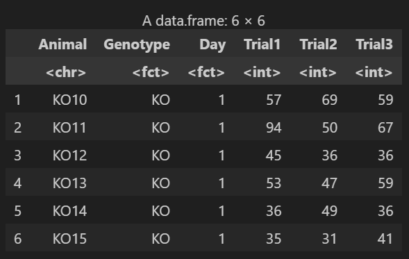
数据
首先准备我们的数据
library(tidyverse)
data <- read.csv("Rotarod.csv")
data$Day <- factor(data$Day, levels = c("1", "2"))
data$Genotype <- factor(data$Genotype, levels = c("WT", "KO"))
head(data)
代码
本次用ggplot实现这张图的绘制,首先需要安装ghibli库和ggdist,该库提供了一些高级绘图函数,感兴趣的同学可以自行探索。
绘图代码如下:
library(ghibli)
library(ggdist)
# Enhanced plot of Rorarod performance
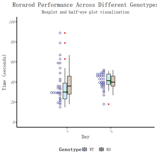
edv <- ggplot(data, aes(x = Day, y = Trial3, fill = Genotype)) +
# Improved Ghibli theme color scheme for a more attractive appearance
scale_fill_ghibli_d("SpiritedMedium", direction = -1, guide = guide_legend(title = "Genotype")) +
# Boxplot with refined aesthetics
geom_boxplot(width = 0.2, outlier.color = "red", alpha = 0.7) +
# Enhanced axis labels and title for clarity and impact
labs(
x = 'Day',
y = 'Time (seconds)',
title = "Rorarod Performance Across Different Genotypes",
subtitle = "Boxplot and half-eye plot visualization"
) +
# Use the classic theme with a serif font for a sophisticated look
theme_classic(base_size = 16, base_family = "serif") +
# Refined theme adjustments for improved readability and aesthetics
theme(
plot.title = element_text(hjust = 0.5, size = 20),
plot.subtitle = element_text(hjust = 0.5, size = 14),
legend.position = "bottom",
legend.box = "horizontal",
legend.title = element_text(face = "bold"),
axis.text.x = element_text(angle = 45, hjust = 1),
axis.text.y = element_text(face = "italic")
) +
# Adjust y-axis scale for better data representation
scale_y_continuous(
breaks = seq(0, 100, by = 20),
limits = c(0, 100)
) +
# Dot plot adjustment for clarity
stat_dots(
side = "left",
justification = 1.15,
binwidth = 2,
color = "darkblue",
alpha = 0.5
) +
# Half-eye plot with refined aesthetics
stat_halfeye(
adjust = .5,
width = .8,
justification = -.25,
.width = 0.25,
fill = NA,
color = "darkgreen",
alpha = 0.5
)
# Display the enhanced plot
edv
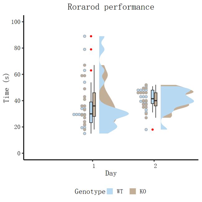
对代码进行一定修改,还能绘制出另一种风格:
# Load necessary libraries
library(ghibli)
library(ggdist)

# Plotting Rorarod performance
edv <- ggplot(data, aes(x = Day, y = Trial3, fill = Genotype)) +
  # Use Ghibli theme for fill colors, with custom direction
  scale_fill_ghibli_d("SpiritedMedium", direction = -1) +

  # Adding a boxplot with custom width and outlier color
  geom_boxplot(width = 0.1, outlier.color = "red") +

  # Customizing axis labels
  xlab('Day') +
  ylab('Time (s)') +

  # Setting plot title and applying classic theme with custom base size and family
  ggtitle("Rorarod performance") +
  theme_classic(base_size = 18, base_family = "serif") +

  # Customizing text, axis text, title, subtitle, and legend positioning
  theme(
    text = element_text(size = 18),
    axis.text.x = element_text(angle = 0, hjust = .1, vjust = 0.5, color = "black"),
    axis.text.y = element_text(color = "black"),
    plot.title = element_text(hjust = 0.5),
    plot.subtitle = element_text(hjust = 0.5),
    legend.position = "bottom"
  ) +

  # Customizing y-axis scale
  scale_y_continuous(
    breaks = seq(0, 100, by = 20),
    limits = c(0, 100)
  ) +

  # Adding dot plots from ggdist package
  stat_dots(
    side = "left",
    justification = 1.12,
    binwidth = 1.9
  ) +

  # Adding half-violin from ggdist package
  stat_halfeye(
    adjust = .5,
    width = .6,
    justification = -.2,
    .width = 0,
    point_colour = NA
  )

# Display the plot
edv
原理讲解
这段R代码利用ggplot2、ghibli和ggdist包来绘制一个复合图形,包括箱线图、点图和半眼图。每个模块和函数在绘图中扮演了特定的角色,共同作用以展现Rorarod性能的数据。下面是对各个部分的简要解析:
1. 基础图形设置
-
ggplot(data, aes(x = Day, y = Trial3, fill = Genotype)): 使用ggplot函数设置图表的数据源和基础映射,其中x轴为Day,y轴为Trial3,颜色填充(fill)基于Genotype。
2. 配色方案
-
scale_fill_ghibli_d("SpiritedMedium", direction = -1): 应用ghibli包中的"SpiritedMedium"主题进行颜色填充,并通过设置direction = -1反转颜色渐变顺序。
3. 箱线图
-
geom_boxplot(width = 0.1, outlier.color = "red"): 添加箱线图层,其中width控制箱体的宽度,outlier.color设置异常值的颜色。
4. 轴标签与图标题
-
xlab('Day') + ylab('Time (s)') + ggtitle("Rorarod performance"): 分别设置x轴和y轴的标签,以及图形的标题。
5. 主题和样式调整
-
theme_classic(base_size = 18, base_family = "serif"): 应用经典主题,设置基础字体大小和字体族。 -
theme(...): 进一步自定义文本、轴文本、标题、子标题和图例的位置等元素的样式。
6. y轴刻度调整
-
scale_y_continuous(breaks = seq(0, 100, by = 20), limits = c(0, 100)): 设置y轴的刻度间隔和限制范围。
7. 点图和密度图
-
stat_dots(...): 使用ggdist包添加点图层,以展示数据点的分布情况,其中包括点的位置调整和宽度设置。 -
stat_halfeye(...): 添加密度图层,这是一种展示数据分布密度的图形,通过调整宽度、调整系数和颜色设置进行自定义。