【人工智能】Python常用库-Matplotlib常用方法教程
Matplotlib 是一个强大的 Python 数据可视化库,用于绘制各种图形。以下是 Matplotlib 常用方法的详细说明及示例,帮助你快速上手。
1. 安装和导入 Matplotlib
安装 Matplotlib:
pip install matplotlib导入 Matplotlib:
import matplotlib.pyplot as plt2. 基本绘图
绘制简单折线图
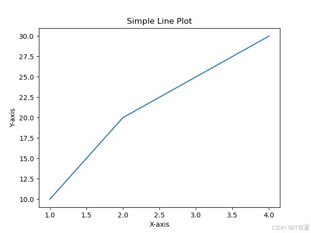
import matplotlib.pyplot as plt

# 数据
x = [1, 2, 3, 4]
y = [10, 20, 25, 30]

# 绘图
plt.plot(x, y)

# 添加标题和标签
plt.title("Simple Line Plot")
plt.xlabel("X-axis")
plt.ylabel("Y-axis")

# 显示图形
plt.show()
3. 图形样式
设置颜色、线型和标记
plt.plot(x, y, color='red', linestyle='--', marker='o')
plt.show()
添加网格
plt.plot(x, y)
plt.grid(True)
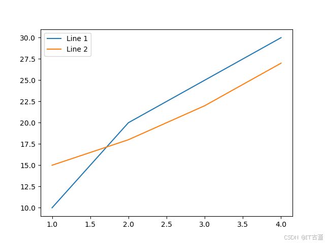
plt.show()多条曲线
x = [1, 2, 3, 4]
y1 = [10, 20, 25, 30]
y2 = [15, 18, 22, 27]

plt.plot(x, y1, label='Line 1')
plt.plot(x, y2, label='Line 2')

# 添加图例
plt.legend()

plt.show()
4. 常见图表类型
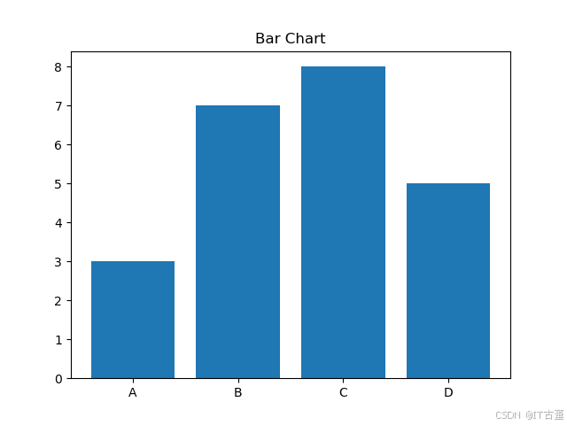
柱状图
categories = ['A', 'B', 'C', 'D']
values = [3, 7, 8, 5]

plt.bar(categories, values)
plt.title("Bar Chart")
plt.show()
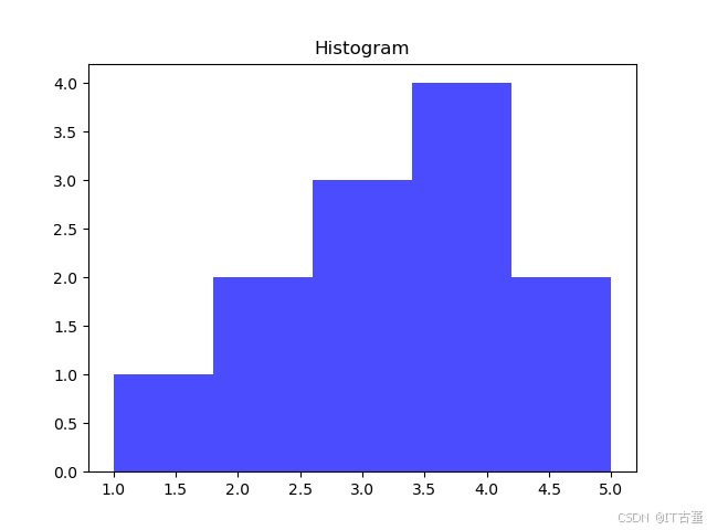
直方图
data = [1, 2, 2, 3, 3, 3, 4, 4, 4, 4, 5, 5]

plt.hist(data, bins=5, color='blue', alpha=0.7)
plt.title("Histogram")
plt.show()
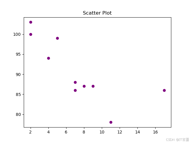
散点图
x = [5, 7, 8, 7, 2, 17, 2, 9, 4, 11]
y = [99, 86, 87, 88, 100, 86, 103, 87, 94, 78]

plt.scatter(x, y, color='purple')
plt.title("Scatter Plot")
plt.show()
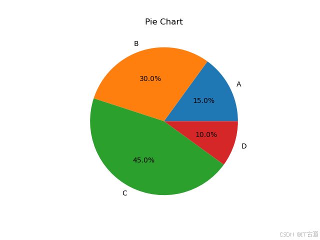
饼图
labels = ['A', 'B', 'C', 'D']
sizes = [15, 30, 45, 10]

plt.pie(sizes, labels=labels, autopct='%1.1f%%')
plt.title("Pie Chart")
plt.show()
5. 高级功能
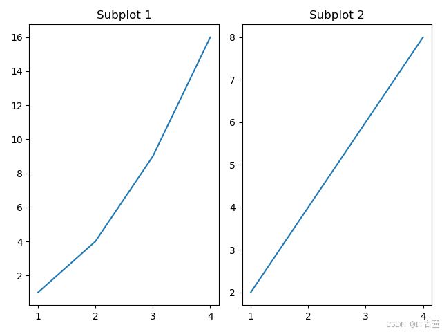
子图
x = [1, 2, 3, 4]
y1 = [1, 4, 9, 16]
y2 = [2, 4, 6, 8]

# 创建两个子图
plt.subplot(1, 2, 1)
plt.plot(x, y1)
plt.title("Subplot 1")

plt.subplot(1, 2, 2)
plt.plot(x, y2)
plt.title("Subplot 2")

plt.tight_layout()
plt.show()
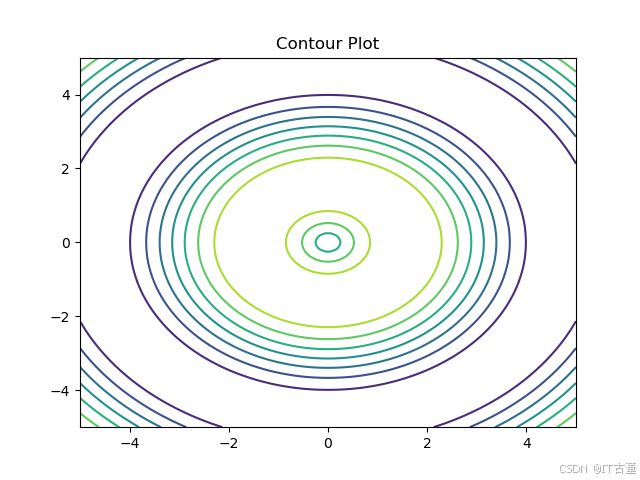
绘制等高线图
import numpy as np

x = np.linspace(-5, 5, 100)
y = np.linspace(-5, 5, 100)
X, Y = np.meshgrid(x, y)
Z = np.sin(np.sqrt(X**2 + Y**2))

plt.contour(X, Y, Z)
plt.title("Contour Plot")
plt.show()
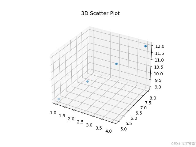
3D 图形
from mpl_toolkits.mplot3d import Axes3D

fig = plt.figure()
ax = fig.add_subplot(111, projection='3d')

x = [1, 2, 3, 4]
y = [5, 6, 7, 8]
z = [9, 10, 11, 12]

ax.scatter(x, y, z)
plt.title("3D Scatter Plot")
plt.show()
6. 图形美化
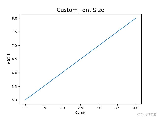
设置字体和大小
plt.plot(x, y)
plt.title("Custom Font Size", fontsize=16)
plt.xlabel("X-axis", fontsize=12)
plt.ylabel("Y-axis", fontsize=12)
plt.show()
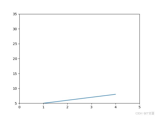
调整坐标轴范围
plt.plot(x, y)
plt.xlim(0, 5)
plt.ylim(5, 35)
plt.show()
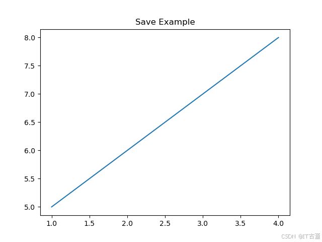
保存图像
plt.plot(x, y)
plt.title("Save Example")
plt.savefig("example_plot.png")
7. 动态更新图表
动态折线图
import matplotlib.pyplot as plt
import time

x, y = [], []

plt.ion()  # 开启交互模式
fig, ax = plt.subplots()

for i in range(10):
    x.append(i)
    y.append(i**2)

    ax.clear()
    ax.plot(x, y)
    plt.pause(0.5)

plt.ioff()
plt.show()
8. 常见问题和优化建议
-
中文乱码问题
使用 Matplotlib 时可能出现中文无法显示的问题。解决方法:plt.rcParams['font.sans-serif'] = ['SimHei'] # 设置中文字体 plt.rcParams['axes.unicode_minus'] = False # 正常显示负号
-
显示图例超出边界
解决方法:plt.legend(loc='best')总结
Matplotlib 提供了强大而灵活的绘图能力,适用于基础数据可视化和复杂分析任务。通过熟悉上述方法和技巧,可以高效地绘制各种图形并美化图表,为数据分析和展示提供支持。