从CV工程师到CtrlCV架构师:PromptCoder如何让前端搬砖变成乐高拼装
《从CV工程师到CtrlCV架构师:PromptCoder如何让前端搬砖变成乐高拼装》
各位在座的代码艺术家、CSS炼金术师、React吟游诗人,今天我们要聊一个能让原型图自动「现出原形」的黑魔法——是的,我说的不是Figma切图插件,而是能让你的Ctrl+C/V进化成量子纠缠的PromptCoder。
官网:PromptCoder
当截图遇见AI:前端复刻的「降维打击」
还记得那些年我们对着设计图手动敲Tailwind的日子吗?就像拿着显微镜拼乐高,明明只是想要个YouTube首页,却要经历:
- 像素级测量间距
- 和flexbox玩俄罗斯方块
- 在icon库里玩寻宝游戏
- 最后得到「看起来差不多但总觉得哪里怪」的成果
现在,请把这份痛苦交给PromptCoder。它的工作原理就像给AI装了个「前端翻译器」——你扔给它一张截图,它还你一套完整的组件架构说明书,附赠贴心的"Cursor食用指南"(您也可以在Windsurf,V0,Bolt.New 等类似应用中使用)。
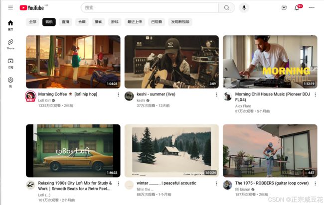
原版
PromptCoder + Curosr 复刻版
Why PromptCoder?
Promptcoder 到底是什么?
核心功能:AI驱动的代码生成
Prompt Coder 的主要功能是利用人工智能技术,根据用户输入的信息(如框架选择和界面截图)自动生成代码。用户无需手动编写代码,只需提供必要的输入,AI 就会生成对应的代码框架或完整代码,从而大大提高开发效率。
操作流程
(1) 选择框架
用户需要首先选择一个开发框架。这可能包括但不限于常见的前端框架(如 React、Vue、Angular)或后端框架(如 Node.js、Django、Flask 等)。选择合适的框架后,AI 会根据该框架的规范生成代码。
(2) 上传界面截图
用户可以上传一个界面截图(支持 JPG、PNG、GIF 格式,最大 2MB)。这个截图通常是一个设计稿或界面草图,AI 会根据截图的内容和布局生成对应的代码。例如,如果截图是一个网页设计,AI 可能会生成 HTML、CSS 和 JavaScript 代码来实现该设计。
(3) 代码生成
在用户完成上述步骤后,AI 会处理输入信息并生成代码。生成的代码可以直接用于开发,或者作为进一步开发的基础。
特点
- 高效性:通过 AI 自动化代码生成,节省了手动编写代码的时间。
- 易用性:用户无需深入了解代码细节,只需提供设计截图和选择框架即可。
- 适用性:适用于不同技术水平的开发者,从初学者到专业开发者都可以使用。
- 灵活性:支持多种开发框架,满足不同项目的需求。
技术人最懂的技术浪漫
这个工具最性感的地方,是它比你的技术主管更懂组件化:
// 它生成的不是代码,而是组件哲学
<VideoGrid>
  {videos.map((video) => (
    <VideoCard
      soul={designSystem}
      flesh={thumbnailURL}
      blood={hoverEffect}
    />
  ))}
</VideoGrid>
看看这个提示词模板,简直就是前端架构师的思维导图:
- 严格区分服务端/客户端组件边界('use client’的仪式感)
- 像强迫症一样管理import路径(@/别名教徒狂喜)
- 甚至提前配置好next.config.js的图片白名单
- 还不忘提醒「别用其他UI库!」(Lucide React死忠粉认证)
提示词分享:
Create detailed components with these requirements:
1. Use 'use client' directive for client-side components
2. Style with Tailwind CSS utility classes for responsive design
3. Use Lucide React for icons (from lucide-react package). Do NOT use other UI libraries unless requested
4. Use stock photos from picsum.photos where appropriate, only valid URLs you know exist
5. Configure next.config.js image remotePatterns to enable stock photos from picsum.photos
6. Avoid duplicate components
7. Automatically source and display logos from a CDN in design placeholders
8. Follow proper import practices:
   - Use @/ path aliases
   - Keep component imports organized
   - Update current src/app/page.tsx with new comprehensive code
   - Don't forget root route (page.tsx) handling
   - You MUST complete the entire prompt before stopping

   **Layout Overview**

* **Page Structure**: The page will be divided into a single main section containing a grid layout of video cards.
* **Component Hierarchy**:
	+ `VideoGrid` (container component)
		- `VideoCard` (repeated component for each video)
			- `Thumbnail` (image component)
			- `VideoTitle` (text component)
* **Responsive Design Considerations**:
	+ The grid layout will be responsive, adapting to different screen sizes and devices.
	+ On smaller screens, the grid will collapse into a single column, with each video card taking up the full width of the screen.
	+ On larger screens, the grid will expand to display multiple columns, with each video card taking up a portion of the screen width.

**Component Details**

* **VideoGrid**:
	+ Will receive an array of video data as a prop.
	+ Will render a grid of `VideoCard` components, with each card representing a single video.
	+ Will handle responsive layout and grid item sizing.
* **VideoCard**:
	+ Will receive a single video object as a prop.
	+ Will render a `Thumbnail` component and a `VideoTitle` component.
	+ Will handle hover and click events for video playback.
* **Thumbnail**:
	+ Will receive an image URL as a prop.
	+ Will render an `img` element with the provided URL.
* **VideoTitle**:
	+ Will receive a title string as a prop.
	+ Will render a `p` element with the provided title.
* **State Management Needs**:
	+ The `VideoGrid` component will need to manage the state of the video data array.
	+ The `VideoCard` component will need to manage the state of the video playback (e.g., play/pause, current time).
* **Props and Data Flow**:
	+ The `VideoGrid` component will receive the video data array as a prop from a parent component.
	+ The `VideoCard` component will receive the video object as a prop from the `VideoGrid` component.

**Styling Specifications**

* **Color Schemes**:
	+ Primary color: #FF0000 (YouTube red)
	+ Secondary color: #FFFFFF (white)
	+ Background color: #F7F7F7 (light gray)
* **Typography**:
	+ Font family: Open Sans
	+ Font sizes:
		- Video title: 16px
		- Video description: 14px
* **Spacing and Alignment**:
	+ Grid item spacing: 16px
	+ Video title padding: 8px
	+ Video description padding: 16px
* **Animations and Transitions**:
	+ Video card hover effect: scale up by 10% and change background color to #CCCCCC (dark gray)
	+ Video playback transition: fade in/out over 0.5 seconds

**Interactive Elements**

* **User Inputs**:
	+ Video playback controls (play/pause, seek)
	+ Video title click event (opens video in new tab)
* **Navigation**:
	+ Grid navigation (scrolling, pagination)
* **Loading States**:
	+ Video grid loading state (spinner or skeleton UI)
	+ Video playback loading state (spinner or buffering animation)
* **Micro-interactions**:
	+ Video card hover effect
	+ Video playback transition
	+ Grid item animation on scroll
比免费更贵的是时间
我们都知道,程序员最奢侈的消费不是机械键盘,而是不用加班写重复代码的夜晚。PromptCoder的免费策略像极了狡猾的咖啡机——第一杯免费,等你发现原本要花2小时写的布局现在1分钟就能生成,自然会主动续杯。
(此处可插入数据对比:传统开发vs PromptCoder工作流,时间柱状图呈现断崖式下跌)
当框架战争变成「小孩子才做选择」
React派?Vue原教旨主义者?Flutter激进分子?PromptCoder表示「我全都要」。它的多框架支持就像代码界的同声传译,你负责想象界面,它负责用目标框架的语法重新演绎——这大概就是前端领域的《星际迷航》通用翻译器。
来点高级玩法
想要真正发挥它的威力?试试这些开发者专属骚操作:
- 把产品经理的「随便画两笔」手稿扫描成代码
- 用历史commit训练专属提示词模板
- 把生成的代码当成活文档学习架构设计
- 甚至…反向工程竞争对手的网页?(律师函警告)
最后的真相
说到底,PromptCoder不是在取代开发者,而是把我们从「像素搬运工」升级成「界面雕塑家」。当重复劳动被自动化,我们终于可以腾出手来做真正有趣的事——比如用省下的时间研究Three.js,或者准时下班看《Rick and Morty》。
点击这里开启你的「代码炼成阵」: PromptCoder官网 (温馨提示:建议上班时间谨慎试用,避免因效率提升过快引发同事怀疑人生)
现在,是时候把你的IDE从代码编辑器,升级成创意发射台了。毕竟,真正的魔法不在于写出多少行代码,而在于把想象力直接编译成界面——这不就是我们入行时梦想的「未来开发」吗?