前端新手必看!用 HTML、JS 实现复杂自定义饼图全流程》 《从零开始:HTML 与 JS 打造超炫复杂自定义饼图教程》 《手把手教你用 HTML 和 JS 制作复杂自定义饼图》 《哇!HTML+J
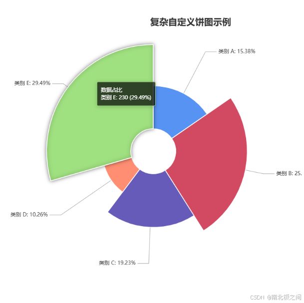
效果图
【定制化开发服务,让您的项目领先一步】
如有需求,直接私信留下您的联系方式。谢谢。
我的邮箱:[email protected]
前端新手:HTML 与 JS 实现复杂自定义饼图教程
一、引言
在前端开发中,数据可视化是一项非常重要的技能。饼图作为一种常见的数据可视化图表,能够直观地展示各部分数据占总体的比例关系。今天,我们将使用 HTML 和 JavaScript,借助 ECharts 库来创建一个复杂的自定义饼图。这个饼图包含了南丁格尔玫瑰图效果、自定义标签、引导线样式调整等功能,非常适合前端新手学习。
二、准备工作
2.1 环境搭建
我们只需要一个文本编辑器(如 VS Code)和一个现代浏览器(如 Chrome、Firefox 等)就可以开始编写代码了。
2.2 引入 ECharts 库
ECharts 是一个强大的开源 JavaScript 图表库,我们可以通过 CDN 的方式引入它。在 HTML 文件的 标签中添加以下代码:
<script src="https://cdn.jsdelivr.net/npm/[email protected]/dist/echarts.min.js">script>
三、代码实现
3.1 HTML 结构
首先,创建一个基本的 HTML 文件,包含必要的元数据和用于显示饼图的容器。以下是完整的 HTML 代码:
DOCTYPE html>
<html lang="en">

<head>
    <meta charset="UTF-8">
    <meta name="viewport" content="width=device-width, initial-scale=1.0">
    <title>复杂自定义饼图title>

    <script src="https://cdn.jsdelivr.net/npm/[email protected]/dist/echarts.min.js">script>
head>

<body>

    <div id="complexPieChart" style="width: 1000px; height: 800px;">div>
body>

html>
代码解释:
:声明文档类型为 HTML5。:设置字符编码为 UTF - 8,确保页面能正确显示各种字符。:设置视口,使页面在不同设备上能自适应显示。</code> 标签:设置页面标题,用于在浏览器标签栏显示。</li> <li><code><script></code> 标签:通过 CDN 引入 ECharts 库,方便后续使用。</li> <li><code><div id="complexPieChart"></code>:创建一个 <code>div</code> 元素作为饼图的容器,设置其宽度为 1000 像素,高度为 800 像素,<code>id</code> 为 <code>complexPieChart</code>,方便后续通过 JavaScript 定位。</li> </ul> <h4>3.2 JavaScript 代码</h4> <p>在 HTML 文件的 <code><body></code> 标签中添加以下 JavaScript 代码:</p> <pre><code class="prism language-html"><span class="token tag"><span class="token tag"><span class="token punctuation"><</span>script</span><span class="token punctuation">></span></span><span class="token script"><span class="token language-javascript"> <span class="token comment">// 初始化 ECharts 实例,将其绑定到指定的 DOM 元素上</span> <span class="token keyword">var</span> complexPieChart <span class="token operator">=</span> echarts<span class="token punctuation">.</span><span class="token function">init</span><span class="token punctuation">(</span>document<span class="token punctuation">.</span><span class="token function">getElementById</span><span class="token punctuation">(</span><span class="token string">'complexPieChart'</span><span class="token punctuation">)</span><span class="token punctuation">)</span><span class="token punctuation">;</span> <span class="token comment">// 定义数据</span> <span class="token keyword">var</span> data <span class="token operator">=</span> <span class="token punctuation">[</span> <span class="token punctuation">{</span> <span class="token literal-property property">value</span><span class="token operator">:</span> <span class="token number">120</span><span class="token punctuation">,</span> <span class="token literal-property property">name</span><span class="token operator">:</span> <span class="token string">'类别 A'</span> <span class="token punctuation">}</span><span class="token punctuation">,</span> <span class="token punctuation">{</span> <span class="token literal-property property">value</span><span class="token operator">:</span> <span class="token number">200</span><span class="token punctuation">,</span> <span class="token literal-property property">name</span><span class="token operator">:</span> <span class="token string">'类别 B'</span> <span class="token punctuation">}</span><span class="token punctuation">,</span> <span class="token punctuation">{</span> <span class="token literal-property property">value</span><span class="token operator">:</span> <span class="token number">150</span><span class="token punctuation">,</span> <span class="token literal-property property">name</span><span class="token operator">:</span> <span class="token string">'类别 C'</span> <span class="token punctuation">}</span><span class="token punctuation">,</span> <span class="token punctuation">{</span> <span class="token literal-property property">value</span><span class="token operator">:</span> <span class="token number">80</span><span class="token punctuation">,</span> <span class="token literal-property property">name</span><span class="token operator">:</span> <span class="token string">'类别 D'</span> <span class="token punctuation">}</span><span class="token punctuation">,</span> <span class="token punctuation">{</span> <span class="token literal-property property">value</span><span class="token operator">:</span> <span class="token number">230</span><span class="token punctuation">,</span> <span class="token literal-property property">name</span><span class="token operator">:</span> <span class="token string">'类别 E'</span> <span class="token punctuation">}</span> <span class="token punctuation">]</span><span class="token punctuation">;</span> <span class="token comment">// 定义图表配置项</span> <span class="token keyword">var</span> option <span class="token operator">=</span> <span class="token punctuation">{</span> <span class="token comment">// 标题配置</span> <span class="token literal-property property">title</span><span class="token operator">:</span> <span class="token punctuation">{</span> <span class="token literal-property property">text</span><span class="token operator">:</span> <span class="token string">'复杂自定义饼图示例'</span><span class="token punctuation">,</span> <span class="token literal-property property">left</span><span class="token operator">:</span> <span class="token string">'center'</span><span class="token punctuation">,</span> <span class="token literal-property property">top</span><span class="token operator">:</span> <span class="token string">'5%'</span><span class="token punctuation">,</span> <span class="token literal-property property">textStyle</span><span class="token operator">:</span> <span class="token punctuation">{</span> <span class="token literal-property property">fontSize</span><span class="token operator">:</span> <span class="token number">24</span><span class="token punctuation">,</span> <span class="token literal-property property">fontWeight</span><span class="token operator">:</span> <span class="token string">'bold'</span><span class="token punctuation">,</span> <span class="token literal-property property">color</span><span class="token operator">:</span> <span class="token string">'#333'</span> <span class="token punctuation">}</span> <span class="token punctuation">}</span><span class="token punctuation">,</span> <span class="token comment">// 提示框配置</span> <span class="token literal-property property">tooltip</span><span class="token operator">:</span> <span class="token punctuation">{</span> <span class="token literal-property property">trigger</span><span class="token operator">:</span> <span class="token string">'item'</span><span class="token punctuation">,</span> <span class="token literal-property property">formatter</span><span class="token operator">:</span> <span class="token string">'{a} <br/>{b}: {c} ({d}%)'</span><span class="token punctuation">,</span> <span class="token literal-property property">backgroundColor</span><span class="token operator">:</span> <span class="token string">'rgba(0, 0, 0, 0.7)'</span><span class="token punctuation">,</span> <span class="token literal-property property">textStyle</span><span class="token operator">:</span> <span class="token punctuation">{</span> <span class="token literal-property property">color</span><span class="token operator">:</span> <span class="token string">'#fff'</span> <span class="token punctuation">}</span> <span class="token punctuation">}</span><span class="token punctuation">,</span> <span class="token comment">// 图例配置</span> <span class="token literal-property property">legend</span><span class="token operator">:</span> <span class="token punctuation">{</span> <span class="token literal-property property">type</span><span class="token operator">:</span> <span class="token string">'scroll'</span><span class="token punctuation">,</span> <span class="token literal-property property">orient</span><span class="token operator">:</span> <span class="token string">'vertical'</span><span class="token punctuation">,</span> <span class="token literal-property property">right</span><span class="token operator">:</span> <span class="token number">10</span><span class="token punctuation">,</span> <span class="token literal-property property">top</span><span class="token operator">:</span> <span class="token number">20</span><span class="token punctuation">,</span> <span class="token literal-property property">bottom</span><span class="token operator">:</span> <span class="token number">20</span><span class="token punctuation">,</span> <span class="token literal-property property">data</span><span class="token operator">:</span> data<span class="token punctuation">.</span><span class="token function">map</span><span class="token punctuation">(</span><span class="token parameter">item</span> <span class="token operator">=></span> item<span class="token punctuation">.</span>name<span class="token punctuation">)</span><span class="token punctuation">,</span> <span class="token literal-property property">textStyle</span><span class="token operator">:</span> <span class="token punctuation">{</span> <span class="token literal-property property">fontSize</span><span class="token operator">:</span> <span class="token number">14</span> <span class="token punctuation">}</span><span class="token punctuation">,</span> <span class="token literal-property property">pageIconColor</span><span class="token operator">:</span> <span class="token string">'#333'</span><span class="token punctuation">,</span> <span class="token literal-property property">pageIconInactiveColor</span><span class="token operator">:</span> <span class="token string">'#999'</span> <span class="token punctuation">}</span><span class="token punctuation">,</span> <span class="token comment">// 系列配置</span> <span class="token literal-property property">series</span><span class="token operator">:</span> <span class="token punctuation">[</span> <span class="token punctuation">{</span> <span class="token literal-property property">name</span><span class="token operator">:</span> <span class="token string">'数据占比'</span><span class="token punctuation">,</span> <span class="token literal-property property">type</span><span class="token operator">:</span> <span class="token string">'pie'</span><span class="token punctuation">,</span> <span class="token comment">// 南丁格尔玫瑰图模式,radius 决定扇区半径根据数值大小变化</span> <span class="token literal-property property">roseType</span><span class="token operator">:</span> <span class="token string">'radius'</span><span class="token punctuation">,</span> <span class="token literal-property property">radius</span><span class="token operator">:</span> <span class="token punctuation">[</span><span class="token string">'15%'</span><span class="token punctuation">,</span> <span class="token string">'70%'</span><span class="token punctuation">]</span><span class="token punctuation">,</span> <span class="token literal-property property">center</span><span class="token operator">:</span> <span class="token punctuation">[</span><span class="token string">'40%'</span><span class="token punctuation">,</span> <span class="token string">'50%'</span><span class="token punctuation">]</span><span class="token punctuation">,</span> <span class="token literal-property property">data</span><span class="token operator">:</span> data<span class="token punctuation">,</span> <span class="token comment">// 标签配置</span> <span class="token literal-property property">label</span><span class="token operator">:</span> <span class="token punctuation">{</span> <span class="token literal-property property">show</span><span class="token operator">:</span> <span class="token boolean">true</span><span class="token punctuation">,</span> <span class="token literal-property property">formatter</span><span class="token operator">:</span> <span class="token string">'{b}: {d}%'</span><span class="token punctuation">,</span> <span class="token literal-property property">position</span><span class="token operator">:</span> <span class="token string">'outside'</span><span class="token punctuation">,</span> <span class="token literal-property property">color</span><span class="token operator">:</span> <span class="token string">'#333'</span><span class="token punctuation">,</span> <span class="token literal-property property">fontSize</span><span class="token operator">:</span> <span class="token number">14</span><span class="token punctuation">,</span> <span class="token comment">// 标签样式</span> <span class="token literal-property property">rich</span><span class="token operator">:</span> <span class="token punctuation">{</span> <span class="token literal-property property">value</span><span class="token operator">:</span> <span class="token punctuation">{</span> <span class="token literal-property property">color</span><span class="token operator">:</span> <span class="token string">'#999'</span><span class="token punctuation">,</span> <span class="token literal-property property">fontSize</span><span class="token operator">:</span> <span class="token number">12</span> <span class="token punctuation">}</span> <span class="token punctuation">}</span> <span class="token punctuation">}</span><span class="token punctuation">,</span> <span class="token comment">// 标签引导线配置</span> <span class="token literal-property property">labelLine</span><span class="token operator">:</span> <span class="token punctuation">{</span> <span class="token literal-property property">show</span><span class="token operator">:</span> <span class="token boolean">true</span><span class="token punctuation">,</span> <span class="token literal-property property">length</span><span class="token operator">:</span> <span class="token number">20</span><span class="token punctuation">,</span> <span class="token literal-property property">length2</span><span class="token operator">:</span> <span class="token number">30</span><span class="token punctuation">,</span> <span class="token literal-property property">lineStyle</span><span class="token operator">:</span> <span class="token punctuation">{</span> <span class="token literal-property property">color</span><span class="token operator">:</span> <span class="token string">'#999'</span><span class="token punctuation">,</span> <span class="token literal-property property">width</span><span class="token operator">:</span> <span class="token number">1</span> <span class="token punctuation">}</span> <span class="token punctuation">}</span><span class="token punctuation">,</span> <span class="token comment">// 扇区样式配置</span> <span class="token literal-property property">itemStyle</span><span class="token operator">:</span> <span class="token punctuation">{</span> <span class="token literal-property property">borderWidth</span><span class="token operator">:</span> <span class="token number">2</span><span class="token punctuation">,</span> <span class="token literal-property property">borderColor</span><span class="token operator">:</span> <span class="token string">'#fff'</span><span class="token punctuation">,</span> <span class="token comment">// 为每个扇区设置不同的颜色</span> <span class="token function-variable function">color</span><span class="token operator">:</span> <span class="token keyword">function</span> <span class="token punctuation">(</span><span class="token parameter">params</span><span class="token punctuation">)</span> <span class="token punctuation">{</span> <span class="token keyword">var</span> colorList <span class="token operator">=</span> <span class="token punctuation">[</span> <span class="token string">'#5793f3'</span><span class="token punctuation">,</span> <span class="token string">'#d14a61'</span><span class="token punctuation">,</span> <span class="token string">'#675bba'</span><span class="token punctuation">,</span> <span class="token string">'#ff8e72'</span><span class="token punctuation">,</span> <span class="token string">'#91cc75'</span> <span class="token punctuation">]</span><span class="token punctuation">;</span> <span class="token keyword">return</span> colorList<span class="token punctuation">[</span>params<span class="token punctuation">.</span>dataIndex<span class="token punctuation">]</span><span class="token punctuation">;</span> <span class="token punctuation">}</span> <span class="token punctuation">}</span><span class="token punctuation">,</span> <span class="token comment">// 高亮状态下扇区样式配置</span> <span class="token literal-property property">emphasis</span><span class="token operator">:</span> <span class="token punctuation">{</span> <span class="token literal-property property">itemStyle</span><span class="token operator">:</span> <span class="token punctuation">{</span> <span class="token literal-property property">shadowBlur</span><span class="token operator">:</span> <span class="token number">10</span><span class="token punctuation">,</span> <span class="token literal-property property">shadowOffsetX</span><span class="token operator">:</span> <span class="token number">0</span><span class="token punctuation">,</span> <span class="token literal-property property">shadowColor</span><span class="token operator">:</span> <span class="token string">'rgba(0, 0, 0, 0.5)'</span> <span class="token punctuation">}</span> <span class="token punctuation">}</span> <span class="token punctuation">}</span> <span class="token punctuation">]</span> <span class="token punctuation">}</span><span class="token punctuation">;</span> <span class="token comment">// 使用配置项显示图表</span> complexPieChart<span class="token punctuation">.</span><span class="token function">setOption</span><span class="token punctuation">(</span>option<span class="token punctuation">)</span><span class="token punctuation">;</span> </span></span><span class="token tag"><span class="token tag"><span class="token punctuation"></</span>script</span><span class="token punctuation">></span></span> </code></pre> <p>代码解释:</p> <h5>初始化 ECharts 实例</h5> <pre><code class="prism language-javascript"><span class="token keyword">var</span> complexPieChart <span class="token operator">=</span> echarts<span class="token punctuation">.</span><span class="token function">init</span><span class="token punctuation">(</span>document<span class="token punctuation">.</span><span class="token function">getElementById</span><span class="token punctuation">(</span><span class="token string">'complexPieChart'</span><span class="token punctuation">)</span><span class="token punctuation">)</span><span class="token punctuation">;</span> </code></pre> <p>这行代码通过 <code>echarts.init</code> 方法将 ECharts 实例绑定到之前创建的 <code>div</code> 元素(<code>id</code> 为 <code>complexPieChart</code>)上,后续可以通过这个实例来配置和显示图表。</p> <h5>定义数据</h5> <pre><code class="prism language-javascript"><span class="token keyword">var</span> data <span class="token operator">=</span> <span class="token punctuation">[</span> <span class="token punctuation">{</span> <span class="token literal-property property">value</span><span class="token operator">:</span> <span class="token number">120</span><span class="token punctuation">,</span> <span class="token literal-property property">name</span><span class="token operator">:</span> <span class="token string">'类别 A'</span> <span class="token punctuation">}</span><span class="token punctuation">,</span> <span class="token punctuation">{</span> <span class="token literal-property property">value</span><span class="token operator">:</span> <span class="token number">200</span><span class="token punctuation">,</span> <span class="token literal-property property">name</span><span class="token operator">:</span> <span class="token string">'类别 B'</span> <span class="token punctuation">}</span><span class="token punctuation">,</span> <span class="token punctuation">{</span> <span class="token literal-property property">value</span><span class="token operator">:</span> <span class="token number">150</span><span class="token punctuation">,</span> <span class="token literal-property property">name</span><span class="token operator">:</span> <span class="token string">'类别 C'</span> <span class="token punctuation">}</span><span class="token punctuation">,</span> <span class="token punctuation">{</span> <span class="token literal-property property">value</span><span class="token operator">:</span> <span class="token number">80</span><span class="token punctuation">,</span> <span class="token literal-property property">name</span><span class="token operator">:</span> <span class="token string">'类别 D'</span> <span class="token punctuation">}</span><span class="token punctuation">,</span> <span class="token punctuation">{</span> <span class="token literal-property property">value</span><span class="token operator">:</span> <span class="token number">230</span><span class="token punctuation">,</span> <span class="token literal-property property">name</span><span class="token operator">:</span> <span class="token string">'类别 E'</span> <span class="token punctuation">}</span> <span class="token punctuation">]</span><span class="token punctuation">;</span> </code></pre> <p>定义了一个包含多个对象的数组 <code>data</code>,每个对象表示一个数据项,<code>value</code> 表示该数据项的数值,<code>name</code> 表示数据项的名称。</p> <h5>定义图表配置项 <code>option</code></h5> <ul> <li><strong>标题配置(<code>title</code>)</strong></li> </ul> <pre><code class="prism language-javascript"><span class="token literal-property property">title</span><span class="token operator">:</span> <span class="token punctuation">{</span> <span class="token literal-property property">text</span><span class="token operator">:</span> <span class="token string">'复杂自定义饼图示例'</span><span class="token punctuation">,</span> <span class="token literal-property property">left</span><span class="token operator">:</span> <span class="token string">'center'</span><span class="token punctuation">,</span> <span class="token literal-property property">top</span><span class="token operator">:</span> <span class="token string">'5%'</span><span class="token punctuation">,</span> <span class="token literal-property property">textStyle</span><span class="token operator">:</span> <span class="token punctuation">{</span> <span class="token literal-property property">fontSize</span><span class="token operator">:</span> <span class="token number">24</span><span class="token punctuation">,</span> <span class="token literal-property property">fontWeight</span><span class="token operator">:</span> <span class="token string">'bold'</span><span class="token punctuation">,</span> <span class="token literal-property property">color</span><span class="token operator">:</span> <span class="token string">'#333'</span> <span class="token punctuation">}</span> <span class="token punctuation">}</span> </code></pre> <p>设置图表的标题文本为“复杂自定义饼图示例”,水平居中显示,距离顶部为整个图表高度的 5%,并设置了标题的字体大小、粗细和颜色。</p> <ul> <li><strong>提示框配置(<code>tooltip</code>)</strong></li> </ul> <pre><code class="prism language-javascript"><span class="token literal-property property">tooltip</span><span class="token operator">:</span> <span class="token punctuation">{</span> <span class="token literal-property property">trigger</span><span class="token operator">:</span> <span class="token string">'item'</span><span class="token punctuation">,</span> <span class="token literal-property property">formatter</span><span class="token operator">:</span> <span class="token string">'{a} <br/>{b}: {c} ({d}%)'</span><span class="token punctuation">,</span> <span class="token literal-property property">backgroundColor</span><span class="token operator">:</span> <span class="token string">'rgba(0, 0, 0, 0.7)'</span><span class="token punctuation">,</span> <span class="token literal-property property">textStyle</span><span class="token operator">:</span> <span class="token punctuation">{</span> <span class="token literal-property property">color</span><span class="token operator">:</span> <span class="token string">'#fff'</span> <span class="token punctuation">}</span> <span class="token punctuation">}</span> </code></pre> <p><code>trigger: 'item'</code> 表示当鼠标悬停在数据项上时触发提示框。<code>formatter</code> 定义了提示框的显示格式,<code>{a}</code> 表示系列名称,<code>{b}</code> 表示数据项名称,<code>{c}</code> 表示数据项值,<code>{d}</code> 表示数据项所占百分比。同时设置了提示框的背景颜色和文本颜色。</p> <ul> <li><strong>图例配置(<code>legend</code>)</strong></li> </ul> <pre><code class="prism language-javascript"><span class="token literal-property property">legend</span><span class="token operator">:</span> <span class="token punctuation">{</span> <span class="token literal-property property">type</span><span class="token operator">:</span> <span class="token string">'scroll'</span><span class="token punctuation">,</span> <span class="token literal-property property">orient</span><span class="token operator">:</span> <span class="token string">'vertical'</span><span class="token punctuation">,</span> <span class="token literal-property property">right</span><span class="token operator">:</span> <span class="token number">10</span><span class="token punctuation">,</span> <span class="token literal-property property">top</span><span class="token operator">:</span> <span class="token number">20</span><span class="token punctuation">,</span> <span class="token literal-property property">bottom</span><span class="token operator">:</span> <span class="token number">20</span><span class="token punctuation">,</span> <span class="token literal-property property">data</span><span class="token operator">:</span> data<span class="token punctuation">.</span><span class="token function">map</span><span class="token punctuation">(</span><span class="token parameter">item</span> <span class="token operator">=></span> item<span class="token punctuation">.</span>name<span class="token punctuation">)</span><span class="token punctuation">,</span> <span class="token literal-property property">textStyle</span><span class="token operator">:</span> <span class="token punctuation">{</span> <span class="token literal-property property">fontSize</span><span class="token operator">:</span> <span class="token number">14</span> <span class="token punctuation">}</span><span class="token punctuation">,</span> <span class="token literal-property property">pageIconColor</span><span class="token operator">:</span> <span class="token string">'#333'</span><span class="token punctuation">,</span> <span class="token literal-property property">pageIconInactiveColor</span><span class="token operator">:</span> <span class="token string">'#999'</span> <span class="token punctuation">}</span> </code></pre> <p><code>type: 'scroll'</code> 表示当图例项过多时支持滚动显示。<code>orient: 'vertical'</code> 使图例垂直排列。通过 <code>data.map(item => item.name)</code> 从 <code>data</code> 数组中提取名称作为图例项。还设置了图例的位置、文本样式和分页图标颜色。</p> <ul> <li><strong>系列配置(<code>series</code>)</strong></li> </ul> <pre><code class="prism language-javascript"><span class="token literal-property property">series</span><span class="token operator">:</span> <span class="token punctuation">[</span> <span class="token punctuation">{</span> <span class="token literal-property property">name</span><span class="token operator">:</span> <span class="token string">'数据占比'</span><span class="token punctuation">,</span> <span class="token literal-property property">type</span><span class="token operator">:</span> <span class="token string">'pie'</span><span class="token punctuation">,</span> <span class="token literal-property property">roseType</span><span class="token operator">:</span> <span class="token string">'radius'</span><span class="token punctuation">,</span> <span class="token literal-property property">radius</span><span class="token operator">:</span> <span class="token punctuation">[</span><span class="token string">'15%'</span><span class="token punctuation">,</span> <span class="token string">'70%'</span><span class="token punctuation">]</span><span class="token punctuation">,</span> <span class="token literal-property property">center</span><span class="token operator">:</span> <span class="token punctuation">[</span><span class="token string">'40%'</span><span class="token punctuation">,</span> <span class="token string">'50%'</span><span class="token punctuation">]</span><span class="token punctuation">,</span> <span class="token literal-property property">data</span><span class="token operator">:</span> data<span class="token punctuation">,</span> <span class="token comment">// 标签配置</span> <span class="token literal-property property">label</span><span class="token operator">:</span> <span class="token punctuation">{</span> <span class="token literal-property property">show</span><span class="token operator">:</span> <span class="token boolean">true</span><span class="token punctuation">,</span> <span class="token literal-property property">formatter</span><span class="token operator">:</span> <span class="token string">'{b}: {d}%'</span><span class="token punctuation">,</span> <span class="token literal-property property">position</span><span class="token operator">:</span> <span class="token string">'outside'</span><span class="token punctuation">,</span> <span class="token literal-property property">color</span><span class="token operator">:</span> <span class="token string">'#333'</span><span class="token punctuation">,</span> <span class="token literal-property property">fontSize</span><span class="token operator">:</span> <span class="token number">14</span><span class="token punctuation">,</span> <span class="token literal-property property">rich</span><span class="token operator">:</span> <span class="token punctuation">{</span> <span class="token literal-property property">value</span><span class="token operator">:</span> <span class="token punctuation">{</span> <span class="token literal-property property">color</span><span class="token operator">:</span> <span class="token string">'#999'</span><span class="token punctuation">,</span> <span class="token literal-property property">fontSize</span><span class="token operator">:</span> <span class="token number">12</span> <span class="token punctuation">}</span> <span class="token punctuation">}</span> <span class="token punctuation">}</span><span class="token punctuation">,</span> <span class="token comment">// 标签引导线配置</span> <span class="token literal-property property">labelLine</span><span class="token operator">:</span> <span class="token punctuation">{</span> <span class="token literal-property property">show</span><span class="token operator">:</span> <span class="token boolean">true</span><span class="token punctuation">,</span> <span class="token literal-property property">length</span><span class="token operator">:</span> <span class="token number">20</span><span class="token punctuation">,</span> <span class="token literal-property property">length2</span><span class="token operator">:</span> <span class="token number">30</span><span class="token punctuation">,</span> <span class="token literal-property property">lineStyle</span><span class="token operator">:</span> <span class="token punctuation">{</span> <span class="token literal-property property">color</span><span class="token operator">:</span> <span class="token string">'#999'</span><span class="token punctuation">,</span> <span class="token literal-property property">width</span><span class="token operator">:</span> <span class="token number">1</span> <span class="token punctuation">}</span> <span class="token punctuation">}</span><span class="token punctuation">,</span> <span class="token comment">// 扇区样式配置</span> <span class="token literal-property property">itemStyle</span><span class="token operator">:</span> <span class="token punctuation">{</span> <span class="token literal-property property">borderWidth</span><span class="token operator">:</span> <span class="token number">2</span><span class="token punctuation">,</span> <span class="token literal-property property">borderColor</span><span class="token operator">:</span> <span class="token string">'#fff'</span><span class="token punctuation">,</span> <span class="token function-variable function">color</span><span class="token operator">:</span> <span class="token keyword">function</span> <span class="token punctuation">(</span><span class="token parameter">params</span><span class="token punctuation">)</span> <span class="token punctuation">{</span> <span class="token keyword">var</span> colorList <span class="token operator">=</span> <span class="token punctuation">[</span> <span class="token string">'#5793f3'</span><span class="token punctuation">,</span> <span class="token string">'#d14a61'</span><span class="token punctuation">,</span> <span class="token string">'#675bba'</span><span class="token punctuation">,</span> <span class="token string">'#ff8e72'</span><span class="token punctuation">,</span> <span class="token string">'#91cc75'</span> <span class="token punctuation">]</span><span class="token punctuation">;</span> <span class="token keyword">return</span> colorList<span class="token punctuation">[</span>params<span class="token punctuation">.</span>dataIndex<span class="token punctuation">]</span><span class="token punctuation">;</span> <span class="token punctuation">}</span> <span class="token punctuation">}</span><span class="token punctuation">,</span> <span class="token comment">// 高亮状态下扇区样式配置</span> <span class="token literal-property property">emphasis</span><span class="token operator">:</span> <span class="token punctuation">{</span> <span class="token literal-property property">itemStyle</span><span class="token operator">:</span> <span class="token punctuation">{</span> <span class="token literal-property property">shadowBlur</span><span class="token operator">:</span> <span class="token number">10</span><span class="token punctuation">,</span> <span class="token literal-property property">shadowOffsetX</span><span class="token operator">:</span> <span class="token number">0</span><span class="token punctuation">,</span> <span class="token literal-property property">shadowColor</span><span class="token operator">:</span> <span class="token string">'rgba(0, 0, 0, 0.5)'</span> <span class="token punctuation">}</span> <span class="token punctuation">}</span> <span class="token punctuation">}</span> <span class="token punctuation">]</span> </code></pre> <pre><code>- `name`:系列名称为“数据占比”。 - `type: 'pie'`:指定图表类型为饼图。 - `roseType: 'radius'`:使用南丁格尔玫瑰图模式,扇区半径根据数值大小变化。 - `radius`:设置饼图的内外半径范围。 - `center`:设置饼图的中心位置。 - `data`:使用之前定义的数据。 - **标签配置(`label`)**:显示标签,自定义标签显示格式,设置标签位置在扇区外部,并通过 `rich` 定义富文本样式。 - **标签引导线配置(`labelLine`)**:显示引导线,设置引导线的两段长度和样式。 - **扇区样式配置(`itemStyle`)**:设置扇区的边框宽度和颜色,通过自定义函数为每个扇区设置不同的颜色。 - **高亮状态下扇区样式配置(`emphasis`)**:设置鼠标悬停时扇区的阴影效果。 </code></pre> <h5>应用配置项</h5> <pre><code class="prism language-javascript">complexPieChart<span class="token punctuation">.</span><span class="token function">setOption</span><span class="token punctuation">(</span>option<span class="token punctuation">)</span><span class="token punctuation">;</span> </code></pre> <p>将配置项 <code>option</code> 应用到 ECharts 实例 <code>complexPieChart</code> 上,从而显示出复杂的自定义饼图。</p> <h3>四、总结</h3> <p>通过以上步骤,我们成功使用 HTML 和 JavaScript 借助 ECharts 库创建了一个复杂的自定义饼图。这个过程中,我们学习了如何初始化 ECharts 实例、定义数据、配置图表的各个部分(标题、提示框、图例、系列等)。希望这个教程能帮助前端新手更好地掌握数据可视化的相关知识。你可以根据自己的需求对代码进行修改和扩展,创造出更多个性化的图表。</p> <h4>完整代码</h4> <pre><code class="prism language-html"><span class="token doctype"><span class="token punctuation"><!</span><span class="token doctype-tag">DOCTYPE</span> <span class="token name">html</span><span class="token punctuation">></span></span> <span class="token tag"><span class="token tag"><span class="token punctuation"><</span>html</span> <span class="token attr-name">lang</span><span class="token attr-value"><span class="token punctuation attr-equals">=</span><span class="token punctuation">"</span>en<span class="token punctuation">"</span></span><span class="token punctuation">></span></span> <span class="token tag"><span class="token tag"><span class="token punctuation"><</span>head</span><span class="token punctuation">></span></span> <span class="token tag"><span class="token tag"><span class="token punctuation"><</span>meta</span> <span class="token attr-name">charset</span><span class="token attr-value"><span class="token punctuation attr-equals">=</span><span class="token punctuation">"</span>UTF-8<span class="token punctuation">"</span></span><span class="token punctuation">></span></span> <span class="token tag"><span class="token tag"><span class="token punctuation"><</span>meta</span> <span class="token attr-name">name</span><span class="token attr-value"><span class="token punctuation attr-equals">=</span><span class="token punctuation">"</span>viewport<span class="token punctuation">"</span></span> <span class="token attr-name">content</span><span class="token attr-value"><span class="token punctuation attr-equals">=</span><span class="token punctuation">"</span>width=device-width, initial-scale=1.0<span class="token punctuation">"</span></span><span class="token punctuation">></span></span> <span class="token tag"><span class="token tag"><span class="token punctuation"><</span>title</span><span class="token punctuation">></span></span>复杂自定义饼图<span class="token tag"><span class="token tag"><span class="token punctuation"></</span>title</span><span class="token punctuation">></span></span> <span class="token comment"><!-- 引入 ECharts 库 --></span> <span class="token tag"><span class="token tag"><span class="token punctuation"><</span>script</span> <span class="token attr-name">src</span><span class="token attr-value"><span class="token punctuation attr-equals">=</span><span class="token punctuation">"</span>https://cdn.jsdelivr.net/npm/echarts@5.3.2/dist/echarts.min.js<span class="token punctuation">"</span></span><span class="token punctuation">></span></span><span class="token script"></span><span class="token tag"><span class="token tag"><span class="token punctuation"></</span>script</span><span class="token punctuation">></span></span> <span class="token tag"><span class="token tag"><span class="token punctuation"></</span>head</span><span class="token punctuation">></span></span> <span class="token tag"><span class="token tag"><span class="token punctuation"><</span>body</span><span class="token punctuation">></span></span> <span class="token comment"><!-- 创建用于显示饼图的容器 --></span> <span class="token tag"><span class="token tag"><span class="token punctuation"><</span>div</span> <span class="token attr-name">id</span><span class="token attr-value"><span class="token punctuation attr-equals">=</span><span class="token punctuation">"</span>complexPieChart<span class="token punctuation">"</span></span> <span class="token special-attr"><span class="token attr-name">style</span><span class="token attr-value"><span class="token punctuation attr-equals">=</span><span class="token punctuation">"</span><span class="token value css language-css"><span class="token property">width</span><span class="token punctuation">:</span> 1000px<span class="token punctuation">;</span> <span class="token property">height</span><span class="token punctuation">:</span> 800px<span class="token punctuation">;</span></span><span class="token punctuation">"</span></span></span><span class="token punctuation">></span></span><span class="token tag"><span class="token tag"><span class="token punctuation"></</span>div</span><span class="token punctuation">></span></span> <span class="token tag"><span class="token tag"><span class="token punctuation"><</span>script</span><span class="token punctuation">></span></span><span class="token script"><span class="token language-javascript"> <span class="token comment">// 初始化 ECharts 实例,将其绑定到指定的 DOM 元素上</span> <span class="token keyword">var</span> complexPieChart <span class="token operator">=</span> echarts<span class="token punctuation">.</span><span class="token function">init</span><span class="token punctuation">(</span>document<span class="token punctuation">.</span><span class="token function">getElementById</span><span class="token punctuation">(</span><span class="token string">'complexPieChart'</span><span class="token punctuation">)</span><span class="token punctuation">)</span><span class="token punctuation">;</span> <span class="token comment">// 定义数据</span> <span class="token keyword">var</span> data <span class="token operator">=</span> <span class="token punctuation">[</span> <span class="token punctuation">{</span> <span class="token literal-property property">value</span><span class="token operator">:</span> <span class="token number">120</span><span class="token punctuation">,</span> <span class="token literal-property property">name</span><span class="token operator">:</span> <span class="token string">'类别 A'</span> <span class="token punctuation">}</span><span class="token punctuation">,</span> <span class="token punctuation">{</span> <span class="token literal-property property">value</span><span class="token operator">:</span> <span class="token number">200</span><span class="token punctuation">,</span> <span class="token literal-property property">name</span><span class="token operator">:</span> <span class="token string">'类别 B'</span> <span class="token punctuation">}</span><span class="token punctuation">,</span> <span class="token punctuation">{</span> <span class="token literal-property property">value</span><span class="token operator">:</span> <span class="token number">150</span><span class="token punctuation">,</span> <span class="token literal-property property">name</span><span class="token operator">:</span> <span class="token string">'类别 C'</span> <span class="token punctuation">}</span><span class="token punctuation">,</span> <span class="token punctuation">{</span> <span class="token literal-property property">value</span><span class="token operator">:</span> <span class="token number">80</span><span class="token punctuation">,</span> <span class="token literal-property property">name</span><span class="token operator">:</span> <span class="token string">'类别 D'</span> <span class="token punctuation">}</span><span class="token punctuation">,</span> <span class="token punctuation">{</span> <span class="token literal-property property">value</span><span class="token operator">:</span> <span class="token number">230</span><span class="token punctuation">,</span> <span class="token literal-property property">name</span><span class="token operator">:</span> <span class="token string">'类别 E'</span> <span class="token punctuation">}</span> <span class="token punctuation">]</span><span class="token punctuation">;</span> <span class="token comment">// 定义图表配置项</span> <span class="token keyword">var</span> option <span class="token operator">=</span> <span class="token punctuation">{</span> <span class="token comment">// 标题配置</span> <span class="token literal-property property">title</span><span class="token operator">:</span> <span class="token punctuation">{</span> <span class="token literal-property property">text</span><span class="token operator">:</span> <span class="token string">'复杂自定义饼图示例'</span><span class="token punctuation">,</span> <span class="token literal-property property">left</span><span class="token operator">:</span> <span class="token string">'center'</span><span class="token punctuation">,</span> <span class="token literal-property property">top</span><span class="token operator">:</span> <span class="token string">'5%'</span><span class="token punctuation">,</span> <span class="token literal-property property">textStyle</span><span class="token operator">:</span> <span class="token punctuation">{</span> <span class="token literal-property property">fontSize</span><span class="token operator">:</span> <span class="token number">24</span><span class="token punctuation">,</span> <span class="token literal-property property">fontWeight</span><span class="token operator">:</span> <span class="token string">'bold'</span><span class="token punctuation">,</span> <span class="token literal-property property">color</span><span class="token operator">:</span> <span class="token string">'#333'</span> <span class="token punctuation">}</span> <span class="token punctuation">}</span><span class="token punctuation">,</span> <span class="token comment">// 提示框配置</span> <span class="token literal-property property">tooltip</span><span class="token operator">:</span> <span class="token punctuation">{</span> <span class="token literal-property property">trigger</span><span class="token operator">:</span> <span class="token string">'item'</span><span class="token punctuation">,</span> <span class="token literal-property property">formatter</span><span class="token operator">:</span> <span class="token string">'{a} <br/>{b}: {c} ({d}%)'</span><span class="token punctuation">,</span> <span class="token literal-property property">backgroundColor</span><span class="token operator">:</span> <span class="token string">'rgba(0, 0, 0, 0.7)'</span><span class="token punctuation">,</span> <span class="token literal-property property">textStyle</span><span class="token operator">:</span> <span class="token punctuation">{</span> <span class="token literal-property property">color</span><span class="token operator">:</span> <span class="token string">'#fff'</span> <span class="token punctuation">}</span> <span class="token punctuation">}</span><span class="token punctuation">,</span> <span class="token comment">// 图例配置</span> <span class="token literal-property property">legend</span><span class="token operator">:</span> <span class="token punctuation">{</span> <span class="token literal-property property">type</span><span class="token operator">:</span> <span class="token string">'scroll'</span><span class="token punctuation">,</span> <span class="token literal-property property">orient</span><span class="token operator">:</span> <span class="token string">'vertical'</span><span class="token punctuation">,</span> <span class="token literal-property property">right</span><span class="token operator">:</span> <span class="token number">10</span><span class="token punctuation">,</span> <span class="token literal-property property">top</span><span class="token operator">:</span> <span class="token number">20</span><span class="token punctuation">,</span> <span class="token literal-property property">bottom</span><span class="token operator">:</span> <span class="token number">20</span><span class="token punctuation">,</span> <span class="token literal-property property">data</span><span class="token operator">:</span> data<span class="token punctuation">.</span><span class="token function">map</span><span class="token punctuation">(</span><span class="token parameter">item</span> <span class="token operator">=></span> item<span class="token punctuation">.</span>name<span class="token punctuation">)</span><span class="token punctuation">,</span> <span class="token literal-property property">textStyle</span><span class="token operator">:</span> <span class="token punctuation">{</span> <span class="token literal-property property">fontSize</span><span class="token operator">:</span> <span class="token number">14</span> <span class="token punctuation">}</span><span class="token punctuation">,</span> <span class="token literal-property property">pageIconColor</span><span class="token operator">:</span> <span class="token string">'#333'</span><span class="token punctuation">,</span> <span class="token literal-property property">pageIconInactiveColor</span><span class="token operator">:</span> <span class="token string">'#999'</span> <span class="token punctuation">}</span><span class="token punctuation">,</span> <span class="token comment">// 系列配置</span> <span class="token literal-property property">series</span><span class="token operator">:</span> <span class="token punctuation">[</span> <span class="token punctuation">{</span> <span class="token literal-property property">name</span><span class="token operator">:</span> <span class="token string">'数据占比'</span><span class="token punctuation">,</span> <span class="token literal-property property">type</span><span class="token operator">:</span> <span class="token string">'pie'</span><span class="token punctuation">,</span> <span class="token comment">// 南丁格尔玫瑰图模式,radius 决定扇区半径根据数值大小变化</span> <span class="token literal-property property">roseType</span><span class="token operator">:</span> <span class="token string">'radius'</span><span class="token punctuation">,</span> <span class="token literal-property property">radius</span><span class="token operator">:</span> <span class="token punctuation">[</span><span class="token string">'15%'</span><span class="token punctuation">,</span> <span class="token string">'70%'</span><span class="token punctuation">]</span><span class="token punctuation">,</span> <span class="token literal-property property">center</span><span class="token operator">:</span> <span class="token punctuation">[</span><span class="token string">'40%'</span><span class="token punctuation">,</span> <span class="token string">'50%'</span><span class="token punctuation">]</span><span class="token punctuation">,</span> <span class="token literal-property property">data</span><span class="token operator">:</span> data<span class="token punctuation">,</span> <span class="token comment">// 标签配置</span> <span class="token literal-property property">label</span><span class="token operator">:</span> <span class="token punctuation">{</span> <span class="token literal-property property">show</span><span class="token operator">:</span> <span class="token boolean">true</span><span class="token punctuation">,</span> <span class="token literal-property property">formatter</span><span class="token operator">:</span> <span class="token string">'{b}: {d}%'</span><span class="token punctuation">,</span> <span class="token literal-property property">position</span><span class="token operator">:</span> <span class="token string">'outside'</span><span class="token punctuation">,</span> <span class="token literal-property property">color</span><span class="token operator">:</span> <span class="token string">'#333'</span><span class="token punctuation">,</span> <span class="token literal-property property">fontSize</span><span class="token operator">:</span> <span class="token number">14</span><span class="token punctuation">,</span> <span class="token comment">// 标签样式</span> <span class="token literal-property property">rich</span><span class="token operator">:</span> <span class="token punctuation">{</span> <span class="token literal-property property">value</span><span class="token operator">:</span> <span class="token punctuation">{</span> <span class="token literal-property property">color</span><span class="token operator">:</span> <span class="token string">'#999'</span><span class="token punctuation">,</span> <span class="token literal-property property">fontSize</span><span class="token operator">:</span> <span class="token number">12</span> <span class="token punctuation">}</span> <span class="token punctuation">}</span> <span class="token punctuation">}</span><span class="token punctuation">,</span> <span class="token comment">// 标签引导线配置</span> <span class="token literal-property property">labelLine</span><span class="token operator">:</span> <span class="token punctuation">{</span> <span class="token literal-property property">show</span><span class="token operator">:</span> <span class="token boolean">true</span><span class="token punctuation">,</span> <span class="token literal-property property">length</span><span class="token operator">:</span> <span class="token number">20</span><span class="token punctuation">,</span> <span class="token literal-property property">length2</span><span class="token operator">:</span> <span class="token number">30</span><span class="token punctuation">,</span> <span class="token literal-property property">lineStyle</span><span class="token operator">:</span> <span class="token punctuation">{</span> <span class="token literal-property property">color</span><span class="token operator">:</span> <span class="token string">'#999'</span><span class="token punctuation">,</span> <span class="token literal-property property">width</span><span class="token operator">:</span> <span class="token number">1</span> <span class="token punctuation">}</span> <span class="token punctuation">}</span><span class="token punctuation">,</span> <span class="token comment">// 扇区样式配置</span> <span class="token literal-property property">itemStyle</span><span class="token operator">:</span> <span class="token punctuation">{</span> <span class="token literal-property property">borderWidth</span><span class="token operator">:</span> <span class="token number">2</span><span class="token punctuation">,</span> <span class="token literal-property property">borderColor</span><span class="token operator">:</span> <span class="token string">'#fff'</span><span class="token punctuation">,</span> <span class="token comment">// 为每个扇区设置不同的颜色</span> <span class="token function-variable function">color</span><span class="token operator">:</span> <span class="token keyword">function</span> <span class="token punctuation">(</span><span class="token parameter">params</span><span class="token punctuation">)</span> <span class="token punctuation">{</span> <span class="token keyword">var</span> colorList <span class="token operator">=</span> <span class="token punctuation">[</span> <span class="token string">'#5793f3'</span><span class="token punctuation">,</span> <span class="token string">'#d14a61'</span><span class="token punctuation">,</span> <span class="token string">'#675bba'</span><span class="token punctuation">,</span> <span class="token string">'#ff8e72'</span><span class="token punctuation">,</span> <span class="token string">'#91cc75'</span> <span class="token punctuation">]</span><span class="token punctuation">;</span> <span class="token keyword">return</span> colorList<span class="token punctuation">[</span>params<span class="token punctuation">.</span>dataIndex<span class="token punctuation">]</span><span class="token punctuation">;</span> <span class="token punctuation">}</span> <span class="token punctuation">}</span><span class="token punctuation">,</span> <span class="token comment">// 高亮状态下扇区样式配置</span> <span class="token literal-property property">emphasis</span><span class="token operator">:</span> <span class="token punctuation">{</span> <span class="token literal-property property">itemStyle</span><span class="token operator">:</span> <span class="token punctuation">{</span> <span class="token literal-property property">shadowBlur</span><span class="token operator">:</span> <span class="token number">10</span><span class="token punctuation">,</span> <span class="token literal-property property">shadowOffsetX</span><span class="token operator">:</span> <span class="token number">0</span><span class="token punctuation">,</span> <span class="token literal-property property">shadowColor</span><span class="token operator">:</span> <span class="token string">'rgba(0, 0, 0, 0.5)'</span> <span class="token punctuation">}</span> <span class="token punctuation">}</span> <span class="token punctuation">}</span> <span class="token punctuation">]</span> <span class="token punctuation">}</span><span class="token punctuation">;</span> <span class="token comment">// 使用配置项显示图表</span> complexPieChart<span class="token punctuation">.</span><span class="token function">setOption</span><span class="token punctuation">(</span>option<span class="token punctuation">)</span><span class="token punctuation">;</span> </span></span><span class="token tag"><span class="token tag"><span class="token punctuation"></</span>script</span><span class="token punctuation">></span></span> <span class="token tag"><span class="token tag"><span class="token punctuation"></</span>body</span><span class="token punctuation">></span></span> <span class="token tag"><span class="token tag"><span class="token punctuation"></</span>html</span><span class="token punctuation">></span></span> </code></pre> </div> </div>�������� </div> </div> </div> <!--PC和WAP自适应版--> <div id="SOHUCS" sid="1887578484084109312"></div> <script type="text/javascript" src="/views/front/js/chanyan.js"></script> <!-- 文章页-底部 动态广告位 --> <div class="youdao-fixed-ad" id="detail_ad_bottom"></div> </div> <div class="col-md-3"> <div class="row" id="ad"> <!-- 文章页-右侧1 动态广告位 --> <div id="right-1" class="col-lg-12 col-md-12 col-sm-4 col-xs-4 ad"> <div class="youdao-fixed-ad" id="detail_ad_1"> </div> </div> <!-- 文章页-右侧2 动态广告位 --> <div id="right-2" class="col-lg-12 col-md-12 col-sm-4 col-xs-4 ad"> <div class="youdao-fixed-ad" id="detail_ad_2"></div> </div> <!-- 文章页-右侧3 动态广告位 --> <div id="right-3" class="col-lg-12 col-md-12 col-sm-4 col-xs-4 ad"> <div class="youdao-fixed-ad" id="detail_ad_3"></div> </div> </div> </div> </div> </div> </div> <div class="container"> <h4 class="pt20 mb15 mt0 border-top">你可能感兴趣的:(echarts图表从入门到精通,前端,html,javascript)</h4> <div id="paradigm-article-related"> <div class="recommend-post mb30"> <ul class="widget-links"> <li><a href="/article/1939960697832140800.htm" title="Mac10.7.5 XCode4.5.2 ios6编译VLC1.1.0" target="_blank">Mac10.7.5 XCode4.5.2 ios6编译VLC1.1.0</a> <span class="text-muted">woohyuknrg</span> <a class="tag" taget="_blank" href="/search/iOS/1.htm">iOS</a> <div>参考了这篇博文:http://blog.csdn.net/madongchunqiu/article/details/7625083,根据后面的问答修改了一些脚本内容,以及编译时遇到的问题说明只针对真机编译,前几步跟上面博文一样:1.到http://www.videolan.org/vlc/download-ios.html下载3个压缩文件2.创建目录(比如/VLC),并将3个源代码包解压在目录内</div> </li> <li><a href="/article/1939954520809336832.htm" title="第210天:node、nvm、npm和gulp的安装和使用详解" target="_blank">第210天:node、nvm、npm和gulp的安装和使用详解</a> <span class="text-muted">lelara</span> <a class="tag" taget="_blank" href="/search/node/1.htm">node</a> <div>一、node1、什么是node?它不是JS文件,也不是JS框架,而是ServersideJavaScriptruntime,当服务端的一个JS文件运行时,会被NODE拦截,在NODE中运行JS代码。JS由ES(ECMAScript),DOM,BOM组成,目前运行在浏览器内核中,NODE中只能运行ECMAScript,无法使用DOM,BOM。NODE就是一个JS运行环境。主要用于开发WEB应用程序开</div> </li> <li><a href="/article/1939954267695673344.htm" title="从零构建现代JavaScript技术栈:Node.js与Yarn基础配置指南" target="_blank">从零构建现代JavaScript技术栈:Node.js与Yarn基础配置指南</a> <span class="text-muted">施想钧</span> <div>从零构建现代JavaScript技术栈:Node.js与Yarn基础配置指南js-stack-from-scratchverekia/js-stack-from-scratch:是一个从零开始构建现代JavaScript开发栈的教程,包括工具、技术和实践。适合JavaScript开发人员、前端开发人员和初学者,以及对构建现代Web应用程序感兴趣的人员。项目地址:https://gitcode.co</div> </li> <li><a href="/article/1939945949929467904.htm" title="js递归树结构,返回符合条件的子集" target="_blank">js递归树结构,返回符合条件的子集</a> <span class="text-muted">啃火龙果的兔子</span> <a class="tag" taget="_blank" href="/search/%E5%BC%80%E5%8F%91DEMO/1.htm">开发DEMO</a><a class="tag" taget="_blank" href="/search/javascript/1.htm">javascript</a><a class="tag" taget="_blank" href="/search/%E5%BC%80%E5%8F%91%E8%AF%AD%E8%A8%80/1.htm">开发语言</a><a class="tag" taget="_blank" href="/search/ecmascript/1.htm">ecmascript</a> <div>JavaScript递归遍历树结构返回符合条件的子集下面我将介绍几种在JavaScript中递归遍历树结构并返回符合条件的子集的方法。方法一:使用递归函数返回符合条件的子树functionfindSubtree(tree,condition){if(condition(tree)){returntree;}if(tree.children&&tree.children.length){for(le</div> </li> <li><a href="/article/1939942674270318592.htm" title="视频断点续播全栈实现:基于HTML5前端与Spring Boot后端" target="_blank">视频断点续播全栈实现:基于HTML5前端与Spring Boot后端</a> <span class="text-muted">独立开发者阿乐</span> <a class="tag" taget="_blank" href="/search/%E5%8E%9F%E5%88%9B/1.htm">原创</a><a class="tag" taget="_blank" href="/search/%E5%89%8D%E7%AB%AF/1.htm">前端</a><a class="tag" taget="_blank" href="/search/%E9%9F%B3%E8%A7%86%E9%A2%91/1.htm">音视频</a><a class="tag" taget="_blank" href="/search/REST/1.htm">REST</a><a class="tag" taget="_blank" href="/search/API/1.htm">API</a><a class="tag" taget="_blank" href="/search/API/1.htm">API</a><a class="tag" taget="_blank" href="/search/Spring/1.htm">Spring</a><a class="tag" taget="_blank" href="/search/Boot/1.htm">Boot</a><a class="tag" taget="_blank" href="/search/JavaScript/1.htm">JavaScript</a><a class="tag" taget="_blank" href="/search/video%E5%85%83%E7%B4%A0/1.htm">video元素</a> <div>文章目录视频断点续播功能实现方案核心思路前端实现HTML结构JavaScript实现SpringBoot后端实现1.依赖配置(pom.xml)2.实体类3.存储库接口4.服务层5.控制器实现要点视频断点续播功能构思图流程说明用户交互:前端核心功能:后端处理:数据存储:我的个人网站:乐乐主题创作室视频断点续播功能实现方案核心思路实现视频断点续播需要前后端配合,主要包括:前端记录播放进度后端存储进度信</div> </li> <li><a href="/article/1939942169838153728.htm" title="vue中父子组件通过prop传递函数,子组件调用函数本质" target="_blank">vue中父子组件通过prop传递函数,子组件调用函数本质</a> <span class="text-muted">咔咔咔索菲斯</span> <a class="tag" taget="_blank" href="/search/vue.js/1.htm">vue.js</a><a class="tag" taget="_blank" href="/search/%E5%89%8D%E7%AB%AF/1.htm">前端</a><a class="tag" taget="_blank" href="/search/javascript/1.htm">javascript</a> <div>在Vue中,通过prop将函数从父组件传递到子组件后,子组件调用的本质是父组件上的原始函数,而非新函数。具体原理如下:1.函数传递的本质:引用传递-JavaScript中,函数作为引用类型,传递的是内存地址(引用)而非副本。-父组件通过prop传递函数时,实际是将函数的引用传给子组件,两者指向同一函数对象。2.示例验证exportdefault{methods:{parentFunction(){</div> </li> <li><a href="/article/1939916963736252416.htm" title="三分钟使用github的技巧" target="_blank">三分钟使用github的技巧</a> <span class="text-muted">小白学CS</span> <a class="tag" taget="_blank" href="/search/%E5%AE%89%E8%A3%85%2F%E4%BD%BF%E7%94%A8%E6%95%99%E7%A8%8B/1.htm">安装/使用教程</a><a class="tag" taget="_blank" href="/search/%E8%BF%90%E7%BB%B4/1.htm">运维</a><a class="tag" taget="_blank" href="/search/github/1.htm">github</a><a class="tag" taget="_blank" href="/search/git/1.htm">git</a> <div>文章目录一、GitHub搜索技巧——找开发者二、GitHub搜索技巧——找项目三、in关键字限制搜索范围四、stars或fork数量去查找一、GitHub搜索技巧——找开发者搜索条件备注location:location:china,匹配用户填写的地址在chinalanguage:language:javascript,匹配开发语言为javascript的开发者followers:follower</div> </li> <li><a href="/article/1939900321186770944.htm" title="服务端渲染SSR:原理、实践与未来趋势" target="_blank">服务端渲染SSR:原理、实践与未来趋势</a> <span class="text-muted">GISer_Jinger</span> <a class="tag" taget="_blank" href="/search/%E5%89%8D%E7%AB%AF/1.htm">前端</a><a class="tag" taget="_blank" href="/search/javascript/1.htm">javascript</a><a class="tag" taget="_blank" href="/search/vue.js/1.htm">vue.js</a> <div>深入解析服务器端渲染(SSR):原理、实践与未来趋势在当今追求极致用户体验的Web开发领域,服务器端渲染(SSR)已成为解决性能与SEO难题的关键技术。本文将带你深入理解SSR的核心机制、应用场景及前沿实践。一、SSR的本质与工作原理SSR(Server-SideRendering)指在服务器端生成完整HTML页面并发送至浏览器的技术。与客户端渲染(CSR)不同,SSR的核心流程如下:请求解析:用</div> </li> <li><a href="/article/1939896791747063808.htm" title="【代码审计】安全审核常见漏洞修复策略" target="_blank">【代码审计】安全审核常见漏洞修复策略</a> <span class="text-muted">秋说</span> <a class="tag" taget="_blank" href="/search/Java%E4%BB%A3%E7%A0%81%E5%AE%A1%E8%AE%A1/1.htm">Java代码审计</a><a class="tag" taget="_blank" href="/search/%E7%BD%91%E7%BB%9C%E5%AE%89%E5%85%A8/1.htm">网络安全</a><a class="tag" taget="_blank" href="/search/%E4%BB%A3%E7%A0%81%E5%AE%A1%E8%AE%A1/1.htm">代码审计</a> <div>文章目录1.异常信息泄露修复建议不推荐用法推荐用法2.文件上传漏洞错误示例(缺乏校验)安全示例(含格式/扩展名校验)3.SQL注入漏洞(MyBatis${})示例修复建议4.生成组件间接依赖生成依赖树建议5.间接依赖组件的漏洞什么是间接依赖后端修复1后端修复2前端修复1前端修复26.XSS(跨站脚本攻击)错误示例(存在风险)安全示例(自动转义)修复建议7.接口未鉴权修复建议8.路径遍历漏洞错误示例</div> </li> <li><a href="/article/1939894269816926208.htm" title="Flask + GPT 实践" target="_blank">Flask + GPT 实践</a> <span class="text-muted">红鼻子时代</span> <a class="tag" taget="_blank" href="/search/flask%E9%A1%B9%E7%9B%AE/1.htm">flask项目</a><a class="tag" taget="_blank" href="/search/flask/1.htm">flask</a><a class="tag" taget="_blank" href="/search/gpt/1.htm">gpt</a><a class="tag" taget="_blank" href="/search/python/1.htm">python</a> <div>一、前言本篇文章会介绍从零开始构建一个基于Flask+GPT的小项目的过程。总共有四个版本的迭代,包括:1、调用GPT接口并渲染到前端页面;2、使用Flask提供的session来实现登录和登出功能;3、用SQLAlchemy管理数据库,实现用户注册和登录;4、记录和分页查看用户与GPT的对话历史。二、项目环境与依赖Python版本:建议3.7+Flask:最常用的PythonWeb框架之一ope</div> </li> <li><a href="/article/1939893261384609792.htm" title="uni-app subPackages 分包加载:优化应用性能的利器" target="_blank">uni-app subPackages 分包加载:优化应用性能的利器</a> <span class="text-muted">阿珊和她的猫</span> <a class="tag" taget="_blank" href="/search/uni-app/1.htm">uni-app</a><a class="tag" taget="_blank" href="/search/%E7%8A%B6%E6%80%81%E6%A8%A1%E5%BC%8F/1.htm">状态模式</a> <div>前端开发工程师、技术日更博主、已过CET6阿珊和她的猫_CSDN博客专家、23年度博客之星前端领域TOP1牛客高级专题作者、打造专栏《前端面试必备》、《2024面试高频手撕题》、《前端求职突破计划》蓝桥云课签约作者、上架课程《Vue.js和Egg.js开发企业级健康管理项目》、《带你从入门到实战全面掌握uni-app》文章目录subPackages配置注意事项优点使用场景在uni-app中,sub</div> </li> <li><a href="/article/1939892127068647424.htm" title="【C#】两个list根据某个元素比较差集" target="_blank">【C#】两个list根据某个元素比较差集</a> <span class="text-muted">weixin_30594001</span> <a class="tag" taget="_blank" href="/search/c%23/1.htm">c#</a> <div>1.今天突然跟前端有一点小小的分歧,传输数据和数据库里的数据做比对,该前端做处理还是后端,(并不是都不愿意做,相反,都愿意在自己那端处理==)2.最后终于归结我这了,好久之前做过list比对,记得刚写代码的时候,两个list比对?那就无限foreach呗,当然实现是能实现,这就很影响比对效果和代码的整洁度了。3.接下来,我回忆起来了我之前写过的一个比较方法,拿出来记录一下//重写比较方法publi</div> </li> <li><a href="/article/1939891748394299392.htm" title="java+vue+SpringBoo智慧旅游系统(程序+数据库+报告+部署教程+答辩指导)" target="_blank">java+vue+SpringBoo智慧旅游系统(程序+数据库+报告+部署教程+答辩指导)</a> <span class="text-muted"></span> <div>源代码+数据库+LW文档(1万字以上)+开题报告+答辩稿ppt+部署教程+代码讲解+代码时间修改工具技术实现开发语言:后端:Java前端:vue框架:springboot数据库:mysql开发工具JDK版本:JDK1.8数据库:mysql数据库工具:Navicat开发软件:idea主要角色及功能介绍本次系统的用例图做出了十分明确的功能划分,在设计时可以有很好的设计思路进行设计和延展。(1)管理员用</div> </li> <li><a href="/article/1939886127213244416.htm" title="前端base64遇到的坑:window.btoa中文报错的修复方案" target="_blank">前端base64遇到的坑:window.btoa中文报错的修复方案</a> <span class="text-muted"></span> <a class="tag" taget="_blank" href="/search/%E5%89%8D%E7%AB%AF/1.htm">前端</a> <div>问题是这样的:同事在使用的过程中发现一个问题:点击确定按钮后,有个报错提示。如下截图所示:报错文本是:invalidcharactererrorfailedtoexecutebtoaonwindowthestringtobeencodedcontainscharactersoutsideofthelatin1range详情:前端base64遇到的坑:window.btoa中文报错的修复方案</div> </li> <li><a href="/article/1939884308172959744.htm" title="Spring Security 鉴权与授权详解(前后端分离项目)" target="_blank">Spring Security 鉴权与授权详解(前后端分离项目)</a> <span class="text-muted"></span> <div>前言在现代Web开发中,前后端分离架构已经成为主流。后端专注于提供RESTfulAPI,而前端通过AJAX请求与后端交互。在这种架构下,如何对用户进行认证(Authentication)和授权(Authorization)成为了系统设计中的核心问题。SpringSecurity是Spring框架中用于构建安全系统的模块,它不仅提供了强大的安全机制,还支持灵活的自定义配置。本文将围绕鉴权失败和成功时</div> </li> <li><a href="/article/1939867302753267712.htm" title="Go语言利用TPL完成代码生成器——struct模型" target="_blank">Go语言利用TPL完成代码生成器——struct模型</a> <span class="text-muted">学历真的很重要</span> <a class="tag" taget="_blank" href="/search/golang/1.htm">golang</a><a class="tag" taget="_blank" href="/search/%E5%90%8E%E7%AB%AF/1.htm">后端</a><a class="tag" taget="_blank" href="/search/go/1.htm">go</a><a class="tag" taget="_blank" href="/search/%E5%BC%80%E5%8F%91%E8%AF%AD%E8%A8%80/1.htm">开发语言</a> <div>一、TPL文件在Go语言中的概念TPL文件通常指模板文件(TemplateFile),在Go语言中主要用于HTML或其他文本的模板化处理。Go标准库提供了text/template和html/template两个包来支持模板功能。1.使用text/template处理TPL文件text/template适用于普通文本模板的生成。以下是一个简单的例子:packagemainimport("os""t</div> </li> <li><a href="/article/1939864782756704256.htm" title="前端Vue面试八股常考题(二)" target="_blank">前端Vue面试八股常考题(二)</a> <span class="text-muted">LuxTorch</span> <a class="tag" taget="_blank" href="/search/%E5%89%8D%E7%AB%AF%E9%9D%A2%E8%AF%95%E9%A2%98/1.htm">前端面试题</a><a class="tag" taget="_blank" href="/search/vue.js/1.htm">vue.js</a><a class="tag" taget="_blank" href="/search/%E5%89%8D%E7%AB%AF/1.htm">前端</a><a class="tag" taget="_blank" href="/search/%E9%9D%A2%E8%AF%95/1.htm">面试</a> <div>文章目录1、VueRouter如何配置404页面?1.基础配置步骤2.高级用法2、Vue中的过滤器有哪些应用场景?Vue3如何替代?1.过滤器的核心功能2.典型应用场景3.Vue3中的替代方案3、Vue中computed和methods的区别是什么?示例对比4、什么是Vue的前端路由?如何实现?1.核心实现方式:VueRouter2.VueRouter配置步骤3.VueRouter核心功能特性5、</div> </li> <li><a href="/article/1939842101881663488.htm" title="手把手教你入门vue+springboot开发(十三)--无感token前端实现" target="_blank">手把手教你入门vue+springboot开发(十三)--无感token前端实现</a> <span class="text-muted">段鸿潭</span> <a class="tag" taget="_blank" href="/search/java/1.htm">java</a><a class="tag" taget="_blank" href="/search/%E5%89%8D%E7%AB%AF/1.htm">前端</a><a class="tag" taget="_blank" href="/search/vue.js/1.htm">vue.js</a><a class="tag" taget="_blank" href="/search/spring/1.htm">spring</a><a class="tag" taget="_blank" href="/search/boot/1.htm">boot</a> <div>文章目录前言一、前端代码实现1.登录处理2.刷新token请求增加3.请求拦截器修改4.响应拦截器修改5.测试结果二、代码逻辑优化前言上一篇我们研究了无感token刷新的实现方案以及后端代码实现,本篇我们将详细研究一下前端代码实现,前端代码实现过程中也有很多细节的地方需要注意,重点要关注前端代码编码过程中的业务逻辑处理。一、前端代码实现1.登录处理Login.vue文件中://调用接口,完成登录l</div> </li> <li><a href="/article/1939822946658873344.htm" title="为什么要学习 next.js 框架 + Vercel 部署平台,因为我想把自己的 app 分享给别人。" target="_blank">为什么要学习 next.js 框架 + Vercel 部署平台,因为我想把自己的 app 分享给别人。</a> <span class="text-muted">waterHBO</span> <a class="tag" taget="_blank" href="/search/%E5%AD%A6%E4%B9%A0/1.htm">学习</a><a class="tag" taget="_blank" href="/search/javascript/1.htm">javascript</a><a class="tag" taget="_blank" href="/search/%E5%BC%80%E5%8F%91%E8%AF%AD%E8%A8%80/1.htm">开发语言</a> <div>前端开发太卷?不如给你的React换个“豪华座驾”和“F1赛道”**如果你像我一样,从create-react-app的时代一路走来,你一定经历过那种“甜蜜的烦恼”:React给了你一个超强的V8引擎,但造车剩下的所有事——从方向盘(路由)、底盘(项目结构)到导航系统(数据管理)——都得你自己撸。结果就是,每个项目开始前,你都在重复发明轮子,在Webpack的配置地狱里苦苦挣扎。好消息是,时代变了</div> </li> <li><a href="/article/1939812734363299840.htm" title="用html代码制作一个表单页面,HTML网页表单制作详细讲解" target="_blank">用html代码制作一个表单页面,HTML网页表单制作详细讲解</a> <span class="text-muted">weixin_39747975</span> <a class="tag" taget="_blank" href="/search/%E7%94%A8html%E4%BB%A3%E7%A0%81%E5%88%B6%E4%BD%9C%E4%B8%80%E4%B8%AA%E8%A1%A8%E5%8D%95%E9%A1%B5%E9%9D%A2/1.htm">用html代码制作一个表单页面</a> <div>表单是一个网站和访问者开展互动的窗口,我们现在就给大家介绍一下表单的一些基本知识和表单美化方法。初识表单表单可以用来在网页中发送数据,特别是经常被用在联系表单-用户输入信息然后发送到Email中。表单本身是没有什么用的。这需要编一个程序来处理输入表单中的数据。这也超出了本站指南的范围。如果使用网络服务器来放置HTML,你能够自助地找到一些简单的教程,开发一个服务器端的程序使一个发送到Email的表</div> </li> <li><a href="/article/1939811092834349056.htm" title="URI 加载本地html传递参数?被转义的问题" target="_blank">URI 加载本地html传递参数?被转义的问题</a> <span class="text-muted">乱乱乱乱</span> <a class="tag" taget="_blank" href="/search/html/1.htm">html</a><a class="tag" taget="_blank" href="/search/%E5%89%8D%E7%AB%AF/1.htm">前端</a><a class="tag" taget="_blank" href="/search/java/1.htm">java</a> <div>本人使用c#,用URL进行加载本地文件stringpath="file:///f:/xxxx/html?p=111";时,使用Uriuri=newUri(paht);传递参数p=111时,发现无法加载该html,提示文件不存在,发现是因为?被转义了%3F导致加载的文件为file:///f:/xxxx/html%p=111,找不到这个文件,报错解决方案使用,Uriuri=newUri(paht,tr</div> </li> <li><a href="/article/1939809077144121344.htm" title="HTML—表单页面制作" target="_blank">HTML—表单页面制作</a> <span class="text-muted">夏天YWQ</span> <a class="tag" taget="_blank" href="/search/%E5%89%8D%E7%AB%AF/1.htm">前端</a><a class="tag" taget="_blank" href="/search/html/1.htm">html</a> <div>大学生HTML练习之表单页面制作,上面是做好呈现出来的成品图。这里的是引入css样式,代码如下:创建一个表单您的个人信息:用户名:密码:</div> </li> <li><a href="/article/1939806424880181248.htm" title="html制作一个简单的表单" target="_blank">html制作一个简单的表单</a> <span class="text-muted">Gin387</span> <a class="tag" taget="_blank" href="/search/html/1.htm">html</a><a class="tag" taget="_blank" href="/search/%E5%89%8D%E7%AB%AF/1.htm">前端</a><a class="tag" taget="_blank" href="/search/javascript/1.htm">javascript</a> <div>表单输入练习申请表姓名感兴趣的职位:web设计师web开发着web管理者其他需求:阅读确认信息经验无经验1年2年3年其中,input有很多text,radio(单选),checkbox(多选)其中的绑定关系</div> </li> <li><a href="/article/1939801504806400000.htm" title="jQuery-Json-AJAX-跨域" target="_blank">jQuery-Json-AJAX-跨域</a> <span class="text-muted">了解化</span> <a class="tag" taget="_blank" href="/search/jquery/1.htm">jquery</a><a class="tag" taget="_blank" href="/search/json/1.htm">json</a><a class="tag" taget="_blank" href="/search/ajax/1.htm">ajax</a> <div>一、jQuery1.简介用于简化JavaScript代码开发主要作用:对于前端来说,写更少代码、做更多事情2、JQuery入门2.1操作选择器$("p")选取元素。$("p.intro")选取所有class="intro"的元素。$("p#demo")选取所有id="demo"的元素。事件及其事件绑定JavaScript的事件与jQuery事件区别:jQuery事件就是将JavaScript事件名</div> </li> <li><a href="/article/1939800243533049856.htm" title="测试计划和测试用例" target="_blank">测试计划和测试用例</a> <span class="text-muted">南柯一梦梦红尘</span> <div>如何更好的实现测试,及时准确进行评估,以下文章非常详细的介绍了如何制定测试计划?https://www.cnblogs.com/ZoeLiang/p/10746919.html详细的测试计划模板,如下文章已经给出:https://wenku.baidu.com/view/9381f6e84afe04a1b071ded4.html目前大部分公司所采用的测试均为敏捷测试很少给出时间写成详细的测试计划,</div> </li> <li><a href="/article/1939799864963559424.htm" title="ECharts后台读取数据动态生成折线图:实时数据可视化解决方案" target="_blank">ECharts后台读取数据动态生成折线图:实时数据可视化解决方案</a> <span class="text-muted">窦菲芊Harriet</span> <div>ECharts后台读取数据动态生成折线图:实时数据可视化解决方案【下载地址】ECharts后台读取数据动态生成折线图该项目提供了一种高效的方法,利用PHP从数据库中读取数据,并通过JSON格式传输到前端,结合ECharts库动态生成折线图。通过AJAX技术,数据能够实时刷新,确保折线图始终反映最新数据变化。项目集成了ECharts和jQuery,简化了开发流程,适合需要实时数据可视化的场景。只需将</div> </li> <li><a href="/article/1939799234706468864.htm" title="二次开发源码 借贷系统uniapp/借贷认证系统/小额信贷系统/工薪贷APP/资金贷系统h5" target="_blank">二次开发源码 借贷系统uniapp/借贷认证系统/小额信贷系统/工薪贷APP/资金贷系统h5</a> <span class="text-muted">csdndddsd</span> <a class="tag" taget="_blank" href="/search/uniapp%E5%80%9F%E8%B4%B7%E7%B3%BB%E7%BB%9F%E5%BC%80%E5%8F%91/1.htm">uniapp借贷系统开发</a><a class="tag" taget="_blank" href="/search/%E5%B0%8F%E9%A2%9D%E8%B4%B7%E7%B3%BB%E7%BB%9Fapp/1.htm">小额贷系统app</a><a class="tag" taget="_blank" href="/search/%E5%B7%A5%E8%96%AA%E8%B4%B7%E7%B3%BB%E7%BB%9F%E5%AE%89%E8%A3%85%E6%90%AD%E5%BB%BA/1.htm">工薪贷系统安装搭建</a><a class="tag" taget="_blank" href="/search/%E4%BF%A1%E7%94%A8%E8%B4%B7%E8%AE%A4%E8%AF%81%E7%B3%BB%E7%BB%9F/1.htm">信用贷认证系统</a><a class="tag" taget="_blank" href="/search/h5%E8%B5%84%E9%87%91%E8%B4%B7%E7%B3%BB%E7%BB%9F%E5%AE%89%E8%A3%85%E6%90%AD%E5%BB%BA%E6%95%99%E7%A8%8B/1.htm">h5资金贷系统安装搭建教程</a><a class="tag" taget="_blank" href="/search/%E5%80%9F%E8%B4%B7%E7%B3%BB%E7%BB%9F%E5%AE%89%E8%A3%85%E6%90%AD%E5%BB%BA/1.htm">借贷系统安装搭建</a><a class="tag" taget="_blank" href="/search/%E5%80%9F%E8%B4%B7%E7%B3%BB%E7%BB%9F%E4%BA%8C%E6%AC%A1%E5%BC%80%E5%8F%91/1.htm">借贷系统二次开发</a> <div>前端:UNIAPP后端:ThinkPHP数据库:Mysql前端使用的uniapp可以打包APPH5小程序系统提供了完善的网络借贷体系,为金融中介平台提供从获客到贷后管理全流程服务,解决了借贷手续繁琐、流程缓慢等问题此源码为运营中版本,具有极高稳定性,防注入,防攻击,修复全部已知后门漏洞仅供学习演示、二次开发专用,禁止一切违法行为的利用!可提现金额(元)¥{{qbMoney}}充值提现余额明细余额变</div> </li> <li><a href="/article/1939793945613627392.htm" title="Nuxt.js学习(二) --- Nuxt目录结构详解、Nuxt常用配置项、Nuxt路由配置和参数传递..." target="_blank">Nuxt.js学习(二) --- Nuxt目录结构详解、Nuxt常用配置项、Nuxt路由配置和参数传递...</a> <span class="text-muted">庭前云落</span> <a class="tag" taget="_blank" href="/search/%E5%89%8D%E7%AB%AF/1.htm">前端</a><a class="tag" taget="_blank" href="/search/---/1.htm">---</a><a class="tag" taget="_blank" href="/search/Nuxt.JS/1.htm">Nuxt.JS</a><a class="tag" taget="_blank" href="/search/vue/1.htm">vue</a><a class="tag" taget="_blank" href="/search/java/1.htm">java</a><a class="tag" taget="_blank" href="/search/javascript/1.htm">javascript</a><a class="tag" taget="_blank" href="/search/react/1.htm">react</a><a class="tag" taget="_blank" href="/search/js/1.htm">js</a> <div>[TOC]1、Nuxt目录结构详解Nuxt项目文件目录结构|--.nuxt//Nuxt自动生成,临时的用于编辑的文件,build|--assets//用于组织未编译的静态资源入LESS、SASS或JavaScript|--components//用于自己编写的Vue组件,比如滚动组件,日历组件,分页组件|--layouts//布局目录,用于组织应用的布局组件,不可更改。|--middleware/</div> </li> <li><a href="/article/1939792557802319872.htm" title="Nuxt.js页面目录结构详解:从入门到精通" target="_blank">Nuxt.js页面目录结构详解:从入门到精通</a> <span class="text-muted">柏廷章Berta</span> <div>Nuxt.js页面目录结构详解:从入门到精通nuxtTheIntuitiveVueFramework.项目地址:https://gitcode.com/gh_mirrors/nu/nuxt什么是Nuxt.js的pages目录Nuxt.js采用基于文件系统的路由机制,pages目录是Nuxt项目中最核心的目录之一。该目录下的每个Vue组件文件都会自动映射为一个应用路由,这种设计极大地简化了路由配置工</div> </li> <li><a href="/article/1939784868821004288.htm" title="招标专家随机抽选——抽取结果打印模板设计—未来之窗智能编程——仙盟创梦IDE" target="_blank">招标专家随机抽选——抽取结果打印模板设计—未来之窗智能编程——仙盟创梦IDE</a> <span class="text-muted">未来之窗软件服务</span> <a class="tag" taget="_blank" href="/search/%E6%8B%9B%E6%A0%87%E4%B8%93%E5%AE%B6/1.htm">招标专家</a><a class="tag" taget="_blank" href="/search/%E4%BB%99%E7%9B%9F%E5%88%9B%E6%A2%A6IDE/1.htm">仙盟创梦IDE</a><a class="tag" taget="_blank" href="/search/%E4%B8%9C%E6%96%B9%E4%BB%99%E7%9B%9F/1.htm">东方仙盟</a> <div>打印代码function未来之窗_人工智能_打印指定区域(魔都id){varmode="iframe";varclose=false;varextraCss=`.cyberwinqrimg{display:inline-block!important;}`;varkeepAttr=[];keepAttr.push($("#"+魔都id).html());varheadElements=',';va</div> </li> <li><a href="/article/47.htm" title="jdk tomcat 环境变量配置" target="_blank">jdk tomcat 环境变量配置</a> <span class="text-muted">Array_06</span> <a class="tag" taget="_blank" href="/search/java/1.htm">java</a><a class="tag" taget="_blank" href="/search/jdk/1.htm">jdk</a><a class="tag" taget="_blank" href="/search/tomcat/1.htm">tomcat</a> <div>Win7 下如何配置java环境变量 1。准备jdk包,win7系统,tomcat安装包(均上网下载即可) 2。进行对jdk的安装,尽量为默认路径(但要记住啊!!以防以后配置用。。。) 3。分别配置高级环境变量。 电脑-->右击属性-->高级环境变量-->环境变量。 分别配置 : path &nbs</div> </li> <li><a href="/article/174.htm" title="Spring调SDK包报java.lang.NoSuchFieldError错误" target="_blank">Spring调SDK包报java.lang.NoSuchFieldError错误</a> <span class="text-muted">bijian1013</span> <a class="tag" taget="_blank" href="/search/java/1.htm">java</a><a class="tag" taget="_blank" href="/search/spring/1.htm">spring</a> <div> 在工作中调另一个系统的SDK包,出现如下java.lang.NoSuchFieldError错误。 org.springframework.web.util.NestedServletException: Handler processing failed; nested exception is java.l</div> </li> <li><a href="/article/301.htm" title="LeetCode[位运算] - #136 数组中的单一数" target="_blank">LeetCode[位运算] - #136 数组中的单一数</a> <span class="text-muted">Cwind</span> <a class="tag" taget="_blank" href="/search/java/1.htm">java</a><a class="tag" taget="_blank" href="/search/%E9%A2%98%E8%A7%A3/1.htm">题解</a><a class="tag" taget="_blank" href="/search/%E4%BD%8D%E8%BF%90%E7%AE%97/1.htm">位运算</a><a class="tag" taget="_blank" href="/search/LeetCode/1.htm">LeetCode</a><a class="tag" taget="_blank" href="/search/Algorithm/1.htm">Algorithm</a> <div>原题链接:#136 Single Number 要求: 给定一个整型数组,其中除了一个元素之外,每个元素都出现两次。找出这个元素 注意:算法的时间复杂度应为O(n),最好不使用额外的内存空间 难度:中等 分析: 题目限定了线性的时间复杂度,同时不使用额外的空间,即要求只遍历数组一遍得出结果。由于异或运算 n XOR n = 0, n XOR 0 = n,故将数组中的每个元素进</div> </li> <li><a href="/article/428.htm" title="qq登陆界面开发" target="_blank">qq登陆界面开发</a> <span class="text-muted">15700786134</span> <a class="tag" taget="_blank" href="/search/qq/1.htm">qq</a> <div>今天我们来开发一个qq登陆界面,首先写一个界面程序,一个界面首先是一个Frame对象,即是一个窗体。然后在这个窗体上放置其他组件。代码如下: public class First { public void initul(){ jf=ne</div> </li> <li><a href="/article/555.htm" title="Linux的程序包管理器RPM" target="_blank">Linux的程序包管理器RPM</a> <span class="text-muted">被触发</span> <a class="tag" taget="_blank" href="/search/linux/1.htm">linux</a> <div>在早期我们使用源代码的方式来安装软件时,都需要先把源程序代码编译成可执行的二进制安装程序,然后进行安装。这就意味着每次安装软件都需要经过预处理-->编译-->汇编-->链接-->生成安装文件--> 安装,这个复杂而艰辛的过程。为简化安装步骤,便于广大用户的安装部署程序,程序提供商就在特定的系统上面编译好相关程序的安装文件并进行打包,提供给大家下载,我们只需要根据自己的</div> </li> <li><a href="/article/682.htm" title="socket通信遇到EOFException" target="_blank">socket通信遇到EOFException</a> <span class="text-muted">肆无忌惮_</span> <a class="tag" taget="_blank" href="/search/EOFException/1.htm">EOFException</a> <div>java.io.EOFException at java.io.ObjectInputStream$PeekInputStream.readFully(ObjectInputStream.java:2281) at java.io.ObjectInputStream$BlockDataInputStream.readShort(ObjectInputStream.java:</div> </li> <li><a href="/article/809.htm" title="基于spring的web项目定时操作" target="_blank">基于spring的web项目定时操作</a> <span class="text-muted">知了ing</span> <a class="tag" taget="_blank" href="/search/java/1.htm">java</a><a class="tag" taget="_blank" href="/search/Web/1.htm">Web</a> <div>废话不多说,直接上代码,很简单 配置一下项目启动就行 1,web.xml <?xml version="1.0" encoding="UTF-8"?> <web-app xmlns:xsi="http://www.w3.org/2001/XMLSchema-instance" xmlns="h</div> </li> <li><a href="/article/936.htm" title="树形结构的数据库表Schema设计" target="_blank">树形结构的数据库表Schema设计</a> <span class="text-muted">矮蛋蛋</span> <a class="tag" taget="_blank" href="/search/schema/1.htm">schema</a> <div>原文地址: http://blog.csdn.net/MONKEY_D_MENG/article/details/6647488 程序设计过程中,我们常常用树形结构来表征某些数据的关联关系,如企业上下级部门、栏目结构、商品分类等等,通常而言,这些树状结构需要借助于数据库完成持久化。然而目前的各种基于关系的数据库,都是以二维表的形式记录存储数据信息,</div> </li> <li><a href="/article/1063.htm" title="maven将jar包和源码一起打包到本地仓库" target="_blank">maven将jar包和源码一起打包到本地仓库</a> <span class="text-muted">alleni123</span> <a class="tag" taget="_blank" href="/search/maven/1.htm">maven</a> <div>http://stackoverflow.com/questions/4031987/how-to-upload-sources-to-local-maven-repository <project> ... <build> <plugins> <plugin> <groupI</div> </li> <li><a href="/article/1190.htm" title="java IO操作 与 File 获取文件或文件夹的大小,可读,等属性!!!" target="_blank">java IO操作 与 File 获取文件或文件夹的大小,可读,等属性!!!</a> <span class="text-muted">百合不是茶</span> <div>类 File File是指文件和目录路径名的抽象表示形式。 1,何为文件: 标准文件(txt doc mp3...) 目录文件(文件夹) 虚拟内存文件 2,File类中有可以创建文件的 createNewFile()方法,在创建新文件的时候需要try{} catch(){}因为可能会抛出异常;也有可以判断文件是否是一个标准文件的方法isFile();这些防抖都</div> </li> <li><a href="/article/1317.htm" title="Spring注入有继承关系的类(2)" target="_blank">Spring注入有继承关系的类(2)</a> <span class="text-muted">bijian1013</span> <a class="tag" taget="_blank" href="/search/java/1.htm">java</a><a class="tag" taget="_blank" href="/search/spring/1.htm">spring</a> <div>被注入类的父类有相应的属性,Spring可以直接注入相应的属性,如下所例:1.AClass类 package com.bijian.spring.test4; public class AClass { private String a; private String b; public String getA() { retu</div> </li> <li><a href="/article/1444.htm" title="30岁转型期你能否成为成功人士" target="_blank">30岁转型期你能否成为成功人士</a> <span class="text-muted">bijian1013</span> <a class="tag" taget="_blank" href="/search/%E6%88%90%E9%95%BF/1.htm">成长</a><a class="tag" taget="_blank" href="/search/%E5%8A%B1%E5%BF%97/1.htm">励志</a> <div> 很多人由于年轻时走了弯路,到了30岁一事无成,这样的例子大有人在。但同样也有一些人,整个职业生涯都发展得很优秀,到了30岁已经成为职场的精英阶层。由于做猎头的原因,我们接触很多30岁左右的经理人,发现他们在职业发展道路上往往有很多致命的问题。在30岁之前,他们的职业生涯表现很优秀,但从30岁到40岁这一段,很多人</div> </li> <li><a href="/article/1571.htm" title="【Velocity四】Velocity与Java互操作" target="_blank">【Velocity四】Velocity与Java互操作</a> <span class="text-muted">bit1129</span> <a class="tag" taget="_blank" href="/search/velocity/1.htm">velocity</a> <div>Velocity出现的目的用于简化基于MVC的web应用开发,用于替代JSP标签技术,那么Velocity如何访问Java代码.本篇继续以Velocity三http://bit1129.iteye.com/blog/2106142中的例子为基础, POJO package com.tom.servlets; public</div> </li> <li><a href="/article/1698.htm" title="【Hive十一】Hive数据倾斜优化" target="_blank">【Hive十一】Hive数据倾斜优化</a> <span class="text-muted">bit1129</span> <a class="tag" taget="_blank" href="/search/hive/1.htm">hive</a> <div>什么是Hive数据倾斜问题 操作:join,group by,count distinct 现象:任务进度长时间维持在99%(或100%),查看任务监控页面,发现只有少量(1个或几个)reduce子任务未完成;查看未完成的子任务,可以看到本地读写数据量积累非常大,通常超过10GB可以认定为发生数据倾斜。 原因:key分布不均匀 倾斜度衡量:平均记录数超过50w且</div> </li> <li><a href="/article/1825.htm" title="在nginx中集成lua脚本:添加自定义Http头,封IP等" target="_blank">在nginx中集成lua脚本:添加自定义Http头,封IP等</a> <span class="text-muted">ronin47</span> <a class="tag" taget="_blank" href="/search/nginx+lua+csrf/1.htm">nginx lua csrf</a> <div>Lua是一个可以嵌入到Nginx配置文件中的动态脚本语言,从而可以在Nginx请求处理的任何阶段执行各种Lua代码。刚开始我们只是用Lua 把请求路由到后端服务器,但是它对我们架构的作用超出了我们的预期。下面就讲讲我们所做的工作。 强制搜索引擎只索引mixlr.com Google把子域名当作完全独立的网站,我们不希望爬虫抓取子域名的页面,降低我们的Page rank。 location /{</div> </li> <li><a href="/article/1952.htm" title="java-3.求子数组的最大和" target="_blank">java-3.求子数组的最大和</a> <span class="text-muted">bylijinnan</span> <a class="tag" taget="_blank" href="/search/java/1.htm">java</a> <div>package beautyOfCoding; public class MaxSubArraySum { /** * 3.求子数组的最大和 题目描述: 输入一个整形数组,数组里有正数也有负数。 数组中连续的一个或多个整数组成一个子数组,每个子数组都有一个和。 求所有子数组的和的最大值。要求时间复杂度为O(n)。 例如输入的数组为1, -2, 3, 10, -4,</div> </li> <li><a href="/article/2079.htm" title="Netty源码学习-FileRegion" target="_blank">Netty源码学习-FileRegion</a> <span class="text-muted">bylijinnan</span> <a class="tag" taget="_blank" href="/search/java/1.htm">java</a><a class="tag" taget="_blank" href="/search/netty/1.htm">netty</a> <div>今天看org.jboss.netty.example.http.file.HttpStaticFileServerHandler.java 可以直接往channel里面写入一个FileRegion对象,而不需要相应的encoder: //pipeline(没有诸如“FileRegionEncoder”的handler): public ChannelPipeline ge</div> </li> <li><a href="/article/2206.htm" title="使用ZeroClipboard解决跨浏览器复制到剪贴板的问题" target="_blank">使用ZeroClipboard解决跨浏览器复制到剪贴板的问题</a> <span class="text-muted">cngolon</span> <a class="tag" taget="_blank" href="/search/%E8%B7%A8%E6%B5%8F%E8%A7%88%E5%99%A8/1.htm">跨浏览器</a><a class="tag" taget="_blank" href="/search/%E5%A4%8D%E5%88%B6%E5%88%B0%E7%B2%98%E8%B4%B4%E6%9D%BF/1.htm">复制到粘贴板</a><a class="tag" taget="_blank" href="/search/Zero+Clipboard/1.htm">Zero Clipboard</a> <div>Zero Clipboard的实现原理 Zero Clipboard 利用透明的Flash让其漂浮在复制按钮之上,这样其实点击的不是按钮而是 Flash ,这样将需要的内容传入Flash,再通过Flash的复制功能把传入的内容复制到剪贴板。 Zero Clipboard的安装方法 首先需要下载 Zero Clipboard的压缩包,解压后把文件夹中两个文件:ZeroClipboard.js </div> </li> <li><a href="/article/2333.htm" title="单例模式" target="_blank">单例模式</a> <span class="text-muted">cuishikuan</span> <a class="tag" taget="_blank" href="/search/%E5%8D%95%E4%BE%8B%E6%A8%A1%E5%BC%8F/1.htm">单例模式</a> <div>第一种(懒汉,线程不安全): public class Singleton { 2 private static Singleton instance; 3 pri</div> </li> <li><a href="/article/2460.htm" title="spring+websocket的使用" target="_blank">spring+websocket的使用</a> <span class="text-muted">dalan_123</span> <div>一、spring配置文件 <?xml version="1.0" encoding="UTF-8"?><beans xmlns="http://www.springframework.org/schema/beans" xmlns:xsi="http://www.w3.or</div> </li> <li><a href="/article/2587.htm" title="细节问题:ZEROFILL的用法范围。" target="_blank">细节问题:ZEROFILL的用法范围。</a> <span class="text-muted">dcj3sjt126com</span> <a class="tag" taget="_blank" href="/search/mysql/1.htm">mysql</a> <div> 1、zerofill把月份中的一位数字比如1,2,3等加前导0 mysql> CREATE TABLE t1 (year YEAR(4), month INT(2) UNSIGNED ZEROFILL, -> day</div> </li> <li><a href="/article/2714.htm" title="Android开发10——Activity的跳转与传值" target="_blank">Android开发10——Activity的跳转与传值</a> <span class="text-muted">dcj3sjt126com</span> <a class="tag" taget="_blank" href="/search/Android%E5%BC%80%E5%8F%91/1.htm">Android开发</a> <div>Activity跳转与传值,主要是通过Intent类,Intent的作用是激活组件和附带数据。 一、Activity跳转 方法一Intent intent = new Intent(A.this, B.class); startActivity(intent) 方法二Intent intent = new Intent();intent.setCla</div> </li> <li><a href="/article/2841.htm" title="jdbc 得到表结构、主键" target="_blank">jdbc 得到表结构、主键</a> <span class="text-muted">eksliang</span> <a class="tag" taget="_blank" href="/search/jdbc+%E5%BE%97%E5%88%B0%E8%A1%A8%E7%BB%93%E6%9E%84%E3%80%81%E4%B8%BB%E9%94%AE/1.htm">jdbc 得到表结构、主键</a> <div>转自博客:http://blog.csdn.net/ocean1010/article/details/7266042 假设有个con DatabaseMetaData dbmd = con.getMetaData(); rs = dbmd.getColumns(con.getCatalog(), schema, tableName, null); rs.getSt</div> </li> <li><a href="/article/2968.htm" title="Android 应用程序开关GPS" target="_blank">Android 应用程序开关GPS</a> <span class="text-muted">gqdy365</span> <a class="tag" taget="_blank" href="/search/android/1.htm">android</a> <div>要在应用程序中操作GPS开关需要权限: <uses-permission android:name="android.permission.WRITE_SECURE_SETTINGS" /> 但在配置文件中添加此权限之后会报错,无法再eclipse里面正常编译,怎么办? 1、方法一:将项目放到Android源码中编译; 2、方法二:网上有人说cl</div> </li> <li><a href="/article/3095.htm" title="Windows上调试MapReduce" target="_blank">Windows上调试MapReduce</a> <span class="text-muted">zhiquanliu</span> <a class="tag" taget="_blank" href="/search/mapreduce/1.htm">mapreduce</a> <div>1.下载hadoop2x-eclipse-plugin https://github.com/winghc/hadoop2x-eclipse-plugin.git 把 hadoop2.6.0-eclipse-plugin.jar 放到eclipse plugin 目录中。 2.下载 hadoop2.6_x64_.zip http://dl.iteye.com/topics/download/d2b</div> </li> <li><a href="/article/3222.htm" title="如何看待一些知名博客推广软文的行为?" target="_blank">如何看待一些知名博客推广软文的行为?</a> <span class="text-muted">justjavac</span> <a class="tag" taget="_blank" href="/search/%E5%8D%9A%E5%AE%A2/1.htm">博客</a> <div>本文来自我在知乎上的一个回答:http://www.zhihu.com/question/23431810/answer/24588621 互联网上的两种典型心态: 当初求种像条狗,如今撸完嫌人丑 当初搜贴像条犬,如今读完嫌人软 你为啥感觉不舒服呢? 难道非得要作者把自己的劳动成果免费给你用,你才舒服? 就如同 Google 关闭了 Gooled Reader,那是</div> </li> <li><a href="/article/3349.htm" title="sql优化总结" target="_blank">sql优化总结</a> <span class="text-muted">macroli</span> <a class="tag" taget="_blank" href="/search/sql/1.htm">sql</a> <div>为了是自己对sql优化有更好的原则性,在这里做一下总结,个人原则如有不对请多多指教。谢谢! 要知道一个简单的sql语句执行效率,就要有查看方式,一遍更好的进行优化。 一、简单的统计语句执行时间 declare @d datetime ---定义一个datetime的变量set @d=getdate() ---获取查询语句开始前的时间select user_id</div> </li> <li><a href="/article/3476.htm" title="Linux Oracle中常遇到的一些问题及命令总结" target="_blank">Linux Oracle中常遇到的一些问题及命令总结</a> <span class="text-muted">超声波</span> <a class="tag" taget="_blank" href="/search/oracle/1.htm">oracle</a><a class="tag" taget="_blank" href="/search/linux/1.htm">linux</a> <div>1.linux更改主机名 (1)#hostname oracledb 临时修改主机名 (2) vi /etc/sysconfig/network 修改hostname (3) vi /etc/hosts 修改IP对应的主机名 2.linux重启oracle实例及监听的各种方法 (注意操作的顺序应该是先监听,后数据库实例) &nbs</div> </li> <li><a href="/article/3603.htm" title="hive函数大全及使用示例" target="_blank">hive函数大全及使用示例</a> <span class="text-muted">superlxw1234</span> <a class="tag" taget="_blank" href="/search/hadoop/1.htm">hadoop</a><a class="tag" taget="_blank" href="/search/hive%E5%87%BD%E6%95%B0/1.htm">hive函数</a> <div> 具体说明及示例参 见附件文档。 文档目录: 目录 一、关系运算: 4 1. 等值比较: = 4 2. 不等值比较: <> 4 3. 小于比较: < 4 4. 小于等于比较: <= 4 5. 大于比较: > 5 6. 大于等于比较: >= 5 7. 空值判断: IS NULL 5</div> </li> <li><a href="/article/3730.htm" title="Spring 4.2新特性-使用@Order调整配置类加载顺序" target="_blank">Spring 4.2新特性-使用@Order调整配置类加载顺序</a> <span class="text-muted">wiselyman</span> <a class="tag" taget="_blank" href="/search/spring+4/1.htm">spring 4</a> <div>4.1 @Order Spring 4.2 利用@Order控制配置类的加载顺序 4.2 演示 两个演示bean package com.wisely.spring4_2.order; public class Demo1Service { } package com.wisely.spring4_2.order; public class</div> </li> </ul> </div> </div> </div> <div> <div class="container"> <div class="indexes"> <strong>按字母分类:</strong> <a href="/tags/A/1.htm" target="_blank">A</a><a href="/tags/B/1.htm" target="_blank">B</a><a href="/tags/C/1.htm" target="_blank">C</a><a href="/tags/D/1.htm" target="_blank">D</a><a href="/tags/E/1.htm" target="_blank">E</a><a href="/tags/F/1.htm" target="_blank">F</a><a href="/tags/G/1.htm" target="_blank">G</a><a href="/tags/H/1.htm" target="_blank">H</a><a href="/tags/I/1.htm" target="_blank">I</a><a href="/tags/J/1.htm" target="_blank">J</a><a href="/tags/K/1.htm" target="_blank">K</a><a href="/tags/L/1.htm" target="_blank">L</a><a href="/tags/M/1.htm" target="_blank">M</a><a href="/tags/N/1.htm" target="_blank">N</a><a href="/tags/O/1.htm" target="_blank">O</a><a href="/tags/P/1.htm" target="_blank">P</a><a href="/tags/Q/1.htm" target="_blank">Q</a><a href="/tags/R/1.htm" target="_blank">R</a><a href="/tags/S/1.htm" target="_blank">S</a><a href="/tags/T/1.htm" target="_blank">T</a><a href="/tags/U/1.htm" target="_blank">U</a><a href="/tags/V/1.htm" target="_blank">V</a><a href="/tags/W/1.htm" target="_blank">W</a><a href="/tags/X/1.htm" target="_blank">X</a><a href="/tags/Y/1.htm" target="_blank">Y</a><a href="/tags/Z/1.htm" target="_blank">Z</a><a href="/tags/0/1.htm" target="_blank">其他</a> </div> </div> </div> <footer id="footer" class="mb30 mt30"> <div class="container"> <div class="footBglm"> <a target="_blank" href="/">首页</a> - <a target="_blank" href="/custom/about.htm">关于我们</a> - <a target="_blank" href="/search/Java/1.htm">站内搜索</a> - <a target="_blank" href="/sitemap.txt">Sitemap</a> - <a target="_blank" href="/custom/delete.htm">侵权投诉</a> </div> <div class="copyright">版权所有 IT知识库 CopyRight © 2000-2050 E-COM-NET.COM , All Rights Reserved. <!-- <a href="https://beian.miit.gov.cn/" rel="nofollow" target="_blank">京ICP备09083238号</a><br>--> </div> </div> </footer> <!-- 代码高亮 --> <script type="text/javascript" src="/static/syntaxhighlighter/scripts/shCore.js"></script> <script type="text/javascript" src="/static/syntaxhighlighter/scripts/shLegacy.js"></script> <script type="text/javascript" src="/static/syntaxhighlighter/scripts/shAutoloader.js"></script> <link type="text/css" rel="stylesheet" href="/static/syntaxhighlighter/styles/shCoreDefault.css"/> <script type="text/javascript" src="/static/syntaxhighlighter/src/my_start_1.js"></script> </body> </html><script data-cfasync="false" src="/cdn-cgi/scripts/5c5dd728/cloudflare-static/email-decode.min.js"></script>