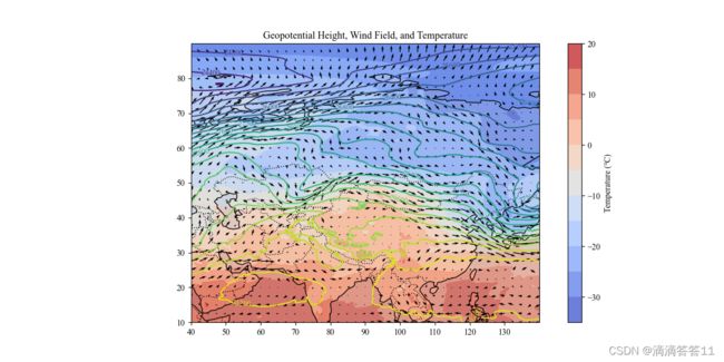
单图
"""
@Features:
@Author: xxx
@Date: 4/7/2024
"""
import matplotlib.pyplot as plt
import numpy as np
import pandas as pd
import netCDF4 as nc
import cartopy.feature as cfeature
import cartopy.crs as ccrs
from matplotlib.colors import Normalize
plt.rcParams['font.family'] = 'Times New Roman, SimSun'
plt.rcParams['mathtext.fontset'] = 'stix'
if __name__ == '__main__':
filename = 'data.nc'
dataset = nc.Dataset(filename)
height = dataset.variables['z'][:]
u_wind = dataset.variables['u'][:]
v_wind = dataset.variables['v'][:]
temperature = dataset.variables['t'][:] - 273.15
level = dataset.variables['level'][:]
time = dataset.variables['time']
real_time = nc.num2date(time, time.units).data
lon = dataset.variables['longitude'][:]
lat = dataset.variables['latitude'][:]
time_index = [37, 61, 78, 92]
height_index = [0, 4, 9, 15]
for t in time_index:
for h in height_index:
print(t, h)
fig = plt.figure(figsize=(12, 6))
ax = fig.add_subplot(1, 1, 1, projection=ccrs.PlateCarree())
ax.add_feature(cfeature.LAND)
ax.add_feature(cfeature.OCEAN)
ax.add_feature(cfeature.COASTLINE)
ax.add_feature(cfeature.BORDERS, linestyle=':')
c1 = ax.contour(lon, lat, height[t, h, :, :], levels=20, transform=ccrs.PlateCarree())
ax.clabel(c1, inline=True, fontsize=9)
c2 = ax.contourf(lon, lat, temperature[t, h, :, :], levels=10, cmap='coolwarm',
alpha=0.8, transform=ccrs.PlateCarree())
ax.quiver(lon[::10], lat[::10], u_wind[t, h, ::10, ::10], v_wind[t, h, ::10, ::10],
transform=ccrs.PlateCarree())
fig.colorbar(c2, label='Temperature (℃)', location='right')
ax.set_title('Geopotential Height, Wind Field, and Temperature')
ax.set_xticks(np.arange(lon[0], lon[-1], 10), crs=ccrs.PlateCarree())
ax.set_yticks(np.arange(lat[-1], lat[0], 10), crs=ccrs.PlateCarree())
plt.savefig(r'H:\pic\UTC-' + str(real_time[t])[:13] + '-Level-' + str(level[h]) + '.png')
多图
"""
@Features:
@Author:
@Date: 2024/5/26
"""
import matplotlib.pyplot as plt
import numpy as np
import pandas as pd
import netCDF4 as nc
import cartopy.feature as cfeature
import cartopy.crs as ccrs
from matplotlib.colors import Normalize
plt.rcParams['font.family'] = 'Times New Roman, SimSun'
plt.rcParams['mathtext.fontset'] = 'stix'
if __name__ == '__main__':
filename = 'data.nc'
dataset = nc.Dataset(filename)
height = dataset.variables['z'][:]
u_wind = dataset.variables['u'][:]
v_wind = dataset.variables['v'][:]
temperature = dataset.variables['t'][:] - 273.15
level = dataset.variables['level'][:]
time = dataset.variables['time']
real_time = nc.num2date(time, time.units).data
lon = dataset.variables['longitude'][:]
lat = dataset.variables['latitude'][:]
time_index = [37, 61, 72, 78, 92]
height_index = [0, 4, 9, 15]
for t in time_index:
fig = plt.figure(figsize=(12, 10))
for index, h in enumerate(height_index, start=1):
print(t, h)
ax = fig.add_subplot(2, 2, index, projection=ccrs.PlateCarree())
ax.add_feature(cfeature.LAND)
ax.add_feature(cfeature.OCEAN)
ax.add_feature(cfeature.COASTLINE)
ax.add_feature(cfeature.BORDERS, linestyle=':')
c1 = ax.contour(lon, lat, height[t, h, :, :], levels=20, transform=ccrs.PlateCarree())
ax.clabel(c1, inline=True, fontsize=9)
c2 = ax.contourf(lon, lat, temperature[t, h, :, :], levels=10, cmap='coolwarm',
alpha=0.8, transform=ccrs.PlateCarree())
ax.quiver(lon[::10], lat[::10], u_wind[t, h, ::10, ::10], v_wind[t, h, ::10, ::10],
transform=ccrs.PlateCarree())
cb = fig.colorbar(c2, label='Temperature (℃)', location='right', shrink=0.6)
cb.ax.yaxis.label.set_size(14)
for tick in cb.ax.get_yticklabels():
tick.set_fontsize(18)
ax.set_title('Geopotential Height, Wind Field, and Temperature')
ax.set_xticks(np.arange(lon[0], lon[-1], 10), crs=ccrs.PlateCarree())
ax.tick_params(axis='x', labelsize=18)
ax.set_yticks(np.arange(lat[-1], lat[0], 10), crs=ccrs.PlateCarree())
ax.tick_params(axis='y', labelsize=18)
ax.text(0.05, 0.95, "("+chr(ord('a') + index-1)+")", transform=ax.transAxes, fontsize=14,
va='top', ha='left', bbox=dict(boxstyle='round', facecolor='white', edgecolor='0.3', alpha=0.8))
plt.tight_layout()
plt.show()