WPF之Button控件详解
文章目录
-
- 1. 引言
- 2. Button控件基础
-
- Button类定义
- 3. Button控件的核心属性
-
- 3.1 Content属性
- 3.2 IsDefault属性
- 3.3 IsCancel属性
- 3.4 其他常用属性
- 4. 按钮样式与模板自定义
-
- 4.1 简单样式设置
- 4.2 使用Style对象
- 4.3 触发器使用
- 4.4 使用ControlTemplate完全自定义
- 4.5 按钮视觉状态
- 5. 命令绑定
-
- 5.1 命令基础
- 5.2 绑定到内置命令
- 5.3 自定义命令实现
-
- 5.3.1 使用RoutedCommand
- 5.3.2 使用RelayCommand(MVVM模式)
- 5.4 命令参数
- 6. 按钮类型
-
- 6.1 标准Button
- 6.2 ToggleButton
- 6.3 RepeatButton
- 6.4 从Button派生的控件
- 7. 按钮事件处理
-
- 7.1 Click事件
- 7.2 预览事件
- 7.3 按钮事件流程
- 7.4 事件处理最佳实践
- 8. 按钮的高级应用场景
-
- 8.1 图像按钮实现
- 8.2 创建自定义按钮控件
- 8.3 按钮的动画效果
- 8.4 使用按钮创建自定义控件
- 9. 性能和最佳实践
-
- 9.1 按钮性能优化
- 9.2 可访问性考虑
- 9.3 按钮使用的最佳实践
- 10. 总结
- 学习资源
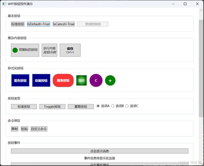
可以根据Github拉取示例程序运行
GitHub程序演示地址(点击直达)
也可以在本文资源中下载
1. 引言
在WPF应用程序开发中,Button控件是最基础也是使用频率最高的UI元素之一。它不仅提供了用户与应用程序交互的基本方式,还可以通过丰富的自定义选项创建出独特的用户体验。作为XAML UI框架的核心组件,深入理解Button控件的各个方面对于开发高质量WPF应用至关重要。
本文将全面深入地剖析WPF Button控件,包括其基本属性、样式自定义、命令绑定机制、不同按钮类型的实现、事件处理以及高级应用场景等。通过本文,您将能够掌握Button控件的方方面面,从基础应用到高级定制。
2. Button控件基础
Button控件继承自ContentControl,这意味着它可以包含任何类型的内容,而不仅仅是文本。在类继承层次上,Button的位置如下:
Button类定义
在.NET中,Button类的基本定义如下:
public class Button : ButtonBase
{
    // 构造函数
    public Button();

    // 依赖属性和事件
    public static readonly DependencyProperty IsDefaultProperty;  // 定义是否为默认按钮的依赖属性
    public static readonly DependencyProperty IsCancelProperty;   // 定义是否为取消按钮的依赖属性

    // 属性
    public bool IsDefault { get; set; }  // 获取或设置按钮是否为默认按钮(按Enter键时自动触发)
    public bool IsCancel { get; set; }   // 获取或设置按钮是否为取消按钮(按Esc键时自动触发)

    // 方法
    protected override void OnClick();  // 重写点击事件处理方法
    protected override AutomationPeer OnCreateAutomationPeer();  // 重写创建自动化对等体方法,用于辅助功能
    // 其他成员...
}
3. Button控件的核心属性
3.1 Content属性
由于Button继承自ContentControl,它拥有Content属性,可以设置为任何对象,包括字符串、图像、面板等:
<Button Content="点击我" />


<Button>
    <StackPanel Orientation="Horizontal">
        <Image Source="/Images/icon.png" Width="16" Height="16" Margin="0,0,5,0"/>
        <TextBlock Text="带图标的按钮"/>
    StackPanel>
Button>
在C#代码中设置:
// 文本内容
myButton.Content = "点击我";

// 复杂内容
StackPanel panel = new StackPanel { Orientation = Orientation.Horizontal };  // 创建水平方向的StackPanel作为按钮内容容器
panel.Children.Add(new Image
{
    Source = new BitmapImage(new Uri("/Images/icon.png", UriKind.Relative)),  // 设置图像源(相对路径)
    Width = 16,      // 设置图像宽度为16像素
    Height = 16,     // 设置图像高度为16像素
    Margin = new Thickness(0, 0, 5, 0)  // 设置图像右侧边距为5像素,使图像与文本有间隔
});
panel.Children.Add(new TextBlock { Text = "带图标的按钮" });  // 添加文本块作为按钮的文字部分
myButton.Content = panel;  // 将整个面板设置为按钮的内容
3.2 IsDefault属性
IsDefault属性当设置为true时,使按钮成为窗口的默认按钮。当用户在窗口中按下Enter键时,默认按钮将被自动点击:
<Button Content="确定" IsDefault="True" />
okButton.IsDefault = true;
这个属性特别适用于表单提交等场景,使用户可以通过按Enter键快速完成操作。
3.3 IsCancel属性
IsCancel属性当设置为true时,使按钮成为窗口的取消按钮。当用户在窗口中按下Esc键时,取消按钮将被自动点击:
<Button Content="取消" IsCancel="True" />
cancelButton.IsCancel = true;
这个属性适用于对话框等需要快速取消操作的场景。
3.4 其他常用属性
除了上述特有属性外,Button还继承了许多来自父类的重要属性:
| 属性名 | 描述 | 示例 |
|---|---|---|
| Background | 设置按钮背景 | |
| Foreground | 设置按钮前景(通常是文本颜色) | |
| FontSize | 设置按钮文本大小 | |
| Padding | 设置按钮内容的内边距 | |
| Margin | 设置按钮的外边距 | |
| HorizontalAlignment | 设置按钮在容器中的水平对齐方式 | |
| VerticalAlignment | 设置按钮在容器中的垂直对齐方式 | |
| Width/Height | 设置按钮的宽度/高度 | |
| IsEnabled | 设置按钮是否启用 | |
| Visibility | 设置按钮的可见性 | |
4. 按钮样式与模板自定义
WPF强大的样式系统允许我们从简单到复杂地自定义Button的外观。
4.1 简单样式设置
最基本的样式设置可以直接通过设置按钮属性完成:
<Button Content="样式化按钮"
        Background="DarkBlue"
        Foreground="White"
        FontWeight="Bold"
        Padding="10,5"
        BorderBrush="LightBlue"
        BorderThickness="2" />
Padding属性设置为一个值时代表上下左右有着相同的设置边距 Padding=“5”
Padding属性设置为两个值时代表左右边距为第一个设置值,上下边距为第二个值
Padding属性设置为四个值时,其内属性依次代表左上右下的边距
4.2 使用Style对象
更系统的方式是创建Style对象:
<Window.Resources>
    <Style x:Key="BlueButton" TargetType="Button">
        "Background" Value="DarkBlue" />
        "Foreground" Value="White" />
        "FontWeight" Value="Bold" />
        "Padding" Value="10,5" />
        "BorderBrush" Value="LightBlue" />
        "BorderThickness" Value="2" />
    Style>
Window.Resources>

<Button Content="样式化按钮" Style="{StaticResource BlueButton}" />
在C#中动态应用样式:
Style blueButtonStyle = (Style)FindResource("BlueButton");
myButton.Style = blueButtonStyle;
4.3 触发器使用
触发器允许按钮在不同状态下有不同的外观:
<Style x:Key="AnimatedButton" TargetType="Button">
    "Background" Value="DarkBlue" />
    "Foreground" Value="White" />
    "FontWeight" Value="Bold" />
    "Padding" Value="10,5" />

        "IsMouseOver" Value="True">
            "Background" Value="RoyalBlue" />
            "Foreground" Value="Yellow" />

        "IsPressed" Value="True">
            "Background" Value="Navy" />
            "RenderTransform">

                    "0.95" ScaleY="0.95" />


        "IsEnabled" Value="False">
            "Opacity" Value="0.5" />


Style>
4.4 使用ControlTemplate完全自定义
要彻底改变按钮的外观,我们需要使用ControlTemplate:
<Style x:Key="RoundedButton" TargetType="Button">
    "Background" Value="#FF3333" />
    "Foreground" Value="White" />
    "FontWeight" Value="Bold" />
    "Padding" Value="15,7" />
    "Template">

            "Button">
                "{TemplateBinding Background}"
                        CornerRadius="20"
                        BorderBrush="#AA0000"
                        BorderThickness="1"
                        Padding="{TemplateBinding Padding}">
                    "Center"
                                      VerticalAlignment="Center" />

                        "2" Opacity="0.3" />


                    "IsMouseOver" Value="True">
                        "Background" Value="#FF6666" />

                    "IsPressed" Value="True">
                        "Background" Value="#CC0000" />
                        "RenderTransform">

                                "1" />


Style>
上面的代码创建了一个圆角按钮,具有悬停和按下效果,还包含阴影效果。
4.5 按钮视觉状态
按钮有几个视觉状态,它们显示了按钮的各种交互状态:
了解这些状态转换对于创建流畅的用户体验非常重要。
5. 命令绑定
WPF的命令系统是它的一个强大特性,Button可以与命令直接绑定,实现视图与逻辑的解耦。
5.1 命令基础
命令是实现ICommand接口的对象,该接口定义了Execute和CanExecute方法,以及CanExecuteChanged事件:
public interface ICommand
{
    void Execute(object parameter);
    bool CanExecute(object parameter);
    event EventHandler CanExecuteChanged;
}
5.2 绑定到内置命令
WPF提供了一组内置命令,如ApplicationCommands.Cut、EditingCommands.MoveToStart等:
<Button Command="ApplicationCommands.Copy" Content="复制" />
5.3 自定义命令实现
5.3.1 使用RoutedCommand
// 定义命令
public static readonly RoutedCommand CustomCommand = new RoutedCommand("Custom", typeof(MainWindow));

// 注册命令绑定
CommandBindings.Add(new CommandBinding(CustomCommand, ExecuteCustomCommand, CanExecuteCustomCommand));

private void ExecuteCustomCommand(object sender, ExecutedRoutedEventArgs e)
{
    // 执行命令逻辑
    MessageBox.Show("自定义命令已执行!");
}

private void CanExecuteCustomCommand(object sender, CanExecuteRoutedEventArgs e)
{
    // 确定命令是否可执行的逻辑
    e.CanExecute = true; // 或其他条件
}
<Button Command="{x:Static local:MainWindow.CustomCommand}" Content="自定义命令" />
5.3.2 使用RelayCommand(MVVM模式)
在MVVM设计模式中,常用RelayCommand实现ICommand:
public class RelayCommand : ICommand
{
    private readonly Action<object> _execute;    // 存储要执行的操作委托
    private readonly Predicate<object> _canExecute;    // 存储用于判断命令是否可执行的委托

    public RelayCommand(Action<object> execute, Predicate<object> canExecute = null)
    {
        _execute = execute ?? throw new ArgumentNullException(nameof(execute));    // 如果execute为null,抛出参数空异常
        _canExecute = canExecute;    // canExecute可以为null,表示命令总是可执行的
    }

    public bool CanExecute(object parameter)
    {
        return _canExecute == null || _canExecute(parameter);    // 如果_canExecute为null,返回true;否则调用_canExecute委托
    }

    public void Execute(object parameter)
    {
        _execute(parameter);    // 调用_execute委托执行命令操作
    }

    public event EventHandler CanExecuteChanged
    {
        add { CommandManager.RequerySuggested += value; }    // 添加事件处理程序到CommandManager的RequerySuggested事件
        remove { CommandManager.RequerySuggested -= value; }    // 从CommandManager的RequerySuggested事件中移除事件处理程序
    }
}
在ViewModel中使用:
public class MainViewModel : INotifyPropertyChanged
{
    private ICommand _saveCommand;
    public ICommand SaveCommand
    {
        get
        {
            return _saveCommand ?? (_saveCommand = new RelayCommand(
                param => SaveData(),    // 命令执行时调用SaveData方法
                param => CanSaveData()  // 判断命令是否可执行,通过CanSaveData方法判断
            ));
        }
    }

    private bool CanSaveData()
    {
        // 检查条件
        return !string.IsNullOrEmpty(Data);  // 当Data不为空或空字符串时,保存命令可执行
    }

    private void SaveData()
    {
        // 保存数据逻辑
        // 这里实现具体的数据保存操作
    }

    private string _data;
    public string Data
    {
        get { return _data; }
        set
        {
            if (_data != value)
            {
                _data = value;
                OnPropertyChanged(nameof(Data));  // 通知UI数据已更改
                // 通知UI更新命令可执行状态
                CommandManager.InvalidateRequerySuggested();  // 强制重新评估命令的可执行状态
            }
        }
    }

    public event PropertyChangedEventHandler PropertyChanged;
    protected void OnPropertyChanged(string propertyName)
    {
        PropertyChanged?.Invoke(this, new PropertyChangedEventArgs(propertyName));  // 触发属性更改事件
    }
}
在XAML中绑定:
<Button Command="{Binding SaveCommand}" Content="保存" />
5.4 命令参数
命令可以接收参数来影响其行为:
<Button Command="{Binding DeleteCommand}" CommandParameter="{Binding SelectedItem}" Content="删除" />
public ICommand DeleteCommand
{
    get
    {
        return new RelayCommand(
            param => DeleteItem(param as Item),
            param => param != null && CanDeleteItem(param as Item)
        );
    }
}
6. 按钮类型
WPF提供了几种不同类型的按钮,每种都有特定的用途。
6.1 标准Button
最常见的按钮类型,点击后触发Click事件:
<Button Content="标准按钮" Click="Button_Click" />
6.2 ToggleButton
ToggleButton是一种可以在选中和未选中状态之间切换的按钮:
<ToggleButton Content="切换按钮" IsChecked="{Binding IsSomethingEnabled}" />
ToggleButton提供了Checked和Unchecked事件,以及三态支持(通过IsThreeState属性):
private void ToggleButton_Checked(object sender, RoutedEventArgs e)
{
    // 处理按钮被选中的情况
}

private void ToggleButton_Unchecked(object sender, RoutedEventArgs e)
{
    // 处理按钮被取消选中的情况
}
6.3 RepeatButton
RepeatButton是一种在按住时会连续触发Click事件的按钮:
<RepeatButton Content="重复按钮" Click="RepeatButton_Click" Delay="500" Interval="100" />
RepeatButton有两个特殊属性:
- Delay:首次Click触发前的延迟(毫秒)
- Interval:后续Click事件之间的间隔(毫秒)
适用场景包括数值调整、滚动等需要重复操作的情况。
6.4 从Button派生的控件
一些常用控件也是从Button派生的:
-
CheckBox:
<CheckBox Content="选项1" IsChecked="{Binding IsOption1Selected}" /> -
RadioButton:
<StackPanel>
    <RadioButton Content="选项A" GroupName="Options" IsChecked="{Binding IsOptionASelected}" />
    <RadioButton Content="选项B" GroupName="Options" IsChecked="{Binding IsOptionBSelected}" />
    <RadioButton Content="选项C" GroupName="Options" />
StackPanel>
7. 按钮事件处理
Button控件具有多种事件,使我们能够响应用户交互。
7.1 Click事件
最常用的按钮事件是Click,当用户点击按钮时触发:
<Button Content="点击我" Click="Button_Click" />
private void Button_Click(object sender, RoutedEventArgs e)
{
    MessageBox.Show("按钮被点击了!");
}
7.2 预览事件
WPF的事件路由系统包括隧道事件(PreviewXXX)和冒泡事件(XXX)。预览事件在冒泡事件之前触发,从根元素向下传播:
<Button Content="点击我" PreviewMouseDown="Button_PreviewMouseDown" MouseDown="Button_MouseDown" />
private void Button_PreviewMouseDown(object sender, MouseButtonEventArgs e)
{
    Console.WriteLine("PreviewMouseDown 事件触发");
    // 可以通过 e.Handled = true 阻止事件继续传播
}

private void Button_MouseDown(object sender, MouseButtonEventArgs e)
{
    Console.WriteLine("MouseDown 事件触发");
}
7.3 按钮事件流程
按钮点击的完整事件序列如下:
7.4 事件处理最佳实践
MVVM模式中的事件处理
在MVVM模式中,我们通常使用命令而不是事件处理器:
<Button Content="保存" Command="{Binding SaveCommand}" />
这样可以更好地分离UI和业务逻辑。
事件到命令的转换
有时需要将事件转换为命令,特别是对于不支持命令的事件。可以使用行为(Behaviors)实现这一点:
<Button Content="特殊按钮">
    <i:Interaction.Triggers>
        <i:EventTrigger EventName="MouseEnter">
            <i:InvokeCommandAction Command="{Binding MouseEnterCommand}" />
        i:EventTrigger>
    i:Interaction.Triggers>
Button>
8. 按钮的高级应用场景
8.1 图像按钮实现
创建图像按钮有多种方式:
使用Image控件作为Content
<Button>
    <Image Source="/Images/save_icon.png" Width="24" Height="24" />
Button>
结合图像和文本
<Button>
    <StackPanel Orientation="Horizontal">
        <Image Source="/Images/save_icon.png" Width="16" Height="16" Margin="0,0,5,0" />
        <TextBlock Text="保存" />
    StackPanel>
Button>
使用ImageBrush作为背景
<Button Width="40" Height="40">
    <Button.Background>
        <ImageBrush ImageSource="/Images/play_button.png" />
    Button.Background>
Button>
8.2 创建自定义按钮控件
对于特殊需求,我们可以创建自定义按钮控件:
public class CircleButton : Button
{
    static CircleButton()
    {
        // 覆盖默认样式
        DefaultStyleKeyProperty.OverrideMetadata(
            typeof(CircleButton),
            new FrameworkPropertyMetadata(typeof(CircleButton)));  // 将默认样式键设置为CircleButton类型,确保应用时查找正确的样式
    }

    public double Radius
    {
        get { return (double)GetValue(RadiusProperty); }  // 获取Radius依赖属性的值
        set { SetValue(RadiusProperty, value); }          // 设置Radius依赖属性的值
    }

    public static readonly DependencyProperty RadiusProperty =
        DependencyProperty.Register(
            "Radius",                    // 属性名
            typeof(double),              // 属性类型
            typeof(CircleButton),        // 属性所有者类型
            new PropertyMetadata(20.0)); // 默认值为20.0
}
在Themes/Generic.xaml中定义样式:
<Style TargetType="{x:Type local:CircleButton}">
"Template" >
" {x:Type local:CircleButton}">
"{TemplateBinding Radius}"
Height="{TemplateBinding Radius}"
Fill="{TemplateBinding Background}" />
"Center"
VerticalAlignment="Center" />
Style>
8.3 按钮的动画效果
可以为按钮添加各种动画效果,增强交互体验:
悬停动画
<Style x:Key="AnimatedButton" TargetType="Button">
    "Background" Value="Blue" />
    "Foreground" Value="White" />

        "Mouse.MouseEnter">


                    "(Button.Background).(SolidColorBrush.Color)"
                                    To="LightBlue" Duration="0:0:0.2" />
                    "(Button.RenderTransform).(ScaleTransform.ScaleX)"
                                     To="1.1" Duration="0:0:0.2" />
                    "(Button.RenderTransform).(ScaleTransform.ScaleY)"
                                     To="1.1" Duration="0:0:0.2" />


        "Mouse.MouseLeave">


                    "(Button.Background).(SolidColorBrush.Color)"
                                    To="Blue" Duration="0:0:0.2" />
                    "(Button.RenderTransform).(ScaleTransform.ScaleX)"
                                     To="1.0" Duration="0:0:0.2" />
                    "(Button.RenderTransform).(ScaleTransform.ScaleY)"
                                     To="1.0" Duration="0:0:0.2" />


    "RenderTransformOrigin" Value="0.5,0.5" />
    "RenderTransform">

            "1" ScaleY="1" />


Style>
8.4 使用按钮创建自定义控件
按钮可以作为自定义控件的基础,例如创建评分控件:
public class RatingControl : Control
{
    public static readonly DependencyProperty ValueProperty =
        DependencyProperty.Register(
            "Value",                    // 属性名:当前评分值
            typeof(int),                // 属性类型:整数
            typeof(RatingControl),      // 所有者类型:RatingControl
            new PropertyMetadata(0, OnValueChanged));  // 默认值为0,并指定属性变更时的回调方法

    public int Value
    {
        get { return (int)GetValue(ValueProperty); }  // 获取当前评分值
        set { SetValue(ValueProperty, value); }       // 设置当前评分值
    }

    public static readonly DependencyProperty MaximumProperty =
        DependencyProperty.Register(
            "Maximum",                  // 属性名:最大评分值
            typeof(int),                // 属性类型:整数
            typeof(RatingControl),      // 所有者类型:RatingControl
            new PropertyMetadata(5, OnMaximumChanged));  // 默认值为5,并指定属性变更时的回调方法

    public int Maximum
    {
        get { return (int)GetValue(MaximumProperty); }  // 获取最大评分值
        set { SetValue(MaximumProperty, value); }       // 设置最大评分值
    }

    private static void OnValueChanged(DependencyObject d, DependencyPropertyChangedEventArgs e)
    {
        ((RatingControl)d).UpdateStars();  // 当Value属性变更时,更新星星显示
    }

    private static void OnMaximumChanged(DependencyObject d, DependencyPropertyChangedEventArgs e)
    {
        ((RatingControl)d).UpdateStars();  // 当Maximum属性变更时,更新星星显示
    }

    private StackPanel _starPanel;  // 用于存放星星按钮的面板

    static RatingControl()
    {
        DefaultStyleKeyProperty.OverrideMetadata(
            typeof(RatingControl),
            new FrameworkPropertyMetadata(typeof(RatingControl)));  // 设置默认样式键
    }

    public override void OnApplyTemplate()
    {
        base.OnApplyTemplate();
        _starPanel = GetTemplateChild("PART_StarPanel") as StackPanel;  // 从模板中获取名为"PART_StarPanel"的面板元素
        UpdateStars();  // 应用模板后更新星星显示
    }

    private void UpdateStars()
    {
        if (_starPanel == null) return;  // 如果面板未初始化,直接返回

        _starPanel.Children.Clear();  // 清除现有的所有星星按钮

        for (int i = 1; i <= Maximum; i++)
        {
            Button starButton = new Button();
            starButton.Content = i <= Value ? "★" : "☆";  // 如果当前索引小于等于Value,显示实心星星,否则显示空心星星
            starButton.Tag = i;  // 将按钮索引保存在Tag属性中
            starButton.Click += StarButton_Click;  // 添加点击事件处理
            _starPanel.Children.Add(starButton);  // 将按钮添加到面板中
        }
    }

    private void StarButton_Click(object sender, RoutedEventArgs e)
    {
        Button button = sender as Button;
        if (button != null)
        {
            Value = (int)button.Tag;  // 点击星星时,将Value设置为对应星星的索引
        }
    }
}
9. 性能和最佳实践
9.1 按钮性能优化
- 尽量避免复杂的控件模板:复杂的视觉树会影响性能。
- 合理使用缓存:对于不经常变化的视觉元素,考虑使用BitmapCache。
- 小心使用动画:过多或过于复杂的动画可能会影响性能。
- 适当使用虚拟化:在有大量按钮的列表中,使用VirtualizingStackPanel等。
<Button Content="高性能按钮">
    <Button.CacheMode>
        <BitmapCache />
    Button.CacheMode>
Button>
9.2 可访问性考虑
- 提供适当的自动化属性:
<Button Content="保存" AutomationProperties.Name="保存文档" AutomationProperties.HelpText="将当前文档保存到文件" />
-
确保键盘导航:按钮应该可以通过Tab键聚焦,并通过空格/回车键激活。
-
为图像按钮提供文本替代:
<Button AutomationProperties.Name="保存">
    <Image Source="/Images/save_icon.png" />
Button>
9.3 按钮使用的最佳实践
- 适当的大小和间距:确保按钮足够大,使用户能轻松点击,尤其是在触摸屏上。
- 一致的视觉样式:在整个应用程序中保持一致的按钮样式,提高用户体验。
- 清晰的标签:按钮标签应该简短、明确地表示操作。
- 使用命令而不是事件处理器:遵循MVVM模式,提高代码的可维护性。
- 视觉反馈:当按钮被点击、禁用或者出错时,提供适当的视觉反馈。
- 考虑国际化:按钮文本应该能够适应不同语言,允许文本长度变化。
10. 总结
WPF Button控件作为最基础的交互元素,在功能和样式上都有很高的灵活性。本文深入探讨了Button的基本属性、样式自定义、命令绑定、事件处理以及高级应用场景等方面,希望能帮助开发者在WPF应用程序中更好地使用Button控件。
从简单的文本按钮到复杂的自定义控件,Button提供了丰富的可能性,使我们能够创建出既美观又实用的用户界面。通过合理使用Button控件的各种特性,我们可以提升应用程序的用户体验,简化用户操作,并提高开发效率。
学习资源
以下是一些深入学习WPF Button控件的优质资源:
- 微软官方文档:Button类
- WPF控件深入详解系列 - MSDN
- WPF UI指南 - 按钮设计最佳实践
- 命令系统深入解析
- WPF示例代码库
- WPF动画教程
- Stack Overflow上的WPF按钮问题集
通过系统学习和不断实践,你将能够充分利用WPF Button控件的强大功能,创建出更加直观、易用的用户界面。