最新的HTML,CSS和JS的开发技术
This article first appeared in issue 234 of .net magazine – the world's best-selling magazine for web designers and developers.
A technique, at its core, is a way to carry out a task and, being frontend developers and designers, we have a lot of tasks. That said, we often forget how much this landscape has changed. From 2002 to 2010 our community was rotten with code and resource bloat, hindering performance and maintainability. To overcome this, we created a slew of tips, tricks and hacks we dubbed ‘technique’. We were still accomplishing tasks, just not in the most efficient manner.
Doing a 360, the last few years have seen better standards and standards implementations spring to life, enabling us as a community to develop newer and more advanced ‘techniques’. This new landscape is what’s considered the ‘modern web’.
As ‘Web 2.0’ became stagnant and confusing, so too will the ‘modern web’. Give it time. That said, for now, we can use and abuse the term so long as there is a common understanding of what it represents.
In 2010 the HTML5 specification landed, providing a brand new, semi-standardised web environment. Browsers such as Opera, Firefox, Chrome and Safari embraced this new wave and pushed their dev teams to new limits of standards implementations and API exploration. To give you an idea of how ‘onboard’ these browsers are, check www.html5readiness.com’s visualisations of changing HTML5 support.
ADVERTISEMENT
Don’t be worried about the lack of support in Internet Explorer. We can combat this thanks toGoogle Chrome Frame. Since Google introduced it in 2010 it’s become the go-to support mechanism for Internet Explorer. All versions of IE can be targeted with Chrome Frame, which prompts a new user to download a plug-in that renders opted-in websites with a lightweight version of Chrome, inside IE. To implement Chrome Frame we add the following <meta> tag within our site’s <head> tag.
-
<meta http-equiv="X-UA-Compatible" content=" chrome=1" />
From here we can prompt IE users to download the plug-in, if not already installed, using JavaScript:
-
<script type = "text/javascript" src = "http://ajax.
-
googleapis.com/ajax/libs/chrome-frame/1/CFInstall.
-
min.js" ></script >
-
<script >
-
window. onload = function ( ) {
-
CFInstall. check ( {
-
mode : "overlay" ,
-
destination : "http://www.yourdomain.com"
-
} ) ;
-
} ;
-
</script >
>> destination can be set to send the user to a certain link after installing the plug-in. A word of caution: though Chrome Frame gives us a method to develop strictly for truly modern browsers, we mustn’t forget that the user has the option of not downloading the plug-in if they don’t want to. If they don’t, and you are required to provide support for one or other different versions of IE, you’ll have to spend some more time finding out what you can and can’t provide, with your experiences, cross-browser.
With this code providing a considerably more level playing field on which to develop on the modern web stack, we can move forward with our minds at ease. You may remember having to create a number of browser-specific hacks to get your site structured right cross-browser, creating a countless number of empty elements to be used with your sliced images, or even writing overly verbose or redundant JavaScript code to get the simplest of functionality to work. All these pains are, in some sense, the same problems we worry about today. We’re still fighting for more control and better tools to combat layout, style and functionality but on a level that’s mature.
 A chart from www.html5readiness.com showing 2012 HTML5 and CSS3 readiness across browsers
Layout
Clearfix
Floating an element was introduced back in CSS 2.1 but never quite turned out to be the complete solution we had hoped. One of the biggest problems was maintaining a parent element’s dimensions when a child element was floated. To address this, the clearfix technique was created.
Take the following HTML:
-
<div class="wrapper clearfix">
-
<div class="left">... </div>
-
<div class="right">... </div>
-
</div>
This technique was written by Nicolas Gallagher:
-
.clearfix :before ,
-
.clearfix :after {
-
content : " " ;
-
display : table ;
-
}
-
.clearfix :after {
-
clear : both ;
-
}
-
.clearfix {
-
*zoom : 1 ;
-
}
>> If you use HTML5Boilerplate to kick off your projects, then you’ll already have this version of the clearfix technique baked in.
Box-sizing
For years developers debated which box model implementation made more sense. Quirks vs Standards mode really meant: ‘should an element’s dimensions change, after being set, when borders and padding are applied, or not’. It’s now widely agreed that it makes more sense for borders and padding to take away from the available space within an element, and not add to the element’s width or height. The debate has been made irrelevant with the widespread implementation of box-sizing. The browser will take its cues from you instead of vice versa.
Popularised by Chris Coyier and Paul Irish, an all-encompassing technique can be implemented with the following:
-
* {
-
-webkit-box-sizing : border-box ;
-
-moz-box-sizing : border-box ;
-
box-sizing : border-box ;
-
}
>> Using the * selector in CSS has been debated, due to potential performance hits. These kinds of claims are frivolous if you aren’t hyper-optimising all other aspects of your website/app. Using border-box will make the browser add padding and borders inside the available space set. ‘Standards Mode’ can be used by setting box-sizing to content-box.
Multi-columns
The web was greatly inspired by written form and type. Unfortunately, we got stuck at the parchment phase. Some of these issues are coming to a head with long awaited Paged-Media and CSS Regions specifications. That said, the first steps toward more magazine-like layouts were taken when browsers began implementing CSS multi-columns. The code to generate this effect is rather straightforward:
-
p {
-
-webkit-column-count : 2 ;
-
-moz-column-count : 2 ;
-
column-count : 2 ;
-
}
>> You can learn more about the CSS3 multi-column specification, as well as a JavaScript fallback that you can use for any browser without support, from A List Apart’s blog.
Calculations
Calculating dimensions can be hard. Back in the old days, we had no way of doing any kind of unit calculations, let alone mixed unit calculations. That’s all changed thanks to calc. Creating a padded effect that doesn’t affect the initial elements width or utilise something like box-sizing:border-box; was, until recently, only possible by adding extra containing elements.
-
.padded {
-
margin : 0 auto ;
-
position : relative ;
-
width : -webkit-calc ( 100% - ( 20px * 2 ) ) ;
-
width : -moz-calc ( 100% - ( 20px * 2 ) ) ;
-
width : calc ( 100% - ( 20px * 2 ) ) ;
-
}
>> calc() takes care of the proper width calculation based on .padded’s parent width and minus a defined 20px padding. I multiplied this by 2 for either side of my element, centring the element utilising relative positioning and a left and right margin auto.
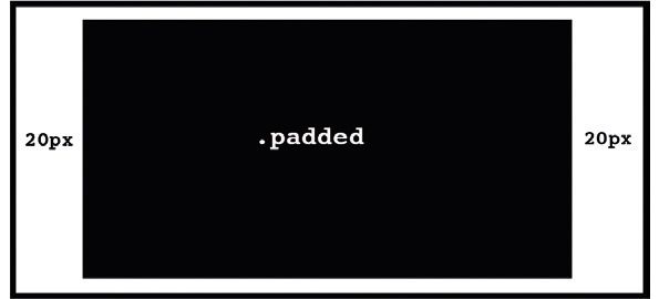 calc() has made calculating dimensions easier
Style
Transparency
Getting the right style of an element has always been dependent on the kind of tools we’ve had available to us in CSS. Transparency is one of the first support variants you would run into in the early to mid-2000s.
With the advent of HTML5 and more focused standards efforts, browsers have a standard implementation of the opacity property, and have exposed alpha channel support as per the new Color Module specification. This includes RGBA and HSLA guidelines.
-
a {
-
color : rgba ( 0 , 255 , 0 , 0.5 ) ;
-
background : rgba ( 0 , 0 , 255 , 0.05 ) ;
-
border : rgba ( 255 , 0 , 0 , 0.5 ) ;
-
}
>> You can use RGBA or HSLA colours wherever you’d find HEX values. There’s also an extended list of fun colours with defined names you can check out right in the specification. These come in handy when you want to create a dynamic blend between elements.
Filters
CSS filters are extremely exciting. Having the ability to dynamically change the look and feel of elements on a page without the need for third party plug-ins is amazing, and will help to vastly reduce your time spent in Photoshop.
-
<img src="market.jpg">
-
img {
-
-webkit-filter: grayscale(100%);
-
}
>> CSS filters are only currently supported in WebKit browsers so their use should be of the additive nature, not dependent. Read more here.
 CSS filters enable in-browser tweaking of page elements’ look and feel. More examples of the exciting bevy of filters available can be found here
Image replacement
Replacing text with images has been around for a long time. Unfortunately, there are still drawbacks, accessibility-wise, to the latest and most sophisticated image replacement techniques. But two have recently come to light that are extremely clever, and unique in their own rights. The first was written by Scott Kellman:
-
<h1 class = 'hide-text' >My Website 's Logo</h1>
-
.hide-text {
-
text-indent: 100%;
-
white-space: nowrap;
-
overflow: hidden;
-
}
The second was written by Nicolas Gallagher:
-
.hide- text {
-
font : 0/ 0 a ;
-
text-shadow : none ;
-
color : transparent ;
-
}
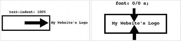 Image switch methods by Scott Kellman and Nicolas Gallagher
Responsive video
Getting media to correctly scale in a responsive environment can be challenging. With more and more websites respecting adaptive design, it’s essential to handle elements’ dimensions and aspect ratio properly.
Embedded video has been one of the more challenging media types to wrangle because of the way in which third-party services serve up the content. A typical YouTube embed looks something like this:
-
<iframe width="640" height="390" src="http:// www.youtube.com/embed/oHg5SJYRHA0"frameborder="0" allowfullscreen=""></iframe>
The iframe element then contains a Flash object or embed element. Using something like iframe { maxwidth: 100%; } will not work because the nested elements do not resize properly when the width changes. So, we have to do some trickery.
-
<div class="video">
-
<iframe width="640" height="390" src="http://www.youtube.com/embed/oHg5SJYRHA0"frameborder="0" allowfullscreen=""></iframe>
-
</div>
>> Wrapping the iframe in another element will give us the control we need to add proper responsive functionality to the video.
-
.video {
-
position : relative ;
-
padding-bottom : 56.25% ;
-
height : 0 ;
-
overflow : hidden ;
-
}
-
.video iframe ,
-
.video object ,
-
.video embed {
-
position : absolute ;
-
top : 0 ;
-
left : 0 ;
-
width : 100% ;
-
height : 100% ;
-
}
>> Setting the .video wrapper’s padding-bottom: 56.25%; is the magic in this method. Using padding means the percentage used will be based on the parent’s width; ‘56.25%’ will create a 16:9 aspect ratio. Do the maths yourself, if you want. 9 / 16 = 0.5625. 0.5625 * 100 = 56.25 (this is our per cent).
Functionality
Easily selecting elements
With the popularity of a number of JavaScript libraries (jQuery, for example), the ECMAScript committee and W3C standards took note of one of the core pieces of functionality developers lacked natively – good element selection. Methods such as getElementByID() and getElementByClassName() were fast but not as flexible and robust as the selector engines coming from the developer community; querySelectorAll() was the standards body’s way of mimicking some of that flexibility in a native selector method.
-
var items = document. querySelectorAll ( '#header .item' ) ;
>> querySelectorAll() can be passed multiple and mixed selectors. Read more on this.
Creating new arrays
Iterating over an array is something that’s become tiresome to write. Writing and rewriting for() loops isn’t fun. In JS version 1.6 the map() method landed providing support for an easy way to iterate over and create a new array from another.
-
var people = [ 'Heather' , 'James' , 'Kari' , 'Kevin' ] ;
-
var welcomes = people. map ( function ( name ) {
-
return 'Hi ' + name + '!' ;
-
} ) ;
Running this code, if we were to console.log(welcomes) you’d see welcomes is a new array [ ‘Hi Heather!’, ‘Hi James!’, ‘Hi Kari!’, ‘Hi Kevin!’ ].
Clean document and window objects
Third party JavaScript libraries are prone to messing with native document and window objects. This can be a problem for other third party libraries, and the developer including them. As either party, ensure you’re working with a clean version of both objects by creating a new instance of them. The best way to do this is by creating an iframe element, inserting it into the DOM and storing the new instances of those objects.
-
var iframe = document. createElement ( 'iframe' ) ;
-
iframe. style. display = "none" ;
-
iframe = document. body. appendChild (iframe ) ;
-
var _window = iframe. contentWindow ;
-
var _document = iframe. contentDocument ||
-
iframe. contentWindow. document ;
-
document. body. removeChild (iframe ) ;
Though there have been big improvements to the web stack, continuing to round out and sophisticate our technology suite to meet the challenges we face within our project’s layout, style and functionality is still hugely important. To maintain a good ecosystem of growth we must encourage standards bodies and browser vendors to continue progress with new specifications and innovative feature implementations while sharing our own knowledge with fellow developers and designers. More insights, less hacks.