The smartphone isn’t just a phone – it has evolved into the primary communication device for the average person. And not just the usual one-on-one calling communication that a phone entails, but interaction with the world at large. With the Internet access that smartphones provide, users can research, browse, and shop at any time, in any place.
According to Internet Retailer, a report by comScore Inc. titled “State of the U.S. Online Retail Economy, Q1 2013” compared the mobile shopping habits of users in February 2010 and February 2013. The report found that the amount of time consumers spent with online retail rose 104% to 34.9 billion minutes in February 2013 compared with 17.1 billion minutes in February 2010. Time spent with online retail on smartphones exponentially increased, going from 2.7 billion minutes to 12.9 billion minutes.
With more minutes spent perusing web stores on their smartphones, people are growing more comfortable with making their purchases there as well. Citing Forrester Research Inc., Internet Retailer states that U.S. consumers made $8 billion worth of retail purchases via smartphones in 2012, 3% of total e-commerce sales.
As the smartphone continues to evolve into the future of computing and connecting, retailers need to evolve with it as well. Creating a mobile store that makes shopping and purchasing quick, easy, and painless is crucial for getting mobile users to keep returning. Please read our tips below for optimizing your mobile store offering.
Clean and Compact Layout
When designing your mobile store, remember the screen you’re designing for. Since the typical smartphone screen is much smaller than a traditional desktop or laptop computer, you have to be mindful of what you display and how you display it – you can’t fit everything.
Simplifying and focusing are key to an effective mobile phone layout. When a mobile user visits your mobile store, they should be able to instantly understand how to navigate to what they’re looking for.
A mobile store should follow the same design aesthetic as the online store site, but it should be tailored for clear, simple navigation.
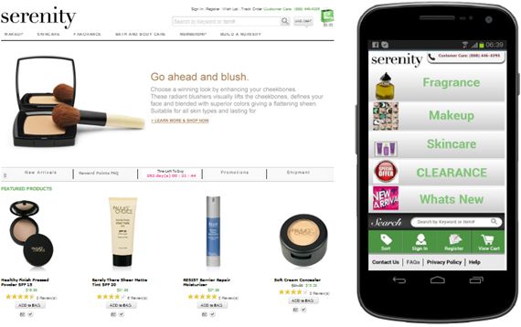
Take the two images above as an example. The Serenity cosmetics store’s mobile store incorporates the design aesthetic of the retailer’s online store, but the layout of both stores are designed according to very different devices. Given that the online store is accessible from a desktop or laptop computer, it contains a variety of different product options that the computer user can browse at leisure. The store displays various images of the products themselves, and offers different entry points to get deeper into site – for instance, a browser can click through the categories at the top, or on the products in the “Featured Products” section, etc.
The mobile store, on the other hand, makes the most out of its limited screen size and shows necessary information in a clear, concise way. The mobile shopper sees what is available on the platform, and can navigate to it accordingly. The simple column layout of brief text and images creates a clean, straightforward site – too much text or too many images would clutter the screen and overwhelm the mobile shopper, which naturally would make them leave. By keeping a streamlined look-and-feel, mobile retailers help shoppers focus on the reason they’re there in the first place – to check out the merchandise.
Straightforward Navigation
With the mobile store home page providing a clear and easy guide for mobile shoppers, shoppers then must be able to locate items quickly and easily.
Once such way is by ensuring that a search box is prominent, and that the same powerful search capabilities that desktop or laptop users enjoy are available for mobile users as well. Not being able to search for an item is very frustrating, and given that mobile phone users are all about instant gratification, hidden search boxes are not going to fly.
In addition to making it easy for mobile users to get around your site, properly showcasing your product pages for mobile viewers are also important. For example, allowing them to see an image of the product, product ratings, and/or additional relevant information – all while continuing to keep the page clean and uncluttered – gives them the information they need, which in turn motivates them to buy.
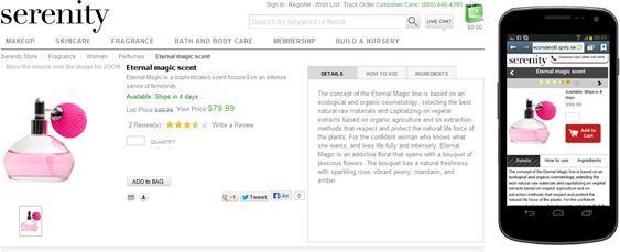
Displaying product information in a “tab view” is helpful for keeping an orderly mobile store product page. Take a look at the mobile image above for an example of tab view format. Product details, instructions on how to use the product, and ingredients that are used in the product are arranged in tabs below the image and the “Add to Cart” button.
This is the same information that’s on the web store (left), but because of the limited space of the mobile screen (and thus its conduciveness for vertical scrolling), putting the information in clearly marked tabs provides good content visibility, as well as makes reading easier. So the mobile shopper gets access to the same information as a web store shopper, but the information is packaged in a user-friendly, easily digestible way.
Making Checkout as Easy as 1-2-3
The fewer clicks it takes to complete a purchase from a mobile store, the better – for both the shopper (getting what he or she wants) and you (increasing your revenues).
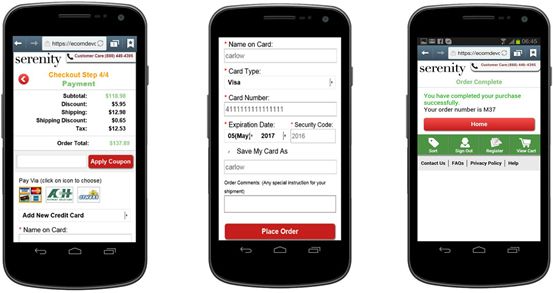
The Ignify eCommerce mobile platform requires users to input log-in information before placing an order – which saves customers time by saving billing and shipping information for future purchases. And once their information is saved, the customer should be able to finish checking out with just a couple more clicks.
Streamlining the checkout process so that it takes the fewest number of steps (and clicks) possible is crucial for driving shopping cart conversion.
By giving your customers a quick and easy shopping experience, you give them an enticing incentive to return – and your competitors are realizing this as well. According to a recent poll conducted by Forrester Research, Inc., 32% of e-business professionals plan to spend at least $1 million on mobile this year compared to 24% who planned to spend that much in 2012.
With other companies understanding the advantage of a strong mobile store solution, it’s time for you to jump in and invest in mobile technology right away.


