移动电子商务网站可用性-商品页面和购物车
原文链接:
http://www.getelastic.com/mobile-commerce-usability-product-pages-and-cart-summary/
This is the third installment of a 4 part series on mobile commerce design and usability:
Part 1: Home Pages and Navigation
Part 2: Search and Category Pages
Part 3: Product Pages and Cart Summary
Part 4: Forms and Checkout
This series is based on a review of 10 mobile ecommerce sites: Best Buy, Target, Sephora, Moosejaw (old and new design), Barnes and Noble, Amazon, Sears2Go, Ralph Lauren and Tickets.com. (Links point to mobile versions of each site)
Product Pages
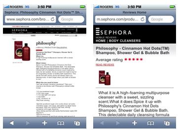
Though you can access e-stores on any smartphone, product pages on mobile optimized sites are much more usable, as you can see below:
Product Descriptions
While stripping down images and unnecessary navigation on home pages is a good idea on mobile sites, keep in mind the importance of content in the online buying experience:
- 77% are “very to somewhat” influenced by the quality of content (descriptions, copy, images and tools) when deciding to purchase from an online retailer
- 79% “rarely or never” purchase a product without complete product information
- 76% believe content is insufficient to complete research or purchase online “always,” “most often” or “some of the time”
- When faced with incomplete information, 72% go to a competitor or research further
Source: e-tailing group, 2007
The best online stores provide rich product descriptions, multiple image views, image zoom, review content and even product comparison tools. While it may not be optimal or even possible to include everything from the online store into the mobile site, care should be taken that product information presents the key benefits of the product/brand/make/model.
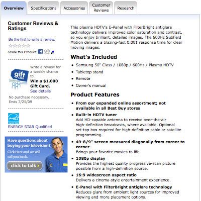
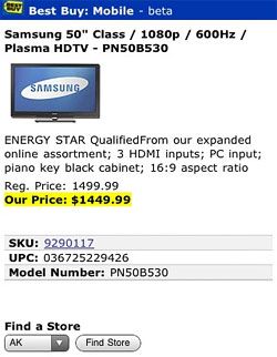
Above is a product page for an HDTV on Best Buy’s ecommerce store. The same product page on its mobile site:
The Best Buy example is concise, but if the mobile site is to be used for product research, is this enough information to “sell” the product? Will customers understand the jargon of HDMI inputs, aspect ratio and piano key black cabinet?
Customers also want as seamless an experience as possible. If you won their loyalty through a usable and content-rich website, it’s important to meet expectations on mobile devices also.
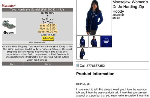
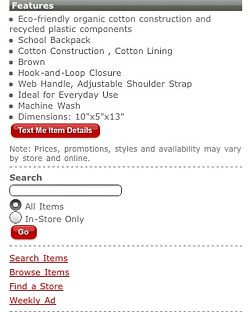
Be careful that product descriptions don’t display as run-on paragraphs. Moosejaw ditched its squished descriptions (left) in its redesign (right):
The old site suffered from several problems, HYPN OLV probably describes the color – but it’s not obvious what it means. The click-to-call and add to cart buttons were way too close together, too easy to tap the wrong one on a touch-screen. And the Zoom Prod. Image call-to-action at the end of the paragraph doesn’t look like a link. The new site looks and feels more like the regular Moosejaw site, and its descriptions include the quirky Moosejaw personality. The click-to-call link and and multiple images are easier to tap for touch-screen users.
Target takes advantage of bullet points to present an easy to scan snapshot of product specs:
You can even send product details to yourself via text message.
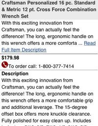
Sears2Go allows you to read an intro to the description and expand for more detail if you wish. This removes the burden for folks that hate to scroll while presenting enough information to satisfy researchers:
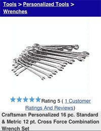
Sephora and Sears link to ratings and reviews right at the top of the product page:
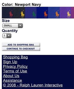
Be careful with tables, they often force the user to scroll horizontally and sometimes both horizontally and vertically to view them, like Ralph Lauren on the iPhone:
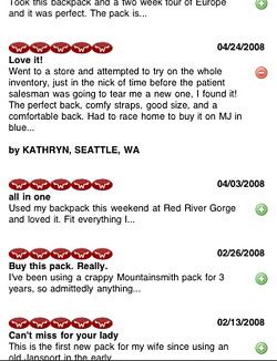
Moosejaw allows customers to expand and contract reviews, which minimizes scrolling and page load time:
Images
Considering 77% are “very to somewhat” influenced by the quality of content including images and tools, quality imagery should not be skimped on. Target, Ralph Lauren and Sears show large images by default, and Moosejaw offers alternate image views. Obviously, you can expect better conversion with better images.
Calls to Action
Avoid stacking calls to action like “Add to Cart,” “Add to Wishlist” and “Continue Shopping” for touch-screen users. Leave some space between buttons, or place them side by side instead:
Cart Summary
Best Buy, Sephora, Target and Moosejaw don’t support mobile checkout. Of the sites that did, here are some highlights:
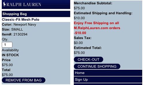
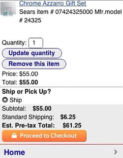
Ralph Lauren and Sears both allow cart editing, and Barnes and Noble allows you to move items to a wishlist. Surprisingly, Amazon doesn’t have a cart summary page – it jumps right to a sign-in screen.
Ralph Lauren confirms the item is in stock and highlights that free shipping is honored for mobile purchases. Sears offers shipping or in-store pickup options, but disables store pickup when it’s not available for a product. The best feature is Sears’ security icon on its cart button – as I mentioned in last week’s Multichannel 2.0 webinar, fear of security is a major roadblock to actually completing mobile purchases.
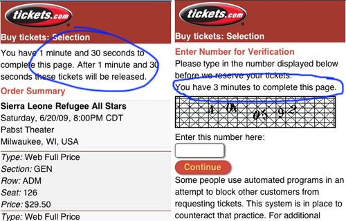
Tickets.com is interesting, its business is unique and one aspect of ticket purchasing is a time limit before the tickets are returned to stock if you don’t complete the purchase. You also rarely see a captcha in an ecommerce checkout, but the ticketing industry is more vulnerable to shady activity than other retailers. Unfortunately this captcha is difficult to decipher.
Next post we’ll cover highlights from the checkout process and forms on mobile commerce sites.
