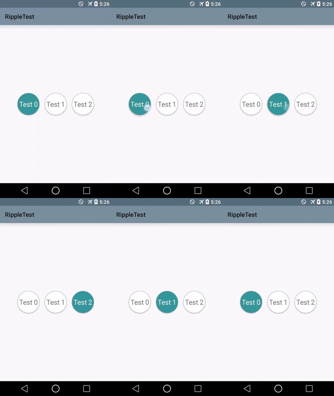
按钮水波效果
Simple Ripple + Reveal + Elevation tutorial
Today (during my 11 hours flight to Seattle :) ) I will try to guide you through the process of implementing Ripple, Elevation and Reveal effects for your views introduced in Android API 21.
Here is what we will be doing today:
Let's get party started
I decided to choose circular buttons to make things a bit more complicated and funnier. So in general, ripple effect for regular buttons works out of the box (in Material theme) and for other touchable views can be achieved by specifying ?android:selectableItemBackground as a background:
<LinearLayout
    android:id="@+id/someTouchableArea"
    android:layout_width="wrap_content"
    android:layout_height="wrap_content"
    android:background="?android:selectableItemBackground">

    .....
</LinearLayout>
But in our case, we have custom button with selected state, our text color changes depending on the state, etc. So default button background is not going to work for us here.
Creating circular button
This part is not really related to our today's topic, so feel free to skip it if you feel comfortable implementing circular button with selector.
That's what you would normally do in Holo (and prior):
- create 3 shape drawables (for every button state): normal state, pressed state, selected state
- create selector for the button background
- create color selector for the text color (we need to change text color to white when button is selected)
So here we go:
layout/circularbutton_layout.xml
<Button
    xmlns:android="http://schemas.android.com/apk/res/android"
    android:layout_width="72dip"
    android:layout_height="72dip"
    android:background="@drawable/circular_button_selector"
    android:textAppearance="?android:textAppearanceLarge"
    android:textColor="@color/button_text_selector"/>
layout/main_activity.xml
<FrameLayout xmlns:android="http://schemas.android.com/apk/res/android"
    xmlns:tools="http://schemas.android.com/tools"
    android:layout_width="match_parent"
    android:layout_height="match_parent"
    android:paddingBottom="@dimen/activity_vertical_margin"
    android:paddingLeft="@dimen/activity_horizontal_margin"
    android:paddingRight="@dimen/activity_horizontal_margin"
    android:paddingTop="@dimen/activity_vertical_margin"
    tools:context=".MainActivity">

    <LinearLayout
        android:id="@+id/buttonsContainer"
        android:layout_width="wrap_content"
        android:layout_height="wrap_content"
        android:orientation="horizontal"
        android:layout_gravity="center"/>

</FrameLayout>
MainActivity.java
package trickyandroid.com.rippletest;

import android.app.Activity;
import android.os.Bundle;
import android.view.View;
import android.view.ViewGroup;
import android.widget.Button;
import android.widget.Space;


public class MainActivity extends Activity implements View.OnClickListener {

    private ViewGroup buttonsContainer;
    private Button activeButton = null;
    private final int MAX_BUTTONS = 3;

    @Override
    protected void onCreate(Bundle savedInstanceState) {
        super.onCreate(savedInstanceState);
        setContentView(R.layout.activity_main);

        this.buttonsContainer = (ViewGroup) findViewById(R.id.buttonsContainer);

        int buttonsSpacing = (int) getResources().getDimension(R.dimen.activity_horizontal_margin);
        int buttonSize = (int) getResources().getDimension(R.dimen.button_size);

        for (int i = 0; i < MAX_BUTTONS; i++) {
            Button button = (Button) getLayoutInflater().inflate(R.layout.circular_button_layout, buttonsContainer, false);
            button.setText("Test " + i);
            button.setOnClickListener(this);
            buttonsContainer.addView(button);

            //Add margin between buttons manually
            if (i != MAX_BUTTONS - 1) {
                buttonsContainer.addView(new Space(this), new ViewGroup.LayoutParams(buttonsSpacing, buttonSize));
            }
        }
        selectButton((Button) buttonsContainer.getChildAt(0));
    }

    private void selectButton(Button button) {
        if (activeButton != null) {
            activeButton.setSelected(false);
            activeButton = null;
        }

        activeButton = button;
        button.setSelected(true);
    }

    @Override
    public void onClick(View view) {
        selectButton((Button) view);
    }
}
color/buttontext_selector.xml
<?xml version="1.0" encoding="utf-8"?>

<selector xmlns:android="http://schemas.android.com/apk/res/android">
    <item android:state_selected="true" android:color="#FFF"/>
    <item android:color="#777"/>
</selector>
drawable/circularbutton_selector.xml
<?xml version="1.0" encoding="utf-8"?>

<selector xmlns:android="http://schemas.android.com/apk/res/android">
    <item android:state_selected="true" android:drawable="@drawable/circular_button_selected"/>
    <item android:state_pressed="true" android:drawable="@drawable/circular_button_pressed"/>
    <item android:drawable="@drawable/circular_button"/>

</selector>
... and 3 shape drawables for each state - tired of copy-pasting layouts - go and check them out on GitHub (see the end of the article)
And here is what we've got:
Looks..... Holo :) Not Material. Let's fix it.
Speaking Material
First thing we need to do - is to create new ripple selector which will contain our old (slightly modified) holo selector:
drawabale/ripple_selector.xml
<?xml version="1.0" encoding="utf-8"?>
<ripple xmlns:android="http://schemas.android.com/apk/res/android"
    android:color="?android:colorControlHighlight">
    <item android:id="@android:id/mask" android:drawable="@drawable/circular_button"/>
    <item android:drawable="@drawable/circular_button_selector"/>
</ripple>
Allright, what we have here. The new ripple xml tag describes what our ripple should look like.
-
android:color- defines the color of ripple. I changed?android:colorControlHighlightattribute in my theme to match my main accent color. In this way built-in ripple effects for default buttons will get the same color. - first
itemwith id@android:id/maskdefines the shape of my ripple. If we do not specify mask - shape will be determined by the shape of all other leyers. So in my case specifying mask was not really necessary. - second
itemis my old selector resource. I still want my button to have it's selected state, so I have to specify it here. The only modification I need to do in my old selector - is to get rid of pressed state. I don't need it because during "press" action - my ripple will kick in. - if you specify empty "ripple" tag (with no children) - you will get borderless circular ripple effect
drawable/circularbutton_selector
<?xml version="1.0" encoding="utf-8"?>

<selector xmlns:android="http://schemas.android.com/apk/res/android">
    <item android:state_selected="true" android:drawable="@drawable/circular_button_selected"/>
    <item android:drawable="@drawable/circular_button"/>
</selector>
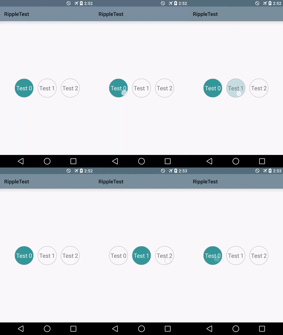
Now let's replace our button's background attribute with our new ripple selector and see what happens:
Looks nicer already! But still kinda plain.
Elevation
Really neat trick for making your views feel Material - is giving them a bit of elevation in response to touch. In Android L you can easily do this with android:stateListAnimator. It looks like a regular selector, but instead of state drawables you can specify custom objectAnimator which will start an animation when view changes it's state:
anim/button_elevation.xml
<?xml version="1.0" encoding="utf-8"?>
<selector xmlns:android="http://schemas.android.com/apk/res/android">
    <item
        android:state_enabled="true"
        android:state_pressed="true">
        <objectAnimator
            android:duration="@android:integer/config_shortAnimTime"
            android:propertyName="translationZ"
            android:valueFrom="2dip"
            android:valueTo="4dip"
            android:valueType="floatType" />
    </item>
    <item>
        <objectAnimator
            android:duration="@android:integer/config_shortAnimTime"
            android:propertyName="translationZ"
            android:valueFrom="4dip"
            android:valueTo="2dip"
            android:valueType="floatType" />
    </item>
</selector>
So here we asked stateListAnimator to animate view elevation from "2" to "4" when button is pressed and back when released. Now we need to set this stateListAnimator to our button:
layout/circularbutton_layout
<?xml version="1.0" encoding="utf-8"?>

<Button
    xmlns:android="http://schemas.android.com/apk/res/android"
    android:layout_width="@dimen/button_size"
    android:layout_height="@dimen/button_size"
    android:background="@drawable/circular_button_ripple_selector"
    android:textAppearance="?android:textAppearanceLarge"
    android:textColor="@color/button_text_selector"
    android:stateListAnimator="@anim/button_elevation"/>
Note: there is a way to specify
stateListAnimatorvia code (View#setStateListAnimator()), but I couldn't find a way to get StateListAnimator object from resources (like we did with regular animations). If anybody knows how to do that - please let me know
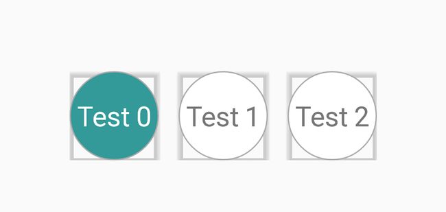
If we run this code - we will get this ugly result:
The problem is that shadow doesn't know anything about our custom button shape, so by default it thinks it is rectangular. To fix this - we need to specify Outline to our button:
MainActivity.java
@Override
protected void onCreate(Bundle savedInstanceState) {
    super.onCreate(savedInstanceState);
    setContentView(R.layout.activity_main);
    ...........
    int buttonSize = (int) getResources().getDimension(R.dimen.button_size);
    Outline circularOutline = new Outline();
    circularOutline.setOval(0, 0, buttonSize, buttonSize);

    for (int i = 0; i < MAX_BUTTONS; i++) {
        Button button = ......
        .......
        button.setOutline(circularOutline);
        ........
    }
    .....
}
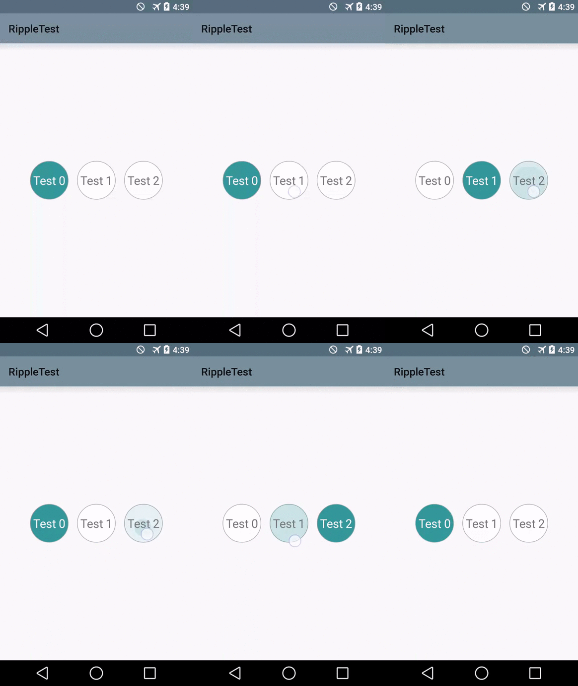
Now we got really nice looking shadows below our buttons + neat elevation touch feedback in addition to our ripple:
Reveal
Even though we got really nice looking Material-themed widget, I would like to go one step further and try to implement something similar to the reveal effect described by +RomanNurik here. What I want to do - is to make my button reveal it's "selected" state instead of simply changing it's color.
Want to point out that the way I implemented it might not be the correct way of doing such kind of things since it looks messy to me. Anyways, this is the best I have so far, so let's wait until Google I/O app source code is released, so we can take a peak at how it needs to be done.
So what is "reveal"? It is just an animation which animates view's clipping boundaries. Android provides really convinient helper method to create this animation: ViewAnimationUtils#createCircularReveal(View view, int centerX, int centerY, float startRadius, float endRadius). As we can see, everything is pretty straight forward:
-
view- view to reveal -
centerX- start X coordinate of reveal -
centerY- start Y coordinate of reveal -
startRadius- start radius. In most cases - 0 -
endRadius- end radius - depends on your view's bounds
So in theory, once item becomes selected - we need to create reveal animation and start it:
MainActivity.java
private void selectButton(Button button) {
    if (activeButton != null) {
        activeButton.setSelected(false);
        activeButton = null;
    }

    activeButton = button;
    button.setSelected(true);

    ViewAnimationUtils.createCircularReveal(button,
            button.getWidth(),
            button.getHeight(),
            0,
            button.getHeight() * 2).start();
}
Em... Looks... Weird. The stroke part in our shape gets revealed as well. What I really want - is to leave stroke part always the same and reveal color part only.
I couldn't find a proper way of revealing only a part my view, so I decided to wrap my button into a separate layout which has stroke border as a background. In this case when I reveal my button - background part stays the same, so it looks like only color part is revealed.
I realize, this is not the best way since I created additional overdraw and added another level to my view hierarchy. But since reveal - is just an animation - we can optimize it by displaying this additional level only when animation is in progress. Hope you can figure that out yourself.
circularbutton_layout.xml
<?xml version="1.0" encoding="utf-8"?>

<FrameLayout xmlns:android="http://schemas.android.com/apk/res/android"
    android:layout_width="@dimen/button_size"
    android:layout_height="@dimen/button_size"
    android:background="@drawable/circular_button">

    <Button
        android:layout_width="match_parent"
        android:layout_height="match_parent"
        android:background="@drawable/circular_button_ripple_selector"
        android:textAppearance="?android:textAppearanceLarge"
        android:textColor="@color/button_text_selector"
        android:stateListAnimator="@anim/button_elevation"/>

</FrameLayout>
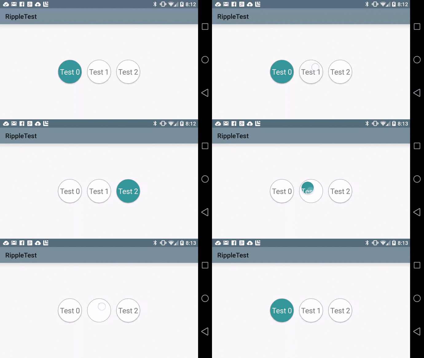
And here is what it looks like. I intentionally slowed down animation to see what actually happens:
The last nitpick. I promise :)
Right now no matter where we touch our button, reveal goes from bottom-right corner and goes up to the left corner. It would feel more natural if reveal starts right where you released your finger (just like RippleDrawable does).
MainActivity.java
@Override
protected void onCreate(Bundle savedInstanceState) {
    ........
    for (int i = 0; i < MAX_BUTTONS; i++) {
        ........
        button.setOnTouchListener(this);
        .........
    }
    ......
}

private void selectButton(Button button, boolean reveal, int startX, int startY) {
    ........
    ViewAnimationUtils.createCircularReveal(activeButton,
                startX,
                startY,
                0,
                activeButton.getHeight()).start();
}

@Override
public boolean onTouch(View view, MotionEvent motionEvent) {
    if (motionEvent.getAction() == MotionEvent.ACTION_UP) {
        selectButton((Button) view, true, (int) motionEvent.getX(), (int) motionEvent.getY());
    }
    return false;
}
And here is what it looks like:
Also I had to replace my button with regular
TextViewsince Button had ugly artifact during reveal. My suspicion is that was because myStateListAnimatorwas set to the button, but not to the outer host. Feel free to check out the complete solution on GitHub.
