Beginning Auto Layout in iOS 6: Part 1/2
原文地址:http://www.raywenderlich.com/20881/beginning-auto-layout-part-1-of-2
Note from Ray: Congratulations, you guys did it! By helping to spread the word about the iOS 6 Feast, you guys unlocked the first iOS 6 tutorial early!
This tutorial is an abbreviated version of one of the chapters from our new book iOS 6 By Tutorials. Matthijs Hollemans wrote this – the same guy who wrote the iOS Apprentice Series. Enjoy!
This is a post by iOS Tutorial Team member Matthijs Hollemans, an experienced iOS developer and designer.
Have you ever been frustrated trying to make your apps look good in both portrait and landscape orientation? Is making screen layouts that support both the iPhone and iPad driving you to the brink of madness? Despair no longer, I bring you good news!
It’s not hard to design a user interface for a screen that is always guaranteed to be the same size, but if the screen’s frame can change, the positions and sizes of your UI elements also have to adapt to fit into these new dimensions.
Until now, if your designs were reasonably complex, you had to write a lot of code to support such adaptive layouts. You will be glad to hear that this is no longer the case – iOS 6 brings an awesome new feature to the iPhone and iPad: Auto Layout.
Not only does Auto Layout makes it easy to support different screen sizes in your apps, as a bonus it also makes internationalization almost trivial. You no longer have to make new nibs or storyboards for every language that you wish to support, and this includes right-to-left languages such as Hebrew or Arabic.
This tutorial shows you how to get started with Auto Layout using Interface Builder. In iOS 6 by Tutorials, we take this tutorial even further, and then have an entirely new chapter that builds on this knowledge and shows you how to unleash the full power of Auto Layout via code.
So grab a snack and your favorite caffeinated beverage, and get ready to become an Auto Layout master!
The problem with springs and struts
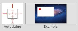
You are no doubt familiar with autosizing masks – also known as the “springs and struts” model. The autosizing mask determines what happens to a view when its superview changes size. Does it have flexible or fixed margins (the struts), and what happens to its width and height (the springs)?
For example, with a flexible width the view will become proportionally wider if the superview also becomes wider. And with a fixed right margin, the view’s right edge will always stick to the superview’s right edge.
The autosizing system works well for simple cases, but it quickly breaks down when your layouts become more intricate. Let’s look at an example where springs and struts simply don’t cut it.
Open Xcode and create a new project based on the Single View Application template. Call the app “StrutsProblem”, choose iPhone and disable Storyboards:
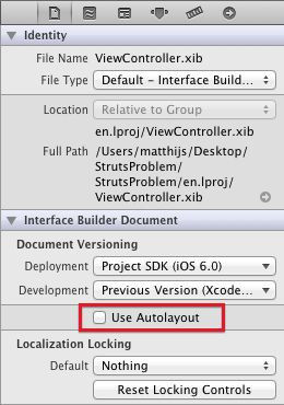
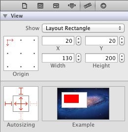
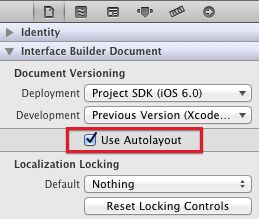
Click on ViewController.xib to open it in Interface Builder. Before you do anything else, first disable Auto Layout for this nib. You do that in the File inspector:
Uncheck the “Use Autolayout” box. Now the nib uses the old struts-and-springs model.
Note: Any new nib or storyboard files that you create with Xcode 4.5 or better will have Auto Layout activated by default. Because Auto Layout is an iOS 6 feature only, if you want to use Xcode 4.5 to make apps that are compatible with iOS 5, you need to disable Auto Layout on any new nibs or storyboard files by unchecking the “Use Autolayout” checkbox.
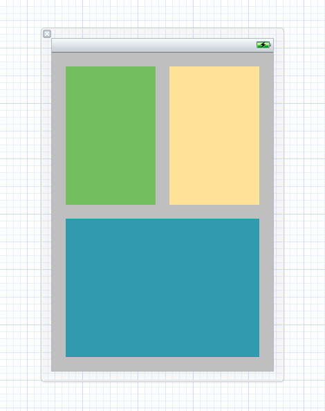
Drag three new views on to the main view and line them up like this:
For clarity, give each view its own color so that you can see which is which.
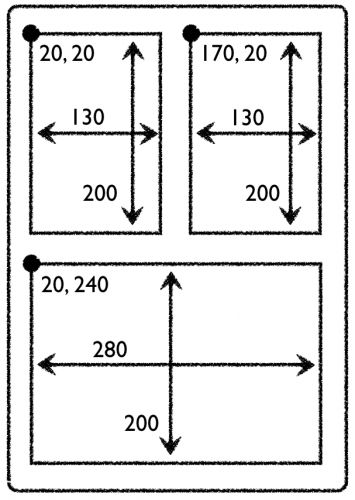
Each view is inset 20 points from the window’s borders; the padding between the views is also 20 points. The bottom view is 280 points wide and the two views on top are both 130 points wide. All views are 200 points high.
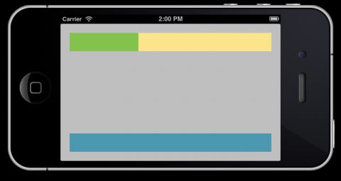
Run the app and rotate the simulator or your device to landscape. That will make the app look like this, not quite what I had in mind:
Note: You can rotate the simulator using the Hardware\Rotate Left and Rotate Right menu options, or by holding down Cmd and tapping the left or right arrow keys.
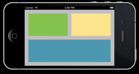
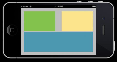
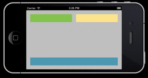
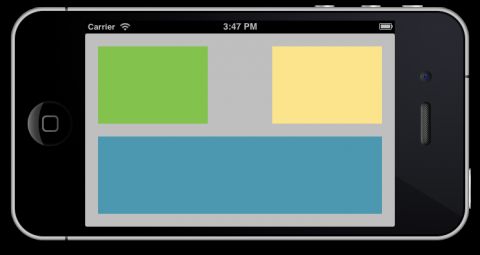
Instead, I want the app to look like this in landscape:
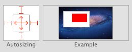
Obviously, the autosizing masks for all three views leave a little something to be desired. Change the autosizing settings for the top-left view to:
This makes the view stick to the top and left edges (but not the bottom and right edges), and resizes it both horizontally and vertically when the superview changes its size.
Similarly, change the autosizing settings for the top-right view:
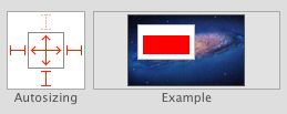
And for the bottom view:
Run the app again and rotate to landscape. It should now look like this:
Close, but not quite. The padding between the views is not correct. Another way of looking at it is that the sizes of the views are not 100% right. The problem is that the autosizing masks tell the views to resize when the superview resizes, but there is no way to tell them by how much they should resize.
You can play with the autosizing masks – for example, change the flexible width and height settings (the “springs”) – but you won’t get it to look exactly right with a 20-point gap between the three views.
To solve this layout problem with the springs and struts method, unfortunately you will have to write some code.
UIKit sends several messages to your view controllers before, during and after rotating the user interface. You can intercept these messages to make changes to the layout of your UI. Typically you would overridewillAnimateRotationToInterfaceOrientation:duration: to change the frames of any views that need to be rearranged.
But before you can do that, you first have to make outlet properties to refer to the views to be arranged.
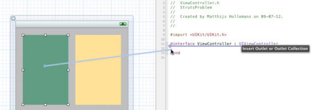
Switch to the Assistant Editor mode (middle button on the Editor toolset on the Xcode toolbar) and Ctrl-drag from each of the three views onto ViewController.h:
Connect the views to these three properties, respectively:
@property (weak, nonatomic) IBOutlet UIView *topLeftView; @property (weak, nonatomic) IBOutlet UIView *topRightView; @property (weak, nonatomic) IBOutlet UIView *bottomView; |
Add the following code to ViewController.m:
- (void)willAnimateRotationToInterfaceOrientation:(UIInterfaceOrientation)toInterfaceOrientation duration:(NSTimeInterval)duration { [super willAnimateRotationToInterfaceOrientation:toInterfaceOrientation duration:duration]; if (toInterfaceOrientation == UIInterfaceOrientationLandscapeLeft || toInterfaceOrientation == UIInterfaceOrientationLandscapeRight) { CGRect rect = self.topLeftView.frame; rect.size.width = 210; rect.size.height = 120; self.topLeftView.frame = rect; rect = self.topRightView.frame; rect.origin.x = 250; rect.size.width = 210; rect.size.height = 120; self.topRightView.frame = rect; rect = self.bottomView.frame; rect.origin.y = 160; rect.size.width = 440; rect.size.height = 120; self.bottomView.frame = rect; } else { CGRect rect = self.topLeftView.frame; rect.size.width = 130; rect.size.height = 200; self.topLeftView.frame = rect; rect = self.topRightView.frame; rect.origin.x = 170; rect.size.width = 130; rect.size.height = 200; self.topRightView.frame = rect; rect = self.bottomView.frame; rect.origin.y = 240; rect.size.width = 280; rect.size.height = 200; self.bottomView.frame = rect; } } |
This callback occurs when the view controller is rotating to a new orientation. It looks at the orientation the view controller is rotating to and resizes the views appropriately – in this case with hardcoded offsets based on the known screen dimensions of the iPhone. This callback occurs within an animation block, so the changes in size will animate.
Don’t run the app just yet. First you have to restore the autosizing masks of all three views to the following, or the autosizing mechanism will clash with the positions and sizes you set on the views inwillAnimateRotation:
That should do it. Run the app and flip to landscape. Now the views line up nicely. Flip back to portrait and verify that everything looks good there as well.
It works, but that was a lot of code you had to write for a layout that is actually pretty simple. Imagine the effort it takes for layouts that are truly complex, especially dynamic ones where the individual views change size, or the number of subviews isn’t fixed.
Note: Another approach you can take is to make separate nibs for the portrait and landscape orientations. When the device rotates you load the views from the other nib and swap out the existing ones. But this is still a lot of work and it adds the trouble of having to maintain two nibs instead of one.
Auto Layout to the rescue!
You will now see how to accomplish this same effect with Auto Layout. First, removewillAnimateRotationToInterfaceOrientation:duration: from ViewController.m, because you’re now going to do this without writing any code.
Select ViewController.xib and in the File inspector panel, check the “Use Autolayout” box to enable Auto Layout for this nib file:
Note: Auto Layout is always enabled for the entire nib or storyboard file. All the views inside that nib or storyboard will use Auto Layout if you check that box.
Run the app and rotate to landscape. It should give the same messed up layout that it did earlier:
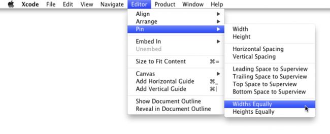
Let’s put Auto Layout into action. Hold down the Cmd key while you click on the two views on the top (the green and yellow ones), so that both are selected. From Xcode’s Editor menu, select Pin\Widths Equally:
Select the same two views again and choose Editor\Pin\Horizontal Spacing. (Even though the two views appear selected after you carry out the first Pin action, do note that they are in a special layout relationship display mode. So you do have to reselect the two views.)
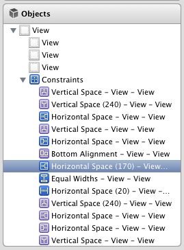
In the Document Outline on the left, you’ll notice a new section named “Constraints”. This section was added when you enabled Auto Layout for the nib. You will learn all about what these constraints are and how they operate in the next section.
For now, locate the one named “Horizontal Space (170)” and delete it from the list:
Run the app and rotate to landscape. That looks better already – the views at the top now have the proper widths and padding – but you’re not quite there yet:
Hold down Cmd and select all three views. From the Editor menu, choose Pin\Heights Equally.
Now select the top-left corner view and the bottom view (using Cmd as before), and chooseEditor\Pin\Vertical Spacing.
Finally, remove the “Vertical Space (240)” constraint from the list.
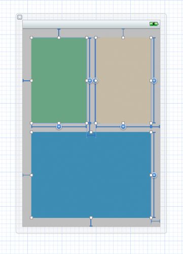
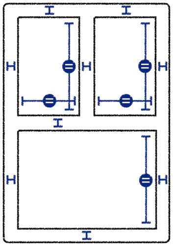
If you select all three views at the same time, Interface Builder should show something like this:
The blue “T-bar” shaped things represent the constraints between the views. It might look a bit scary, but it is actually quite straightforward once you learn what it all means.
Run the app and… voila, everything looks good again, all without writing a single line of code!
Cool, but what exactly did you do here? Rather than requiring you to hard-code how big your views are and where they are positioned, Auto Layout lets you express how the views in your layout relate to each other.
You have put the following relationships – what is known as constraints – into the layout:
- The top-left and top-right views always have the same width (that was the first pin widths equally command).
- There is a 20-point horizontal padding between the top-left and top-right views (that was the pin horizontal spacing).
- All the views always have the same height (the pin heights equally command).
- There is a 20-point vertical padding between the two views on top and the one at the bottom (the pin vertical spacing).
And that is enough to express to Auto Layout where it should place the views and how it should behave when the size of the screen changes.
Note: There are also a few other constraints that were brought over from the springs-and-struts layout when you toggled the “Use Autolayout” checkbox. For each of the margins between the views and the edges of the screen there is now a constraint that basically says: “this view always sits at a 20-points distance from the top/bottom/left/right edge.”
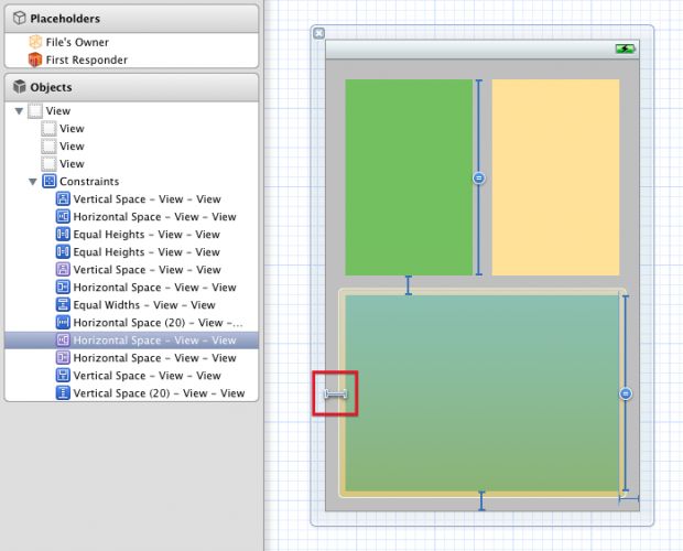
You can see all your constraints in the Document Outline. If you click on a constraint in the Document Outline, Interface Builder will highlight where it sits on the view by drawing a white outline around the constraint and adding a shadow to it so that it stands out:
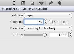
Constraints are real objects (of class NSLayoutConstraint) and they also have attributes. For example, select the constraint that creates the padding between the two top views (it is named “Horizontal Space (20)”) and then switch to the Attributes inspector. There you can change the size of the margin by editing the Constant field.
Set it to 100 and run the app again. Now the margin is a lot wider:
Auto Layout is a lot more expressive than springs and struts when it comes to describing the views in your apps. In the rest of this tutorial, you will learn all about constraints and how to apply them in Interface Builder to make different kinds of layouts.
How Auto Layout works
As you’ve seen in the test drive above, the basic tool in Auto Layout is the constraint. A constraint describes a geometric relationship between two views. For example, you might have a constraint that says:
“The right edge of label A is connected to the left edge of button B with 20 points of empty space between them.”
Auto Layout takes all of these constraints and does some mathematics to calculate the ideal positions and sizes of all your views. You no longer have to set the frames of your views yourself – Auto Layout does that for you, entirely based on the constraints you have set on those views.
Before Auto Layout, you always had to hard-code the frames of your views, either by placing them at specific coordinates in Interface Builder, by passing a rectangle into initWithFrame:, or by setting the view’s frame, bounds or center properties.
For the app that you just made, you specifically set the frames to:
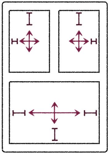
You also set autosizing masks on each of these views:
That is no longer how you should think of your screen designs. With Auto Layout, all you need to do is this:
The sizes and positions of the views are no longer important; only the constraints matter. Of course, when you drag a new button or label on to the canvas it will have a certain size and you will drop it at a certain position, but that is only a design aid that you use to tell Interface Builder where to put the constraints.
Designing like you mean it
The big advantage of using constraints is that you no longer have to fiddle with coordinates to get your views to appear in the proper places. Instead, you can describe to Auto Layout how the views are related to each other and Auto Layout will do all the hard work for you. This is called designing by intent.
When you design by intent, you’re expressing what you want to accomplish but not necessarily how it should be accomplished. Instead of saying: “the button’s top-left corner is at coordinates (20, 230)”, you now say:
“The button is centered vertically in its superview, and it is placed at a fixed distance from the left edge of the superview.”
Using this description, Auto Layout can automatically calculate where your button should appear, no matter how big or small that superview is.
Other examples of designing with intent (and Auto Layout can handle all of these instructions):
“These two text fields should always be the same size.”
“These two buttons should always move together.”
“These four labels should always be right-aligned.”
This makes the design of your user interfaces much more descriptive. You simply define the constraints, and the system calculates the frames for you automatically.
You saw in the first section that even a layout with just a few views needs quite a bit of work to layout properly in both orientations. With Auto Layout you can skip all that effort. If you set up your constraints properly, then the layout should work without any changes in both portrait and landscape.
Another important benefit of using Auto Layout is internationalization. Text in German, for example, is infamous for being very long and getting it to fit into your labels can be a headache. Again, Auto Layout takes all this work out of your hands, because it can automatically resize your labels based on the content they need to display – and have everything else adapt with constraints.
Adding support for German, French, or any other language is now simply a matter of setting up your constraints, translating the text, and… that’s it!
The best way to get the hang of Auto Layout is to play with it, so that’s exactly what you will do in the rest of this tutorial.
Note: Auto Layout is not just useful for rotation; it can also easily scale your UI up and down to accommodate different screen sizes. It is no coincidence that this technology was added to iOS at the same time that the iPhone 5 and its taller screen came out! Auto Layout makes it a lot easier to stretch your apps’ user interfaces to fill up that extra vertical space on the iPhone 5. And who knows what will come of the rumored “iPad mini”… With Auto Layout you will be prepared for the future.
Courting constraints
Close your current project and create a new project using the Single View Application template. Name it “Constraints”. This will be an iPhone project that does not use storyboards, but it does use Automatic Reference Counting.
Any new projects that you create with Xcode 4.5 automatically assume that you will be using Auto Layout, so you do not need to do anything special to enable it.
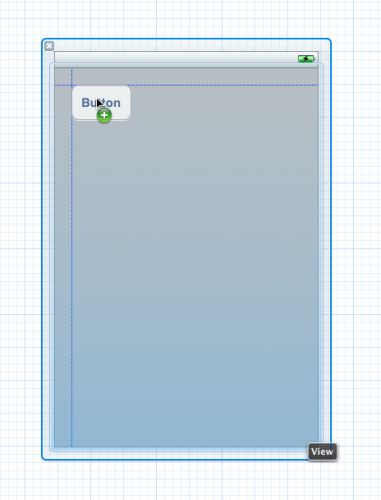
Click on ViewController.xib to open Interface Builder. Drag a new Round Rect Button onto the canvas. Notice that while you’re dragging, dashed blue lines appear. These lines are known as the guides:
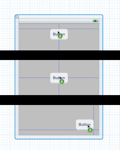
There are guides around the margins of the screen, as well as in the center:
If you have used Interface Builder before, then you have no doubt seen these guides. They are helpful hints that make it easier to align stuff. With Auto Layout enabled, however, the guides have a different purpose. You still use them for alignment, but they also tell you where the new constraints will go.
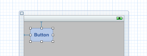
Drop the button in the top-left corner against the blue guides. Now the nib looks like this:
There are two blue thingies attached to the button. These T-bar shaped objects are the constraints that are set on this button.
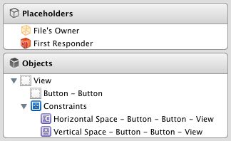
All the constraints are also listed in the Document Outline pane on the left-hand side of the Interface Builder window:
There are currently two constraints, a Horizontal Space between the button and the left edge of the main view, and a Vertical Space between the button and the top edge of the main view. The relationship that is expressed by these constraints is:
“The button always sits at the top-left corner in its superview.”
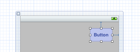
Now pick up the button and place it in the nib’s top-right corner, again against the blue guides:
The Horizontal Space constraint has changed. It is no longer attached to the button’s left side, but to its right.
When you place a button (or any other view) against the guides, you get a constraint with a standard size that is defined by the “HIG”, Apple’s iOS Human Interface Guidelines document. For margins around the edges, the standard size is a space of 20 points.
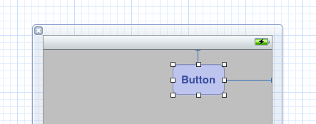
Even if you place the button where there is no guide, you still get a Horizontal or Vertical Space constraint to keep it in place. Try it out. Drag the button a bit to the left until you get something like this:
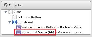
There is still a Horizontal Space constraint, but it’s larger now. In the Document Outline, you can see that it no longer has a standard space:
What constraints you get depend on where you place the button.
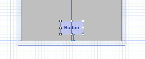
There is also a “center” constraint. Drag the button to the bottom center of the canvas, so that it snaps into place with the guides:
Notice that the Horizontal Space constraint has been replaced by a Center X Alignment constraint, which means that the button is always center-aligned with its superview, on the horizontal axis. There is still a Vertical Space constraint to keep the button away from the bottom of the view (again, using the standard margin).
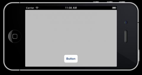
Run the app and rotate it to landscape. Even in landscape mode, the button stays at the bottom center of the screen:
That’s how you express intent: “This button should always be at bottom center.” Notice that nowhere did you have to tell Interface Builder what the button’s coordinates are, only where you want it anchored in the view.
With Auto Layout, you’re no longer supposed to care about the exact coordinates of where you place your views on the canvas or what their size is. Instead, Auto Layout derives these two things from the constraints that you set (or that Interface Builder sets for you).
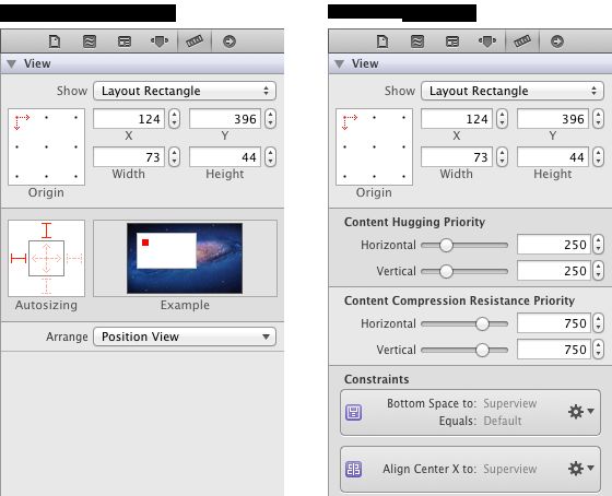
You can see this paradigm shift in the Size inspector for the button, which is now quite different:
With Auto Layout disabled, typing into the X, Y, Width or Height fields will change the position and size of the selected view. With Auto Layout enabled, you can still type new values into these fields, but that may not always have the effect you want. The view will move, but Interface Builder will also calculate new constraints based on your new values.
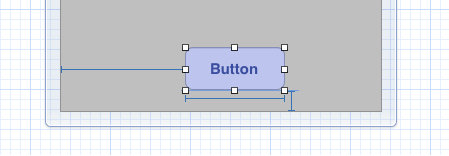
For example, change the Width value to 100. The canvas turns into something like this:
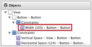
The Center X Alignment constraint has disappeared, and in its place is a Horizontal Space that glues the button to the left edge of the screen, as well as a new constraint on the button itself that forces it to have a width of 100 points (the blue bar below the button).
You can also see this new Width constraint in the Document Outline on the left:
Unlike the other constraints, which are between the button and its superview, the Width constraint only applies to the button itself. You can think of this as a constraint between the button and… the button.
Drag the button so that it snaps with the Center X Alignment constraint again.
Tip: Because changing the position and size in the Size inspector may mess up your constraints, I advise against doing this. Instead, if you want to make changes to the layout, change the constraints.
You may wonder why the button did not have a Width constraint before. How did Auto Layout know how wide to make the button without it?
Here’s the thing: the button itself knows how wide it must be. It calculates this based on its title text plus some padding for the rounded corners. If you set a background image on the button, it also takes that into account.
This is known as the intrinsic content size. Not all controls have this, but many do (UILabel is another example). If a view can calculate its own preferred size, then you do not need to set specific Width or Height constraints on it. You will see more of this later.
To return the button to its optimal size, select it and choose Size to Fit Content from the Editor menu. This gets rid of the explicit Width constraint and restores the button’s intrinsic content size.
It takes two to tango
Guides do not appear only between a view and its superview, but also between views on the same level of the view hierarchy. To demonstrate this, drag a new round rectangular button onto the canvas.
If you put it far enough away from the other button, then this new button gets its own constraints. However, if you drag them close to each other, then their constraints start to interact.
Put the new button next to the existing one so that it snaps into place:
There are quite a few dotted guidelines here, but Interface Builder doesn’t turn them all into constraints; that would be a bit much. It basically recognizes that these two buttons can align in different ways – at their tops, centers and baselines.
After dropping the button in place, the constraints look like this:
The new button has a Vertical Space to the bottom of the screen, but also a Horizontal Space that links it with the other button. Because this space is small (only 8 points), the T-bar may be a bit hard to see, but it is definitely there.
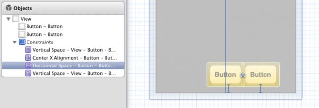
Click on the Horizontal Space constraint in the Document Outline to select it:
When you select a constraint, it lights up the controls it belongs to. This particular constraint sits between the two buttons. What you’ve done here is say:
“The second button always appears on the right of the first one, no matter where the first button is positioned or how big it is.”
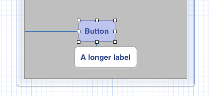
Select the button on the left and type something long into its label like “A longer label”. When you’re done, the button resizes to make room for the new text, and the other button shifts out of the way. After all, it is attached to the first button’s right edge, so that is exactly what you intended to happen:
Notice that Interface Builder replaced the Center X Alignment on the first button with a Horizontal Space again. Every time you make a change to the size (or position) of your controls, Interface Builder will recalculate a set of constraints that it thinks are optimal. Often it does the right thing, but sometimes it completely misses the boat. Obviously you just wanted to change the text in the button but keep it centered here.
Drag the button back so that it is centered again. Take a look at the constraints now:
That is probably not what you wanted to happen. The two buttons are no longer connected to each other. Instead, the rightmost button now has a Horizontal Space to the right edge of the screen. There is no longer a Horizontal Space constraint between them.
Of course, you can reconnect these two buttons by snapping them together again, but this problem could have been avoided by not dragging views around.
First, press Cmd-Z to undo, so that the first button is no longer center-aligned. Now select that button and from the Editor menu select Align\Horizontal Center in Container. This time not only the first button moves to the center – the other button moves along with it. That is more like it!
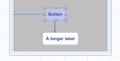
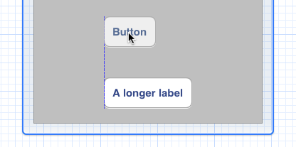
Just to get a better feel for how this works, play with this some more. Select the smaller button and put it above the other one, so that they snap into place vertically (but don’t try to align the left edges of the two buttons):
Because you snapped the two buttons together, there is now a Vertical Space between them. Again it has the standard spacing of 8 points that is recommended by the HIG.
Note: The “HIG”, which is short for iOS Human Interface Guidelines, contains Apple’s recommendations for designing good user interfaces. It is mandatory reading for any iOS developer. The HIG explains which UI elements are appropriate to use under which circumstances, and best practices for using them. You can find this document here.
You are not limited to standard spacing between controls, though. Constraints are full-fledged objects, just like views, and therefore have attributes that you can change.
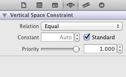
Select the Vertical Space constraint between the two buttons. You can do this in the canvas by clicking the T-bar, although that tends to be a bit finicky. By far the easiest method is to click on the constraint in the Document Outline. Once you have it selected, switch to the Attributes inspector:
By default the Standard attribute is checked. For a space constraint between two objects this is 8 points; for a margin around the edges of the superview it is 20 points. Type 40 into the Constant field to change how big the constraint is. Now the two buttons will be further apart, but they are still connected:
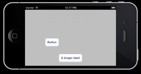
Run the app and flip to landscape to see the effect:
The buttons certainly keep their vertical arrangement, but not their horizontal one!
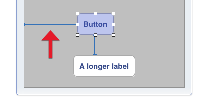
If you look at the nib, you’ll see a Horizontal Space between the top button and the left edge of the canvas (at least if you placed the button roughly in the same spot that I did):
The bottom label is horizontally centered in the screen, but the top button isn’t – it always keeps the same distance from the left edge.
That doesn’t look very nice, so instead you are going to express the following intention:
“The bottom button will always be horizontally centered, and the top button will align its left edge with the left edge of the bottom button.”
You already have a constraint for the first condition, but not for the second.
Interface Builder shows guides for alignment, so you can drag the top button until its left edge snaps with the left edge of the bottom button:
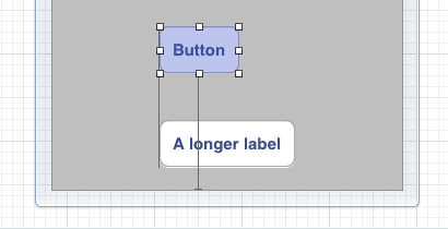
Unfortunately, this also removes the Vertical Space between the two buttons (at least sometimes, depending on how things are dragged/placed). Interface Builder simply “forgets” it was there and replaces it with a Vertical Space to the bottom of the view:
That is not quite what you want. Instead, there should be a Vertical Space between these two buttons, not one that extends all the way to the window edge. Here’s a comic that shows how that might feel when this happens:
As I mentioned before, dragging around views is not a good idea if you want to keep your constraints intact. There is a better way to align these two buttons.
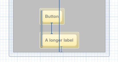
First, undo the change so that the top button moves back to its previous, unaligned position. Then hold down Cmd and click both buttons to select them. Now from the Editor menu, pick Align\Left Edges. This tells Interface Builder that you want to left-align these two controls, leaving the existing constraints intact:
As you can see, your previous constraints are still there – the Center X Alignment on the bottom button and the Vertical Space between the two buttons – while a new “Leading Alignment” constraint was added to keep the top button left-aligned with the bottom one.
Tip: You don’t always need to go to the Editor menu to pick an alignment option. Interface Builder has a shortcut menu in the bottom-right corner:
The left-most button opens the Align menu:
Because you’ll be using these options a lot, using the shortcut menu will save you some time.
Run the app and rotate to landscape to verify that it works:
Where To Go From Here?
Now that you’ve got your first taste of Auto Layout, how do you like it? It can take a bit of getting used to, but can make your life a lot easier and your apps much more flexible!
Want to learn more? Keep reading for part 2 of this tutorial, where you’ll continue playing with the buttons in Interface Builder to get a better understanding of the possibilities Auto Layout offers — and the problems you may encounter.
And best of all – you will also use Auto Layout to create a realistic layout that you may find in a real app! :]
In the meantime, if you have any questions or comments please join the forum discussion below!

This is a post by iOS Tutorial Team member Matthijs Hollemans, an experienced iOS developer and designer.

