开发中常用的伸缩布局详解
今天给大家讲讲在我们经常用于移动端的伸缩布局,这段日子闲得蛋疼,之前都特别忙,要么就是懒,一直不想写博,最近决定有时间每天更更博,妹子我也是够拼了,虽然现在还没啥阅读量,但我还是要努力写。
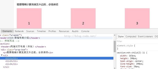
在做传统布局的时候,我们需要精确计算宽度和外边距,好麻烦啊有木有!css3在布局方面做了很大的改进,对块级元素的排列方式非常灵活,因为强大的伸缩性,在响应式开发中发挥着极大的作用
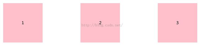
首先用传统布局和伸缩布局实现这样一个效果
传统布局和伸缩布局主要样式代码:
/*两端对齐(传统)*/
   section:nth-child(2) ul {
      overflow: hidden;
   }

   section:nth-child(2) li {
      width: 200px;
      height: 200px;
      text-align: center;
      line-height: 200px;
      font-size: 20px;
      float: left;
      background-color: pink;
      margin-right: 192px;
   }

   section:nth-child(2) li:last-child {
      margin-right: 0;
   }

   /*伸缩写法*/
   section:nth-child(3) ul {
      /*这样便可以实现两端对齐*/
      display: flex;/*指定伸缩布局*/
      justify-content: space-between;/*调整主轴对齐,两端对齐*/
   }

   section:nth-child(3) li {
      width: 240px;
      height: 240px;
      text-align: center;
      line-height: 200px;
      background: pink;
   }
</style>
结构代码:(ps:我这里用了语义化标签,如果不懂请百度~~~这里不做介绍)
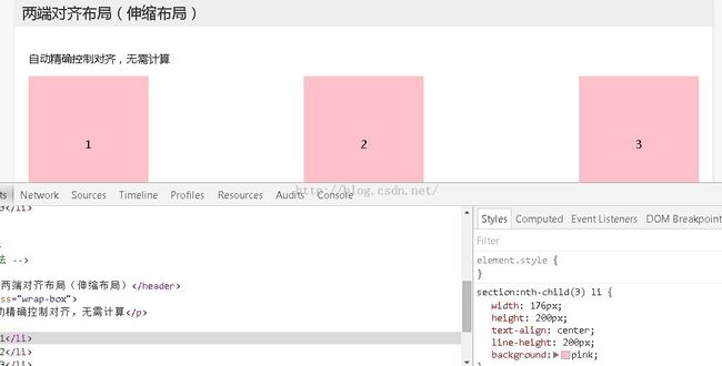
<div class="wrapper">
   <header>CSS3-伸缩布局介绍</header>
   <!-- 传统写法 -->
   <section>
      <header>两端对齐布局(传统)</header>
      <div class="wrap-box">
         <p>需要精确计算宽度及外边距,会很麻烦</p>
         <ul>
            <li>1</li>
            <li>2</li>
            <li>3</li>
         </ul>
      </div>
   </section>

   <!-- 伸缩布局 -->
   <section>
      <header>两端对齐布局(伸缩布局)</header>
      <div class="wrap-box">
         <p>自动精确控制对齐,无需计算</p>
         <ul>
            <li>1</li>
            <li>2</li>
            <li>3</li>
         </ul>
      </div>
   </section>
传统布局改变宽度,两端就不会对齐了,而伸缩布局不管怎么改,仍然对齐。
下面讲下下伸缩布局的一些概念性的东西,方便大家理解,我po了一张图,从这张图片上可以看到,外面有大盒子,里面有1号盒子和2号盒子,我们称为子盒子,要做伸缩布局,必须是父子关系,在父盒子上加上dispaly:flex;指定是伸缩布局,才有主轴和侧轴,子盒子相对于父盒子去对齐的,两条轴都是有方向的,Flex容器的主轴主要用来配置Flex项目,默认是水平方向 侧轴默认垂直向下方向,他们不是固定不变的,可以通过flex-direction互换。
这里写一个经典布局
样式:
<style>
    body {
        margin: 0;
        padding: 0;
        font-family: '微软雅黑';
        background-color: #F7F7F7;
    }

    ul {
        margin: 0;
        padding: 0;
        list-style: none;
    }

    .wrapper {
        width: 1024px;
        margin: 0 auto;
    }

    .wrapper > section {
        min-height: 300px;
        margin-bottom: 30px;
        box-shadow: 1px 1px 4px #DDD;
        background-color: #FFF;
    }
    .wrapper .wrap-box {
        padding: 20px;
    }

    .layout{
        width: 100%;
        height: 600px;
        display: flex;
        flex-direction: column;/*垂直排列*/
        justify-content: space-between;
    }
    .layout .header{
        height: 60px;
        text-align: center;
        line-height: 60px;
        background-color:green;
    }
    .layout .main{
        flex: 1;
        display: flex;
        text-align: center;
    }
    .layout .main .aside{
        flex: 1;
        background-color: blue;
    }
    .layout .main .content{
        flex: 2;
        background-color: pink;
    }
    .layout .footer{
        width: 100%;
        height: 60px;
        background: yellow;text-align: center;
    }
</style>
结构:
<div class="wrapper">
    <section>
            <div class="layout">
                <div class="header">头部</div>
                <div class="main">
                    <div class="aside">侧边栏</div>
                    <div class="content">主体内容</div>
                </div>
                <div class="footer">底部</div>
            </div>
    </section>
</div>
各属性精解:
flex-direction 调整主轴方向,默认为水平
justify-content 调整主轴对齐
align-items 调整侧轴对齐
flex-wrap 控制是否换行
align-conten 堆栈(由flex-wrap产生的独立行)
flex-flow是flex-direction、flex-wrap的简写
flex子项目在主轴的缩放比例,不指定flex属性,则不参与伸缩分配
order控制子项目的排列顺序,正序方式排序由小到大