Table of Contents [hide]
- 1 Borders, Margins and Padding
- 1.1 Overview
- 1.2 The Box Model
- 2 AndroidPlot’s Interpretation of the Box Model
- 3 Enabling Markup
- 4 Modifying Margins and Padding
Borders, Margins and Padding
We try to keep these pages as up to date as possible, but typos are inevitable, especially immediately following new releases. If you spot an error, please let us know either in the forums or shoot an email to [email protected]. Thanks!
Last Updated For: Androidplot 0.3cOverview
The Box Model
AndroidPlot’s Interpretation of the Box Model
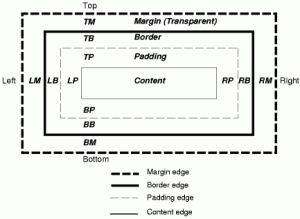
AndroidPlot diverges from the classic box model in one key area; borders don’t live in their own layer as shown above. Instead, they overlap the margin and padding sections evenly; if you had a border of 3 pixels, 1.5 pixels of the border would be drawn on the inner border of the margin layer and 1.5 pixels of the border would also be drawn on the outer border of the padding layer.
To further illustrate this let’s start with a basic XYPlot. Working with the SimpleXYPlotExample, lets modify res/layout/main.xml to make our plot fill the screen and have no external borders:
<com.androidplot.xy.XYPlot
    android:id="@+id/mySimpleXYPlot"
    android:layout_width="fill_parent"
    android:layout_height="fill_parent"
    android:layout_marginTop="0px"
    android:layout_marginLeft="0px"
    android:layout_marginRight="0px"
    title="A Simple XYPlot Example"
/>
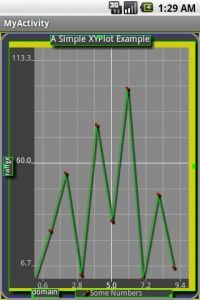
Figure 2: An XYPlot with markup disabled.
Enabling Markup
Now let’s take a look at what’s going on with the margins and padding within AndroidPlot. The easiest way to do this is to let AndroidPlot draw some markup guides for us. Drawing markup is actually enabled by default in AndroidPlot and is disabled programatically – you’ll probably even recognize this line from all the sample applications so far:
plot.disableAllMarkup();
In the case of the plot above, if we comment this line out we will see this:
You will notice that there are now some green lines and squares as well as some blue and yellow borders. The green lines represent widgets positioned within the plot, the tiny green squares represent their points of origin, the yellow fill represents a margin and the blue fill represents padding. You can just barely see the margin and padding along the outer edge of the plot; by default both are set to 3px on all four sides. You will also notice a fairly thick margin on the top, left and bottom of the graph section of the plot. This is the padding applied to the graph “widget”. Widgets are sub-components positioned inside of the plot area. Each has it’s own box model associated with it which is visible in markup mode. Most widgets have a margin and padding of 0.
Modifying Margins and Padding
To make the padding and margins around the edge of the plot a little easier to see, let’s increase both to 10 pixels. Padding and margin values can be set for each edge independently or in a single method call as shown here:
plot.setPlotMargins(10, 10, 10, 10);
plot.setPlotPadding(10, 10, 10, 10);
Which gives us this:
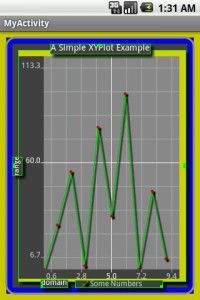
Now it’s a little easier to see our plot’s margins and padding. Notice how the border overlaps the inner edge of the margin layer and the outer edge of the padding layer. As mentioned above, this is the major divergence from the classic box model. This will probably change some time in the future but for now that’s how it is.
Next, let’s try to get rid of as much of the margins and padding as possible to maximize our graph area.
First, we set our plot’s margins and padding to 0:
plot.setPlotMargins(0, 0, 0, 0);
plot.setPlotPadding(0, 0, 0, 0);
Looking at figure 4, we notice that there’s quite a bit of unnecessary margin space on the top and right of the graph. Let’s remove that space and while we are at it lets switch to a square border for our plot and disable markup again:
plot.getGraphWidget().setMarginTop(2);
plot.getGraphWidget().setMarginRight(2);
plot.setBorderStyle(Plot.BorderStyle.SQUARE, null, null);
plot.disableAllMarkup();
Which gives us this:


