共享单车项目分析
共享单车项目分析
分析背景与目的:
- 经过多年的发展,共享单车越来越受到了人们的追捧,成为了大多数人外出必不可少的出行工具,
城市街道上随处可见的共享单车成为了一个 城市快速发展中的一道靓丽的风景线; - 在共享单车快速发展的的同时,接踵而至的是竞争地不断加剧、租赁数量增长缓慢等问题;
- 期望通过对本次共享单车的租赁数据进行诊断分析,以及剖析已发现的问题,为以后的产品维护、运营工作提供参考与指导。
分析思路


接下来是具体的分析操作:
数据下载自Kaggle
数据源
数据分析方面可用Excel或者python来分析,为了便于演示,加上后面需要预测租赁额,需要构造随机森林模型来进行预测,所以就在python的jupyter notebook环境下进行操作:
导入相关模块和数据:
import numpy as np
import pandas as pd
from datetime import datetime
import warnings
import matplotlib.pyplot as plt
%matplotlib inline
warnings.filterwarnings('ignore')
import seaborn as sns
sns.set(style='whitegrid', palette='tab10')
path = 'C:\\Users\\Master\\Desktop\\bike-sharing-demand\\'
train=pd.read_csv(path + 'train.csv')
查看训练数据是否有缺失值:
train.info()
输出:
RangeIndex: 10886 entries, 0 to 10885
Data columns (total 12 columns):
datetime      10886 non-null object
season        10886 non-null int64
holiday       10886 non-null int64
workingday    10886 non-null int64
weather       10886 non-null int64
temp          10886 non-null float64
atemp         10886 non-null float64
humidity      10886 non-null int64
windspeed     10886 non-null float64
casual        10886 non-null int64
registered    10886 non-null int64
count         10886 non-null int64
dtypes: float64(3), int64(8), object(1)
memory usage: 1020.6+ KB
可一看到训练数据共有10886行,并无缺失值
接下来导入导入测试数据:
test=pd.read_csv('test.csv')
test.info()
输出:
RangeIndex: 6493 entries, 0 to 6492
Data columns (total 9 columns):
datetime      6493 non-null object
season        6493 non-null int64
holiday       6493 non-null int64
workingday    6493 non-null int64
weather       6493 non-null int64
temp          6493 non-null float64
atemp         6493 non-null float64
humidity      6493 non-null int64
windspeed     6493 non-null float64
dtypes: float64(3), int64(5), object(1)
memory usage: 456.6+ KB
本数据集没有缺失数据,但没有缺失不代表没有异常。
检查异常值:
#查看数据有误异常值
train.describe()
输出:

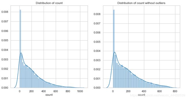
从数值型数据入手,想要知道租赁额(count)数据差异多大,可以观察一下它的密度分布情况:
#观察租赁额密度分布情况
fig = plt.figure()
ax = fig.add_subplot(1,1,1)
fig.set_size_inches(6,5)

sns.distplot(train['count'])
ax.set(xlabel='count', title='Distribution of count');
输出:

可以发现数据密度分布 的偏斜比较严重,且有一个很长的尾巴,为了后面的预测分析准确率高,需要尽可能的让数据符合正太分布,所以希望将这一列的数据的长尾巴处理掉,可以排除掉距离均值3个标准差以为的数据
train_withountOutliers = train[np.abs(train['count']-train['count'].mean())<=(3*train['count'].std())]
train_withountOutliers.shape
输出:
(10739, 12)
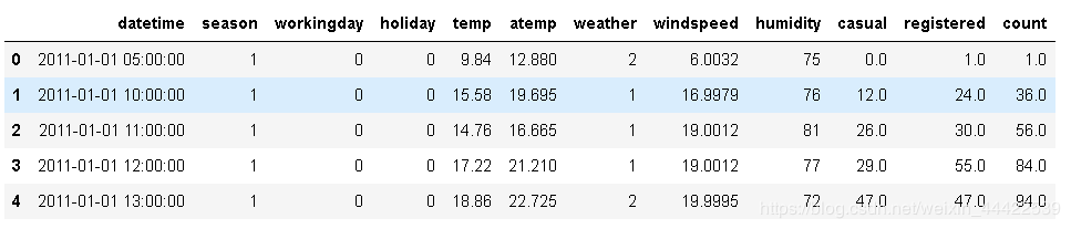
再来查看一下它的密度分布,同时可以和原始数据对比一下:
fig = plt.figure()
ax1 = fig.add_subplot(1,2,1)
ax2 = fig.add_subplot(1,2,2)

sns.distplot(train['count'], ax=ax1)
sns.distplot(train_withountOutliers['count'], ax=ax2)

ax1.set(xlabel='count', title='Distribution of count')
ax2.set(xlabel='count', title='Distribution of count without outliers')
输出:
可以看到波动性依旧很大,为了在训练数据的时候避免容易产生过拟合,我们希望波动性能稳定点,所以这里可以采用对数转换:
yLabels = train_withountOutliers['count']
yLabels_log = np.log(yLabels)
sns.distplot(yLabels_log)
输出:

可以看到数据分布均匀了很多,大小差异也缩小了,利用这样的数据标签对模型的训练是有益的
接下来就是对其它的数据进行处理了,在这里可以把测试数据合并起来一起处理:
Bike_data = pd.concat([train_withountOutliers,test],ignore_index=True)
Bike_data.shape
输出:
(17232, 12)
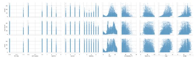
#查看一下数据结构
Bike_data.head()
输出:
数据里面有个时间特征,为了方便可视化分析,可以将时间类型细分为:年、月、日、周次、小时等
如果用Excel工具来分析,则直接可使用日期型函数直接处理,碍于工具之间转换麻烦,直接用代码完成:
Bike_data['date']=Bike_data.datetime.apply( lambda c : c.split( )[0])
Bike_data['hour']=Bike_data.datetime.apply( lambda c : c.split( )[1].split(':')[0]).astype('int')
Bike_data['year']=Bike_data.datetime.apply( lambda c : c.split( )[0].split('-')[0]).astype('int')
Bike_data['month']=Bike_data.datetime.apply( lambda c : c.split( )[0].split('-')[1]).astype('int')
Bike_data['weekday']=Bike_data.date.apply( lambda c : datetime.strptime(c,'%Y-%m-%d').isoweekday())
Bike_data.head()
输出:

接下来对temp(温度),atemp(体感温度),humidity(湿度),windspeed(风速)这四个数值型数据进行查看分析,首先观察一下它们的密度分布:
fig, axes = plt.subplots(2,2)
fig.set_size_inches(12, 10)

sns.distplot(Bike_data['temp'], ax=axes[0,0])
sns.distplot(Bike_data['atemp'], ax=axes[0,1])
sns.distplot(Bike_data['humidity'], ax=axes[1,0])
sns.distplot(Bike_data['windspeed'], ax=axes[1,1])

axes[0,0].set(xlabel='Temp', title='Distribution of temp')
axes[0,1].set(xlabel='Atemp', title='Distribution of atemp')
axes[1,0].set(xlabel='Humidity', title='Distribution of humidity')
axes[1,1].set(xlabel='Windspeed', title='Distribution of windspeed')
输出:

看一看到windspeed(风速)为0的数据占比很大,通过观察数据描述可以推测出数据本身也许存在缺失值,但是被0填充了,所以导致为0的数据占比大,这样的数据会对分析和预测产生干扰,所以需要对缺失值进行更加合适的填充,这里希望利用随机森林根据相同的年份、月份、季节、温度、湿度等几个特征来预测风速的缺失值。
使用随机森林填充缺失值:
from sklearn.ensemble import RandomForestRegressor
Bike_data['windspeed_rfr']=Bike_data['windspeed']

dataWind0 = Bike_data[Bike_data['windspeed_rfr']==0]
dataWindNot0 = Bike_data[Bike_data['windspeed'] != 0]

rfModel_wind = RandomForestRegressor(n_estimators=1000, random_state=42)
#选定特征
windColumns = ['season', 'weather','humidity','month','temp','year','atemp']
#将风速不等于0的数据做训练集, fit到RandomForestRegressor之中
rfModel_wind.fit(dataWindNot0[windColumns], dataWindNot0['windspeed_rfr'])
wind0Values = rfModel_wind.predict(X=dataWind0[windColumns])
#通过训练好的模型填充到风速为零的数据中
dataWind0.loc[:,'windspeed_rfr'] = wind0Values
#连接两部分
Bike_data = dataWindNot0.append(dataWind0)
Bike_data.reset_index(inplace=True)
Bike_data.drop('index', inplace=True, axis=1)
填充好之后在画图观察一下这四个特征的密度分布(代码如上):

可以看到风速的缺失值已经填充好了
接下来对数据进行可视化分析::
最终是希望了解到影响租赁总数的因数,所以先整体来看一下租赁额相关的三个值与其它特征值的关系:
sns.set(style="ticks", color_codes=True)

sns.pairplot(Bike_data, x_vars=['weekday','season','weather', 'humidity','temp','atemp'],
            y_vars=['casual','registered','count'], plot_kws={'alpha':0.1})
输出:
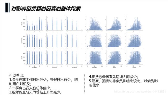
从图中大致可以观察到:
1.会员在工作日出行多,节假日出行少,临时用户则相反;
2.一季度出行人数总体偏少;
3.租赁数量随天气等级上升而减少;
4.小时数对租赁情况影响明显,会员呈现两个高峰,非会员呈现一个正态分布;
5.租赁数量随风速增大而减少;
6.温度、湿度对非会员影响比较大,对会员影响较小
下面绘制热力图查看一下各个特征与租赁额的相关系数
fig = plt.figure()
ax = fig.add_subplot()
fig.set_size_inches(12,9)
sns.heatmap(df_corr, cbar=True, annot=True, square=True, \
                fmt='.2f', annot_kws={'size':10}, yticklabels=col.values, \
                xticklabels=col.values, cmap='YlGnBu',ax=ax)
输出:
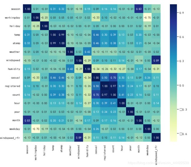
可以看出特征值对租赁数量的影响力度为,时段>温度>湿度>年份>月份>季节>天气等级>风速>星期几>是否工作日>是否假日,接下来再看一下共享单车整体使用情况。
时段对租赁数量的影响
因为时段对租赁数量的影响最大首先展示这一项数据
df_workingday = Bike_data[Bike_data['workingday'] == 1]
df_workingday = df_workingday.groupby(['hour'], as_index=True).agg({'casual':'mean',
                                                                   'registered':'mean',
                                                                   'count':'mean'})
df_workingday0 = Bike_data[Bike_data['workingday'] == 0]
df_workingday0 = df_workingday0.groupby(['hour'], as_index=True).agg({'casual':'mean',
                                                                   'registered':'mean',
                                                                   'count':'mean'})

fig, axes = plt.subplots(1, 2, sharey=True)

df_workingday.plot(figsize=(15,5),title='The average number of rentals initiated per hour in the working day',ax=axes[0])
df_workingday0.plot(figsize=(15,5), title='The average number of rentals initiated per hour in the nonworking day',ax=axes[1])
输出:
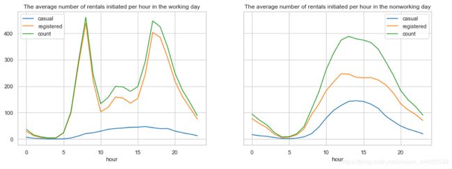
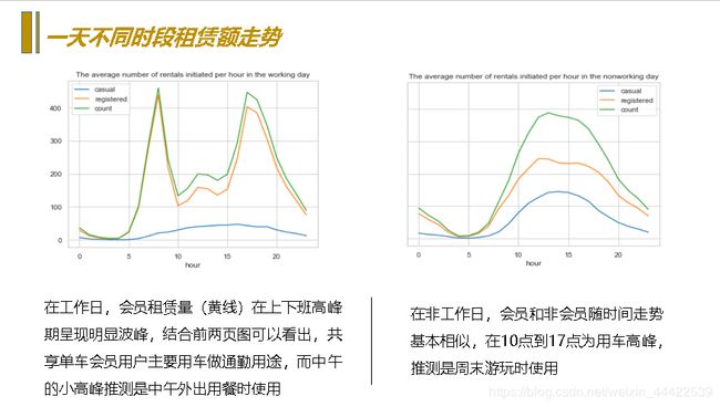
通过对比是否工作日的租赁额可以看到:
- 工作日对于会员用户上下班时间是两个用车高峰,而中午也会有一个小高峰,猜测可能是外出午餐的人;
- 而对临时用户起伏比较平缓,高峰期在17点左右;
- 并且会员用户的用车数量远超过临时用户。
- 对非工作日而言租赁数量随时间呈现一个正态分布,高峰在14点左右,低谷在4点左右,且分布比较均匀。
温度对租赁数量的影响
先观察温度的走势
#数据按小时统计展示起来太麻烦,希望能够按天汇总取一天的气温中位数
df_temp = Bike_data.groupby(['date','weekday'], as_index=False).agg({'year':'mean',
                                                                   'month':'mean',
                                                                   'temp':'median'})
#由于测试数据集中没有租赁信息,会导致折线图有断裂,所以将缺失的数据丢弃
df_temp.dropna ( axis = 0 , how ='any', inplace = True )

#预计按天统计的波动仍然很大,再按月取日平均值
temp_month = df_temp.groupby(['year','month'], as_index=False).agg({'weekday':'min',
                                                                    'temp':'median'})
#将按天求和统计日期转换成datetime格式
df_temp['date'] = pd.to_datetime(df_temp['date'])

#将按月统计数据设置一列时间序列
temp_month.rename(columns={'weekday':'day'},inplace=True)
fig = plt.figure(figsize=(18,6))
ax = fig.add_subplot(1,1,1)

#使用折线图展示总体租赁情况(count)随时间的走势
plt.plot(df_temp['date'], df_temp['temp'], linewidth=1.3, label='Daily average')
ax.set_title('Change trend of average temperature per day in two years')
plt.plot(temp_month['date'], temp_month['temp'], marker='o', linewidth=1.3, label='Monthly average')
ax.legend();
输出:
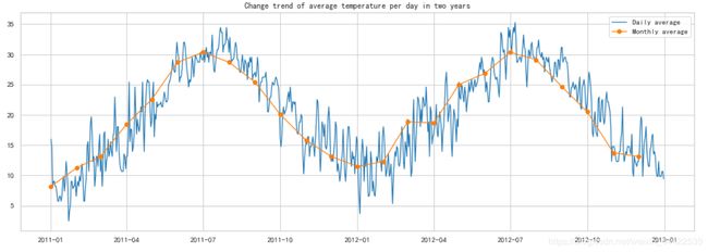
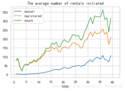
可以看出每年的气温趋势相同随月份变化,在7月份气温最高,1月份气温最低,再看一下每小时平均租赁数量随温度变化的趋势
#按温度取租赁额平均值
temp_rentals = Bike_data.groupby(['temp'], as_index=True).agg({'casual':'mean',
                                                             'registered':'mean',
                                                             'count':'mean'})
temp_rentals.plot(title = 'The average number of rentals initiated per hour changes with the temperature')

可观察到随气温上升租车数量总体呈现上升趋势,但在气温超过35时开始下降,在气温4度时达到最低点。
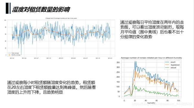
湿度对租赁数量的影响
df_humidity = Bike_data.groupby(['date'], as_index=False).agg({'humidity':'mean'})
df_humidity['date'] = pd.to_datetime(df_humidity['date'])
#将日期改为时间索引
df_humidity = df_humidity.set_index('date')

humidity_month = Bike_data.groupby(['year','month'], as_index=False).agg({'weekday':'min',
                                                                         'humidity':'mean'})

humidity_month.rename(columns={'weekday':'day'}, inplace=True)
humidity_month['date'] = pd.to_datetime(humidity_month[['year','month','day']])

fig = plt.figure(figsize=(18, 6))
ax = fig.add_subplot(1,1,1)

plt.plot(df_humidity.index, df_humidity['humidity'], linewidth=1.3, label='Daily average')
plt.plot(humidity_month['date'], humidity_month['humidity'], marker='o', linewidth=1.3, label='Monthly average')
ax.legend()
ax.set_title(u'Change trend of average humidity per day in two years')

观察一下租赁人数随湿度变化趋势,按湿度对租赁数量取平均值。
humidity_rentals = Bike_data.groupby(['humidity'], as_index=True).agg({'count':'mean',
                                                                     'registered':'mean',
                                                                     'casual':'mean'})

humidity_rentals.plot(title='Average number of rentals initiated per hour in different humidity')
输出:
可以观察到在湿度20左右租赁数量迅速达到高峰值,此后缓慢递减。
年份、月份对租赁数量的影响
先观察两年时间里,总租车数量随时间变化的趋势
#数据按小时统计展示起来太麻烦,希望能够按天汇总
count_df = Bike_data.groupby(['date','weekday'], as_index=False).agg({'year':'mean',
                                                                      'month':'mean',
                                                                      'casual':'sum',
                                                                      'registered':'sum',
                                                                       'count':'sum'})
#由于测试数据集中没有租赁信息,会导致折线图有断裂,所以将缺失的数据丢弃
count_df = count_df[count_df['count'] != 0]

#预计按天统计的波动仍然很大,再按月取日平均值
count_month = count_df.groupby(['year','month'], as_index=False).agg({'weekday':'min',
                                                                      'casual':'mean',
                                                                      'registered':'mean',
                                                                      'count':'mean'})

#将按天求和统计数据的日期转换成datetime格式
count_df['date']=pd.to_datetime(count_df['date'])

#将按月统计数据设置一列时间序列
count_month.rename(columns={'weekday':'day'},inplace=True)
count_month['date']=pd.to_datetime(count_month[['year','month','day']])

#设置画框尺寸
fig = plt.figure(figsize=(18,6))
ax = fig.add_subplot(1,1,1)

#使用折线图展示总体租赁情况(count)随时间的走势
plt.plot(count_df['date'] , count_df['count'] , linewidth=1.3 , label='Daily average')
ax.set_title('Change trend of average number of rentals initiated  per day in two years')
plt.plot(count_month['date'] , count_month['count'] , marker='o',
         linewidth=1.3 , label='Monthly average')
ax.legend()
输出:
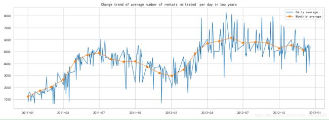
可以看出:
- 共享单车的租赁情况2012年整体是比2011年有增涨的;
- 租赁情况随月份波动明显;
- 数据在2011年9到12月,2012年3到9月间波动剧烈,有很多局部波谷值。
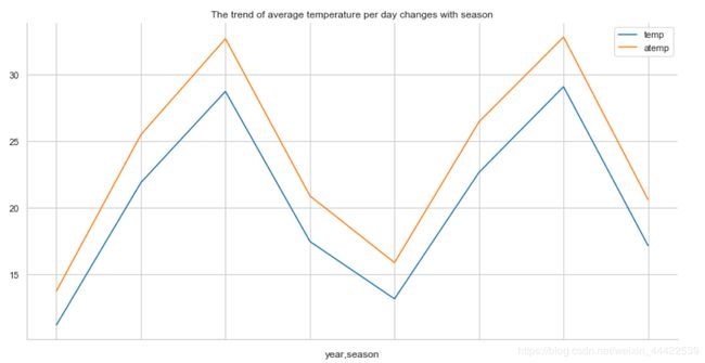
季节对出行人数的影响
上图中的数据存在很多局部低谷,所以将租赁数量按季节取中位数展示,同时观察季节的温度变化
day_df=Bike_data.groupby('date').agg({'year':'mean','season':'mean',
                                      'casual':'sum', 'registered':'sum'
                                      ,'count':'sum','temp':'mean',
                                      'atemp':'mean'})
season_df = day_df.groupby(['year','season'], as_index=True).agg({'casual':'mean',
                                                                  'registered':'mean',
                                                                  'count':'mean'})
temp_df = day_df.groupby(['year','season'], as_index=True).agg({'temp':'mean',
                                                                'atemp':'mean'})
season_df.plot()
plt.title('The trend of number of renrals initiated per day changes with season')
plt.xlabel('')
temp_df.plot()
plt.title('The trend of average temperature per day changes with season')
输出:
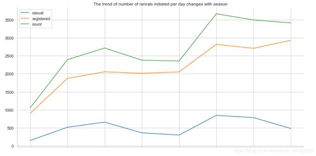
可以看出无论是临时用户还是会员用户用车的数量都在秋季迎来高峰,而春季度用户数量最低
天气情况对出行情况的影响
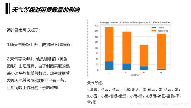
考虑到不同天气的天数不同,例如非常糟糕的天气(4)会很少出现,查看一下不同天气等级的数据条数,再对租赁数量按天气等级取每小时平均值。
weather_df = Bike_data.groupby('weather', as_index=True).agg({'casual':'mean',
                                                              'registered':'mean'})
weather_df.plot.bar(stacked=True,title = 'Average number of rentals initiated per hour in different weather')
输出:
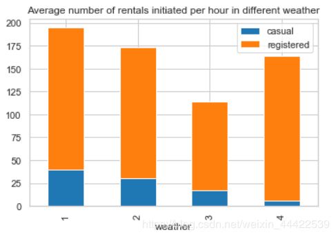
观察到天气等级4的时候出行人数并不少,尤其是会员出行人数甚至比天气等级2的平均值还高,通过观察在已知租赁情况的数据中心,天气等级4的数据只有一条,因为这条数据在上下班高峰期,所以可以认为是一个异常数据,可以得出结论租赁额是随着天气等级的提升而呈现下降趋势。
风速对出行情况的影响
windspeed_rentals = Bike_data.groupby(['windspeed'], as_index=True).agg({'casual':'max',
                                                                         'registered':'max',
                                                                         'count':'max'})
windspeed_rentals .plot(title = 'Max number of rentals initiated per hour in different windspeed')
输出:
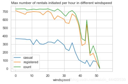
可以看到租赁数量随风速越大租赁数量越少,在风速超过30的时候明显减少,但风速在风速40左右却有一次反弹,应该是和天气情况一样存在异常的数据,打印异常数据观察一下
df2=Bike_data[Bike_data['windspeed']>40]
df2=df2[df2['count']>400]
df2
输出:

也是一个下班高峰的异常值
日期对出行的影响
考虑到相同日期是否工作日,星期几,以及所属年份等信息是一样的,把租赁数据按天求和,其它日期类数据取平均值
day_df = Bike_data.groupby(['date'], as_index=False).agg({'casual':'sum','registered':'sum',
'count':'sum', 'workingday':'mean',
'weekday':'mean','holiday':'mean',
'year':'mean'})
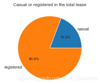
number_pei = day_df[['casual', 'registered']].mean()
plt.axes(aspect='equal')
plt.pie(number_pei, labels=['casual', 'registered'], autopct='%1.1f%%',
pctdistance=0.6, labeldistance=1.05, radius=1)
plt.title('Casual or registered in the total lease');
输出:
由于工作日和休息日的天数差别,对工作日和非工作日租赁数量取了平均值,对一周中每天的租赁数量求和
workingday_df=day_df.groupby(['workingday'], as_index=True).agg({'casual':'mean',
                                                                 'registered':'mean'})
workingday_df_0 = workingday_df.loc[0]
workingday_df_1 = workingday_df.loc[1]

# plt.axes(aspect='equal')
fig = plt.figure(figsize=(8,6))
plt.subplots_adjust(hspace=0.5, wspace=0.2)     #设置子图表间隔
grid = plt.GridSpec(2, 2, wspace=0.5, hspace=0.5)   #设置子图表坐标轴 对齐

plt.subplot2grid((2,2),(1,0), rowspan=2)
width = 0.3       # 设置条宽

p1 = plt.bar(workingday_df.index,workingday_df['casual'], width)
p2 = plt.bar(workingday_df.index,workingday_df['registered'],
             width,bottom=workingday_df['casual'])
plt.title('Average number of rentals initiated per day')
plt.xticks([0,1], ('nonworking day', 'working day'),rotation=20)
plt.legend((p1[0], p2[0]), ('casual', 'registered'))

plt.subplot2grid((2,2),(0,0))
plt.pie(workingday_df_0, labels=['casual','registered'], autopct='%1.1f%%',
        pctdistance=0.6 , labeldistance=1.35 , radius=1.3)
plt.axis('equal')
plt.title('nonworking day')

plt.subplot2grid((2,2),(0,1))
plt.pie(workingday_df_1, labels=['casual','registered'], autopct='%1.1f%%',
        pctdistance=0.6 , labeldistance=1.35 , radius=1.3)
plt.title('working day')
plt.axis('equal')
输出:

weekday_df=day_df.groupby(['weekday'], as_index=True).agg({'casual':'mean','registered':'mean'})
weekday_df.plot.bar(stacked=True, title='Average number of rentals initiated per day by weekday')
输出:
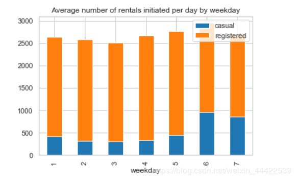
通过上面两个图可以看出:
- 工作日会员用户出行数量较多,临时用户出行数量较少;
- 周末会员用户租赁数量降低,临时用户租赁数量增加。
节假日对比:
holiday_df = day_df.groupby(['holiday'], as_index=True).agg({"casual":'mean','registered':'mean'})
holiday_df.plot.bar(stacked=True, title='Average umber of rentals initiated per day by holiday or not')
输出:
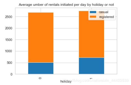
通过图可以看出是否节假日对租赁额并无太大的影响。
以上就是全部的可视化分析,接下来就要对测试数据的租赁额进行预测了
选择特征:
根基前面的分析观察,可以将将时段(hour)、温度(temp)、湿度(humidity)、年份(year)、月份(month)、季节(season)、天气等级(weather)、风速(windspeed_rfr)、星期几(weekday)、是否工作日(workingday)、是否假日(holiday)11项作为特征值
由于CART决策树使用二分类,所以将多类别型数据使用one-hot转化成多个二分型类别
dummies_moth = pd.get_dummies(Bike_data['month'], prefix='month')
dummies_season = pd.get_dummies(Bike_data['season'], prefix='season')
dummies_weather = pd.get_dummies(Bike_data['weather'], prefix='weather')
dummies_year = pd.get_dummies(Bike_data['year'], prefix='year')
Bike_data = pd.concat([Bike_data, dummies_moth,dummies_season,dummies_weather,dummies_year], axis=1)
分离训练数据和测试数据:
dataTrain = Bike_data[pd.notnull(Bike_data['count'])]
dataTest = Bike_data[~pd.notnull(Bike_data['count'])].sort_values(['datetime'])
datetimecol = dataTest['datetime']
yLabels = dataTrain['count']
yLabels_log = np.log(yLabels)
把不要的列丢弃
dropFeatures = ['casual', 'count', 'datetime', 'date', 'registered', 'windspeed', 'atemp', 'month',\
               'season', 'weather','year']
dataTrain = dataTrain.drop(dropFeatures, axis=1)
dataTest = dataTest.drop(dropFeatures, axis=1)
由于该数据的比赛已经结束了,测试数据的预测结果得不到验证,所以这里采用训练数据的20%来做测试数据,方便验证准确率。
重新构建训练数据和测试数据:
from sklearn.model_selection import train_test_split
X_train, X_test, y_train, y_test = train_test_split(dataTrain,yLabels_log,test_size=0.2,random_state=42)
选择模型、训练模型
rfModel = RandomForestRegressor(n_estimators=1000, random_state=42)
rfModel.fit(X_train, y_train)
preds = rfModel.predict( X = X_test)
使用R2评分来给模型打分
"""计算并返回预测值相比于预测值的分数"""
from sklearn.metrics import r2_score
score = r2_score(y_test, preds)
print("模型评分score为:" + str(score))
输出:
0.9489621267833775
R2决定系数(拟合优度):
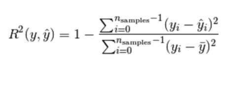
模型越好:r2→1
模型越差:r2→0
总结:
以上一个完整的从数据分析到挖掘的项目就结束了,对于项目而言比较简单,总的来说,预测效果还是蛮不错的,但是可提升改进的地方非常多,可以有更好更健壮的方案替代:
例如有些异常值没能正确地处理(如天气等级为4的数据,因为量太少,删掉会造成数据信息减少);另外,如果还可以获取不同地区的详细数据对比可以得出更多的信息;
对于数据挖掘部分,还可以对模型进行更深一步的参数调节,比如说数的深度、最大叶节点等参数地调优,具体可以采用sklearn中的GridSearchCV(网格搜索)对来找出最优的模型,这里就不详细进行展开了。