R 探索多变量
3) Third Qualitative Variable
ggplot(aes(x = gender, y = age),
       data = subset(pf, !is,na(gender))) +
  geom_boxplot() +
  stat_summary(fun.y = mean, geom = 'point', shape = 4)
4) Plotting Conditional Summaries
# 方法一
ggplot(aes(x = gender, y = age),
       data = subset(pf, !is,na(gender))) +
  geom_line(aes(color = gender), stat = 'summary', fun.y = median)
# 方法二
library(dplyr)
# 汇总数据
pf.fc_by_age_gender <- pf %>%
group_by(age, gender) %>%
summarise(mean_friend_count = mean(friend_count),
median_friend_count = median(friend_count),
n = n())
ggplot(data = pf.fc_by_age_gender,
aes(x = age, y = median_friend_count)) +
geom_line(color = age)You can include multiple variables to split the data frame when using group_by() function in the dplyr package.
new_groupings <- group_by(data, variable1, variable2)
OR
using chained commands…
new_data_frame <- data_frame %>%
group_by(variable1, variable2) %>%
Repeated use of summarise() and group_by(): The summarize function will automatically remove one level of grouping (the last group it collapsed).
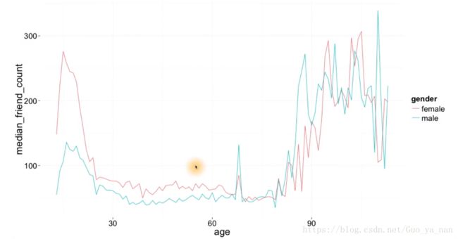
注意这里的图像跟直方图的区别。之前有一个 直方图/频率多边形 是按照性别进行分组,对两个性别的 friend_count 进行直方图展示,本质上其实分析的是一个变量,即 friend_count 。
在那副图中,female 在 500 以下的人数明显 低于 male,跟这里展示的情况截然相反 让人感到混乱,但 仔细想想 两张图确实应该不同:
对于直方图来说,本质上只探寻一个变量,即 考察这个变量的分布情况,如果一个变量在 friend_count 较小的 bins 当中具有很大的频数,那么这个变量的 均值或者中位数 自然也会很小,而另外的变量在 friend_count 较小的 bins 当中没有那么高的频数,那么它的 均值或者中位数 自然也会稍大。
其实,对于直方图来说,左侧堆积的越高,那么它的均值越小。
Your code should look similar to the code we used to make the plot the first time. It will not need to make use of the stat and fun.y parameters.
ggplot(aes(x = age, y = friend_count),
data = subset(pf, !is.na(gender))) +
geom_line(aes(color = gender), stat = ‘summary’, fun.y = median)
You could also use color = gender inside the aes() wrapper of ggplot().
6) Wide and Long Format
install.packages("tidyr")
library(tidyr)

spread(subset(pf.fc_by_age_gender,
       select = c('gender', 'age', 'median_friend_count')),
       gender, median_friend_count)
you will find the tidyr package easier to use than the reshape2 package. Both packages can get the job done.
An Introduction to reshape2 by Sean Anderson
Converting Between Long and Wide Format
Melt Data Frames
7) Reshaping Data
library(reshape2)

pf.fc_by_age_gender.wide <- dcast(pf.fc_by_age_gender,
                                  age ~ gender,
                                  value.var = 'median_friend_count')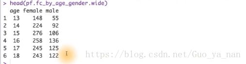
8) Ratio Plot
The linetype parameter can take the values 0-6:
0 = blank, 1 = solid, 2 = dashed
3 = dotted, 4 = dotdash, 5 = longdash
6 = twodash
9) Third Quantitative Variable
# 提取变量,用户哪一年加入
pf$year_joined <- floor(2014 - pf$tenure / 365)
10) Cut a Variable
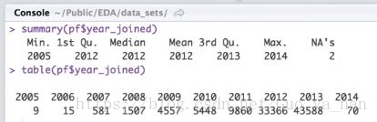
pf$year_joined.bucket <- cut(pf$year_joined, breaks = c(2004, 2009, 2011, 2012, 2014))The Cut Function
11) Plotting It All Together
# 显示NA
table(pf$year_joined.bucket, usaNA = 'ifany')
# 按照 性别 进行分组,不同年龄对应的朋友中位数
ggplot(aes(x = gender, y = age),
data = subset(pf, !is,na(gender))) +
geom_line(aes(color = gender), stat = 'summary', fun.y = median)
# 按照 加入时间 进行分组,不同年龄对应的朋友中位数
ggplot(aes(x = age, y = friend_count),
data = subset(pf, !is,na(year_joined.bucket))) +
geom_line(aes(color = year_joined.bucket), stat = 'summary', fun.y = median)
12) Plot the Grand Mean
# 按照 加入时间 进行分组,不同年龄对应的朋友数均值,以及总的均值
ggplot(aes(x = age, y = friend_count),
       data = subset(pf, !is,na(year_joined.bucket))) +
  geom_line(aes(color = year_joined.bucket), stat = 'summary', fun.y = mean) +
  geom_line(stat = 'summary', fun.y = mean, linetype = 2)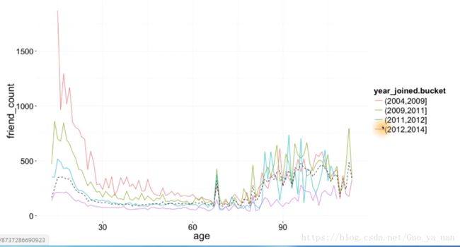
13) Friending Rate
计算 friend-count 和 tenure 之间的比率,每一个用户都能产生这样一个比率,然后汇总一下结果。
看看:比率的中位数是多少?最大值是多少?
# 方法一
pf$fc_tenure_ration = pf$friend_count / pf$tenure
summary(pf$fc_tenure_ration)

# 方法二
with(subset(pf, tenure >= 1), summary(friend_count/tenure))
14) Friendships Initiated
friendship_initiated 由这名用户发起的好友请求
ggplot(aes(x = tenure, y = friendship_initiated/tenure),
       data = subset(pg, tenure >= 1) +
    geom_point(color = year_joined.bucket)
总觉得以下得到的应该是 一个频率多边形,没搞太明白。

15) Bias Variance Trade off Revisited
round 没搞明白,是滑动平均么。
ggplot(aes(x = 7 * round(tenure / 7), y = friendships_initiated / tenure),
       data = subset(pf, tenure > 0)) +
  geom_line(aes(color = year_joined.bucket),
            stat = "summary",
            fun.y = mean)
Understanding the Bias-Variance Tradeoff
NOTE: The code changing the binning is substituting x = tenure in the plotting expressions with x = 7 * round(tenure / 7), etc., binning values by the denominator in the round function and then transforming back to the natural scale with the constant in front.
ggplot(aes(x = tenure, y = friendships_initiated / tenure),
       data = subset(pf, tenure > 1)) +
  geom_smooth(aes(color = year_joined.bucket))
16) Sean’s NFL Fan Sentiment Study
没看懂在讲述什么故事。
17) Introducing the Yogurt Dataset
分析酸奶数据集(顾客每次购买酸奶的记录)。
18) Histograms Revisited
yo <- read.csv('yogurt.csv')

# 将id转为因子类型的变量 factor
yo$id <- factor(yo$id)
str(yo$id)
# 画直方图:价格的分布
# qplot(data = yo, x = price, fill=I('orange'))
ggplot(data = yo, aes(x = price)) +
geom_histogram(fill = I('orange')) +
scale_x_continuous(breaks = seq(20, 70, 2))价格分布呈现一种离散的状态。
tip:如果组距不当,比如说10,可能会掩盖这种离散性,所以要设置适当的组距。